TimePicker
A Material-style time picker dialog.
Can be opened by calling the
Page.show_dialog() method.
Depending on the entry_mode, it will show either a Dial or
an Input (hour and minute text fields) for picking a time.
Example:
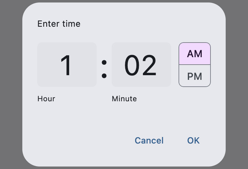
Time picker
Inherits: DialogControl
Properties
-
barrier_color(ColorValue | None) –The color of the modal barrier that darkens everything below this picker's dialog.
-
cancel_text(str | None) –The text that is displayed on the cancel button.
-
confirm_text(str | None) –The text that is displayed on the confirm button.
-
entry_mode(TimePickerEntryMode) –The initial mode of time entry method for this picker.
-
error_invalid_text(str | None) –The error message displayed below the input text field if the input is not a valid hour/minute.
-
help_text(str | None) –The text that is displayed at the top of the header.
-
hour_format(TimePickerHourFormat) –Defines the hour format of this time picker.
-
hour_label_text(str | None) –The text that is displayed below the hour input text field.
-
locale(Locale | None) –The locale for this time picker dialog. It is intended for (rare) cases where this dialog should be localized differently from the rest of the page.
-
minute_label_text(str | None) –The text that is displayed below the minute input text field.
-
modal(bool) –Whether this picker cannot be dismissed by clicking the area outside of it.
-
orientation(Orientation | None) –The orientation of the dialog when displayed.
-
switch_to_input_icon(IconData | None) –The icon displayed in the corner of this picker's dialog when
entry_modeisTimePickerEntryMode.DIAL. -
switch_to_timer_icon(IconData | None) –The icon displayed in the corner of this picker's dialog when
entry_modeisTimePickerEntryMode.INPUT. -
value(time | None) –The selected time that this picker should display.
Events
-
on_change(ControlEventHandler[TimePicker] | None) –Called when user clicks confirm button.
-
on_entry_mode_change(EventHandler[TimePickerEntryModeChangeEvent] | None) –Called when the
entry_modeis changed through the time picker dialog.
Examples#
Basic Example#
from datetime import time
import flet as ft
def main(page: ft.Page):
page.horizontal_alignment = ft.CrossAxisAlignment.CENTER
def handle_change(e: ft.Event[ft.TimePicker]):
selection.value = f"Selection: {time_picker.value}"
page.show_dialog(ft.SnackBar(f"TimePicker change: {time_picker.value}"))
def handle_dismissal(e: ft.Event[ft.DialogControl]):
page.show_dialog(ft.SnackBar("TimePicker dismissed!"))
def handle_entry_mode_change(e: ft.TimePickerEntryModeChangeEvent):
page.show_dialog(ft.SnackBar(f"Entry mode changed: {time_picker.entry_mode}"))
time_picker = ft.TimePicker(
value=time(hour=19, minute=30),
confirm_text="Confirm",
error_invalid_text="Time out of range",
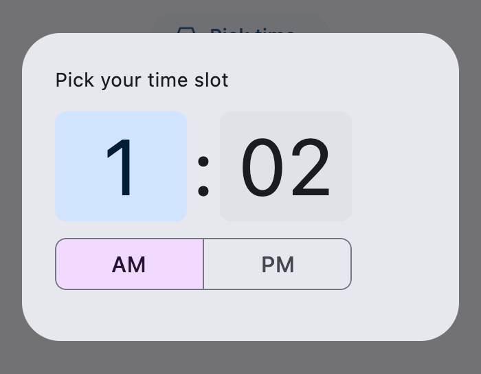
help_text="Pick your time slot",
entry_mode=ft.TimePickerEntryMode.DIAL,
on_change=handle_change,
on_dismiss=handle_dismissal,
on_entry_mode_change=handle_entry_mode_change,
)
page.add(
ft.Button(
content="Pick time",
icon=ft.Icons.TIME_TO_LEAVE,
on_click=lambda: page.show_dialog(time_picker),
),
selection := ft.Text(weight=ft.FontWeight.BOLD),
)
if __name__ == "__main__":
ft.run(main)
Hour Formats#
from datetime import time
import flet as ft
def main(page: ft.Page):
page.horizontal_alignment = ft.CrossAxisAlignment.CENTER
def get_system_hour_format():
"""Returns the current system's hour format."""
return "24h" if page.media.always_use_24_hour_format else "12h"
def format_time(value: time) -> str:
"""Returns a formatted time string based on TimePicker and system settings."""
use_24h = time_picker.hour_format == ft.TimePickerHourFormat.H24 or (
time_picker.hour_format == ft.TimePickerHourFormat.SYSTEM
and page.media.always_use_24_hour_format
)
return value.strftime("%H:%M" if use_24h else "%I:%M %p")
def handle_change(e: ft.Event[ft.TimePicker]):
selection.value = f"Selection: {format_time(time_picker.value)}"
time_picker = ft.TimePicker(
value=time(hour=19, minute=30),
help_text="Choose your meeting time",
on_change=handle_change,
)
def open_picker(e: ft.Event[ft.Button]):
choice = format_dropdown.value
hour_format_map = {
"system": ft.TimePickerHourFormat.SYSTEM,
"12h": ft.TimePickerHourFormat.H12,
"24h": ft.TimePickerHourFormat.H24,
}
time_picker.hour_format = hour_format_map[choice]
page.show_dialog(time_picker)
page.add(
ft.Row(
alignment=ft.MainAxisAlignment.CENTER,
controls=[
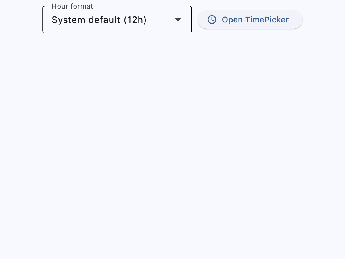
format_dropdown := ft.Dropdown(
label="Hour format",
value="system",
width=260,
key="dd",
options=[
ft.DropdownOption(
key="system",
text=f"System default ({get_system_hour_format()})",
),
ft.DropdownOption(key="12h", text="12-hour clock"),
ft.DropdownOption(key="24h", text="24-hour clock"),
],
),
ft.Button(
"Open TimePicker",
icon=ft.Icons.SCHEDULE,
on_click=open_picker,
),
],
),
selection := ft.Text(weight=ft.FontWeight.BOLD),
)
if __name__ == "__main__":
ft.run(main)
Properties#
class-attribute
instance-attribute
#
barrier_color: ColorValue | None = None
The color of the modal barrier that darkens everything below this picker's dialog.
If None, the DialogTheme.barrier_color is used.
If it is also None, then Colors.BLACK_54 is used.
class-attribute
instance-attribute
#
cancel_text: str | None = None
The text that is displayed on the cancel button.
The default value is "Cancel".
class-attribute
instance-attribute
#
confirm_text: str | None = None
The text that is displayed on the confirm button.
The default value is "OK".
class-attribute
instance-attribute
#
entry_mode: TimePickerEntryMode = DIAL
The initial mode of time entry method for this picker.
Defaults to TimePickerEntryMode.DIAL.
class-attribute
instance-attribute
#
error_invalid_text: str | None = None
The error message displayed below the input text field if the input is not a valid hour/minute.
The default value is "Enter a valid time".
class-attribute
instance-attribute
#
help_text: str | None = None
The text that is displayed at the top of the header.
This is used to indicate to the user what they are selecting a time for.
The default value is "Enter time".
class-attribute
instance-attribute
#
hour_format: TimePickerHourFormat = SYSTEM
Defines the hour format of this time picker.
class-attribute
instance-attribute
#
hour_label_text: str | None = None
The text that is displayed below the hour input text field.
The default value is "Hour".
class-attribute
instance-attribute
#
locale: Locale | None = None
The locale for this time picker dialog. It is intended for (rare) cases where this dialog should be localized differently from the rest of the page.
It overrides the locale used by the page (see Page.locale_configuration),
but does not participate in page-level locale resolution.
If set to None (the default) or an inexistent/unsupported locale,
the current_locale of the
Page.locale_configuration is used as fallback.
class-attribute
instance-attribute
#
minute_label_text: str | None = None
The text that is displayed below the minute input text field.
The default value is "Minute".
class-attribute
instance-attribute
#
modal: bool = False
Whether this picker cannot be dismissed by clicking the area outside of it.
class-attribute
instance-attribute
#
orientation: Orientation | None = None
The orientation of the dialog when displayed.
class-attribute
instance-attribute
#
switch_to_input_icon: IconData | None = None
The icon displayed in the corner of this picker's dialog when entry_mode is TimePickerEntryMode.DIAL.
Clicking on icon changes the entry_mode to
TimePickerEntryMode.INPUT.
If None, defaults to Icons.KEYBOARD_OUTLINED.
class-attribute
instance-attribute
#
switch_to_timer_icon: IconData | None = None
The icon displayed in the corner of this picker's dialog when entry_mode is TimePickerEntryMode.INPUT.
Clicking on this icon changes the entry_mode to
TimePickerEntryMode.DIAL.
If None, defaults to Icons.ACCESS_TIME.
class-attribute
instance-attribute
#
The selected time that this picker should display.
The default value is equal to the current time.
Events#
class-attribute
instance-attribute
#
on_change: ControlEventHandler[TimePicker] | None = None
class-attribute
instance-attribute
#
on_entry_mode_change: (
    EventHandler[TimePickerEntryModeChangeEvent] | None
) = None
Called when the entry_mode is changed through the time picker dialog.