Text

Basic Text control
Inherits: LayoutControl
Properties
-
bgcolor(ColorValue | None) –The text's background color.
-
color(ColorValue | None) –The text's foreground color.
-
enable_interactive_selection(bool) –Whether to enable user interface affordances for changing the text selection.
-
font_family(str | None) –System or custom font family to render text with. See
Fontscookbook guide for instructions on how to import and use custom fonts in your application. -
font_family_fallback(list[str] | None) –Ordered fallback font families used when a glyph is unavailable in
-
italic(bool) –Whether to use italic typeface.
-
max_lines(int | None) –An optional maximum number of lines for the text to span, wrapping if necessary.
-
no_wrap(bool | None) –If
False(default) the text should break at soft line breaks. -
overflow(TextOverflow) –Defines how the text overflows.
-
selectable(bool | None) –Whether the text should be selectable.
-
selection_cursor_color(ColorValue | None) –The color of the cursor.
-
selection_cursor_height(Number | None) –Defines how tall the cursor should be.
-
selection_cursor_width(Number) –Defines how thick the cursor should be.
-
semantics_label(str | None) –An alternative semantics label for this text.
-
show_selection_cursor(bool) –Whether to show cursor (blinking caret) when the text is selected.
-
size(Number | None) –Text size in virtual pixels.
-
spans(list[TextSpan] | None) –The list of
TextSpan -
style(TextStyle | None) –The text's style.
-
text_align(TextAlign) –Text horizontal align.
-
theme_style(TextThemeStyle | None) –Pre-defined text style.
-
value(str) –The text displayed.
-
weight(FontWeight | None) –Font weight.
Events
-
on_selection_change(EventHandler[TextSelectionChangeEvent[Text]] | None) –Called when the user changes the selection of text (including the cursor location).
-
on_tap(ControlEventHandler[Text] | None) –Called when the user taps on this selectable text.
Examples#
Custom text styles#
import flet as ft
def main(page: ft.Page):
page.title = "Text custom styles"
page.scroll = ft.ScrollMode.ADAPTIVE
page.add(
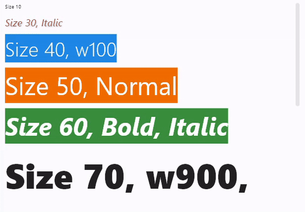
ft.Text("Size 10", size=10),
ft.Text("Size 30, Italic", size=30, color=ft.Colors.PINK_600, italic=True),
ft.Text(
value="Size 40, w100",
size=40,
color=ft.Colors.WHITE,
bgcolor=ft.Colors.BLUE_600,
weight=ft.FontWeight.W_100,
),
ft.Text(
value="Size 50, Normal",
size=50,
color=ft.Colors.WHITE,
bgcolor=ft.Colors.ORANGE_800,
weight=ft.FontWeight.NORMAL,
),
ft.Text(
value="Size 60, Bold, Italic",
size=50,
color=ft.Colors.WHITE,
bgcolor=ft.Colors.GREEN_700,
weight=ft.FontWeight.BOLD,
italic=True,
),
ft.Text(
value="Size 70, w900, selectable",
size=70,
weight=ft.FontWeight.W_900,
selectable=True,
),
ft.Text(
value="Limit long text to 1 line with ellipsis",
theme_style=ft.TextThemeStyle.HEADLINE_SMALL,
),
ft.Text(
value="Proin rutrum, purus sit amet elementum volutpat, nunc lacus vulputate orci, cursus ultrices neque dui quis purus. Ut ultricies purus nec nibh bibendum, eget vestibulum metus various. Duis convallis maximus justo, eu rutrum libero maximus id. Donec ullamcorper arcu in sapien molestie, non pellentesque tellus pellentesque. Nulla nec tristique ex. Maecenas euismod nisl enim, a convallis arcu laoreet at. Ut at tortor finibus, rutrum massa sit amet, pulvinar velit. Phasellus diam lorem, viverra vitae leo vitae, consequat suscipit lorem.",
max_lines=1,
overflow=ft.TextOverflow.ELLIPSIS,
),
ft.Text(
value="Limit long text to 2 lines and fading",
theme_style=ft.TextThemeStyle.HEADLINE_SMALL,
),
ft.Text(
value="Lorem ipsum dolor sit amet, consectetur adipiscing elit. Curabitur quis nibh vitae purus consectetur facilisis sed vitae ipsum. Quisque faucibus sed nulla placerat sagittis. Phasellus condimentum risus vitae nulla vestibulum auctor. Curabitur scelerisque, nibh eget imperdiet consequat, odio ante tempus diam, sed volutpat nisl erat eget turpis. Sed viverra, diam sit amet blandit vulputate, mi tellus dapibus lorem, vitae vehicula diam mauris placerat diam. Morbi sit amet pretium turpis, et consequat ligula. Nulla velit sem, suscipit sit amet dictum non, tincidunt sed nulla. Aenean pellentesque odio porttitor sagittis aliquam. Name various at metus vitae vulputate. Praesent faucibus nibh lorem, eu pretium dolor dictum nec. Phasellus eget dui laoreet, viverra magna vitae, pellentesque diam.",
max_lines=2,
),
ft.Text(
value="Limit the width and height of long text",
theme_style=ft.TextThemeStyle.HEADLINE_SMALL,
),
ft.Text(
value="Lorem ipsum dolor sit amet, consectetur adipiscing elit. Curabitur quis nibh vitae purus consectetur facilisis sed vitae ipsum. Quisque faucibus sed nulla placerat sagittis. Phasellus condimentum risus vitae nulla vestibulum auctor. Curabitur scelerisque, nibh eget imperdiet consequat, odio ante tempus diam, sed volutpat nisl erat eget turpis. Sed viverra, diam sit amet blandit vulputate, mi tellus dapibus lorem, vitae vehicula diam mauris placerat diam. Morbi sit amet pretium turpis, et consequat ligula. Nulla velit sem, suscipit sit amet dictum non, tincidunt sed nulla. Aenean pellentesque odio porttitor sagittis aliquam. Name various at metus vitae vulputate. Praesent faucibus nibh lorem, eu pretium dolor dictum nec. Phasellus eget dui laoreet, viverra magna vitae, pellentesque diam.",
width=700,
height=100,
),
)
ft.run(main)
Pre-defined theme text styles#
import flet as ft
def main(page: ft.Page):
page.title = "Text theme styles"
page.scroll = ft.ScrollMode.ADAPTIVE
page.add(
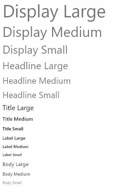
ft.Text("Display Large", theme_style=ft.TextThemeStyle.DISPLAY_LARGE),
ft.Text("Display Medium", theme_style=ft.TextThemeStyle.DISPLAY_MEDIUM),
ft.Text("Display Small", theme_style=ft.TextThemeStyle.DISPLAY_SMALL),
ft.Text("Headline Large", theme_style=ft.TextThemeStyle.HEADLINE_LARGE),
ft.Text("Headline Medium", theme_style=ft.TextThemeStyle.HEADLINE_MEDIUM),
ft.Text("Headline Small", theme_style=ft.TextThemeStyle.HEADLINE_SMALL),
ft.Text("Title Large", theme_style=ft.TextThemeStyle.TITLE_LARGE),
ft.Text("Title Medium", theme_style=ft.TextThemeStyle.TITLE_MEDIUM),
ft.Text("Title Small", theme_style=ft.TextThemeStyle.TITLE_SMALL),
ft.Text("Label Large", theme_style=ft.TextThemeStyle.LABEL_LARGE),
ft.Text("Label Medium", theme_style=ft.TextThemeStyle.LABEL_MEDIUM),
ft.Text("Label Small", theme_style=ft.TextThemeStyle.LABEL_SMALL),
ft.Text("Body Large", theme_style=ft.TextThemeStyle.BODY_LARGE),
ft.Text("Body Medium", theme_style=ft.TextThemeStyle.BODY_MEDIUM),
ft.Text("Body Small", theme_style=ft.TextThemeStyle.BODY_SMALL),
)
ft.run(main)
Font with variable weight#
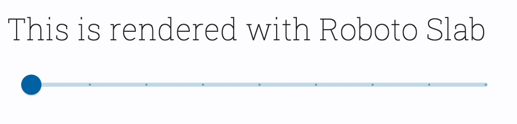
import flet as ft


def main(page: ft.Page):
    page.fonts = {
        "RobotoSlab": "https://github.com/google/fonts/raw/main/apache/robotoslab/RobotoSlab%5Bwght%5D.ttf"
    }

    def handle_slider_change(e):
        text.weight = f"w{int(e.control.value)}"  # noqa
        text.update()

    page.add(
        text := ft.Text(
            "This is rendered with Roboto Slab",
            size=30,
            font_family="RobotoSlab",
            weight=ft.FontWeight.W_100,
        ),
        ft.Slider(
            min=100,
            max=900,
            divisions=8,
            label="Weight = {value}",
            width=500,
            on_change=handle_slider_change,
        ),
    )


ft.run(main)
Basic rich text example#
import flet as ft
def main(page: ft.Page):
page.add(
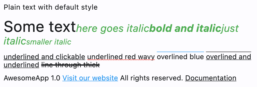
ft.Text("Plain text with default style"),
ft.Text("Selectable plain text with default style", selectable=True),
ft.Text(
value="Some text",
selectable=True,
size=30,
spans=[
ft.TextSpan(
text="here goes italic",
style=ft.TextStyle(italic=True, size=20, color=ft.Colors.GREEN),
spans=[
ft.TextSpan(
text="bold and italic",
style=ft.TextStyle(weight=ft.FontWeight.BOLD),
),
ft.TextSpan(
text="just italic",
spans=[
ft.TextSpan("smaller italic", ft.TextStyle(size=15))
],
),
],
)
],
),
ft.Text(
disabled=False,
spans=[
ft.TextSpan(
text="underlined and clickable",
style=ft.TextStyle(decoration=ft.TextDecoration.UNDERLINE),
on_click=lambda e: print(f"Clicked span: {e.control}"),
on_enter=lambda e: print(f"Entered span: {e.control}"),
on_exit=lambda e: print(f"Exited span: {e.control}"),
),
ft.TextSpan(text=" "),
ft.TextSpan(
text="underlined red wavy",
style=ft.TextStyle(
decoration=ft.TextDecoration.UNDERLINE,
decoration_color=ft.Colors.RED,
decoration_style=ft.TextDecorationStyle.WAVY,
),
on_enter=lambda e: print(f"Entered span: {e.control}"),
on_exit=lambda e: print(f"Exited span: {e.control}"),
),
ft.TextSpan(text=" "),
ft.TextSpan(
text="overlined blue",
style=ft.TextStyle(
decoration=ft.TextDecoration.OVERLINE, decoration_color="blue"
),
),
ft.TextSpan(text=" "),
ft.TextSpan(
text="overlined and underlined",
style=ft.TextStyle(
decoration=ft.TextDecoration.OVERLINE
| ft.TextDecoration.UNDERLINE
),
),
ft.TextSpan(text=" "),
ft.TextSpan(
text="line through thick",
style=ft.TextStyle(
decoration=ft.TextDecoration.LINE_THROUGH,
decoration_thickness=3,
),
),
],
),
)
def handle_link_highlight(e: ft.Event[ft.TextSpan]):
e.control.style.color = ft.Colors.BLUE
e.control.update()
def handle_link_unhighlight(e: ft.Event[ft.TextSpan]):
e.control.style.color = None
e.control.update()
page.add(
ft.Text(
disabled=False,
spans=[
ft.TextSpan(
text="Go to Google",
style=ft.TextStyle(decoration=ft.TextDecoration.UNDERLINE),
url="https://google.com",
on_enter=handle_link_highlight,
on_exit=handle_link_unhighlight,
)
],
),
)
ft.run(main)
Rich text with borders and stroke#
import flet as ft


def main(page: ft.Page):
    page.add(
        ft.Stack(
            controls=[
                ft.Text(
                    spans=[
                        ft.TextSpan(
                            text="Greetings, planet!",
                            style=ft.TextStyle(
                                size=40,
                                weight=ft.FontWeight.BOLD,
                                foreground=ft.Paint(
                                    color=ft.Colors.BLUE_700,
                                    stroke_width=6,
                                    style=ft.PaintingStyle.STROKE,
                                ),
                            ),
                        ),
                    ],
                ),
                ft.Text(
                    spans=[
                        ft.TextSpan(
                            text="Greetings, planet!",
                            style=ft.TextStyle(
                                size=40,
                                weight=ft.FontWeight.BOLD,
                                color=ft.Colors.GREY_300,
                            ),
                        ),
                    ],
                ),
            ]
        )
    )


ft.run(main)

Rich text with gradient#
import flet as ft


def main(page: ft.Page):
    page.add(
        ft.Text(
            spans=[
                ft.TextSpan(
                    text="Greetings, planet!",
                    style=ft.TextStyle(
                        size=40,
                        weight=ft.FontWeight.BOLD,
                        foreground=ft.Paint(
                            gradient=ft.PaintLinearGradient(
                                begin=(0, 20),
                                end=(150, 20),
                                colors=[ft.Colors.RED, ft.Colors.YELLOW],
                            )
                        ),
                    ),
                ),
            ],
        )
    )


ft.run(main)

Properties#
class-attribute
instance-attribute
#
bgcolor: ColorValue | None = None
The text's background color.
class-attribute
instance-attribute
#
color: ColorValue | None = None
The text's foreground color.
class-attribute
instance-attribute
#
enable_interactive_selection: bool = True
Whether to enable user interface affordances for changing the text selection.
For example, setting this to True will enable features such as long-pressing to
select text and show the cut/copy/paste menu, and tapping to move the text caret.
On the other hand, when this is False, the text selection cannot be adjusted by
the user, text cannot be copied.
Note
Has effect only when selectable is True.
class-attribute
instance-attribute
#
font_family: str | None = None
System or custom font family to render text with. See Fonts cookbook guide for instructions on how to import and use custom fonts in your application.
class-attribute
instance-attribute
#
Ordered fallback font families used when a glyph is unavailable in
font_family.
class-attribute
instance-attribute
#
max_lines: int | None = None
An optional maximum number of lines for the text to span, wrapping if necessary.
If the text exceeds the given number of lines, it will be truncated according to
overflow.
If this is 1, text will not wrap. Otherwise, text will be wrapped at the edge of the box.
class-attribute
instance-attribute
#
no_wrap: bool | None = None
If False (default) the text should break at soft line breaks.
If True, the glyphs in the text will be positioned as if there was unlimited
horizontal space.
Defaults to False.
class-attribute
instance-attribute
#
overflow: TextOverflow = CLIP
Defines how the text overflows.
class-attribute
instance-attribute
#
selectable: bool | None = None
Whether the text should be selectable.
Defaults to False.
class-attribute
instance-attribute
#
selection_cursor_color: ColorValue | None = None
The color of the cursor.
The cursor indicates the current text insertion point.
class-attribute
instance-attribute
#
selection_cursor_height: Number | None = None
Defines how tall the cursor should be.
class-attribute
instance-attribute
#
selection_cursor_width: Number = 2.0
Defines how thick the cursor should be.
The cursor will be drawn under the text. The cursor width will extend to the right of the boundary between characters for left-to-right text and to the left for right-to-left text. This corresponds to extending downstream relative to the selected position. Negative values may be used to reverse this behavior.
Note
Has effect only when selectable is True.
class-attribute
instance-attribute
#
semantics_label: str | None = None
An alternative semantics label for this text.
If present, the semantics of this control will contain this value instead of the
actual text. This will overwrite any of the TextSpan.semantics_labels.
This is useful for replacing abbreviations or shorthands with the full text value:
class-attribute
instance-attribute
#
show_selection_cursor: bool = False
Whether to show cursor (blinking caret) when the text is selected.
Note
Has effect only when selectable is True.
class-attribute
instance-attribute
#
size: Number | None = None
Text size in virtual pixels.
Defaults to 14.
class-attribute
instance-attribute
#
The list of TextSpan
objects to build a rich text paragraph.
class-attribute
instance-attribute
#
Text horizontal align.
class-attribute
instance-attribute
#
theme_style: TextThemeStyle | None = None
Pre-defined text style.
class-attribute
instance-attribute
#
weight: FontWeight | None = None
Font weight.
Defaults to FontWeight.NORMAL.
Events#
class-attribute
instance-attribute
#
on_selection_change: (
    EventHandler[TextSelectionChangeEvent[Text]] | None
) = None
Called when the user changes the selection of text (including the cursor location).
Note
Has effect only when selectable is True.
class-attribute
instance-attribute
#
on_tap: ControlEventHandler[Text] | None = None
Called when the user taps on this selectable text.
Note
Has effect only when selectable is True.