Switch
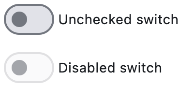
Basic switch and disabled switch
Inherits: LayoutControl, AdaptiveControl
Properties
-
active_color(ColorValue | None) –The color to use when this switch
-
active_track_color(ColorValue | None) –The color to use on the track when
-
adaptive(bool | None) –Whether an adaptive Switch should be created based on the target platform.
-
autofocus(bool) –Whether this switch will be selected as the initial focus. If there is more
-
focus_color(ColorValue | None) –The color to use for the focus
-
hover_color(ColorValue | None) –The color to be used when it is
-
inactive_thumb_color(ColorValue | None) –The color to use on the thumb when
-
inactive_track_color(ColorValue | None) –The color to use on the track when
-
label(StrOrControl | None) –The clickable label to display on the right of this switch.
-
label_position(LabelPosition) –The position of the
label, if provided. -
label_text_style(TextStyle | None) –The
label's text style, when it is a string. -
mouse_cursor(MouseCursor | None) –The cursor to be displayed when a mouse pointer enters or is hovering over
-
overlay_color(ControlStateValue[ColorValue] | None) –The color for the switch's
-
padding(PaddingValue | None) –The amount of space to surround the child inside the bounds of the Switch.
-
splash_radius(Number | None) –The radius of the splash effect when the switch is pressed.
-
thumb_color(ControlStateValue[ColorValue] | None) –The color of this switch's thumb
-
thumb_icon(ControlStateValue[IconData] | None) –The icon of this Switch's thumb in various
-
track_color(ControlStateValue[ColorValue] | None) –The color of this switch's track
-
track_outline_color(ControlStateValue[ColorValue] | None) –The outline color of this switch's
-
track_outline_width(ControlStateValue[Number | None] | None) –The outline width of this switch's track in all or specific
-
value(bool) –Current value of this switch.
Events
-
on_blur(ControlEventHandler[Switch] | None) –Called when the control has lost focus.
-
on_change(ControlEventHandler[Switch] | None) –Called when the state of the Switch is changed.
-
on_focus(ControlEventHandler[Switch] | None) –Called when the control has received focus.
Examples#
Basic Example#
import flet as ft
def main(page: ft.Page):
def handle_button_click(e: ft.Event[ft.Button]):
message.value = (
f"Switch values are: {c1.value}, {c2.value}, {c3.value}, {c4.value}."
)
page.update()
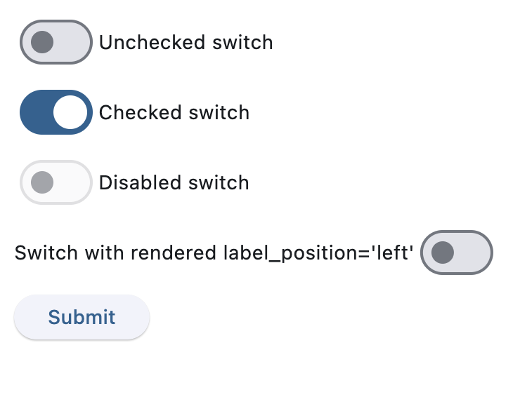
page.add(
c1 := ft.Switch(label="Unchecked switch", value=False),
c2 := ft.Switch(label="Checked switch", value=True),
c3 := ft.Switch(label="Disabled switch", disabled=True),
c4 := ft.Switch(
label="Switch with rendered label_position='left'",
label_position=ft.LabelPosition.LEFT,
),
ft.Button(content="Submit", on_click=handle_button_click),
message := ft.Text(),
)
if __name__ == "__main__":
ft.run(main)
Handling change events#
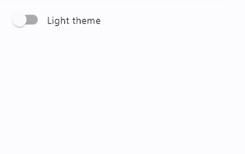
import flet as ft


def main(page: ft.Page):
    def handle_switch_change(e: ft.Event[ft.Switch]):
        page.theme_mode = (
            ft.ThemeMode.DARK
            if page.theme_mode == ft.ThemeMode.LIGHT
            else ft.ThemeMode.LIGHT
        )
        e.control.label = (
            "Light ThemeMode"
            if page.theme_mode == ft.ThemeMode.LIGHT
            else "Dark ThemeMode"
        )
        page.update()

    page.theme_mode = ft.ThemeMode.LIGHT
    page.add(ft.Switch(label="Light ThemeMode", on_change=handle_switch_change))


if __name__ == "__main__":
    ft.run(main)
Properties#
class-attribute
instance-attribute
#
active_color: ColorValue | None = None
The color to use when this switch is on.
class-attribute
instance-attribute
#
active_track_color: ColorValue | None = None
The color to use on the track when this switch is on.
If track_color returns a non-none color in
the ControlState.SELECTED state, it will
be used instead of this color.
class-attribute
instance-attribute
#
adaptive: bool | None = None
Whether an adaptive Switch should be created based on the target platform.
On iOS and macOS, a CupertinoSwitch is created,
which has matching functionality and presentation as Switch,
and the graphics as expected on iOS. On other platforms,
a Material Switch is created.
Defaults to False. See the example of usage
here.
class-attribute
instance-attribute
#
autofocus: bool = False
Whether this switch will be selected as the initial focus. If there is more than one control on a page with autofocus set, then the first one added to the page will get focus.
class-attribute
instance-attribute
#
focus_color: ColorValue | None = None
The color to use for the focus highlight for keyboard interactions.
class-attribute
instance-attribute
#
hover_color: ColorValue | None = None
The color to be used when it is being hovered over by the mouse pointer.
class-attribute
instance-attribute
#
inactive_thumb_color: ColorValue | None = None
The color to use on the thumb when this switch is off.
Defaults to colors defined in the material design specification.
If thumb_color returns a non-none color
in the ControlState.DEFAULT state, it will be
used instead of this color.
class-attribute
instance-attribute
#
inactive_track_color: ColorValue | None = None
The color to use on the track when this switch is off.
Defaults to colors defined in the material design specification.
If track_color returns a non-none color
in the ControlState.DEFAULT state, it will be
used instead of this color.
class-attribute
instance-attribute
#
label: StrOrControl | None = None
The clickable label to display on the right of this switch.
class-attribute
instance-attribute
#
label_position: LabelPosition = RIGHT
The position of the label, if provided.
class-attribute
instance-attribute
#
label_text_style: TextStyle | None = None
The label's text style, when it is a string.
class-attribute
instance-attribute
#
mouse_cursor: MouseCursor | None = None
The cursor to be displayed when a mouse pointer enters or is hovering over this control.
class-attribute
instance-attribute
#
overlay_color: ControlStateValue[ColorValue] | None = None
The color for the switch's
Material in various
ControlState states.
The following states are supported: ControlState.PRESSED,
ControlState.SELECTED, ControlState.HOVERED, ControlState.FOCUSED and
ControlState.DEFAULT.
class-attribute
instance-attribute
#
padding: PaddingValue | None = None
The amount of space to surround the child inside the bounds of the Switch.
Defaults to horizontal padding of 4 pixels. If
Theme.use_material3 is false, then there is no
padding by default.
class-attribute
instance-attribute
#
splash_radius: Number | None = None
The radius of the splash effect when the switch is pressed.
Raises:
-
ValueError–If
splash_radiusis negative.
class-attribute
instance-attribute
#
thumb_color: ControlStateValue[ColorValue] | None = None
The color of this switch's thumb
in various ControlState
states.
The following states are supported: ControlState.SELECTED, ControlState.HOVERED,
ControlState.DISABLED, ControlState.FOCUSED and
ControlState.DEFAULT (fallback).
class-attribute
instance-attribute
#
thumb_icon: ControlStateValue[IconData] | None = None
The icon of this Switch's thumb in various
ControlState states.
The following states are supported: ControlState.SELECTED, ControlState.HOVERED,
ControlState.DISABLED, ControlState.FOCUSED and
ControlState.DEFAULT (fallback).
class-attribute
instance-attribute
#
track_color: ControlStateValue[ColorValue] | None = None
The color of this switch's track
in various ControlState states.
The following states are supported: ControlState.SELECTED,
ControlState.HOVERED, ControlState.DISABLED, ControlState.FOCUSED and
ControlState.DEFAULT (fallback).
class-attribute
instance-attribute
#
track_outline_color: (
    ControlStateValue[ColorValue] | None
) = None
The outline color of this switch's
track in various ControlState
states.
The following states are supported: ControlState.SELECTED, ControlState.HOVERED, ControlState.DISABLED, ControlState.FOCUSED and
ControlState.DEFAULT (fallback).
class-attribute
instance-attribute
#
track_outline_width: (
    ControlStateValue[Number | None] | None
) = None
The outline width of this switch's track in all or specific
ControlState states.
The following states are supported: ControlState.SELECTED,
ControlState.HOVERED, ControlState.DISABLED,
ControlState.FOCUSED and ControlState.DEFAULT (fallback).
Events#
class-attribute
instance-attribute
#
on_blur: ControlEventHandler[Switch] | None = None
Called when the control has lost focus.
class-attribute
instance-attribute
#
on_change: ControlEventHandler[Switch] | None = None
Called when the state of the Switch is changed.
class-attribute
instance-attribute
#
on_focus: ControlEventHandler[Switch] | None = None
Called when the control has received focus.