ShaderMask
Applies a mask generated by a shader to its content.
For example, it can be used to gradually fade out the edge of a control by
using a LinearGradient mask.
ft.ShaderMask(
    blend_mode=ft.BlendMode.MULTIPLY,
    shader=ft.LinearGradient(
        begin=ft.Alignment.CENTER_LEFT,
        end=ft.Alignment.CENTER_RIGHT,
        colors=[ft.Colors.WHITE, ft.Colors.BLACK],
        tile_mode=ft.GradientTileMode.CLAMP,
    ),
    content=ft.Image(
        src="https://picsum.photos/id/288/300/300",
        height=300,
        fit=ft.BoxFit.FILL,
    )
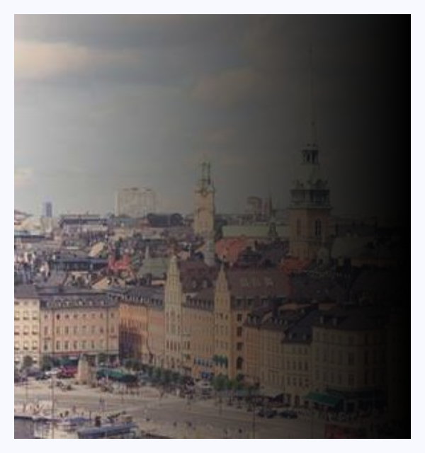
Linear gradient mask
Inherits: LayoutControl
Properties
-
blend_mode(BlendMode) –The blend mode to use when applying the shader to the
-
border_radius(BorderRadiusValue | None) –The radius of the mask.
-
content(Control | None) –The Control to which the
shaderis applied. -
shader(Gradient) –Use gradient as a shader.
Examples#
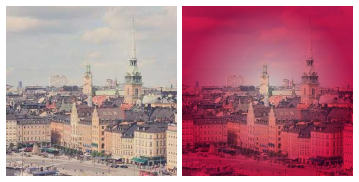
Pink glow around image edges#
import flet as ft


def main(page: ft.Page):
    page.add(
        ft.Row(
            controls=[
                ft.Image(
                    src="/9j/4QDeRXhpZgAASUkqAAgAAAAGABIBAwABAAAAAQAAABoBBQABAAAAVgAAABsBBQABAAAAXgAAACgBAwABAAAAAgAAABMCAwABAAAAAQAAAGmHBAABAAAAZgAAAAAAAABIAAAAAQAAAEgAAAABAAAABwAAkAcABAAAADAyMTABkQcABAAAAAECAwCGkgcAFgAAAMAAAAAAoAcABAAAADAxMDABoAMAAQAAAP//AAACoAQAAQAAACwBAAADoAQAAQAAACwBAAAAAAAAQVNDSUkAAABQaWNzdW0gSUQ6IDI4OP/bAEMACAYGBwYFCAcHBwkJCAoMFA0MCwsMGRITDxQdGh8eHRocHCAkLicgIiwjHBwoNyksMDE0NDQfJzk9ODI8LjM0Mv/bAEMBCQkJDAsMGA0NGDIhHCEyMjIyMjIyMjIyMjIyMjIyMjIyMjIyMjIyMjIyMjIyMjIyMjIyMjIyMjIyMjIyMjIyMv/CABEIASwBLAMBIgACEQEDEQH/xAAaAAACAwEBAAAAAAAAAAAAAAAAAQIDBAUG/8QAGAEBAQEBAQAAAAAAAAAAAAAAAAECAwT/2gAMAwEAAhADEAAAAfQIUoiI0lZIgEyATdYWOplqrazdbSZCQ2Mcm86UBIDKQyhxEkJJOVUs6tiOVKZLUr1VENBZkjrrszlxZSXpKXYVXKbWDkyMmCsi8rIks6rJorU1ZEciLYowEAOUGN1EWlMatjUrLIwLJqIkyBU0glKLJMlLEm4hKxy1uUZUmVGMxKW1YxBJwaySIYFQUiyJJlZYJW7FUSahMYiQJhBZXKamoksnCJYVyskRZJDiCFa4ouQCViVkhSEBQAMQMRDQCG6AAGSICgYsSREZDG05QHFSbqBIsiMsQxUMATAAYkSEAAg0DE1BEMTHKJK0mEkWSESycECrsEBYIAadAEJDEBTQ4AKBMBkiGKgY3GGba8+gBgmgYgOL26zid7HsoQhRkrAAEBJRFAaIYCkgGAQjLaRkgx0qr8maa8ewYFAAmmQfOpy16PNbtTuJq1DESYqTSJ5bC2uWWtxUovM0l0EKYuM1sthjjXSMCOhGEcalbmjZrKI6zFxrmtV3L1XNMNOfGuVrhLee6VTJIiSSYQra5dXEVdVc6yIVaq9FpxQrbDP1Izx1Y8qsnVLeZK62x9zg6sb28Lq82Z6FtqlreiKZ7cHRsinDn25m7Fr6YqavucupwqEuLOzq28es2WOa02cws2WcydmnocnZLo59al2U2wXNLZWzGvbPO8l8cOs+gUudjpsS5U67MuO3p5r09C9auizh2yuNvTj1Dn5GetxejjadWsrmX2Z7Kc9V3TOystzca2VmareGLd0Ofnpqz2ZZOi+J07jdTfHnvkor6r7svfy4i1W24Y9CUYNc6pp1Y1rO2NavOvHqq3LQuzWMlr25bZckutJOBZabmTS5RTpqRsogwWuqaonZXc98c+HTg035uubu/wCe9Jz3yaZ4tTU8ctTRbxdQK/DZqjToDNdVrLvzktjy2k/U+S7mbtdj5a5+fdXpks0Nay5RlsclvfI0Y6bEtDMWK5Kbgy6Y3xlydDn289bM/XnlWqnWYUO3eVLo1YuSvZC2NVsap6WHuZt0LFz1N0yiutwNDxzXUUNJVBXB0YdvSd+/Pfw6WPMXNpVLNlbRfLVmvx27bYWSw4nchvn5g9LV052apx56UZKKed0Odd09fj9xJw0wjk815+3PZzLtlnOc1dbcve5eGMNG+fPu3US79PAuzruPj6c62106VeG7fc1Yd+Pn06NufTnUXXO5kq1c6ojqFehFHK63JWnt8Lu2X13rLynS2Q65x2akc27SRTg7ovFr6dmp5yPpBOZh9PA8vb2BON3+Zoahk0yYpr1543a+D1p03FOXLoVuyW2PNyb5d089Be9y+bRb0u15P1kuqvQueueuRZ2x14czSumFaLlXWW2rLG15bix0BoKBZW0OTVmEsKtUk4supg0z2J2azJ1MXl09ejWfP6OhHecNXWlN8L1mLpY1rhVn53kOK9HPXoo7uLk5Hqs8vCqxU9cdOuquJ9jlSO6+DDnv0dXK7MuaxmRDVTVdV8qz3aIxCYgRMpybMjdMZWutU8OvXGuOm24y6TTnX//EACsQAAICAgEDAwMFAQEBAAAAAAECAAMREhMEISIQFDEgIzAyM0BBQlAkQ//aAAgBAQABBQL8eZmZmZn0zM/QJ3/4uPyj11ms0mk0msx+cfycTH8MfH5czMz6Z9M/jx+HMzM/VmZmZn8uPTEA/FiYmPxYmJiY+jExMTExMeg/42Zn6c/VmZ/n4/5Qg7n+Zj8P9/8AEyZk7/zcTH1dUurdPV/6sfix/Ab9K53/AAGsGaAP/Kc4VHzb9ZcLGYKjWitFcN/DyZk5yfptJmfD67LjlLyoN+06fqc2fjVw31f5nbEH0HBjYCepzlXOtZyI/wA64BTVaQFf6zFazC2bRjiU9mNiqeQTmXHKsz250IF6scyzqFSDq0x7pInVI7FxNSzW5Fa3qYLA05lnKGAYYG284xLa/AB4A+VKgemRAVPoG+8YEOQezMCScB9rLTWwi0OZwGNVYpzkEY9HBdOKyBGwK2EHk/8Adp+wiszLTZDUxgpnDiBvPVs2Z0Y/buYrP7Z1D7wXPxi0a1dRWE5qYOoonuKo1p1r6goG6oseXltbKTbLG9xBdZA7stQZBzVkPe2/Kk2VV+GyCNssOpyXJ06c63i0TmE5IbRNtZzLh/IMcJblo76xUe48AKtVicTmWqqyrp+Wy/p+EpVsq96tatfEQMI/mdVjeUo6cMlxXktfxSsiWbBwuUC5i17RfFntVlrqZxYfFVxMbQkLC/uKOe3J2eawYxYoK8W0urdZWNUM2l7Xmxqeay4WSyg609Ui1vxiOfvbcg3r2Vgq8qw9QCB1TtWC5lyEsQdO+FUmpKmArrLMxWm/qLeSYYPbnWm/w3BlhZp3gOiqdgFbG9ksaJeOWyzNFfVc093m+xbMcTwC2FbGFvlPbkT9wJmtKeNEdA3UNW2iUWOfbWCFC4Fao4uUqDsuhNmVQSjBbqk8tu+xnK8SotUFbi4mnD2NO0WoKdpygln2gWEMwLOkBPJ7y9ou6RLr1TktxZY3KL9gh79yx2ZFGIxBjOK3qs3Y1tdb7VAnHkPikc7FtjYNQo6evWdSmaiMzvuB9ytNa8alQCAsUDdxgn4CCY1bZslmjs2dvt1JqOxOZjMOohpvz6Y1OQYNg88ZXfxj3LsdtozuszOxgrlHaq4ZrFDZ49WAG2va1VS09p8AfAxCMen9CYUqPjC8u5hyDtkK01INP7K0Zntxr1Kmp5mbDY4nYHsIRsOBwOOwggltXUU96rMhLPNwpiB9sd+r/d88YbAXMfIlVFjK3SOqMmkV+QnpHh+2u9YauwI3K+cnUKDK99k6uoVrYpTkXjsCvDSplaq1RUBNF20GSoICzxMC5hXy0UwZClvE/OqmcaCZbcgWSorYzu+1am2XKofuWOcN92KsstdGLaqpVziHtMzpgSyq6g1dx8d43Zj3gbw28f8AWfIsCpbx5chbMwZL6z4h/T6H4DGMe+wthptio5QgxsY0B9E6Zyj0WG21HcYxD6ENimrCYsn3ItShONONwFgbMAXTx17Z7ZIGr7hP7R2EVtpmArhgMH5h+BrG7GmsVEfAmAR1grLNjkb9FB+x/wDTvpZhQyAivvD+3UdenLDJZIth05H1dsjdRAy8LWIRyqXz5GwYsf7IOJWRjsoEZdlwQdCH74OZrCNZ09JSzMWHONE30rzxVNPgdi2E1dAZYpgCTCYowKYUUzmBrp6h+TqLCZysoNu6e5Co1LGurydam2rqzAAFysfU0oNa9jg2ZQJi0XdmbZVtuWK/InS3WW3RZ/WSIW7hgT3M78hP2upPj/iuHvVXt7fLZewKQ7WVi0VPY5ulfTVLHNcRQ7P2PZYGVzXxx+Blsqr3KGsGxlHuWMS2t5Vnd30HLVN69vEJRw1WBuy49CJ2yFGZ/vbxdtYx7ByYWOvT/swmDpnEqTC+zqmErKJS8RVw4t2bEVUnsspd0r1yhMPxFpo0AJfTAVLFAq3D0lQWO4uaVFVse9NOnbNcPed9gTj+sgOR9u4FlfICjsxBFPnQQ0Y2CbwMuORYXGW43ipSk3SeJjdPXYRXqoRzFrcTylndfbbS2rFGrJGzxp+oVLlkVYGpyrVk19Sig9Z0/GnWbluoAWy0JOfvdatpDvPcvs91hgaxivID0n7GPRlwhAATAlhQwK2CSrHMzFGPQJNCJnE2m5mxh7sNRO2AnnwtuK8wJ3UOjDptgKLa1tVyLHdr7XPMWrFdtgYva1Vd5Zq0FjEpZv0lRWjQ5IsnvH1HVq891Sq89ML8g5K1A6lNm6hK6ww41ussjMKyAWU9vozMmbTtnt6a4Pt7d06ew2PR1BsrrvD47Fc18a7pUnIaqiQPNKX3arkbdK1N1aovV+MAyRQItBdCjIjZe0KiyzR0W2tK+dVhuBlUDoR2M1i16hqvML21GCMDXsDlihzp2APriBe1uwcWWie5DM/UprvvVZaa3FqivjRm4VZZ+mVdS9kUdisIEdcFlGy0LqgUtVOZxYy5PLZXK+qsLIdlRthnvjsxwEbYRPg/OPQfEH6bmKirDV2Iod6gTV4VP+57anNaicaT/8QAIxEAAwACAgICAwEBAAAAAAAAAAERAhASISAxMEEDQFETYP/aAAgBAwEBPwHxpS/DBahCEIT5qUpfKHEn6C/4mE0l+jdYmfhwZwepr2XU1CJDjILoy7OLI93XZfCiaJUNTXR6MMkvZln0ViVOA9cWcGcHuEE3iZZX2SkKLveHRl+TJ9b71WTx4vwxGUTdGnSMYp9nQtQiOtU611uPTEoQgl/R8Sl1TkJl0tsZx+BYv+jUOS+xM5nJH0Ncu6fwb+RkRxOOmjtHJlG0j/XEWY/yCd1V8cLp4Yv2hYT0cPswxH1pb71dQnjh77MsEkmZYtb/AP/EACMRAAMAAgICAgIDAAAAAAAAAAABERASAiAhMQNAMEETIoH/2gAIAQIBAT8B6whCfjpSiZS9X0pekIQmJ0psX6c+svpov0aX8VLhsXSE7L11hGcjh66bG2LnUhTyNlbLCnJM4+DYr6eDwzVezVYhB8WevZSl8ntDRx40XEeFSCaN0brNKWiQ0X+2OThSj8i4LCIiIaRsUuPRsij94+QRBpCaG4IeOeKUrxqLFZTiJqYSHyX7y2XEIQSOS8dVjjyh/IexLDxBKHgTJho1EvMH48QROqHinnOxsbFzqPiavC4M0YuByUxGRkZq13omf7hcjY2Pk5eBJkGxMSRUPyajLm9f1n//xAA5EAACAgECBAUCBAMHBQEAAAAAAQIRIRIxEEFRYQMiMnGBE5EgMEKhM7HBQFJicoKS0QQjUGCAov/aAAgBAQAGPwL/AOcn/wCl4r5ZlY/8LqSzaJdFJr+1sab5flOr3/tjT7fkZGxPdsr5/smWqMfhxDfmXWev5GnRsSS8NdRPRXyKCju+v5mPxP8AIyVy/BnV9x2+ZLs+F6bG8ZEqsUtvycpP5NnwZTOf2MX9jn9jYlk34dey41TR1PMx0bMwbnU2rJh1Fs3N5fcxq+56pfczKX3KTNnw3RiSfCUTmXLTp7M7FxE2Uny3KfiGPE2PU/uy68q7mEdcdDYpQ+x6JfYapnpF6l8iJ+xUH5vcW1ivkNcjGr/cfTrB6Me/FU3tfDTpex6Wf4vc80WS1SrLwes1fUf2P4rE/pyr/MV9OT92fw6IxvHdH6TJLuYslGc6JOU1XYUtTaY3CkheaOR14q1DcpX7CdopbFfBszVTa50emRhHpkbM+pfPcvNFGwstYoVdDXorFblv1csi0v3N0eo0qS2vY9SyXrieaOeh6cnQ5ip7dj+L/wDkr9y2/LySFHw4+7iKOrKwWkqjuaKfUlOtmZ2MZQ6j8UTehKqWwtVRjv3Yo3iiopHP2M4J8mu5Zbvi0UmzU3aEuK0v4THKe7/Yh4aSpfqQndtFPTHtQ68TaWxNvzeFpKXLZEl4l7fubxMToq0JVFLsym1vmhKCPM89Ry3fVjT5uz1mZYKVaf3NKjgjKLfyM06qn1kXY2tQty5sTRGa0/6jKi+rMK11JyzSRcdnlFQVOryfSq3dWV/Iv+o/KvuehEtUfTub/ubp43N+Q5TTv9JOq7myHKMVXuZ0f7iKVKsFN5Q3WeZf06XuaXEq6Nxu7QplLhpTPEdGi/LuYkbmWYNyrX3KU4+x+mXydIkfopxwKd5u7HDVdmZ4KX7i1cjV13j1LlGn0oWCtOCsdjO73NMdyLVql9xx8V78y4j1vPXoQuOP1dRJ6/Ej2G9NYG5Fv/qYknq16nuY4aD6bZpHHpwae5TMbcUcmXbLj+xT2Le/txyJsx4epdb4/qMRkbP7Hokfw5WUoSKql3P0u+9HNd7Mvh6SI0adcdXueq/Yt8N8y4ZP6mDPHmVzMFcuFFi1LJb9RD2HrjG+x6VqI6VyyblWYljqYbzvYquhV8ldTdMzCx6o0zEnsIbo1O4nqF8cPDvoeZvfBcm98ZMtrHUwbU+5etNmfEgiPhRjT62W5L7DzqLetuiTit1zQ7UpXufItGps81qPZEVKTtLoNqd4+w3rxe43vSIY3Neiuwpad+QsFUPHMePY34JvhpXQXtvwzEtCT2yRk+aJrQkonpqleDD0rmxKDbrLsdzde5Wp+1kcUlg8qH4ctWO4tSaswiqNmelkq8uBR1R0rsemJ6aPTkbrkeG+5qE63KoofZk+w0zBT4P2F+GJKHhrS+fc2vFGzo+KG3Xpo7cFONMcpR8zIKUX5UbcNn9iqe/QuEjdGw0pt3vkrU9PWx1mOkjiqeD1LSLOORvk7mOuSeFVcMMS4ZMHqvjuRG7u+PpEuaG0/L0Fpfms8IeSy9JHB4nYUja/YlfJW2LKVrmO9KdYo/Qp38Ela1aTw7mrNH1FZHz7UakxvNV0KWck8cuCshJNcLXSv3Plmrt+CKG5c+HwbciVpD8q2IrTuiJsXRmTFU2SpvuKWk2pcMxJVqWOaM6pLojmsczfBexWi++oV71Y7k9tjMaW5LW+yLsqzFSbWyK6f8HfSbYaHP8AT0Fdry2NR32Fz3PCm+aJX6Tfh8Et8IftexHv2IjdcI11Iex4vuRSTs8vq7ksYoppv2FG8D6it0u5JPxVP4ZpjtuUo5Pgb+nbQ/KjMX9zLSaLh4lrsiTV74ZGN7mhrAo01SMTbjextdl6Xd9DS6TyQUdh6Z5FTKPjqPPI3e1bHh+b0kMDWRO/uW6F/Qn0WBSs7j4ZbKl/Qw2/9RpjFXzHr8FIvwIQdCen3HCS+xpjGlnfcc4ukZZuSdOJZbwYYpRjfsScpSl/g6EWoyXZ8NC2ReWzbK5Ii+dbHxROuhz9J4eWn0E2tjPMUU1YtPUh7E4trLfMUbQ1dZ3JNNPFJCrw9WDY2RsJ0ZRiNcN6LcmUpJ92ZcdxenDOY3oyb+6NKhm+QqlpUuVFc+pnLo2yPG46Hi8iTTXwavqJ/wAyc4+H6e54cpWtQ8eYja2LTkmeXxP6mmX8jGfgX/BvsP34cxvWJt53PMldiWN+CTW5sbD4czc3ZiuG5ubGP5FuWaLdNEvJXwf9t8x203XIctFktPh1q6shHT6N6ISqUIrcX9x9Ua3a9io+k8PRXp6EJc+dGrU8SQ4vGeZLwvErfkNp8qFT5FPwMf5jTOMoLqOOX3IvVfuqJedaK+wk78pm/k1abyKelW1sYqKv5G6k3/mFLqJdfwb8brh6haaT7Ik3K7NU6VbUX9S0eZeTnk9f3JLqRjOGHZbhsv1CtXmsbEpwiljSkxOVKs0up5o4W2S3hWOetUuh5lLVzrhFGY8yPd9RVd86RfnLUzS5Ut8IUcSrqOo7myL1xkueDGTauDNRnhYqymOPNEcG5v8AhpPkeZ32NLgitImlzyOMpN3tgfhyadlx/u1TI3vWeFnmUTwzdmwxEnk9KwdPMMjl/cxNmaYzI+Pxw8P8baEmkJJbo55HRsvT/UvRklzyelH/xAAoEAEAAgICAQQCAgMBAQAAAAABABEhMUFRYRAgcYGRsaHBMNHhQPD/2gAIAQEAAT8h91y5cuX7gX6l+u0yamovpfqewxBJftuXLly5cuXLly5cv2B6BmFPRcyvRm/S5cJcX11KetafKML6lSvZXpUplSpXoejiJK9nHqHpiPpcv2PqxJSUlEr1PeS/ZUdMwB4m5iX7rly5cuPoMX6L9F+y/bUFKqX6XLjBl+oRfvX079L9M+8IQHtDElSpUAuVfsFf4K9oBKlSkp6KenD0wPS5cuLfs4lZgY9X/FUqV6V/kCLLl+i/Ql5l/wCYv1qV/lqHoPUnLKle2v8AFcv/AMYzG2Co/wDmIvsq5h73UJeUfWvbX/juX7r9EDBPVEvfwG/TPo36npf/AIa9Lgewr0qeOJYAaFfMzbrH4lu4y4vsv0C409b9p/gvgU+JVYAEuWy/bqWa2/LLYQ5bl/4cdS/SvSvdUr231FyuCYg9p6cwxuOH4xmNMU4CLAu6/D3VK9L/AMNYWNnFQt/gI2dfMGz2UQQtVtQdrauncL537TJ6MdWXcpRNs/8AJomFQpsf8ZaLjKcPcwpj2XMN6mN+yjQ/iaJw/fsHEXzF6uqgy0PKS8TGgX5GWSBptla4rzf/ACYCWQS/c4nEVO5ljK4gNPwQAC1bNzjH9wxZfghzybCU+gmtrN8QBYJ3z8SilPmYGz8wCsu6hdWI+ZhXOIYy2lqCUBRupvGqwQ8IrMwAlHUwAYgdooUtM5OI/d8MrRaDEU5EKP7MouhmFa/KlZhrmlqEPpS3PBBuvPLEi0A7YL+IZdx3Co1LrggWK6JByChwQ/Y1hsmjBmXVYLAibRryx1wG2WXOKfEg5uGUePEyFVviUTLyeUbaVV5gynnDGTIRsCfESGnwsLkCuYyBKroukwvhAWaUy3AzRyzFACliiYmngdotKXLBhUlmo4YRB1Y2TzboiHMcDkmudO6J5C9ypb8GZwGkc8q4zbKIm1eMwXWjZWZdRZd5g5/wsxQKHSLxEAC/Fi80+BARVs2vEc6nbnmbIhipzKFKmM3EI00NotxwwF1wiABOskL8oZQHOL3HOW0LBqAdrbK4I5uJ2nBZaZmTAm4QBUlDgGjEVXJ4mbh5vcqF4u6gBx/JCmjrf9oOa3ZFJmhpwxaLODWbgtbOlQkwt2CYP8yLPXdI0k2b9y9gPuM9t0je5qayNvxKy8a6BlTRvhuYwOGhzGpXlYZ8U/ctVg/UYxAV32gVXc6tMjiX0qHL2JgjUCRT6E7iHT+Z3oCICLF03cAA4iqjWcdtRHyHPEWCLeFaaU8FivMBOCAVAsF0QQEEXtQOUu1FPOWVs1qN2UZsuMkfGPGIPnWHLg+IOEx4uVQL+J2A4qZc00Z1PDhKbiaaLqIr4TUuEkaBD9ZjmDAVKKOyLT9QANDixxEiA/Mgr3IBxnEEt1QFybStRkAC8MqqrO8MSWfllNUxqlBn7JTXEe9TLqasVQrRd36lJQ6EQH8IRyt08RZkN3n6TfDi3C70OVRDQ2dw74uq6rgZrS8vFzacvXE+B3iLlzweJtR9TlIFDQgI2DoxBclgvpAFBnY3KHUAO9xXR84ls5DcKp7TvQa+SwzwqagJkR1BUj3ckD0UHMN0thAoEDQcSHOrMjfmOaoOHmpoaecxufl1jgAVnIliwNmrljDu6sjXdKre5Sq3nFv4jhoGFvUcCisEzFXAMfcG/jARRQH7jdQDcRDAlG7ZR/cpzkcJpKalnK3lirBLUtcLL1kIaFg08LTA68dH/UHdpZjSobWrAq42hsL3DoeCD94CZgYLNquNXKXcV5HwY4Z6NmIa49S1TTOhlg5rlxFpFdsSotNz7ZkQvh8E4Z2IRZQNviUGXA9BBJfXNb+hzCg1dD6S+KLQ4/MpvDlZ+I1MvjjcKJQ4q4Yoi2hjUcsSkX8RMDHmVsZ1dRhFvQ1Kfxt+5vtqqZQMDoJgOx1mCWFum4RdlnUyXESAMviYTkM2kzsqqupfNQ8cZcWgV/c2FfmEsNUSniI0Eagy4O5fUWNKvMBriG5pIvjUcW18QIcfUXZVv1Btb5EfEq3WJhSToMz7YXChrRthmN+7tibK/EMLf5ThuOfmIRvUVWYzWxLqt12vaLqWrlgsMaCOGmyYM4zHsHzCtgarSKx2cVzEFijzFy4zcFbZZRu8axUyP+cAMpXUa2Rv80SzB2DcWAvZdOJagc0EGthGnV6dS319zKi4dobvjVDIrzFQwjtW44GXl4TxElYaG0wAwHwPiJcMGb4YuabrbuGxHEFqOGOUg+I1RW6fNxBV1f5uAIhKZ7llia/uV4FOnzNGuS96lALXTfzxAZxC38yxs7WdxZ/eBar7GZyN4MsTg4YGE5h+JeU9ygb5BFy+0WAN9m0a5I5hIF35CqlCKNAOZxqEyZhoMZdMqArRoREQLmgha2Q4moxSNFmNhVh8C15nDNtf1EFm0DJ3+CIBo7b1PDa3ctKlVPiZr0plbIpbLlIg7iLJGugL1+Y1SX/smyzmIsGuooMCOuGUCF8ms4jxGtDxH4o3fn/ksTyHio7oC0JRYFn7S2FJuozsCocABy7lKNTdDebliJwTKWjjGIpVfLKraKbUdhE3X3VLmrKLRmExMFMMtMmZsaYWeZpeFjEdzTmfmLAKu1QLUxHB+EuK1Nrd3qFtNVcy5pGZQkfJB183CuXHKRiTGf6nygoGN/3FeE064zFz91HTkqbv6iEsMrp1LlCl/iDfKggV43+0lBbDaB+5abHNuOJU4LHxDqAChp3zMho/Mp0nOYpVyqQSMY1uGmx9Ttn8Q6sPCmH5LjAXTO1EzKNN9kXy/X/YSiG16jkXt5LgFy3aJXcciBoeTxEzaHaKAPgIZafKXVeGnMCDlLrmXSTzF8mO4t7dOf8A75gqv9zYc0v1Nu1j+YOvwKnE5olrk1DTNQXXZfuLAtupfxp/caHauIDTLmWVLjH5AX1BCWn/ALLHZzjOpdNBb6lXmzGjBSC9270RZVXcyNn0tw+VwjH1C2coIUQxFl38zo5DmEq3AdRKKrDmC43sfiAwL6nOIiJosqmFaNwKhXmGIiNqV1MzOR1PwhmOOgKfuWCqv4iN2h/KWq1X+moX6qw35uYfSKyeX+psZMLvzMyxRCeysUwVZXXOYPjbXzAM19Liq8fiNWOFiXaJmvqCjDDHFThlhsDipRFT5ijE13HKwO0RMqziEdZF1GmxDzG7BxBEUKYt+IXOjaZ+oAVdTyiJdr/iUFmmNypudc0M0OF4XMxaKWzHlZDTqNpMILzLfWbKIUFxecyyuRIYIqVx3Ad9KwcXFsbbPmUwuG0EqJk/MdqZcJj9igc/MbackIchx1MJrxslLrGn9y6trwjulRBoSQZAs4irBVG5RRhxTKAIj0k4M8r+JfJ5R4OnPWyN4AKqNWNcOkwSail5YGS1sTkg5rcAaw1RmXCsS0TjjHDESpp8RnioSc0umiaq6/pFFR0JjMxrmosVOcbRkuTECSpmrKOpjqeAwUYbZlgAgr6leWMFgrLQF8kG1qhFBkjGjN9CfAuHBvAkriW2Pcszt+ZkEZq7+4X4zbFMXOem8qzEuaOZi7B4A8xxob5l4CK3mfKekxdjuXJiqix4LbVCod+CFrttGzZqZNH3Lot6sNQ6ZS3LFzeQuA8HLsvzEdlvAy2aLFYzFgGexiJ3lpeUomCBMMoXD6r1MrcXV1KVWD4lVScDbcy7KaxMhhzWYXMyuLY4N9r/AOzCtFcYQGWLaArzMPbTKFFX/UoWjzOC3XZFxfZchcpCk5wLndITEYBjvmZ3aZpf5hlJnLdSNtmNQVBD3UvhrKnxKM9TzMaDUgHWBxmYo70oQL9EQxwaC2+ZWqVLjdcAY6cL+oFFbJ/d6YK/ZL1fglwpHh5jsqc0RUtUrK3Cr+YHEx/0JkioYa/iB2pzRiUfIbyoilhQwV57hFyAKFzKiPiLzM7exc3GO1GYQzk3hxMgbcCVRU5zqEVYcBBUQHnJhUdGrqD1T8OYq67fDuUCn8Qez8/2iKQqskZ+g74wap2Rati2Bjtr55iHgeZVf6MAHQv5mVkMuCO7cMvXcLIHOnipQVn8Rol6YlOWv1PihPHZeWb4PzcW0DtORhAJuqJTJfMs5PxLoFajVVK1P95ZrjH7ocQu9U5SKSq3dbmUDw2fU8+bMniBnDW83+YPGFkOHtKK2GY0NIXh+YcEXdo/JCY2NA7/AHLBryUyxFpvKAMONqCYQBXcMWppliaUEmwItfiDAWKNm2bC8CM/H4MLTLmssCdN20jUAVccu5edoK7jMtarCyMRZfZXMfYrhbf3NvxihcLdb6SgAAvcbvuVVmZuq9P3LcTi/wCTDj+ZayNV3L7p9Q8fzjjaHYdTAOrnbDjW7suAh8nj6huoWKbQJS0UhlXPEOGAMeMTBgswNsZAxYa/DiIGYyH8y2dykSBg4EZYu2l4ALpZYNPCK0MaSBSYX8xQjXwgs8tNupRw9DN0XbQTEBX7hW9GChNfl/UvIAywYlfyt7mOAGAaQ8umtQz0+l4lNA1KJnLeczBGK4OYSCwzQ08JzLzaupZXAbGAOOEcdzcm3RBaU8XOR/C5XwyvD9Sst+0yzN6lmme01CHmowC978RTkKaeLlDhVSleSFYc7vN/Ez84xlN9xe1MWW8vpdgbGy5YWs8FdwNHf6lzo+4/hl6gHLoXH3FF3D2LqG44trVm5ndBSmCJK9tZ8S2N/FaSh/PzBg/or9RVNRAwjTVK56i3H8xjuisKhtgv5H9QFpSLRFh6Z28v7m55AzLhQQFgOsC57KYQfDuUQrYOSBsflcqBw7wgf//aAAwDAQACAAMAAAAQpuNOOc8YIN1obd0oFzHus46+jykIkyEq77ew4jjlp9TVUlI3sIwJxLLXRxs/VXhxCIXkZp/QJSXDAQAGa4ADFAiiCX+iBAAIQEEJhQiQ9qFWpWJrALewSIIT26eGzr/4Jg17b46w0VZTtjfAAw3oAxwvnydMKBoETlc/N39GFLkgPPsVr+SMJOklGkCkgqQaVRpCuOVII3LmU/AAOcG+55vNrJfN6D/7gjBEr4ydN0dQ10a+i7S1cHoGFYPwIq6f7JVTBXaUQW8TLLNBu1fPZkpCFjsTii6q+uhG6x4P6Gp4kwrL6MLccPZrGhDgn80FDDfjYEESx8oXUDENrqUgQ3FpS9z5tMPnWth4afqSF//EACARAAMAAwADAAMBAAAAAAAAAAABERAhMSBBUTBhcYH/2gAIAQMBAT8QeH5hDwxDy01iGNRll+JRPwlIiEyYZYbZXii2WIaZ2VlZSjeYQhMQilKXFRcUv4Jis2LCH+Glyioe/B7INTEN+MyouCdezRMNCk3i3FG14LB4V2NTTXhdF8INTCVJBdyqOzoQkvZK9GgaN4p4TQ39C2MRCRlGQYI20KfBoEtiaFDfgVjThYNGIPYmdEPVX2RCpHX0cv6FrUsOaLY2S4TxCWsf6B0Ns6oQuiVvRoEf0hNwKEMIhdbImh70hIwtD1BV1lf0WC16IJMjb2NQ010Tp+zcZpxFtUjRG4aE7hr0oEGTIJPeBIJbIaHbjGlYQJJcGuMg6x1OjXo3gr2UQdQpzDRwTvo06iIbxsxpdISP8L6h8i6wWNaLisbbehvYi2JY9ieQ/ZOQgCzZlBsRrE4awoJL0SbG/ol0JRJBwa9ibE+iZ1HyIayzi6LehHwXxhBV6Kl0qfC+kf3MWJRsuDacK2igCtBwE3RsmTN+ifQqnfAYkFhkEknsYW6E2J0//8QAHhEBAQEAAwEBAQEBAAAAAAAAAQARECExQSBRMGH/2gAIAQIBAT8Qjgk/IZnJwcvIcP8ACbzmwwuyI/ZKUmHDONyc+S7tHBlhYWfjeFttbudZIN4ZkwPG2WfnOd46jCXZm8Wf55L8sY5YZwHeNtOGONttnY3IW226M68sjrjIMnleGOMjJD5xnCljPf438idWWvzQ+xe40Zy28te7bPY6XbyQO4BCjVYl0uSr+c7GpPhlo9hhM7Qh033qZvwkmEHiG3rh/Cz6ZO9ki7gJAd2u+wF3UfnH/wClgRmWZ3K+Ww7s1vSA7Y+HCDq6Fu/vAsdh2v8AZ+BOHlkswM2RdMYOogD5fQjySJdzY15AO5B1D6l9gvlnyCeXkILbwKvTaJJPdhKfZPjdANohCMhgj5wedMP6yN44ak2AmGbw92f1vO7DaO7Hpb6g2Ddj0cG76LQbaPd0J7fJS1egbth6mO8IxdWEDAkHuPRwt6t+pdjryF7KbVmccnt7YxqNgSBuXb84CEv9mHDxQ3y+gkXvLqyyxsnEH9t7yID7wYYwSZJ3fBvJSQayXyWMOCSWYQ7xp95N2EW6iid243//xAAoEAEAAwACAgEDBQEBAQEAAAABABEhMUFRYXEQgZEgobHB0eHw8TD/2gAIAQEAAT8QeJ3GPM7/AFAamP0dsQq/U3BsuDn0L0Mi0CVkvuC8RbhBtzv6ckqLWo7huMLsePouZ9HL6Mfr/PpGpdS7gRO4HUNBATfEQG7iNiabYBXModwrUQrnZjJpmuYo4IqVLHUtuUYpKRTw1EuyWiviB20X4lpTKfEp8Mt4lMFDxS/cMw+gPMBzHYs7+hMjG64gKHSy5VOrMg8wAlQDxBCGvouWQSIYoRR8RiJA9Sx6nxQIrIg6JR4lEBATxKgEKJkIoWmRfUammHK0zkjtm6BbM1MSkNlR+lw9vpPpp8wPM+ctI9/o+f0bJcuDU+ENgSpUFXDGPEXtgWKVEVzEVFdhy5MQ8Yz5/oDcv3FlwZUlSDzFMWst8y0bT6NlstgsuFsRlHMvm+IBdwQOCCVK1uwHiOqlZ8ZSLzEizyy/mX8y0Gdypspq/rQShlUiPptLyjPpD3DwS7qV8T1QBMLua4QEFD6lZ0oNRb+npA0uGZ8so8RC4KlSpRLi39aIcTX1KZyuUR+gvmXL+lsGm4eURFmwSbmYWhqXFRDAjWw6Y1OJd6ir9LYuQhzCqlHiUeJUGj9C7szyxrqMOf8A8LYiv0D6AePrylH34wY/RV/RVS39VP0FcYu4fpePoc/rOfpU4Fc5fiIK1ULefcFZ/wDoOfS36PH1JcuL6F3KPMCoNSg8xTx9K+obFDHuYe8R37zS/MqUxofQ5nMq/oP0V7lwW5cX9PU36cbBYIyLlr9OpcOZhmr6lGaJVBXfG8QADbAuuW2fMpT3KpdTfEVLrJX0wyyIly5cv6V+irlSpUuVA2EUBRymQCF8wFciiWJWfRkQy6VV/aX1QBLd0/ajJc0oW91aFxfAOJRq+SfCIldS2HMWpT6ILsiC1lkuVhT3ErxLlxSyWS5kuckGuY21sV5OwVAIDr3BHGRbuXqXLnfMr3LsJqkoC7rp/wC5ifxCTK9v4nAax4PEd+tEMbi20RK+iUqGxVURC58mUQp3KAle4EqBfbPkzT3KlQ98Sjoi2WlcId+4qS3bWK11FZvP6HicCXko0VQUOLYoDQW6maElMt9x9bGhOPD5uVWPM7lSiVKXEdR5lmbDj9FMqBsVxKPMAKPmu4fBehjOZCOap+KNm0dcypRA3JgwKo7f8miYLAoDh7JQYrsePrT4fxOtjA/DOyNYORVb+0VqNgurRt/CGbQLSC3fZLAQqC0V4qVWeJ39b+j6lSvpthrjJfoO25Uo8fQ5+n7c/mGbQhdrEWAS2wu4sKisQy3YgH0C2FOWu4FUgYKwxNO77lwbr8fMHfQoFCWNIMls3w/0VQsPYRKIniLKzSoURsp0bXXuEIJXCvXIN1VsjApePLKrPEqV9KiBcKShnuLRjPEEU6wgP4jYDe+o/M6qCx2XCW2LKhKrDyX8RtAStWOoi4ZAUFkM84eZsM8pYCllW5SxYt+6KOhLGShtlvOCpuFkFLMHmaCzddZa1RyCUDLp9F97n3jN5qiw+8EEJNOcrssneFrU0iJWi/Ko5ZveBX7yqiL0JTv5iowbUVrXmcPlaHCBzdwvhaoEaruMxeOLX8bEBoOa4H8zW4HR/nmPLxOf3uZT00N57d8QImYav95pgNKh/sA0EFwURMptRq/mOkA5Qoh1L8hHVQQHa1KtFniodOlSqX6HggksFdlRtEy0cxniqG/MFjSyR9f75l9FyrSAjU0020c+IOWA8oliRn0Lh5qv3lkBaKVVfzxFUNq3AnYgZMrQHMGOlKrb+IBgvlLZOilpW/MRq6db5gpZy903hKIWiA5a5ESURdV3kHPtWoA+YDhMDTCuvJSLbxUoUktA13b6jRLTalPtkbS9AiAt1yDl96LD5yASIDW9kdqPYJ6lfzWWWhT9r/ePM3JRs/h/9U0BeU0mxeA4/hl42vgEl3Hh5A2LHR4nGkwefcDd9h4jxRHFKVGGvzKdovSsCJuRrPP19mUAngL580w1plt0bz1D8TsqjfmHCRsNodQgE2VX/H1HbsEDBVXNEVcSosrr3UqlCmowA1x3+Jm8oehvMxYgo0b+YwC6p5IFVXTFOIoE2L1xLSbXkHoltizjeSoOgcRM+CFabM3+S5syc4n9QSHoO38xKHFewDwQKidEwxbYnC6t6JuxeiIM1LmLwsQKA1BbXhVdkLYcab/9cI4I2PJpGpUAK6JalJSd2o3nxX3lDUWYbbrBAAJ0Nt3ZfrPvFCIZyFdiQUwaRivImTX9FpnU1dQtaPiUr4SQMr8th0XjuD1AZ5I0RFJBpAAfN/MombSug97LVDZSmHwWOpSD0qDviCZFyB5bUQYDdKtV+P2hvS00kA9DzKAIAGi5XvdhzrVzkPdY0F/MyG6aLvRNbB1ynorOKd9xnDkAPgf+QngCQW3+IjYpLGd+0QKRXOnqslH7NPZ4vmOlNivO11tJUe0Dgh5O4FAtCW7L7zmJcICeqiNnGTrTz6l2FwHR4MlYLiUNCcE5wfR081FC0OBCMr8RCjoWLCbn4EClpYICjRAhhKQCW11BrC6jp845GKYCF/GUu8S9qwhwA8w6Nt8SsCJZBG+3viJO2Wq2lPIywjCwXRr35lBpXdAeXZzHDaAfKKHMQWgIbplV87Mz8QKgOnYwY3QoDxhsuQgBFCt7xW9S8uV2B/7MdQu0Hzj5llNeGD+0q5mii543j7TDFQUUvij1kQqqKNq8csbaGwuUceoGHtFHgynL9ottSq4Ky/cVfK+HL+ZXwAgUUmQ7sP5LHT4iZSfLUuz42U4MuFrivRKAAdE9OTINbfQWdi/bIRmVS2KeZacJRpX7GURFSFqb8ZB6QeK3p+IL5tbtOPUspYhYDQo93ABxHC9tHxEDuo1huKCBWvas33HDNRdD231A7Uk50NIVowDLFCwH+YoAKJ2sSEsRAuzbNlm10Rj+4XMBaVev3goag3vw3/U6oxEcOxgOWAu7bxMcJfNYRUGzx/cJ1obzd6yVcqz45D94wFiFDYVrHCBwjCQptNQZP32aLfAJ3d1ewhaNHA0o8/MAcELym3dZzDocUcNtH/1Gw8K6Oa8faAifRUgC6decqG0YcMw5EqUE5yp6lSLyLSFLYWW/tF/NVBbr1cZCTvedh7Rv7BvURHQKtTJxDx1Ldm3W3r7uiGG2r/4I4gAc5e7Xv3Fvim6cbSRqwZAg122Ury9TKTECBW8NLpz/ADAhVVAWzoLrhhf1ZUSquvwP4nMXRNu7X+oGgNwDU+SW5I0V4RKG6Ba5UuwaaqgXzK5cSIzqkJfLMwAFcrFfPvUHZUewBe7eVGQOhLW9RLuQ7kDzZWqsrVi9A19tEoa9XewnNRrRWVA7hApRABVw44NixCekg3yf9TRh0dYtbUOZzAZi8EVWDfmbxO9VTa3mNAkiqNLc9Rd4Lor8ygzBqLW1FT17WcsfmUjjaCn5Yr0zjyPM5AB8F4hENgl44Vc7EJXzUVKkaaeCIDXjzxtQRCLl5cQfaFrhVzbDTHdw+A0tbeOCo2ES7FVRIdiYDZxXxHK5SQuu4FvTtEKCF/ZZjBDWqxQl/JMsG7oH7wGA8hKqRV4EELGcchEBDBvLxRAO90ggjj7QhEt3XcDQr1YXkApcbAP9pfZ/iz/cobPjRIX68LpP+y6Tt2pi+1ieLeXcImgK8w/DctbuS2q9j/cedFAGQcArnioqtECo8Vd/uRzN/gtygFtsQV9xmgKhfxdQmqQlu/BB5FeWA88feIAbid+XcIJE8j94CxZ5hVRj0WHj7R4JGNsuMRRBSuvtFDjSaH5ldQjHxNyIslzF+peH1KAwNe/tHYKCRW7931BcauImE7IHFePr7jxCFbXLDHismUjmhVLXR8xouZAVBx3plzeVUPESdG6Bl9EdlOhb/wCYN2ui7blFfbV+7xFvlM4IDMqC5d1GHgQqoamtepoDcvs0Uhr7wR1liydLREbQFpvHw4ZdEW1l7ayNIRta2WKTPFxBNRmWHHzGACguBNV1isQmkK4IL+aw8KkDAeKjnqLKgLZvnfUIQljb4LXLpksOSxDaurSmBElJEHDw8v2EQEg3tRcBHIdt8wUl2hObjhVtFaLlNtaxDT1H0DhFq9wfGR0VBUB/UWI1vPp8BKntzZB/MEtQN8z8GRpQaGp+ySn0F0RRMagbQBzFwICgY518RinK3jo/OEY4mypZ3EQtVTW+5f0cM4PcG+CMJtN+Lg+UGW0nEYNLeXr/AGVhYmBsH1Ut293YNls8iwsu/wCksxhJUtpC5aVRdi+d394Yxa9D45sLrHJpa+PE2hmO22KZxQq0Xp0yo8dv8/7DFsR58/8A2GTBY78P9SiAedSVUgM98/tUQ/TZtlhogWgVeeOYR5SacANf3Dg2lKAc/wAk21oNA0me5fHKvezftKML0tvVXmco4pPvTo29+osVotWHinuCuwQbd0XlfGS5QQKy+DIkhHSyT5twZw8XpVf7fc4fsKlmcuy9xDGLK7PjXSRAslV58QpRridS8iulgf3i6lButC/EbdKEovFfY/EIzo3iHLxLJpWAwYgZ0Qn9ZjKIbxuElIKTzT5QDwo9gpiQ5bVltUf3A4tTB2XCCAloenHcRCAWN/1GIH5Fc7zWnHp/yHal3F6j+BFztUuc3/dRRmOeeH9xsFYnQQnE7ora+FBn3nE4V69XBSKdiE4908rz9uIGWxrUUejuJUpaObTZLFgDThXG2xfskj6CUW2Nd67QmodL3fojFWT+BTysRrho/wD0+JXPq6xRHboCikp/2ViQLEHjqpeP4iT8IOJ/F8jrRR9patflAR9XEgAUmuKpuCBStzU5Msg/sL3+4Ja2zzR/iKNRLfA8PUWqitnUcbC8YU6a3bZh6JYIlPj5ZYMQ2OHH+EBRoPFhRFvjyrmDZVDhVHUvqtgmg2gIu0EVTsFgHuL2kvarNFEzYQ/mUOqD+kaLVZcXpRYb5V/MvASqTGrFyzng4rLxee8gHKqr9uf6h0LEb48p/kQHirOK8MXcgay7gm22CrKt/cfAAjfm5VtIdNIvAKNNHuFx3IKorSvfM4p6ma61/MJzTfcEMJDWxLFb8S5lPYEVTwHT0r7R1g2janUVovENIt6ChXEbAJo/gl4wNyLWCVYaAi+vKE1aFQUe6j4VacKuRWcxVXRaBSDzdZHo2EMSrxcuvAXhdO/vLK3zYfs9MGGVKIAo9S0JrGyt5k0l1hlPNwe1w0BZpzsXDojisfccZqkS25LgCtSK2owNIt3lC/yERVke95F3xISjjyM6l4LEFcRf5IntF57Lt/USh3mr7uYAgke6afzK3lDGmPhGVZJdd85CiDLWY3f7JEBVjKU2JydQFWwyoIeeS/M5kLT2qEwADtijMah5EILQCUAQDR0WuclwWdBuP5gRPmDTqAnHCv8AmWuNmqpjNRBa3wXz5iKdhA81Laei98EAKaAr1LTkyAD6X4iNs5G/N1K2KSq03hfMZmI3dKqqCGyy6v8AkaIVGK/tNHHFpzGzQW8TdZlvuUDpLFtuaP7iiYKxXGUXF1/kz+9IcfyA8RAZ0S+fHqK4ru7ONb+8AlutVLXf7wOIRqat4r7TbLVDZXN8+bipWFlhbSuPca+vC9il04hJs9TgNL7QeNyvNWf1HJGKAp3QHniLdwSmfcSV/agoAOW1XccRYGUqX/2A4Ry9PxzLhHL5NfadTUR39opfbjYtD1Ga80IGyOFazyZf/kVkLDYMuCItGA1Ql/mYRZWCtj/EqQwPLy7i5ByE80rsmuD45lAyMQhKwPPcNBspZPv5jSBjUS/JEwFQoJ6rn9prwSFQpou/ZYr2izh5/wCR0UKSgv4TkGGsFvg/ebvy6LMG27lC1LIo8WD6gAzAhVl9nTUwTBUwPbmIMMKLB8kWJkHa2U3Lwjvabc8eoGAIhCui/wC4q4mK6Br3At831drQU9f5CJSVss5vfQXFDoqOBUi+UhpSpU6t7iU5h7g3PPME1KnFznr8RIKpNdnSIhjKF7eTGyB0uKRBcW1Crig/3IRqq2Ahe4jHgLXnomkBfs66JYyBUP8AQSs0iob8/Yg1F1i1lQgLLsLN+8D0ZiA8hAGpnd4sRKjlaWfEU0uFUjrlNHiLLpUmFBORz5LiMqN7Df28dRivsyx0fcy6dsFIPGjxfX3j3pjBeWvULCKNw+zzHn7+xhle408LGACneX49zBvoAKqOf8io9ORW6v8AiU2aljo9ffzApP4CghqlnL+/UuizALG1GCFOKFPhyXBu3noaTyY+KYNaBYXOw90+4ux2Ea2gvMotja1yQARaB7OkNi6luA8f9lMm8VFKpgKQ3VpHKop1EAKHLcYwoiNWlf2wG282HQDivMXfVFKz0J4iEpYAYXfnhjxAWtx0SDtGvRt5cuMVFEUWPPsliERiv8pQ/uSaR9xMjywsR/2O6SzQbzj8RqYhWAdvzL5As6ewQIUh5YCwrey+YioiZ0MW4rYQLT2nkhQTfm//AGzaureLn8wa5s8WRJk15D/kstA1QdL/AJ7j+xtQbrM8kTLt2NVX2YlpYNNxzONV4WY+ZuDuK2/6hNWaMBN3QzgsMVPpr7xJOKlWjl+WpRgiwMd5b147lYQKC0B84HcVc5aq19vUGV+BO0boPN1EU7JqR5YBu8u0Dw/ePF1VXk6ra9wd0QWKfAP7+J1Q0pBRWuDiBxeJ+4f/AHcBmeLeqdvxBhLKFZbydyyjUL5D0JsPS0vCAd2mjxCYVRLWd0nxKQgtF+PxLeghwOftKSvFmzl/2PXssrQObsAUClExYulosusICltFLXhGKl+HwtP5/aLFWitHNW99EWbqwcF/yYxQOQVktGuhReOalEEFo7fzAjah8MdCyAsKtvv5YI6bL4D/AEiNUdIEWtJbzT+04ojG2l8RSVSJeHE+2peoR8NSxAWFNzu4AiaKF0S3w1QcCBRSUYcXxLPNChdC679wxY1s6Xw35tjpJWKBYWn7jcvgzS2i+iZsJDttZbeasN3DH8EmOZXFxNIVRYOPbk4zY9wHw4+IrlUPOvk24qOPXv8A5q6B/MTV9dElOVF8QRN5ZoaTR+CJFRjyeql7qK0FtDfiFNZhFdiDd+5k2Y5PFDzKZ8k27GIcEVwK+KlSeUXQf/Y0VERSj+d+MhbHlwhK4CU27tY23hbZnzDHlwNs5tlhBX2QbXO4HdiTgq7eCoJiJJe+DK/+VH6c4gY9VQ5zxEbfSIKHfEyQAu/7x+lmiaD9uPvHRJRpA4lDyIwG0Gu0AvoOOf5ghSk+B/EErdfMmms4BIOJZ7REf+v8zQUAujXNRYaOjhHQXiupTd0TZ8qxEtwUxR64faAQwhQhEuh5fEAFgLK3jiL7WA2XKtYL2r44mkeXBXJXxalbKWw8ycgvWAHWMq+tXI1UW8i3SNlGpS7ypkLi1Ma+HUr2LQwdu645gKegULtX/EOnJApwAeYIWEyLwt7qr+YUC+sbiwFARLNFREpoXg89mxCnA6JWCneokGas6/wStYssPYW3nECeIYNA7niCdF+7ZWZDzOfdLb4wwP3P3ifAIWOeLovzGXUFosV5ZYnmiOx+Ibtti5GFRVN5gKqVysXATrcWo67+Jl4bS7pneJmy/a41kAcDYLKgTyInggG4ng9y1IhccjUAH5mOynqGM0+Kjc0PeorRnPZUPDW3D7miUsC+4Ar3BFr57gvejvLXxGphhi8cQh54unI2RbBUUErwas4Py97+hGJW/aCbDRuiMbx3DLPkGuR34lHHmDKiZBdMcFEW1tg6YlSm4te3mAKZjChzMSugaES8VNsKrKb0De/5h+uDgzno9Q5ykpXzzbEWrUqjKuBsu5FtDCEARqQ5DlS9Upgs/pDiSVv+SAXY2jiMASKDXuJgR7IUTarpjdBavF8JDkFgNBEml8V6g2l3v9oDIiAu/mIlPTHbHkP4ItVOY56PlGWFrSytlwY0KN8+bimBQNyqplymaFAzdksl7lo1W0pQX8xbRvgt35lRbEVvKlf/AGn/2Q==",
                    width=300,
                    height=300,
                    fit=ft.BoxFit.FILL,
                ),
                ft.ShaderMask(
                    blend_mode=ft.BlendMode.MULTIPLY,
                    shader=ft.RadialGradient(
                        center=ft.Alignment.CENTER,
                        radius=0.5,
                        colors=[ft.Colors.WHITE, ft.Colors.PINK],
                        tile_mode=ft.GradientTileMode.CLAMP,
                    ),
                    content=ft.Image(
                        src="/9j/4QDeRXhpZgAASUkqAAgAAAAGABIBAwABAAAAAQAAABoBBQABAAAAVgAAABsBBQABAAAAXgAAACgBAwABAAAAAgAAABMCAwABAAAAAQAAAGmHBAABAAAAZgAAAAAAAABIAAAAAQAAAEgAAAABAAAABwAAkAcABAAAADAyMTABkQcABAAAAAECAwCGkgcAFgAAAMAAAAAAoAcABAAAADAxMDABoAMAAQAAAP//AAACoAQAAQAAACwBAAADoAQAAQAAACwBAAAAAAAAQVNDSUkAAABQaWNzdW0gSUQ6IDI4OP/bAEMACAYGBwYFCAcHBwkJCAoMFA0MCwsMGRITDxQdGh8eHRocHCAkLicgIiwjHBwoNyksMDE0NDQfJzk9ODI8LjM0Mv/bAEMBCQkJDAsMGA0NGDIhHCEyMjIyMjIyMjIyMjIyMjIyMjIyMjIyMjIyMjIyMjIyMjIyMjIyMjIyMjIyMjIyMjIyMv/CABEIASwBLAMBIgACEQEDEQH/xAAaAAACAwEBAAAAAAAAAAAAAAAAAQIDBAUG/8QAGAEBAQEBAQAAAAAAAAAAAAAAAAECAwT/2gAMAwEAAhADEAAAAfQIUoiI0lZIgEyATdYWOplqrazdbSZCQ2Mcm86UBIDKQyhxEkJJOVUs6tiOVKZLUr1VENBZkjrrszlxZSXpKXYVXKbWDkyMmCsi8rIks6rJorU1ZEciLYowEAOUGN1EWlMatjUrLIwLJqIkyBU0glKLJMlLEm4hKxy1uUZUmVGMxKW1YxBJwaySIYFQUiyJJlZYJW7FUSahMYiQJhBZXKamoksnCJYVyskRZJDiCFa4ouQCViVkhSEBQAMQMRDQCG6AAGSICgYsSREZDG05QHFSbqBIsiMsQxUMATAAYkSEAAg0DE1BEMTHKJK0mEkWSESycECrsEBYIAadAEJDEBTQ4AKBMBkiGKgY3GGba8+gBgmgYgOL26zid7HsoQhRkrAAEBJRFAaIYCkgGAQjLaRkgx0qr8maa8ewYFAAmmQfOpy16PNbtTuJq1DESYqTSJ5bC2uWWtxUovM0l0EKYuM1sthjjXSMCOhGEcalbmjZrKI6zFxrmtV3L1XNMNOfGuVrhLee6VTJIiSSYQra5dXEVdVc6yIVaq9FpxQrbDP1Izx1Y8qsnVLeZK62x9zg6sb28Lq82Z6FtqlreiKZ7cHRsinDn25m7Fr6YqavucupwqEuLOzq28es2WOa02cws2WcydmnocnZLo59al2U2wXNLZWzGvbPO8l8cOs+gUudjpsS5U67MuO3p5r09C9auizh2yuNvTj1Dn5GetxejjadWsrmX2Z7Kc9V3TOystzca2VmareGLd0Ofnpqz2ZZOi+J07jdTfHnvkor6r7svfy4i1W24Y9CUYNc6pp1Y1rO2NavOvHqq3LQuzWMlr25bZckutJOBZabmTS5RTpqRsogwWuqaonZXc98c+HTg035uubu/wCe9Jz3yaZ4tTU8ctTRbxdQK/DZqjToDNdVrLvzktjy2k/U+S7mbtdj5a5+fdXpks0Nay5RlsclvfI0Y6bEtDMWK5Kbgy6Y3xlydDn289bM/XnlWqnWYUO3eVLo1YuSvZC2NVsap6WHuZt0LFz1N0yiutwNDxzXUUNJVBXB0YdvSd+/Pfw6WPMXNpVLNlbRfLVmvx27bYWSw4nchvn5g9LV052apx56UZKKed0Odd09fj9xJw0wjk815+3PZzLtlnOc1dbcve5eGMNG+fPu3US79PAuzruPj6c62106VeG7fc1Yd+Pn06NufTnUXXO5kq1c6ojqFehFHK63JWnt8Lu2X13rLynS2Q65x2akc27SRTg7ovFr6dmp5yPpBOZh9PA8vb2BON3+Zoahk0yYpr1543a+D1p03FOXLoVuyW2PNyb5d089Be9y+bRb0u15P1kuqvQueueuRZ2x14czSumFaLlXWW2rLG15bix0BoKBZW0OTVmEsKtUk4supg0z2J2azJ1MXl09ejWfP6OhHecNXWlN8L1mLpY1rhVn53kOK9HPXoo7uLk5Hqs8vCqxU9cdOuquJ9jlSO6+DDnv0dXK7MuaxmRDVTVdV8qz3aIxCYgRMpybMjdMZWutU8OvXGuOm24y6TTnX//EACsQAAICAgEDAwMFAQEBAAAAAAECAAMREhMEISIQFDEgIzAyM0BBQlAkQ//aAAgBAQABBQL8eZmZmZn0zM/QJ3/4uPyj11ms0mk0msx+cfycTH8MfH5czMz6Z9M/jx+HMzM/VmZmZn8uPTEA/FiYmPxYmJiY+jExMTExMeg/42Zn6c/VmZ/n4/5Qg7n+Zj8P9/8AEyZk7/zcTH1dUurdPV/6sfix/Ab9K53/AAGsGaAP/Kc4VHzb9ZcLGYKjWitFcN/DyZk5yfptJmfD67LjlLyoN+06fqc2fjVw31f5nbEH0HBjYCepzlXOtZyI/wA64BTVaQFf6zFazC2bRjiU9mNiqeQTmXHKsz250IF6scyzqFSDq0x7pInVI7FxNSzW5Fa3qYLA05lnKGAYYG284xLa/AB4A+VKgemRAVPoG+8YEOQezMCScB9rLTWwi0OZwGNVYpzkEY9HBdOKyBGwK2EHk/8Adp+wiszLTZDUxgpnDiBvPVs2Z0Y/buYrP7Z1D7wXPxi0a1dRWE5qYOoonuKo1p1r6goG6oseXltbKTbLG9xBdZA7stQZBzVkPe2/Kk2VV+GyCNssOpyXJ06c63i0TmE5IbRNtZzLh/IMcJblo76xUe48AKtVicTmWqqyrp+Wy/p+EpVsq96tatfEQMI/mdVjeUo6cMlxXktfxSsiWbBwuUC5i17RfFntVlrqZxYfFVxMbQkLC/uKOe3J2eawYxYoK8W0urdZWNUM2l7Xmxqeay4WSyg609Ui1vxiOfvbcg3r2Vgq8qw9QCB1TtWC5lyEsQdO+FUmpKmArrLMxWm/qLeSYYPbnWm/w3BlhZp3gOiqdgFbG9ksaJeOWyzNFfVc093m+xbMcTwC2FbGFvlPbkT9wJmtKeNEdA3UNW2iUWOfbWCFC4Fao4uUqDsuhNmVQSjBbqk8tu+xnK8SotUFbi4mnD2NO0WoKdpygln2gWEMwLOkBPJ7y9ou6RLr1TktxZY3KL9gh79yx2ZFGIxBjOK3qs3Y1tdb7VAnHkPikc7FtjYNQo6evWdSmaiMzvuB9ytNa8alQCAsUDdxgn4CCY1bZslmjs2dvt1JqOxOZjMOohpvz6Y1OQYNg88ZXfxj3LsdtozuszOxgrlHaq4ZrFDZ49WAG2va1VS09p8AfAxCMen9CYUqPjC8u5hyDtkK01INP7K0Zntxr1Kmp5mbDY4nYHsIRsOBwOOwggltXUU96rMhLPNwpiB9sd+r/d88YbAXMfIlVFjK3SOqMmkV+QnpHh+2u9YauwI3K+cnUKDK99k6uoVrYpTkXjsCvDSplaq1RUBNF20GSoICzxMC5hXy0UwZClvE/OqmcaCZbcgWSorYzu+1am2XKofuWOcN92KsstdGLaqpVziHtMzpgSyq6g1dx8d43Zj3gbw28f8AWfIsCpbx5chbMwZL6z4h/T6H4DGMe+wthptio5QgxsY0B9E6Zyj0WG21HcYxD6ENimrCYsn3ItShONONwFgbMAXTx17Z7ZIGr7hP7R2EVtpmArhgMH5h+BrG7GmsVEfAmAR1grLNjkb9FB+x/wDTvpZhQyAivvD+3UdenLDJZIth05H1dsjdRAy8LWIRyqXz5GwYsf7IOJWRjsoEZdlwQdCH74OZrCNZ09JSzMWHONE30rzxVNPgdi2E1dAZYpgCTCYowKYUUzmBrp6h+TqLCZysoNu6e5Co1LGurydam2rqzAAFysfU0oNa9jg2ZQJi0XdmbZVtuWK/InS3WW3RZ/WSIW7hgT3M78hP2upPj/iuHvVXt7fLZewKQ7WVi0VPY5ulfTVLHNcRQ7P2PZYGVzXxx+Blsqr3KGsGxlHuWMS2t5Vnd30HLVN69vEJRw1WBuy49CJ2yFGZ/vbxdtYx7ByYWOvT/swmDpnEqTC+zqmErKJS8RVw4t2bEVUnsspd0r1yhMPxFpo0AJfTAVLFAq3D0lQWO4uaVFVse9NOnbNcPed9gTj+sgOR9u4FlfICjsxBFPnQQ0Y2CbwMuORYXGW43ipSk3SeJjdPXYRXqoRzFrcTylndfbbS2rFGrJGzxp+oVLlkVYGpyrVk19Sig9Z0/GnWbluoAWy0JOfvdatpDvPcvs91hgaxivID0n7GPRlwhAATAlhQwK2CSrHMzFGPQJNCJnE2m5mxh7sNRO2AnnwtuK8wJ3UOjDptgKLa1tVyLHdr7XPMWrFdtgYva1Vd5Zq0FjEpZv0lRWjQ5IsnvH1HVq891Sq89ML8g5K1A6lNm6hK6ww41ussjMKyAWU9vozMmbTtnt6a4Pt7d06ew2PR1BsrrvD47Fc18a7pUnIaqiQPNKX3arkbdK1N1aovV+MAyRQItBdCjIjZe0KiyzR0W2tK+dVhuBlUDoR2M1i16hqvML21GCMDXsDlihzp2APriBe1uwcWWie5DM/UprvvVZaa3FqivjRm4VZZ+mVdS9kUdisIEdcFlGy0LqgUtVOZxYy5PLZXK+qsLIdlRthnvjsxwEbYRPg/OPQfEH6bmKirDV2Iod6gTV4VP+57anNaicaT/8QAIxEAAwACAgICAwEBAAAAAAAAAAERAhASISAxMEEDQFETYP/aAAgBAwEBPwHxpS/DBahCEIT5qUpfKHEn6C/4mE0l+jdYmfhwZwepr2XU1CJDjILoy7OLI93XZfCiaJUNTXR6MMkvZln0ViVOA9cWcGcHuEE3iZZX2SkKLveHRl+TJ9b71WTx4vwxGUTdGnSMYp9nQtQiOtU611uPTEoQgl/R8Sl1TkJl0tsZx+BYv+jUOS+xM5nJH0Ncu6fwb+RkRxOOmjtHJlG0j/XEWY/yCd1V8cLp4Yv2hYT0cPswxH1pb71dQnjh77MsEkmZYtb/AP/EACMRAAMAAgICAgIDAAAAAAAAAAABERASAiAhMQNAMEETIoH/2gAIAQIBAT8B6whCfjpSiZS9X0pekIQmJ0psX6c+svpov0aX8VLhsXSE7L11hGcjh66bG2LnUhTyNlbLCnJM4+DYr6eDwzVezVYhB8WevZSl8ntDRx40XEeFSCaN0brNKWiQ0X+2OThSj8i4LCIiIaRsUuPRsij94+QRBpCaG4IeOeKUrxqLFZTiJqYSHyX7y2XEIQSOS8dVjjyh/IexLDxBKHgTJho1EvMH48QROqHinnOxsbFzqPiavC4M0YuByUxGRkZq13omf7hcjY2Pk5eBJkGxMSRUPyajLm9f1n//xAA5EAACAgECBAUCBAMHBQEAAAAAAQIRIRIxEEFRYQMiMnGBE5EgMEKhM7HBQFJicoKS0QQjUGCAov/aAAgBAQAGPwL/AOcn/wCl4r5ZlY/8LqSzaJdFJr+1sab5flOr3/tjT7fkZGxPdsr5/smWqMfhxDfmXWev5GnRsSS8NdRPRXyKCju+v5mPxP8AIyVy/BnV9x2+ZLs+F6bG8ZEqsUtvycpP5NnwZTOf2MX9jn9jYlk34dey41TR1PMx0bMwbnU2rJh1Fs3N5fcxq+56pfczKX3KTNnw3RiSfCUTmXLTp7M7FxE2Uny3KfiGPE2PU/uy68q7mEdcdDYpQ+x6JfYapnpF6l8iJ+xUH5vcW1ivkNcjGr/cfTrB6Me/FU3tfDTpex6Wf4vc80WS1SrLwes1fUf2P4rE/pyr/MV9OT92fw6IxvHdH6TJLuYslGc6JOU1XYUtTaY3CkheaOR14q1DcpX7CdopbFfBszVTa50emRhHpkbM+pfPcvNFGwstYoVdDXorFblv1csi0v3N0eo0qS2vY9SyXrieaOeh6cnQ5ip7dj+L/wDkr9y2/LySFHw4+7iKOrKwWkqjuaKfUlOtmZ2MZQ6j8UTehKqWwtVRjv3Yo3iiopHP2M4J8mu5Zbvi0UmzU3aEuK0v4THKe7/Yh4aSpfqQndtFPTHtQ68TaWxNvzeFpKXLZEl4l7fubxMToq0JVFLsym1vmhKCPM89Ry3fVjT5uz1mZYKVaf3NKjgjKLfyM06qn1kXY2tQty5sTRGa0/6jKi+rMK11JyzSRcdnlFQVOryfSq3dWV/Iv+o/KvuehEtUfTub/ubp43N+Q5TTv9JOq7myHKMVXuZ0f7iKVKsFN5Q3WeZf06XuaXEq6Nxu7QplLhpTPEdGi/LuYkbmWYNyrX3KU4+x+mXydIkfopxwKd5u7HDVdmZ4KX7i1cjV13j1LlGn0oWCtOCsdjO73NMdyLVql9xx8V78y4j1vPXoQuOP1dRJ6/Ej2G9NYG5Fv/qYknq16nuY4aD6bZpHHpwae5TMbcUcmXbLj+xT2Le/txyJsx4epdb4/qMRkbP7Hokfw5WUoSKql3P0u+9HNd7Mvh6SI0adcdXueq/Yt8N8y4ZP6mDPHmVzMFcuFFi1LJb9RD2HrjG+x6VqI6VyyblWYljqYbzvYquhV8ldTdMzCx6o0zEnsIbo1O4nqF8cPDvoeZvfBcm98ZMtrHUwbU+5etNmfEgiPhRjT62W5L7DzqLetuiTit1zQ7UpXufItGps81qPZEVKTtLoNqd4+w3rxe43vSIY3Neiuwpad+QsFUPHMePY34JvhpXQXtvwzEtCT2yRk+aJrQkonpqleDD0rmxKDbrLsdzde5Wp+1kcUlg8qH4ctWO4tSaswiqNmelkq8uBR1R0rsemJ6aPTkbrkeG+5qE63KoofZk+w0zBT4P2F+GJKHhrS+fc2vFGzo+KG3Xpo7cFONMcpR8zIKUX5UbcNn9iqe/QuEjdGw0pt3vkrU9PWx1mOkjiqeD1LSLOORvk7mOuSeFVcMMS4ZMHqvjuRG7u+PpEuaG0/L0Fpfms8IeSy9JHB4nYUja/YlfJW2LKVrmO9KdYo/Qp38Ela1aTw7mrNH1FZHz7UakxvNV0KWck8cuCshJNcLXSv3Plmrt+CKG5c+HwbciVpD8q2IrTuiJsXRmTFU2SpvuKWk2pcMxJVqWOaM6pLojmsczfBexWi++oV71Y7k9tjMaW5LW+yLsqzFSbWyK6f8HfSbYaHP8AT0Fdry2NR32Fz3PCm+aJX6Tfh8Et8IftexHv2IjdcI11Iex4vuRSTs8vq7ksYoppv2FG8D6it0u5JPxVP4ZpjtuUo5Pgb+nbQ/KjMX9zLSaLh4lrsiTV74ZGN7mhrAo01SMTbjextdl6Xd9DS6TyQUdh6Z5FTKPjqPPI3e1bHh+b0kMDWRO/uW6F/Qn0WBSs7j4ZbKl/Qw2/9RpjFXzHr8FIvwIQdCen3HCS+xpjGlnfcc4ukZZuSdOJZbwYYpRjfsScpSl/g6EWoyXZ8NC2ReWzbK5Ii+dbHxROuhz9J4eWn0E2tjPMUU1YtPUh7E4trLfMUbQ1dZ3JNNPFJCrw9WDY2RsJ0ZRiNcN6LcmUpJ92ZcdxenDOY3oyb+6NKhm+QqlpUuVFc+pnLo2yPG46Hi8iTTXwavqJ/wAyc4+H6e54cpWtQ8eYja2LTkmeXxP6mmX8jGfgX/BvsP34cxvWJt53PMldiWN+CTW5sbD4czc3ZiuG5ubGP5FuWaLdNEvJXwf9t8x203XIctFktPh1q6shHT6N6ISqUIrcX9x9Ua3a9io+k8PRXp6EJc+dGrU8SQ4vGeZLwvErfkNp8qFT5FPwMf5jTOMoLqOOX3IvVfuqJedaK+wk78pm/k1abyKelW1sYqKv5G6k3/mFLqJdfwb8brh6haaT7Ik3K7NU6VbUX9S0eZeTnk9f3JLqRjOGHZbhsv1CtXmsbEpwiljSkxOVKs0up5o4W2S3hWOetUuh5lLVzrhFGY8yPd9RVd86RfnLUzS5Ut8IUcSrqOo7myL1xkueDGTauDNRnhYqymOPNEcG5v8AhpPkeZ32NLgitImlzyOMpN3tgfhyadlx/u1TI3vWeFnmUTwzdmwxEnk9KwdPMMjl/cxNmaYzI+Pxw8P8baEmkJJbo55HRsvT/UvRklzyelH/xAAoEAEAAgICAQQCAgMBAQAAAAABABEhMUFRYRAgcYGRsaHBMNHhQPD/2gAIAQEAAT8h91y5cuX7gX6l+u0yamovpfqewxBJftuXLly5cuXLly5cv2B6BmFPRcyvRm/S5cJcX11KetafKML6lSvZXpUplSpXoejiJK9nHqHpiPpcv2PqxJSUlEr1PeS/ZUdMwB4m5iX7rly5cuPoMX6L9F+y/bUFKqX6XLjBl+oRfvX079L9M+8IQHtDElSpUAuVfsFf4K9oBKlSkp6KenD0wPS5cuLfs4lZgY9X/FUqV6V/kCLLl+i/Ql5l/wCYv1qV/lqHoPUnLKle2v8AFcv/AMYzG2Co/wDmIvsq5h73UJeUfWvbX/juX7r9EDBPVEvfwG/TPo36npf/AIa9Lgewr0qeOJYAaFfMzbrH4lu4y4vsv0C409b9p/gvgU+JVYAEuWy/bqWa2/LLYQ5bl/4cdS/SvSvdUr231FyuCYg9p6cwxuOH4xmNMU4CLAu6/D3VK9L/AMNYWNnFQt/gI2dfMGz2UQQtVtQdrauncL537TJ6MdWXcpRNs/8AJomFQpsf8ZaLjKcPcwpj2XMN6mN+yjQ/iaJw/fsHEXzF6uqgy0PKS8TGgX5GWSBptla4rzf/ACYCWQS/c4nEVO5ljK4gNPwQAC1bNzjH9wxZfghzybCU+gmtrN8QBYJ3z8SilPmYGz8wCsu6hdWI+ZhXOIYy2lqCUBRupvGqwQ8IrMwAlHUwAYgdooUtM5OI/d8MrRaDEU5EKP7MouhmFa/KlZhrmlqEPpS3PBBuvPLEi0A7YL+IZdx3Co1LrggWK6JByChwQ/Y1hsmjBmXVYLAibRryx1wG2WXOKfEg5uGUePEyFVviUTLyeUbaVV5gynnDGTIRsCfESGnwsLkCuYyBKroukwvhAWaUy3AzRyzFACliiYmngdotKXLBhUlmo4YRB1Y2TzboiHMcDkmudO6J5C9ypb8GZwGkc8q4zbKIm1eMwXWjZWZdRZd5g5/wsxQKHSLxEAC/Fi80+BARVs2vEc6nbnmbIhipzKFKmM3EI00NotxwwF1wiABOskL8oZQHOL3HOW0LBqAdrbK4I5uJ2nBZaZmTAm4QBUlDgGjEVXJ4mbh5vcqF4u6gBx/JCmjrf9oOa3ZFJmhpwxaLODWbgtbOlQkwt2CYP8yLPXdI0k2b9y9gPuM9t0je5qayNvxKy8a6BlTRvhuYwOGhzGpXlYZ8U/ctVg/UYxAV32gVXc6tMjiX0qHL2JgjUCRT6E7iHT+Z3oCICLF03cAA4iqjWcdtRHyHPEWCLeFaaU8FivMBOCAVAsF0QQEEXtQOUu1FPOWVs1qN2UZsuMkfGPGIPnWHLg+IOEx4uVQL+J2A4qZc00Z1PDhKbiaaLqIr4TUuEkaBD9ZjmDAVKKOyLT9QANDixxEiA/Mgr3IBxnEEt1QFybStRkAC8MqqrO8MSWfllNUxqlBn7JTXEe9TLqasVQrRd36lJQ6EQH8IRyt08RZkN3n6TfDi3C70OVRDQ2dw74uq6rgZrS8vFzacvXE+B3iLlzweJtR9TlIFDQgI2DoxBclgvpAFBnY3KHUAO9xXR84ls5DcKp7TvQa+SwzwqagJkR1BUj3ckD0UHMN0thAoEDQcSHOrMjfmOaoOHmpoaecxufl1jgAVnIliwNmrljDu6sjXdKre5Sq3nFv4jhoGFvUcCisEzFXAMfcG/jARRQH7jdQDcRDAlG7ZR/cpzkcJpKalnK3lirBLUtcLL1kIaFg08LTA68dH/UHdpZjSobWrAq42hsL3DoeCD94CZgYLNquNXKXcV5HwY4Z6NmIa49S1TTOhlg5rlxFpFdsSotNz7ZkQvh8E4Z2IRZQNviUGXA9BBJfXNb+hzCg1dD6S+KLQ4/MpvDlZ+I1MvjjcKJQ4q4Yoi2hjUcsSkX8RMDHmVsZ1dRhFvQ1Kfxt+5vtqqZQMDoJgOx1mCWFum4RdlnUyXESAMviYTkM2kzsqqupfNQ8cZcWgV/c2FfmEsNUSniI0Eagy4O5fUWNKvMBriG5pIvjUcW18QIcfUXZVv1Btb5EfEq3WJhSToMz7YXChrRthmN+7tibK/EMLf5ThuOfmIRvUVWYzWxLqt12vaLqWrlgsMaCOGmyYM4zHsHzCtgarSKx2cVzEFijzFy4zcFbZZRu8axUyP+cAMpXUa2Rv80SzB2DcWAvZdOJagc0EGthGnV6dS319zKi4dobvjVDIrzFQwjtW44GXl4TxElYaG0wAwHwPiJcMGb4YuabrbuGxHEFqOGOUg+I1RW6fNxBV1f5uAIhKZ7llia/uV4FOnzNGuS96lALXTfzxAZxC38yxs7WdxZ/eBar7GZyN4MsTg4YGE5h+JeU9ygb5BFy+0WAN9m0a5I5hIF35CqlCKNAOZxqEyZhoMZdMqArRoREQLmgha2Q4moxSNFmNhVh8C15nDNtf1EFm0DJ3+CIBo7b1PDa3ctKlVPiZr0plbIpbLlIg7iLJGugL1+Y1SX/smyzmIsGuooMCOuGUCF8ms4jxGtDxH4o3fn/ksTyHio7oC0JRYFn7S2FJuozsCocABy7lKNTdDebliJwTKWjjGIpVfLKraKbUdhE3X3VLmrKLRmExMFMMtMmZsaYWeZpeFjEdzTmfmLAKu1QLUxHB+EuK1Nrd3qFtNVcy5pGZQkfJB183CuXHKRiTGf6nygoGN/3FeE064zFz91HTkqbv6iEsMrp1LlCl/iDfKggV43+0lBbDaB+5abHNuOJU4LHxDqAChp3zMho/Mp0nOYpVyqQSMY1uGmx9Ttn8Q6sPCmH5LjAXTO1EzKNN9kXy/X/YSiG16jkXt5LgFy3aJXcciBoeTxEzaHaKAPgIZafKXVeGnMCDlLrmXSTzF8mO4t7dOf8A75gqv9zYc0v1Nu1j+YOvwKnE5olrk1DTNQXXZfuLAtupfxp/caHauIDTLmWVLjH5AX1BCWn/ALLHZzjOpdNBb6lXmzGjBSC9270RZVXcyNn0tw+VwjH1C2coIUQxFl38zo5DmEq3AdRKKrDmC43sfiAwL6nOIiJosqmFaNwKhXmGIiNqV1MzOR1PwhmOOgKfuWCqv4iN2h/KWq1X+moX6qw35uYfSKyeX+psZMLvzMyxRCeysUwVZXXOYPjbXzAM19Liq8fiNWOFiXaJmvqCjDDHFThlhsDipRFT5ijE13HKwO0RMqziEdZF1GmxDzG7BxBEUKYt+IXOjaZ+oAVdTyiJdr/iUFmmNypudc0M0OF4XMxaKWzHlZDTqNpMILzLfWbKIUFxecyyuRIYIqVx3Ad9KwcXFsbbPmUwuG0EqJk/MdqZcJj9igc/MbackIchx1MJrxslLrGn9y6trwjulRBoSQZAs4irBVG5RRhxTKAIj0k4M8r+JfJ5R4OnPWyN4AKqNWNcOkwSail5YGS1sTkg5rcAaw1RmXCsS0TjjHDESpp8RnioSc0umiaq6/pFFR0JjMxrmosVOcbRkuTECSpmrKOpjqeAwUYbZlgAgr6leWMFgrLQF8kG1qhFBkjGjN9CfAuHBvAkriW2Pcszt+ZkEZq7+4X4zbFMXOem8qzEuaOZi7B4A8xxob5l4CK3mfKekxdjuXJiqix4LbVCod+CFrttGzZqZNH3Lot6sNQ6ZS3LFzeQuA8HLsvzEdlvAy2aLFYzFgGexiJ3lpeUomCBMMoXD6r1MrcXV1KVWD4lVScDbcy7KaxMhhzWYXMyuLY4N9r/AOzCtFcYQGWLaArzMPbTKFFX/UoWjzOC3XZFxfZchcpCk5wLndITEYBjvmZ3aZpf5hlJnLdSNtmNQVBD3UvhrKnxKM9TzMaDUgHWBxmYo70oQL9EQxwaC2+ZWqVLjdcAY6cL+oFFbJ/d6YK/ZL1fglwpHh5jsqc0RUtUrK3Cr+YHEx/0JkioYa/iB2pzRiUfIbyoilhQwV57hFyAKFzKiPiLzM7exc3GO1GYQzk3hxMgbcCVRU5zqEVYcBBUQHnJhUdGrqD1T8OYq67fDuUCn8Qez8/2iKQqskZ+g74wap2Rati2Bjtr55iHgeZVf6MAHQv5mVkMuCO7cMvXcLIHOnipQVn8Rol6YlOWv1PihPHZeWb4PzcW0DtORhAJuqJTJfMs5PxLoFajVVK1P95ZrjH7ocQu9U5SKSq3dbmUDw2fU8+bMniBnDW83+YPGFkOHtKK2GY0NIXh+YcEXdo/JCY2NA7/AHLBryUyxFpvKAMONqCYQBXcMWppliaUEmwItfiDAWKNm2bC8CM/H4MLTLmssCdN20jUAVccu5edoK7jMtarCyMRZfZXMfYrhbf3NvxihcLdb6SgAAvcbvuVVmZuq9P3LcTi/wCTDj+ZayNV3L7p9Q8fzjjaHYdTAOrnbDjW7suAh8nj6huoWKbQJS0UhlXPEOGAMeMTBgswNsZAxYa/DiIGYyH8y2dykSBg4EZYu2l4ALpZYNPCK0MaSBSYX8xQjXwgs8tNupRw9DN0XbQTEBX7hW9GChNfl/UvIAywYlfyt7mOAGAaQ8umtQz0+l4lNA1KJnLeczBGK4OYSCwzQ08JzLzaupZXAbGAOOEcdzcm3RBaU8XOR/C5XwyvD9Sst+0yzN6lmme01CHmowC978RTkKaeLlDhVSleSFYc7vN/Ez84xlN9xe1MWW8vpdgbGy5YWs8FdwNHf6lzo+4/hl6gHLoXH3FF3D2LqG44trVm5ndBSmCJK9tZ8S2N/FaSh/PzBg/or9RVNRAwjTVK56i3H8xjuisKhtgv5H9QFpSLRFh6Z28v7m55AzLhQQFgOsC57KYQfDuUQrYOSBsflcqBw7wgf//aAAwDAQACAAMAAAAQpuNOOc8YIN1obd0oFzHus46+jykIkyEq77ew4jjlp9TVUlI3sIwJxLLXRxs/VXhxCIXkZp/QJSXDAQAGa4ADFAiiCX+iBAAIQEEJhQiQ9qFWpWJrALewSIIT26eGzr/4Jg17b46w0VZTtjfAAw3oAxwvnydMKBoETlc/N39GFLkgPPsVr+SMJOklGkCkgqQaVRpCuOVII3LmU/AAOcG+55vNrJfN6D/7gjBEr4ydN0dQ10a+i7S1cHoGFYPwIq6f7JVTBXaUQW8TLLNBu1fPZkpCFjsTii6q+uhG6x4P6Gp4kwrL6MLccPZrGhDgn80FDDfjYEESx8oXUDENrqUgQ3FpS9z5tMPnWth4afqSF//EACARAAMAAwADAAMBAAAAAAAAAAABERAhMSBBUTBhcYH/2gAIAQMBAT8QeH5hDwxDy01iGNRll+JRPwlIiEyYZYbZXii2WIaZ2VlZSjeYQhMQilKXFRcUv4Jis2LCH+Glyioe/B7INTEN+MyouCdezRMNCk3i3FG14LB4V2NTTXhdF8INTCVJBdyqOzoQkvZK9GgaN4p4TQ39C2MRCRlGQYI20KfBoEtiaFDfgVjThYNGIPYmdEPVX2RCpHX0cv6FrUsOaLY2S4TxCWsf6B0Ns6oQuiVvRoEf0hNwKEMIhdbImh70hIwtD1BV1lf0WC16IJMjb2NQ010Tp+zcZpxFtUjRG4aE7hr0oEGTIJPeBIJbIaHbjGlYQJJcGuMg6x1OjXo3gr2UQdQpzDRwTvo06iIbxsxpdISP8L6h8i6wWNaLisbbehvYi2JY9ieQ/ZOQgCzZlBsRrE4awoJL0SbG/ol0JRJBwa9ibE+iZ1HyIayzi6LehHwXxhBV6Kl0qfC+kf3MWJRsuDacK2igCtBwE3RsmTN+ifQqnfAYkFhkEknsYW6E2J0//8QAHhEBAQEAAwEBAQEBAAAAAAAAAQARECExQSBRMGH/2gAIAQIBAT8Qjgk/IZnJwcvIcP8ACbzmwwuyI/ZKUmHDONyc+S7tHBlhYWfjeFttbudZIN4ZkwPG2WfnOd46jCXZm8Wf55L8sY5YZwHeNtOGONttnY3IW226M68sjrjIMnleGOMjJD5xnCljPf438idWWvzQ+xe40Zy28te7bPY6XbyQO4BCjVYl0uSr+c7GpPhlo9hhM7Qh033qZvwkmEHiG3rh/Cz6ZO9ki7gJAd2u+wF3UfnH/wClgRmWZ3K+Ww7s1vSA7Y+HCDq6Fu/vAsdh2v8AZ+BOHlkswM2RdMYOogD5fQjySJdzY15AO5B1D6l9gvlnyCeXkILbwKvTaJJPdhKfZPjdANohCMhgj5wedMP6yN44ak2AmGbw92f1vO7DaO7Hpb6g2Ddj0cG76LQbaPd0J7fJS1egbth6mO8IxdWEDAkHuPRwt6t+pdjryF7KbVmccnt7YxqNgSBuXb84CEv9mHDxQ3y+gkXvLqyyxsnEH9t7yID7wYYwSZJ3fBvJSQayXyWMOCSWYQ7xp95N2EW6iid243//xAAoEAEAAwACAgEDBQEBAQEAAAABABEhMUFRYXEQgZEgobHB0eHw8TD/2gAIAQEAAT8QeJ3GPM7/AFAamP0dsQq/U3BsuDn0L0Mi0CVkvuC8RbhBtzv6ckqLWo7huMLsePouZ9HL6Mfr/PpGpdS7gRO4HUNBATfEQG7iNiabYBXModwrUQrnZjJpmuYo4IqVLHUtuUYpKRTw1EuyWiviB20X4lpTKfEp8Mt4lMFDxS/cMw+gPMBzHYs7+hMjG64gKHSy5VOrMg8wAlQDxBCGvouWQSIYoRR8RiJA9Sx6nxQIrIg6JR4lEBATxKgEKJkIoWmRfUammHK0zkjtm6BbM1MSkNlR+lw9vpPpp8wPM+ctI9/o+f0bJcuDU+ENgSpUFXDGPEXtgWKVEVzEVFdhy5MQ8Yz5/oDcv3FlwZUlSDzFMWst8y0bT6NlstgsuFsRlHMvm+IBdwQOCCVK1uwHiOqlZ8ZSLzEizyy/mX8y0Gdypspq/rQShlUiPptLyjPpD3DwS7qV8T1QBMLua4QEFD6lZ0oNRb+npA0uGZ8so8RC4KlSpRLi39aIcTX1KZyuUR+gvmXL+lsGm4eURFmwSbmYWhqXFRDAjWw6Y1OJd6ir9LYuQhzCqlHiUeJUGj9C7szyxrqMOf8A8LYiv0D6AePrylH34wY/RV/RVS39VP0FcYu4fpePoc/rOfpU4Fc5fiIK1ULefcFZ/wDoOfS36PH1JcuL6F3KPMCoNSg8xTx9K+obFDHuYe8R37zS/MqUxofQ5nMq/oP0V7lwW5cX9PU36cbBYIyLlr9OpcOZhmr6lGaJVBXfG8QADbAuuW2fMpT3KpdTfEVLrJX0wyyIly5cv6V+irlSpUuVA2EUBRymQCF8wFciiWJWfRkQy6VV/aX1QBLd0/ajJc0oW91aFxfAOJRq+SfCIldS2HMWpT6ILsiC1lkuVhT3ErxLlxSyWS5kuckGuY21sV5OwVAIDr3BHGRbuXqXLnfMr3LsJqkoC7rp/wC5ifxCTK9v4nAax4PEd+tEMbi20RK+iUqGxVURC58mUQp3KAle4EqBfbPkzT3KlQ98Sjoi2WlcId+4qS3bWK11FZvP6HicCXko0VQUOLYoDQW6maElMt9x9bGhOPD5uVWPM7lSiVKXEdR5lmbDj9FMqBsVxKPMAKPmu4fBehjOZCOap+KNm0dcypRA3JgwKo7f8miYLAoDh7JQYrsePrT4fxOtjA/DOyNYORVb+0VqNgurRt/CGbQLSC3fZLAQqC0V4qVWeJ39b+j6lSvpthrjJfoO25Uo8fQ5+n7c/mGbQhdrEWAS2wu4sKisQy3YgH0C2FOWu4FUgYKwxNO77lwbr8fMHfQoFCWNIMls3w/0VQsPYRKIniLKzSoURsp0bXXuEIJXCvXIN1VsjApePLKrPEqV9KiBcKShnuLRjPEEU6wgP4jYDe+o/M6qCx2XCW2LKhKrDyX8RtAStWOoi4ZAUFkM84eZsM8pYCllW5SxYt+6KOhLGShtlvOCpuFkFLMHmaCzddZa1RyCUDLp9F97n3jN5qiw+8EEJNOcrssneFrU0iJWi/Ko5ZveBX7yqiL0JTv5iowbUVrXmcPlaHCBzdwvhaoEaruMxeOLX8bEBoOa4H8zW4HR/nmPLxOf3uZT00N57d8QImYav95pgNKh/sA0EFwURMptRq/mOkA5Qoh1L8hHVQQHa1KtFniodOlSqX6HggksFdlRtEy0cxniqG/MFjSyR9f75l9FyrSAjU0020c+IOWA8oliRn0Lh5qv3lkBaKVVfzxFUNq3AnYgZMrQHMGOlKrb+IBgvlLZOilpW/MRq6db5gpZy903hKIWiA5a5ESURdV3kHPtWoA+YDhMDTCuvJSLbxUoUktA13b6jRLTalPtkbS9AiAt1yDl96LD5yASIDW9kdqPYJ6lfzWWWhT9r/ePM3JRs/h/9U0BeU0mxeA4/hl42vgEl3Hh5A2LHR4nGkwefcDd9h4jxRHFKVGGvzKdovSsCJuRrPP19mUAngL580w1plt0bz1D8TsqjfmHCRsNodQgE2VX/H1HbsEDBVXNEVcSosrr3UqlCmowA1x3+Jm8oehvMxYgo0b+YwC6p5IFVXTFOIoE2L1xLSbXkHoltizjeSoOgcRM+CFabM3+S5syc4n9QSHoO38xKHFewDwQKidEwxbYnC6t6JuxeiIM1LmLwsQKA1BbXhVdkLYcab/9cI4I2PJpGpUAK6JalJSd2o3nxX3lDUWYbbrBAAJ0Nt3ZfrPvFCIZyFdiQUwaRivImTX9FpnU1dQtaPiUr4SQMr8th0XjuD1AZ5I0RFJBpAAfN/MombSug97LVDZSmHwWOpSD0qDviCZFyB5bUQYDdKtV+P2hvS00kA9DzKAIAGi5XvdhzrVzkPdY0F/MyG6aLvRNbB1ynorOKd9xnDkAPgf+QngCQW3+IjYpLGd+0QKRXOnqslH7NPZ4vmOlNivO11tJUe0Dgh5O4FAtCW7L7zmJcICeqiNnGTrTz6l2FwHR4MlYLiUNCcE5wfR081FC0OBCMr8RCjoWLCbn4EClpYICjRAhhKQCW11BrC6jp845GKYCF/GUu8S9qwhwA8w6Nt8SsCJZBG+3viJO2Wq2lPIywjCwXRr35lBpXdAeXZzHDaAfKKHMQWgIbplV87Mz8QKgOnYwY3QoDxhsuQgBFCt7xW9S8uV2B/7MdQu0Hzj5llNeGD+0q5mii543j7TDFQUUvij1kQqqKNq8csbaGwuUceoGHtFHgynL9ottSq4Ky/cVfK+HL+ZXwAgUUmQ7sP5LHT4iZSfLUuz42U4MuFrivRKAAdE9OTINbfQWdi/bIRmVS2KeZacJRpX7GURFSFqb8ZB6QeK3p+IL5tbtOPUspYhYDQo93ABxHC9tHxEDuo1huKCBWvas33HDNRdD231A7Uk50NIVowDLFCwH+YoAKJ2sSEsRAuzbNlm10Rj+4XMBaVev3goag3vw3/U6oxEcOxgOWAu7bxMcJfNYRUGzx/cJ1obzd6yVcqz45D94wFiFDYVrHCBwjCQptNQZP32aLfAJ3d1ewhaNHA0o8/MAcELym3dZzDocUcNtH/1Gw8K6Oa8faAifRUgC6decqG0YcMw5EqUE5yp6lSLyLSFLYWW/tF/NVBbr1cZCTvedh7Rv7BvURHQKtTJxDx1Ldm3W3r7uiGG2r/4I4gAc5e7Xv3Fvim6cbSRqwZAg122Ury9TKTECBW8NLpz/ADAhVVAWzoLrhhf1ZUSquvwP4nMXRNu7X+oGgNwDU+SW5I0V4RKG6Ba5UuwaaqgXzK5cSIzqkJfLMwAFcrFfPvUHZUewBe7eVGQOhLW9RLuQ7kDzZWqsrVi9A19tEoa9XewnNRrRWVA7hApRABVw44NixCekg3yf9TRh0dYtbUOZzAZi8EVWDfmbxO9VTa3mNAkiqNLc9Rd4Lor8ygzBqLW1FT17WcsfmUjjaCn5Yr0zjyPM5AB8F4hENgl44Vc7EJXzUVKkaaeCIDXjzxtQRCLl5cQfaFrhVzbDTHdw+A0tbeOCo2ES7FVRIdiYDZxXxHK5SQuu4FvTtEKCF/ZZjBDWqxQl/JMsG7oH7wGA8hKqRV4EELGcchEBDBvLxRAO90ggjj7QhEt3XcDQr1YXkApcbAP9pfZ/iz/cobPjRIX68LpP+y6Tt2pi+1ieLeXcImgK8w/DctbuS2q9j/cedFAGQcArnioqtECo8Vd/uRzN/gtygFtsQV9xmgKhfxdQmqQlu/BB5FeWA88feIAbid+XcIJE8j94CxZ5hVRj0WHj7R4JGNsuMRRBSuvtFDjSaH5ldQjHxNyIslzF+peH1KAwNe/tHYKCRW7931BcauImE7IHFePr7jxCFbXLDHismUjmhVLXR8xouZAVBx3plzeVUPESdG6Bl9EdlOhb/wCYN2ui7blFfbV+7xFvlM4IDMqC5d1GHgQqoamtepoDcvs0Uhr7wR1liydLREbQFpvHw4ZdEW1l7ayNIRta2WKTPFxBNRmWHHzGACguBNV1isQmkK4IL+aw8KkDAeKjnqLKgLZvnfUIQljb4LXLpksOSxDaurSmBElJEHDw8v2EQEg3tRcBHIdt8wUl2hObjhVtFaLlNtaxDT1H0DhFq9wfGR0VBUB/UWI1vPp8BKntzZB/MEtQN8z8GRpQaGp+ySn0F0RRMagbQBzFwICgY518RinK3jo/OEY4mypZ3EQtVTW+5f0cM4PcG+CMJtN+Lg+UGW0nEYNLeXr/AGVhYmBsH1Ut293YNls8iwsu/wCksxhJUtpC5aVRdi+d394Yxa9D45sLrHJpa+PE2hmO22KZxQq0Xp0yo8dv8/7DFsR58/8A2GTBY78P9SiAedSVUgM98/tUQ/TZtlhogWgVeeOYR5SacANf3Dg2lKAc/wAk21oNA0me5fHKvezftKML0tvVXmco4pPvTo29+osVotWHinuCuwQbd0XlfGS5QQKy+DIkhHSyT5twZw8XpVf7fc4fsKlmcuy9xDGLK7PjXSRAslV58QpRridS8iulgf3i6lButC/EbdKEovFfY/EIzo3iHLxLJpWAwYgZ0Qn9ZjKIbxuElIKTzT5QDwo9gpiQ5bVltUf3A4tTB2XCCAloenHcRCAWN/1GIH5Fc7zWnHp/yHal3F6j+BFztUuc3/dRRmOeeH9xsFYnQQnE7ora+FBn3nE4V69XBSKdiE4908rz9uIGWxrUUejuJUpaObTZLFgDThXG2xfskj6CUW2Nd67QmodL3fojFWT+BTysRrho/wD0+JXPq6xRHboCikp/2ViQLEHjqpeP4iT8IOJ/F8jrRR9patflAR9XEgAUmuKpuCBStzU5Msg/sL3+4Ja2zzR/iKNRLfA8PUWqitnUcbC8YU6a3bZh6JYIlPj5ZYMQ2OHH+EBRoPFhRFvjyrmDZVDhVHUvqtgmg2gIu0EVTsFgHuL2kvarNFEzYQ/mUOqD+kaLVZcXpRYb5V/MvASqTGrFyzng4rLxee8gHKqr9uf6h0LEb48p/kQHirOK8MXcgay7gm22CrKt/cfAAjfm5VtIdNIvAKNNHuFx3IKorSvfM4p6ma61/MJzTfcEMJDWxLFb8S5lPYEVTwHT0r7R1g2janUVovENIt6ChXEbAJo/gl4wNyLWCVYaAi+vKE1aFQUe6j4VacKuRWcxVXRaBSDzdZHo2EMSrxcuvAXhdO/vLK3zYfs9MGGVKIAo9S0JrGyt5k0l1hlPNwe1w0BZpzsXDojisfccZqkS25LgCtSK2owNIt3lC/yERVke95F3xISjjyM6l4LEFcRf5IntF57Lt/USh3mr7uYAgke6afzK3lDGmPhGVZJdd85CiDLWY3f7JEBVjKU2JydQFWwyoIeeS/M5kLT2qEwADtijMah5EILQCUAQDR0WuclwWdBuP5gRPmDTqAnHCv8AmWuNmqpjNRBa3wXz5iKdhA81Laei98EAKaAr1LTkyAD6X4iNs5G/N1K2KSq03hfMZmI3dKqqCGyy6v8AkaIVGK/tNHHFpzGzQW8TdZlvuUDpLFtuaP7iiYKxXGUXF1/kz+9IcfyA8RAZ0S+fHqK4ru7ONb+8AlutVLXf7wOIRqat4r7TbLVDZXN8+bipWFlhbSuPca+vC9il04hJs9TgNL7QeNyvNWf1HJGKAp3QHniLdwSmfcSV/agoAOW1XccRYGUqX/2A4Ry9PxzLhHL5NfadTUR39opfbjYtD1Ga80IGyOFazyZf/kVkLDYMuCItGA1Ql/mYRZWCtj/EqQwPLy7i5ByE80rsmuD45lAyMQhKwPPcNBspZPv5jSBjUS/JEwFQoJ6rn9prwSFQpou/ZYr2izh5/wCR0UKSgv4TkGGsFvg/ebvy6LMG27lC1LIo8WD6gAzAhVl9nTUwTBUwPbmIMMKLB8kWJkHa2U3Lwjvabc8eoGAIhCui/wC4q4mK6Br3At831drQU9f5CJSVss5vfQXFDoqOBUi+UhpSpU6t7iU5h7g3PPME1KnFznr8RIKpNdnSIhjKF7eTGyB0uKRBcW1Crig/3IRqq2Ahe4jHgLXnomkBfs66JYyBUP8AQSs0iob8/Yg1F1i1lQgLLsLN+8D0ZiA8hAGpnd4sRKjlaWfEU0uFUjrlNHiLLpUmFBORz5LiMqN7Df28dRivsyx0fcy6dsFIPGjxfX3j3pjBeWvULCKNw+zzHn7+xhle408LGACneX49zBvoAKqOf8io9ORW6v8AiU2aljo9ffzApP4CghqlnL+/UuizALG1GCFOKFPhyXBu3noaTyY+KYNaBYXOw90+4ux2Ea2gvMotja1yQARaB7OkNi6luA8f9lMm8VFKpgKQ3VpHKop1EAKHLcYwoiNWlf2wG282HQDivMXfVFKz0J4iEpYAYXfnhjxAWtx0SDtGvRt5cuMVFEUWPPsliERiv8pQ/uSaR9xMjywsR/2O6SzQbzj8RqYhWAdvzL5As6ewQIUh5YCwrey+YioiZ0MW4rYQLT2nkhQTfm//AGzaureLn8wa5s8WRJk15D/kstA1QdL/AJ7j+xtQbrM8kTLt2NVX2YlpYNNxzONV4WY+ZuDuK2/6hNWaMBN3QzgsMVPpr7xJOKlWjl+WpRgiwMd5b147lYQKC0B84HcVc5aq19vUGV+BO0boPN1EU7JqR5YBu8u0Dw/ePF1VXk6ra9wd0QWKfAP7+J1Q0pBRWuDiBxeJ+4f/AHcBmeLeqdvxBhLKFZbydyyjUL5D0JsPS0vCAd2mjxCYVRLWd0nxKQgtF+PxLeghwOftKSvFmzl/2PXssrQObsAUClExYulosusICltFLXhGKl+HwtP5/aLFWitHNW99EWbqwcF/yYxQOQVktGuhReOalEEFo7fzAjah8MdCyAsKtvv5YI6bL4D/AEiNUdIEWtJbzT+04ojG2l8RSVSJeHE+2peoR8NSxAWFNzu4AiaKF0S3w1QcCBRSUYcXxLPNChdC679wxY1s6Xw35tjpJWKBYWn7jcvgzS2i+iZsJDttZbeasN3DH8EmOZXFxNIVRYOPbk4zY9wHw4+IrlUPOvk24qOPXv8A5q6B/MTV9dElOVF8QRN5ZoaTR+CJFRjyeql7qK0FtDfiFNZhFdiDd+5k2Y5PFDzKZ8k27GIcEVwK+KlSeUXQf/Y0VERSj+d+MhbHlwhK4CU27tY23hbZnzDHlwNs5tlhBX2QbXO4HdiTgq7eCoJiJJe+DK/+VH6c4gY9VQ5zxEbfSIKHfEyQAu/7x+lmiaD9uPvHRJRpA4lDyIwG0Gu0AvoOOf5ghSk+B/EErdfMmms4BIOJZ7REf+v8zQUAujXNRYaOjhHQXiupTd0TZ8qxEtwUxR64faAQwhQhEuh5fEAFgLK3jiL7WA2XKtYL2r44mkeXBXJXxalbKWw8ycgvWAHWMq+tXI1UW8i3SNlGpS7ypkLi1Ma+HUr2LQwdu645gKegULtX/EOnJApwAeYIWEyLwt7qr+YUC+sbiwFARLNFREpoXg89mxCnA6JWCneokGas6/wStYssPYW3nECeIYNA7niCdF+7ZWZDzOfdLb4wwP3P3ifAIWOeLovzGXUFosV5ZYnmiOx+Ibtti5GFRVN5gKqVysXATrcWo67+Jl4bS7pneJmy/a41kAcDYLKgTyInggG4ng9y1IhccjUAH5mOynqGM0+Kjc0PeorRnPZUPDW3D7miUsC+4Ar3BFr57gvejvLXxGphhi8cQh54unI2RbBUUErwas4Py97+hGJW/aCbDRuiMbx3DLPkGuR34lHHmDKiZBdMcFEW1tg6YlSm4te3mAKZjChzMSugaES8VNsKrKb0De/5h+uDgzno9Q5ykpXzzbEWrUqjKuBsu5FtDCEARqQ5DlS9Upgs/pDiSVv+SAXY2jiMASKDXuJgR7IUTarpjdBavF8JDkFgNBEml8V6g2l3v9oDIiAu/mIlPTHbHkP4ItVOY56PlGWFrSytlwY0KN8+bimBQNyqplymaFAzdksl7lo1W0pQX8xbRvgt35lRbEVvKlf/AGn/2Q==",
                        width=300,
                        height=300,
                        fit=ft.BoxFit.FILL,
                    ),
                ),
            ]
        )
    )


if __name__ == "__main__":
    ft.run(main)
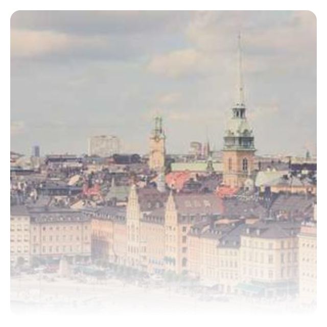
Fade out bottom edge of an image#
import flet as ft


def main(page: ft.Page):
    page.add(
        ft.Row(
            controls=[
                ft.ShaderMask(
                    content=ft.Image(
                        src="/9j/4QDeRXhpZgAASUkqAAgAAAAGABIBAwABAAAAAQAAABoBBQABAAAAVgAAABsBBQABAAAAXgAAACgBAwABAAAAAgAAABMCAwABAAAAAQAAAGmHBAABAAAAZgAAAAAAAABIAAAAAQAAAEgAAAABAAAABwAAkAcABAAAADAyMTABkQcABAAAAAECAwCGkgcAFgAAAMAAAAAAoAcABAAAADAxMDABoAMAAQAAAP//AAACoAQAAQAAACwBAAADoAQAAQAAACwBAAAAAAAAQVNDSUkAAABQaWNzdW0gSUQ6IDI4OP/bAEMACAYGBwYFCAcHBwkJCAoMFA0MCwsMGRITDxQdGh8eHRocHCAkLicgIiwjHBwoNyksMDE0NDQfJzk9ODI8LjM0Mv/bAEMBCQkJDAsMGA0NGDIhHCEyMjIyMjIyMjIyMjIyMjIyMjIyMjIyMjIyMjIyMjIyMjIyMjIyMjIyMjIyMjIyMjIyMv/CABEIASwBLAMBIgACEQEDEQH/xAAaAAACAwEBAAAAAAAAAAAAAAAAAQIDBAUG/8QAGAEBAQEBAQAAAAAAAAAAAAAAAAECAwT/2gAMAwEAAhADEAAAAfQIUoiI0lZIgEyATdYWOplqrazdbSZCQ2Mcm86UBIDKQyhxEkJJOVUs6tiOVKZLUr1VENBZkjrrszlxZSXpKXYVXKbWDkyMmCsi8rIks6rJorU1ZEciLYowEAOUGN1EWlMatjUrLIwLJqIkyBU0glKLJMlLEm4hKxy1uUZUmVGMxKW1YxBJwaySIYFQUiyJJlZYJW7FUSahMYiQJhBZXKamoksnCJYVyskRZJDiCFa4ouQCViVkhSEBQAMQMRDQCG6AAGSICgYsSREZDG05QHFSbqBIsiMsQxUMATAAYkSEAAg0DE1BEMTHKJK0mEkWSESycECrsEBYIAadAEJDEBTQ4AKBMBkiGKgY3GGba8+gBgmgYgOL26zid7HsoQhRkrAAEBJRFAaIYCkgGAQjLaRkgx0qr8maa8ewYFAAmmQfOpy16PNbtTuJq1DESYqTSJ5bC2uWWtxUovM0l0EKYuM1sthjjXSMCOhGEcalbmjZrKI6zFxrmtV3L1XNMNOfGuVrhLee6VTJIiSSYQra5dXEVdVc6yIVaq9FpxQrbDP1Izx1Y8qsnVLeZK62x9zg6sb28Lq82Z6FtqlreiKZ7cHRsinDn25m7Fr6YqavucupwqEuLOzq28es2WOa02cws2WcydmnocnZLo59al2U2wXNLZWzGvbPO8l8cOs+gUudjpsS5U67MuO3p5r09C9auizh2yuNvTj1Dn5GetxejjadWsrmX2Z7Kc9V3TOystzca2VmareGLd0Ofnpqz2ZZOi+J07jdTfHnvkor6r7svfy4i1W24Y9CUYNc6pp1Y1rO2NavOvHqq3LQuzWMlr25bZckutJOBZabmTS5RTpqRsogwWuqaonZXc98c+HTg035uubu/wCe9Jz3yaZ4tTU8ctTRbxdQK/DZqjToDNdVrLvzktjy2k/U+S7mbtdj5a5+fdXpks0Nay5RlsclvfI0Y6bEtDMWK5Kbgy6Y3xlydDn289bM/XnlWqnWYUO3eVLo1YuSvZC2NVsap6WHuZt0LFz1N0yiutwNDxzXUUNJVBXB0YdvSd+/Pfw6WPMXNpVLNlbRfLVmvx27bYWSw4nchvn5g9LV052apx56UZKKed0Odd09fj9xJw0wjk815+3PZzLtlnOc1dbcve5eGMNG+fPu3US79PAuzruPj6c62106VeG7fc1Yd+Pn06NufTnUXXO5kq1c6ojqFehFHK63JWnt8Lu2X13rLynS2Q65x2akc27SRTg7ovFr6dmp5yPpBOZh9PA8vb2BON3+Zoahk0yYpr1543a+D1p03FOXLoVuyW2PNyb5d089Be9y+bRb0u15P1kuqvQueueuRZ2x14czSumFaLlXWW2rLG15bix0BoKBZW0OTVmEsKtUk4supg0z2J2azJ1MXl09ejWfP6OhHecNXWlN8L1mLpY1rhVn53kOK9HPXoo7uLk5Hqs8vCqxU9cdOuquJ9jlSO6+DDnv0dXK7MuaxmRDVTVdV8qz3aIxCYgRMpybMjdMZWutU8OvXGuOm24y6TTnX//EACsQAAICAgEDAwMFAQEBAAAAAAECAAMREhMEISIQFDEgIzAyM0BBQlAkQ//aAAgBAQABBQL8eZmZmZn0zM/QJ3/4uPyj11ms0mk0msx+cfycTH8MfH5czMz6Z9M/jx+HMzM/VmZmZn8uPTEA/FiYmPxYmJiY+jExMTExMeg/42Zn6c/VmZ/n4/5Qg7n+Zj8P9/8AEyZk7/zcTH1dUurdPV/6sfix/Ab9K53/AAGsGaAP/Kc4VHzb9ZcLGYKjWitFcN/DyZk5yfptJmfD67LjlLyoN+06fqc2fjVw31f5nbEH0HBjYCepzlXOtZyI/wA64BTVaQFf6zFazC2bRjiU9mNiqeQTmXHKsz250IF6scyzqFSDq0x7pInVI7FxNSzW5Fa3qYLA05lnKGAYYG284xLa/AB4A+VKgemRAVPoG+8YEOQezMCScB9rLTWwi0OZwGNVYpzkEY9HBdOKyBGwK2EHk/8Adp+wiszLTZDUxgpnDiBvPVs2Z0Y/buYrP7Z1D7wXPxi0a1dRWE5qYOoonuKo1p1r6goG6oseXltbKTbLG9xBdZA7stQZBzVkPe2/Kk2VV+GyCNssOpyXJ06c63i0TmE5IbRNtZzLh/IMcJblo76xUe48AKtVicTmWqqyrp+Wy/p+EpVsq96tatfEQMI/mdVjeUo6cMlxXktfxSsiWbBwuUC5i17RfFntVlrqZxYfFVxMbQkLC/uKOe3J2eawYxYoK8W0urdZWNUM2l7Xmxqeay4WSyg609Ui1vxiOfvbcg3r2Vgq8qw9QCB1TtWC5lyEsQdO+FUmpKmArrLMxWm/qLeSYYPbnWm/w3BlhZp3gOiqdgFbG9ksaJeOWyzNFfVc093m+xbMcTwC2FbGFvlPbkT9wJmtKeNEdA3UNW2iUWOfbWCFC4Fao4uUqDsuhNmVQSjBbqk8tu+xnK8SotUFbi4mnD2NO0WoKdpygln2gWEMwLOkBPJ7y9ou6RLr1TktxZY3KL9gh79yx2ZFGIxBjOK3qs3Y1tdb7VAnHkPikc7FtjYNQo6evWdSmaiMzvuB9ytNa8alQCAsUDdxgn4CCY1bZslmjs2dvt1JqOxOZjMOohpvz6Y1OQYNg88ZXfxj3LsdtozuszOxgrlHaq4ZrFDZ49WAG2va1VS09p8AfAxCMen9CYUqPjC8u5hyDtkK01INP7K0Zntxr1Kmp5mbDY4nYHsIRsOBwOOwggltXUU96rMhLPNwpiB9sd+r/d88YbAXMfIlVFjK3SOqMmkV+QnpHh+2u9YauwI3K+cnUKDK99k6uoVrYpTkXjsCvDSplaq1RUBNF20GSoICzxMC5hXy0UwZClvE/OqmcaCZbcgWSorYzu+1am2XKofuWOcN92KsstdGLaqpVziHtMzpgSyq6g1dx8d43Zj3gbw28f8AWfIsCpbx5chbMwZL6z4h/T6H4DGMe+wthptio5QgxsY0B9E6Zyj0WG21HcYxD6ENimrCYsn3ItShONONwFgbMAXTx17Z7ZIGr7hP7R2EVtpmArhgMH5h+BrG7GmsVEfAmAR1grLNjkb9FB+x/wDTvpZhQyAivvD+3UdenLDJZIth05H1dsjdRAy8LWIRyqXz5GwYsf7IOJWRjsoEZdlwQdCH74OZrCNZ09JSzMWHONE30rzxVNPgdi2E1dAZYpgCTCYowKYUUzmBrp6h+TqLCZysoNu6e5Co1LGurydam2rqzAAFysfU0oNa9jg2ZQJi0XdmbZVtuWK/InS3WW3RZ/WSIW7hgT3M78hP2upPj/iuHvVXt7fLZewKQ7WVi0VPY5ulfTVLHNcRQ7P2PZYGVzXxx+Blsqr3KGsGxlHuWMS2t5Vnd30HLVN69vEJRw1WBuy49CJ2yFGZ/vbxdtYx7ByYWOvT/swmDpnEqTC+zqmErKJS8RVw4t2bEVUnsspd0r1yhMPxFpo0AJfTAVLFAq3D0lQWO4uaVFVse9NOnbNcPed9gTj+sgOR9u4FlfICjsxBFPnQQ0Y2CbwMuORYXGW43ipSk3SeJjdPXYRXqoRzFrcTylndfbbS2rFGrJGzxp+oVLlkVYGpyrVk19Sig9Z0/GnWbluoAWy0JOfvdatpDvPcvs91hgaxivID0n7GPRlwhAATAlhQwK2CSrHMzFGPQJNCJnE2m5mxh7sNRO2AnnwtuK8wJ3UOjDptgKLa1tVyLHdr7XPMWrFdtgYva1Vd5Zq0FjEpZv0lRWjQ5IsnvH1HVq891Sq89ML8g5K1A6lNm6hK6ww41ussjMKyAWU9vozMmbTtnt6a4Pt7d06ew2PR1BsrrvD47Fc18a7pUnIaqiQPNKX3arkbdK1N1aovV+MAyRQItBdCjIjZe0KiyzR0W2tK+dVhuBlUDoR2M1i16hqvML21GCMDXsDlihzp2APriBe1uwcWWie5DM/UprvvVZaa3FqivjRm4VZZ+mVdS9kUdisIEdcFlGy0LqgUtVOZxYy5PLZXK+qsLIdlRthnvjsxwEbYRPg/OPQfEH6bmKirDV2Iod6gTV4VP+57anNaicaT/8QAIxEAAwACAgICAwEBAAAAAAAAAAERAhASISAxMEEDQFETYP/aAAgBAwEBPwHxpS/DBahCEIT5qUpfKHEn6C/4mE0l+jdYmfhwZwepr2XU1CJDjILoy7OLI93XZfCiaJUNTXR6MMkvZln0ViVOA9cWcGcHuEE3iZZX2SkKLveHRl+TJ9b71WTx4vwxGUTdGnSMYp9nQtQiOtU611uPTEoQgl/R8Sl1TkJl0tsZx+BYv+jUOS+xM5nJH0Ncu6fwb+RkRxOOmjtHJlG0j/XEWY/yCd1V8cLp4Yv2hYT0cPswxH1pb71dQnjh77MsEkmZYtb/AP/EACMRAAMAAgICAgIDAAAAAAAAAAABERASAiAhMQNAMEETIoH/2gAIAQIBAT8B6whCfjpSiZS9X0pekIQmJ0psX6c+svpov0aX8VLhsXSE7L11hGcjh66bG2LnUhTyNlbLCnJM4+DYr6eDwzVezVYhB8WevZSl8ntDRx40XEeFSCaN0brNKWiQ0X+2OThSj8i4LCIiIaRsUuPRsij94+QRBpCaG4IeOeKUrxqLFZTiJqYSHyX7y2XEIQSOS8dVjjyh/IexLDxBKHgTJho1EvMH48QROqHinnOxsbFzqPiavC4M0YuByUxGRkZq13omf7hcjY2Pk5eBJkGxMSRUPyajLm9f1n//xAA5EAACAgECBAUCBAMHBQEAAAAAAQIRIRIxEEFRYQMiMnGBE5EgMEKhM7HBQFJicoKS0QQjUGCAov/aAAgBAQAGPwL/AOcn/wCl4r5ZlY/8LqSzaJdFJr+1sab5flOr3/tjT7fkZGxPdsr5/smWqMfhxDfmXWev5GnRsSS8NdRPRXyKCju+v5mPxP8AIyVy/BnV9x2+ZLs+F6bG8ZEqsUtvycpP5NnwZTOf2MX9jn9jYlk34dey41TR1PMx0bMwbnU2rJh1Fs3N5fcxq+56pfczKX3KTNnw3RiSfCUTmXLTp7M7FxE2Uny3KfiGPE2PU/uy68q7mEdcdDYpQ+x6JfYapnpF6l8iJ+xUH5vcW1ivkNcjGr/cfTrB6Me/FU3tfDTpex6Wf4vc80WS1SrLwes1fUf2P4rE/pyr/MV9OT92fw6IxvHdH6TJLuYslGc6JOU1XYUtTaY3CkheaOR14q1DcpX7CdopbFfBszVTa50emRhHpkbM+pfPcvNFGwstYoVdDXorFblv1csi0v3N0eo0qS2vY9SyXrieaOeh6cnQ5ip7dj+L/wDkr9y2/LySFHw4+7iKOrKwWkqjuaKfUlOtmZ2MZQ6j8UTehKqWwtVRjv3Yo3iiopHP2M4J8mu5Zbvi0UmzU3aEuK0v4THKe7/Yh4aSpfqQndtFPTHtQ68TaWxNvzeFpKXLZEl4l7fubxMToq0JVFLsym1vmhKCPM89Ry3fVjT5uz1mZYKVaf3NKjgjKLfyM06qn1kXY2tQty5sTRGa0/6jKi+rMK11JyzSRcdnlFQVOryfSq3dWV/Iv+o/KvuehEtUfTub/ubp43N+Q5TTv9JOq7myHKMVXuZ0f7iKVKsFN5Q3WeZf06XuaXEq6Nxu7QplLhpTPEdGi/LuYkbmWYNyrX3KU4+x+mXydIkfopxwKd5u7HDVdmZ4KX7i1cjV13j1LlGn0oWCtOCsdjO73NMdyLVql9xx8V78y4j1vPXoQuOP1dRJ6/Ej2G9NYG5Fv/qYknq16nuY4aD6bZpHHpwae5TMbcUcmXbLj+xT2Le/txyJsx4epdb4/qMRkbP7Hokfw5WUoSKql3P0u+9HNd7Mvh6SI0adcdXueq/Yt8N8y4ZP6mDPHmVzMFcuFFi1LJb9RD2HrjG+x6VqI6VyyblWYljqYbzvYquhV8ldTdMzCx6o0zEnsIbo1O4nqF8cPDvoeZvfBcm98ZMtrHUwbU+5etNmfEgiPhRjT62W5L7DzqLetuiTit1zQ7UpXufItGps81qPZEVKTtLoNqd4+w3rxe43vSIY3Neiuwpad+QsFUPHMePY34JvhpXQXtvwzEtCT2yRk+aJrQkonpqleDD0rmxKDbrLsdzde5Wp+1kcUlg8qH4ctWO4tSaswiqNmelkq8uBR1R0rsemJ6aPTkbrkeG+5qE63KoofZk+w0zBT4P2F+GJKHhrS+fc2vFGzo+KG3Xpo7cFONMcpR8zIKUX5UbcNn9iqe/QuEjdGw0pt3vkrU9PWx1mOkjiqeD1LSLOORvk7mOuSeFVcMMS4ZMHqvjuRG7u+PpEuaG0/L0Fpfms8IeSy9JHB4nYUja/YlfJW2LKVrmO9KdYo/Qp38Ela1aTw7mrNH1FZHz7UakxvNV0KWck8cuCshJNcLXSv3Plmrt+CKG5c+HwbciVpD8q2IrTuiJsXRmTFU2SpvuKWk2pcMxJVqWOaM6pLojmsczfBexWi++oV71Y7k9tjMaW5LW+yLsqzFSbWyK6f8HfSbYaHP8AT0Fdry2NR32Fz3PCm+aJX6Tfh8Et8IftexHv2IjdcI11Iex4vuRSTs8vq7ksYoppv2FG8D6it0u5JPxVP4ZpjtuUo5Pgb+nbQ/KjMX9zLSaLh4lrsiTV74ZGN7mhrAo01SMTbjextdl6Xd9DS6TyQUdh6Z5FTKPjqPPI3e1bHh+b0kMDWRO/uW6F/Qn0WBSs7j4ZbKl/Qw2/9RpjFXzHr8FIvwIQdCen3HCS+xpjGlnfcc4ukZZuSdOJZbwYYpRjfsScpSl/g6EWoyXZ8NC2ReWzbK5Ii+dbHxROuhz9J4eWn0E2tjPMUU1YtPUh7E4trLfMUbQ1dZ3JNNPFJCrw9WDY2RsJ0ZRiNcN6LcmUpJ92ZcdxenDOY3oyb+6NKhm+QqlpUuVFc+pnLo2yPG46Hi8iTTXwavqJ/wAyc4+H6e54cpWtQ8eYja2LTkmeXxP6mmX8jGfgX/BvsP34cxvWJt53PMldiWN+CTW5sbD4czc3ZiuG5ubGP5FuWaLdNEvJXwf9t8x203XIctFktPh1q6shHT6N6ISqUIrcX9x9Ua3a9io+k8PRXp6EJc+dGrU8SQ4vGeZLwvErfkNp8qFT5FPwMf5jTOMoLqOOX3IvVfuqJedaK+wk78pm/k1abyKelW1sYqKv5G6k3/mFLqJdfwb8brh6haaT7Ik3K7NU6VbUX9S0eZeTnk9f3JLqRjOGHZbhsv1CtXmsbEpwiljSkxOVKs0up5o4W2S3hWOetUuh5lLVzrhFGY8yPd9RVd86RfnLUzS5Ut8IUcSrqOo7myL1xkueDGTauDNRnhYqymOPNEcG5v8AhpPkeZ32NLgitImlzyOMpN3tgfhyadlx/u1TI3vWeFnmUTwzdmwxEnk9KwdPMMjl/cxNmaYzI+Pxw8P8baEmkJJbo55HRsvT/UvRklzyelH/xAAoEAEAAgICAQQCAgMBAQAAAAABABEhMUFRYRAgcYGRsaHBMNHhQPD/2gAIAQEAAT8h91y5cuX7gX6l+u0yamovpfqewxBJftuXLly5cuXLly5cv2B6BmFPRcyvRm/S5cJcX11KetafKML6lSvZXpUplSpXoejiJK9nHqHpiPpcv2PqxJSUlEr1PeS/ZUdMwB4m5iX7rly5cuPoMX6L9F+y/bUFKqX6XLjBl+oRfvX079L9M+8IQHtDElSpUAuVfsFf4K9oBKlSkp6KenD0wPS5cuLfs4lZgY9X/FUqV6V/kCLLl+i/Ql5l/wCYv1qV/lqHoPUnLKle2v8AFcv/AMYzG2Co/wDmIvsq5h73UJeUfWvbX/juX7r9EDBPVEvfwG/TPo36npf/AIa9Lgewr0qeOJYAaFfMzbrH4lu4y4vsv0C409b9p/gvgU+JVYAEuWy/bqWa2/LLYQ5bl/4cdS/SvSvdUr231FyuCYg9p6cwxuOH4xmNMU4CLAu6/D3VK9L/AMNYWNnFQt/gI2dfMGz2UQQtVtQdrauncL537TJ6MdWXcpRNs/8AJomFQpsf8ZaLjKcPcwpj2XMN6mN+yjQ/iaJw/fsHEXzF6uqgy0PKS8TGgX5GWSBptla4rzf/ACYCWQS/c4nEVO5ljK4gNPwQAC1bNzjH9wxZfghzybCU+gmtrN8QBYJ3z8SilPmYGz8wCsu6hdWI+ZhXOIYy2lqCUBRupvGqwQ8IrMwAlHUwAYgdooUtM5OI/d8MrRaDEU5EKP7MouhmFa/KlZhrmlqEPpS3PBBuvPLEi0A7YL+IZdx3Co1LrggWK6JByChwQ/Y1hsmjBmXVYLAibRryx1wG2WXOKfEg5uGUePEyFVviUTLyeUbaVV5gynnDGTIRsCfESGnwsLkCuYyBKroukwvhAWaUy3AzRyzFACliiYmngdotKXLBhUlmo4YRB1Y2TzboiHMcDkmudO6J5C9ypb8GZwGkc8q4zbKIm1eMwXWjZWZdRZd5g5/wsxQKHSLxEAC/Fi80+BARVs2vEc6nbnmbIhipzKFKmM3EI00NotxwwF1wiABOskL8oZQHOL3HOW0LBqAdrbK4I5uJ2nBZaZmTAm4QBUlDgGjEVXJ4mbh5vcqF4u6gBx/JCmjrf9oOa3ZFJmhpwxaLODWbgtbOlQkwt2CYP8yLPXdI0k2b9y9gPuM9t0je5qayNvxKy8a6BlTRvhuYwOGhzGpXlYZ8U/ctVg/UYxAV32gVXc6tMjiX0qHL2JgjUCRT6E7iHT+Z3oCICLF03cAA4iqjWcdtRHyHPEWCLeFaaU8FivMBOCAVAsF0QQEEXtQOUu1FPOWVs1qN2UZsuMkfGPGIPnWHLg+IOEx4uVQL+J2A4qZc00Z1PDhKbiaaLqIr4TUuEkaBD9ZjmDAVKKOyLT9QANDixxEiA/Mgr3IBxnEEt1QFybStRkAC8MqqrO8MSWfllNUxqlBn7JTXEe9TLqasVQrRd36lJQ6EQH8IRyt08RZkN3n6TfDi3C70OVRDQ2dw74uq6rgZrS8vFzacvXE+B3iLlzweJtR9TlIFDQgI2DoxBclgvpAFBnY3KHUAO9xXR84ls5DcKp7TvQa+SwzwqagJkR1BUj3ckD0UHMN0thAoEDQcSHOrMjfmOaoOHmpoaecxufl1jgAVnIliwNmrljDu6sjXdKre5Sq3nFv4jhoGFvUcCisEzFXAMfcG/jARRQH7jdQDcRDAlG7ZR/cpzkcJpKalnK3lirBLUtcLL1kIaFg08LTA68dH/UHdpZjSobWrAq42hsL3DoeCD94CZgYLNquNXKXcV5HwY4Z6NmIa49S1TTOhlg5rlxFpFdsSotNz7ZkQvh8E4Z2IRZQNviUGXA9BBJfXNb+hzCg1dD6S+KLQ4/MpvDlZ+I1MvjjcKJQ4q4Yoi2hjUcsSkX8RMDHmVsZ1dRhFvQ1Kfxt+5vtqqZQMDoJgOx1mCWFum4RdlnUyXESAMviYTkM2kzsqqupfNQ8cZcWgV/c2FfmEsNUSniI0Eagy4O5fUWNKvMBriG5pIvjUcW18QIcfUXZVv1Btb5EfEq3WJhSToMz7YXChrRthmN+7tibK/EMLf5ThuOfmIRvUVWYzWxLqt12vaLqWrlgsMaCOGmyYM4zHsHzCtgarSKx2cVzEFijzFy4zcFbZZRu8axUyP+cAMpXUa2Rv80SzB2DcWAvZdOJagc0EGthGnV6dS319zKi4dobvjVDIrzFQwjtW44GXl4TxElYaG0wAwHwPiJcMGb4YuabrbuGxHEFqOGOUg+I1RW6fNxBV1f5uAIhKZ7llia/uV4FOnzNGuS96lALXTfzxAZxC38yxs7WdxZ/eBar7GZyN4MsTg4YGE5h+JeU9ygb5BFy+0WAN9m0a5I5hIF35CqlCKNAOZxqEyZhoMZdMqArRoREQLmgha2Q4moxSNFmNhVh8C15nDNtf1EFm0DJ3+CIBo7b1PDa3ctKlVPiZr0plbIpbLlIg7iLJGugL1+Y1SX/smyzmIsGuooMCOuGUCF8ms4jxGtDxH4o3fn/ksTyHio7oC0JRYFn7S2FJuozsCocABy7lKNTdDebliJwTKWjjGIpVfLKraKbUdhE3X3VLmrKLRmExMFMMtMmZsaYWeZpeFjEdzTmfmLAKu1QLUxHB+EuK1Nrd3qFtNVcy5pGZQkfJB183CuXHKRiTGf6nygoGN/3FeE064zFz91HTkqbv6iEsMrp1LlCl/iDfKggV43+0lBbDaB+5abHNuOJU4LHxDqAChp3zMho/Mp0nOYpVyqQSMY1uGmx9Ttn8Q6sPCmH5LjAXTO1EzKNN9kXy/X/YSiG16jkXt5LgFy3aJXcciBoeTxEzaHaKAPgIZafKXVeGnMCDlLrmXSTzF8mO4t7dOf8A75gqv9zYc0v1Nu1j+YOvwKnE5olrk1DTNQXXZfuLAtupfxp/caHauIDTLmWVLjH5AX1BCWn/ALLHZzjOpdNBb6lXmzGjBSC9270RZVXcyNn0tw+VwjH1C2coIUQxFl38zo5DmEq3AdRKKrDmC43sfiAwL6nOIiJosqmFaNwKhXmGIiNqV1MzOR1PwhmOOgKfuWCqv4iN2h/KWq1X+moX6qw35uYfSKyeX+psZMLvzMyxRCeysUwVZXXOYPjbXzAM19Liq8fiNWOFiXaJmvqCjDDHFThlhsDipRFT5ijE13HKwO0RMqziEdZF1GmxDzG7BxBEUKYt+IXOjaZ+oAVdTyiJdr/iUFmmNypudc0M0OF4XMxaKWzHlZDTqNpMILzLfWbKIUFxecyyuRIYIqVx3Ad9KwcXFsbbPmUwuG0EqJk/MdqZcJj9igc/MbackIchx1MJrxslLrGn9y6trwjulRBoSQZAs4irBVG5RRhxTKAIj0k4M8r+JfJ5R4OnPWyN4AKqNWNcOkwSail5YGS1sTkg5rcAaw1RmXCsS0TjjHDESpp8RnioSc0umiaq6/pFFR0JjMxrmosVOcbRkuTECSpmrKOpjqeAwUYbZlgAgr6leWMFgrLQF8kG1qhFBkjGjN9CfAuHBvAkriW2Pcszt+ZkEZq7+4X4zbFMXOem8qzEuaOZi7B4A8xxob5l4CK3mfKekxdjuXJiqix4LbVCod+CFrttGzZqZNH3Lot6sNQ6ZS3LFzeQuA8HLsvzEdlvAy2aLFYzFgGexiJ3lpeUomCBMMoXD6r1MrcXV1KVWD4lVScDbcy7KaxMhhzWYXMyuLY4N9r/AOzCtFcYQGWLaArzMPbTKFFX/UoWjzOC3XZFxfZchcpCk5wLndITEYBjvmZ3aZpf5hlJnLdSNtmNQVBD3UvhrKnxKM9TzMaDUgHWBxmYo70oQL9EQxwaC2+ZWqVLjdcAY6cL+oFFbJ/d6YK/ZL1fglwpHh5jsqc0RUtUrK3Cr+YHEx/0JkioYa/iB2pzRiUfIbyoilhQwV57hFyAKFzKiPiLzM7exc3GO1GYQzk3hxMgbcCVRU5zqEVYcBBUQHnJhUdGrqD1T8OYq67fDuUCn8Qez8/2iKQqskZ+g74wap2Rati2Bjtr55iHgeZVf6MAHQv5mVkMuCO7cMvXcLIHOnipQVn8Rol6YlOWv1PihPHZeWb4PzcW0DtORhAJuqJTJfMs5PxLoFajVVK1P95ZrjH7ocQu9U5SKSq3dbmUDw2fU8+bMniBnDW83+YPGFkOHtKK2GY0NIXh+YcEXdo/JCY2NA7/AHLBryUyxFpvKAMONqCYQBXcMWppliaUEmwItfiDAWKNm2bC8CM/H4MLTLmssCdN20jUAVccu5edoK7jMtarCyMRZfZXMfYrhbf3NvxihcLdb6SgAAvcbvuVVmZuq9P3LcTi/wCTDj+ZayNV3L7p9Q8fzjjaHYdTAOrnbDjW7suAh8nj6huoWKbQJS0UhlXPEOGAMeMTBgswNsZAxYa/DiIGYyH8y2dykSBg4EZYu2l4ALpZYNPCK0MaSBSYX8xQjXwgs8tNupRw9DN0XbQTEBX7hW9GChNfl/UvIAywYlfyt7mOAGAaQ8umtQz0+l4lNA1KJnLeczBGK4OYSCwzQ08JzLzaupZXAbGAOOEcdzcm3RBaU8XOR/C5XwyvD9Sst+0yzN6lmme01CHmowC978RTkKaeLlDhVSleSFYc7vN/Ez84xlN9xe1MWW8vpdgbGy5YWs8FdwNHf6lzo+4/hl6gHLoXH3FF3D2LqG44trVm5ndBSmCJK9tZ8S2N/FaSh/PzBg/or9RVNRAwjTVK56i3H8xjuisKhtgv5H9QFpSLRFh6Z28v7m55AzLhQQFgOsC57KYQfDuUQrYOSBsflcqBw7wgf//aAAwDAQACAAMAAAAQpuNOOc8YIN1obd0oFzHus46+jykIkyEq77ew4jjlp9TVUlI3sIwJxLLXRxs/VXhxCIXkZp/QJSXDAQAGa4ADFAiiCX+iBAAIQEEJhQiQ9qFWpWJrALewSIIT26eGzr/4Jg17b46w0VZTtjfAAw3oAxwvnydMKBoETlc/N39GFLkgPPsVr+SMJOklGkCkgqQaVRpCuOVII3LmU/AAOcG+55vNrJfN6D/7gjBEr4ydN0dQ10a+i7S1cHoGFYPwIq6f7JVTBXaUQW8TLLNBu1fPZkpCFjsTii6q+uhG6x4P6Gp4kwrL6MLccPZrGhDgn80FDDfjYEESx8oXUDENrqUgQ3FpS9z5tMPnWth4afqSF//EACARAAMAAwADAAMBAAAAAAAAAAABERAhMSBBUTBhcYH/2gAIAQMBAT8QeH5hDwxDy01iGNRll+JRPwlIiEyYZYbZXii2WIaZ2VlZSjeYQhMQilKXFRcUv4Jis2LCH+Glyioe/B7INTEN+MyouCdezRMNCk3i3FG14LB4V2NTTXhdF8INTCVJBdyqOzoQkvZK9GgaN4p4TQ39C2MRCRlGQYI20KfBoEtiaFDfgVjThYNGIPYmdEPVX2RCpHX0cv6FrUsOaLY2S4TxCWsf6B0Ns6oQuiVvRoEf0hNwKEMIhdbImh70hIwtD1BV1lf0WC16IJMjb2NQ010Tp+zcZpxFtUjRG4aE7hr0oEGTIJPeBIJbIaHbjGlYQJJcGuMg6x1OjXo3gr2UQdQpzDRwTvo06iIbxsxpdISP8L6h8i6wWNaLisbbehvYi2JY9ieQ/ZOQgCzZlBsRrE4awoJL0SbG/ol0JRJBwa9ibE+iZ1HyIayzi6LehHwXxhBV6Kl0qfC+kf3MWJRsuDacK2igCtBwE3RsmTN+ifQqnfAYkFhkEknsYW6E2J0//8QAHhEBAQEAAwEBAQEBAAAAAAAAAQARECExQSBRMGH/2gAIAQIBAT8Qjgk/IZnJwcvIcP8ACbzmwwuyI/ZKUmHDONyc+S7tHBlhYWfjeFttbudZIN4ZkwPG2WfnOd46jCXZm8Wf55L8sY5YZwHeNtOGONttnY3IW226M68sjrjIMnleGOMjJD5xnCljPf438idWWvzQ+xe40Zy28te7bPY6XbyQO4BCjVYl0uSr+c7GpPhlo9hhM7Qh033qZvwkmEHiG3rh/Cz6ZO9ki7gJAd2u+wF3UfnH/wClgRmWZ3K+Ww7s1vSA7Y+HCDq6Fu/vAsdh2v8AZ+BOHlkswM2RdMYOogD5fQjySJdzY15AO5B1D6l9gvlnyCeXkILbwKvTaJJPdhKfZPjdANohCMhgj5wedMP6yN44ak2AmGbw92f1vO7DaO7Hpb6g2Ddj0cG76LQbaPd0J7fJS1egbth6mO8IxdWEDAkHuPRwt6t+pdjryF7KbVmccnt7YxqNgSBuXb84CEv9mHDxQ3y+gkXvLqyyxsnEH9t7yID7wYYwSZJ3fBvJSQayXyWMOCSWYQ7xp95N2EW6iid243//xAAoEAEAAwACAgEDBQEBAQEAAAABABEhMUFRYXEQgZEgobHB0eHw8TD/2gAIAQEAAT8QeJ3GPM7/AFAamP0dsQq/U3BsuDn0L0Mi0CVkvuC8RbhBtzv6ckqLWo7huMLsePouZ9HL6Mfr/PpGpdS7gRO4HUNBATfEQG7iNiabYBXModwrUQrnZjJpmuYo4IqVLHUtuUYpKRTw1EuyWiviB20X4lpTKfEp8Mt4lMFDxS/cMw+gPMBzHYs7+hMjG64gKHSy5VOrMg8wAlQDxBCGvouWQSIYoRR8RiJA9Sx6nxQIrIg6JR4lEBATxKgEKJkIoWmRfUammHK0zkjtm6BbM1MSkNlR+lw9vpPpp8wPM+ctI9/o+f0bJcuDU+ENgSpUFXDGPEXtgWKVEVzEVFdhy5MQ8Yz5/oDcv3FlwZUlSDzFMWst8y0bT6NlstgsuFsRlHMvm+IBdwQOCCVK1uwHiOqlZ8ZSLzEizyy/mX8y0Gdypspq/rQShlUiPptLyjPpD3DwS7qV8T1QBMLua4QEFD6lZ0oNRb+npA0uGZ8so8RC4KlSpRLi39aIcTX1KZyuUR+gvmXL+lsGm4eURFmwSbmYWhqXFRDAjWw6Y1OJd6ir9LYuQhzCqlHiUeJUGj9C7szyxrqMOf8A8LYiv0D6AePrylH34wY/RV/RVS39VP0FcYu4fpePoc/rOfpU4Fc5fiIK1ULefcFZ/wDoOfS36PH1JcuL6F3KPMCoNSg8xTx9K+obFDHuYe8R37zS/MqUxofQ5nMq/oP0V7lwW5cX9PU36cbBYIyLlr9OpcOZhmr6lGaJVBXfG8QADbAuuW2fMpT3KpdTfEVLrJX0wyyIly5cv6V+irlSpUuVA2EUBRymQCF8wFciiWJWfRkQy6VV/aX1QBLd0/ajJc0oW91aFxfAOJRq+SfCIldS2HMWpT6ILsiC1lkuVhT3ErxLlxSyWS5kuckGuY21sV5OwVAIDr3BHGRbuXqXLnfMr3LsJqkoC7rp/wC5ifxCTK9v4nAax4PEd+tEMbi20RK+iUqGxVURC58mUQp3KAle4EqBfbPkzT3KlQ98Sjoi2WlcId+4qS3bWK11FZvP6HicCXko0VQUOLYoDQW6maElMt9x9bGhOPD5uVWPM7lSiVKXEdR5lmbDj9FMqBsVxKPMAKPmu4fBehjOZCOap+KNm0dcypRA3JgwKo7f8miYLAoDh7JQYrsePrT4fxOtjA/DOyNYORVb+0VqNgurRt/CGbQLSC3fZLAQqC0V4qVWeJ39b+j6lSvpthrjJfoO25Uo8fQ5+n7c/mGbQhdrEWAS2wu4sKisQy3YgH0C2FOWu4FUgYKwxNO77lwbr8fMHfQoFCWNIMls3w/0VQsPYRKIniLKzSoURsp0bXXuEIJXCvXIN1VsjApePLKrPEqV9KiBcKShnuLRjPEEU6wgP4jYDe+o/M6qCx2XCW2LKhKrDyX8RtAStWOoi4ZAUFkM84eZsM8pYCllW5SxYt+6KOhLGShtlvOCpuFkFLMHmaCzddZa1RyCUDLp9F97n3jN5qiw+8EEJNOcrssneFrU0iJWi/Ko5ZveBX7yqiL0JTv5iowbUVrXmcPlaHCBzdwvhaoEaruMxeOLX8bEBoOa4H8zW4HR/nmPLxOf3uZT00N57d8QImYav95pgNKh/sA0EFwURMptRq/mOkA5Qoh1L8hHVQQHa1KtFniodOlSqX6HggksFdlRtEy0cxniqG/MFjSyR9f75l9FyrSAjU0020c+IOWA8oliRn0Lh5qv3lkBaKVVfzxFUNq3AnYgZMrQHMGOlKrb+IBgvlLZOilpW/MRq6db5gpZy903hKIWiA5a5ESURdV3kHPtWoA+YDhMDTCuvJSLbxUoUktA13b6jRLTalPtkbS9AiAt1yDl96LD5yASIDW9kdqPYJ6lfzWWWhT9r/ePM3JRs/h/9U0BeU0mxeA4/hl42vgEl3Hh5A2LHR4nGkwefcDd9h4jxRHFKVGGvzKdovSsCJuRrPP19mUAngL580w1plt0bz1D8TsqjfmHCRsNodQgE2VX/H1HbsEDBVXNEVcSosrr3UqlCmowA1x3+Jm8oehvMxYgo0b+YwC6p5IFVXTFOIoE2L1xLSbXkHoltizjeSoOgcRM+CFabM3+S5syc4n9QSHoO38xKHFewDwQKidEwxbYnC6t6JuxeiIM1LmLwsQKA1BbXhVdkLYcab/9cI4I2PJpGpUAK6JalJSd2o3nxX3lDUWYbbrBAAJ0Nt3ZfrPvFCIZyFdiQUwaRivImTX9FpnU1dQtaPiUr4SQMr8th0XjuD1AZ5I0RFJBpAAfN/MombSug97LVDZSmHwWOpSD0qDviCZFyB5bUQYDdKtV+P2hvS00kA9DzKAIAGi5XvdhzrVzkPdY0F/MyG6aLvRNbB1ynorOKd9xnDkAPgf+QngCQW3+IjYpLGd+0QKRXOnqslH7NPZ4vmOlNivO11tJUe0Dgh5O4FAtCW7L7zmJcICeqiNnGTrTz6l2FwHR4MlYLiUNCcE5wfR081FC0OBCMr8RCjoWLCbn4EClpYICjRAhhKQCW11BrC6jp845GKYCF/GUu8S9qwhwA8w6Nt8SsCJZBG+3viJO2Wq2lPIywjCwXRr35lBpXdAeXZzHDaAfKKHMQWgIbplV87Mz8QKgOnYwY3QoDxhsuQgBFCt7xW9S8uV2B/7MdQu0Hzj5llNeGD+0q5mii543j7TDFQUUvij1kQqqKNq8csbaGwuUceoGHtFHgynL9ottSq4Ky/cVfK+HL+ZXwAgUUmQ7sP5LHT4iZSfLUuz42U4MuFrivRKAAdE9OTINbfQWdi/bIRmVS2KeZacJRpX7GURFSFqb8ZB6QeK3p+IL5tbtOPUspYhYDQo93ABxHC9tHxEDuo1huKCBWvas33HDNRdD231A7Uk50NIVowDLFCwH+YoAKJ2sSEsRAuzbNlm10Rj+4XMBaVev3goag3vw3/U6oxEcOxgOWAu7bxMcJfNYRUGzx/cJ1obzd6yVcqz45D94wFiFDYVrHCBwjCQptNQZP32aLfAJ3d1ewhaNHA0o8/MAcELym3dZzDocUcNtH/1Gw8K6Oa8faAifRUgC6decqG0YcMw5EqUE5yp6lSLyLSFLYWW/tF/NVBbr1cZCTvedh7Rv7BvURHQKtTJxDx1Ldm3W3r7uiGG2r/4I4gAc5e7Xv3Fvim6cbSRqwZAg122Ury9TKTECBW8NLpz/ADAhVVAWzoLrhhf1ZUSquvwP4nMXRNu7X+oGgNwDU+SW5I0V4RKG6Ba5UuwaaqgXzK5cSIzqkJfLMwAFcrFfPvUHZUewBe7eVGQOhLW9RLuQ7kDzZWqsrVi9A19tEoa9XewnNRrRWVA7hApRABVw44NixCekg3yf9TRh0dYtbUOZzAZi8EVWDfmbxO9VTa3mNAkiqNLc9Rd4Lor8ygzBqLW1FT17WcsfmUjjaCn5Yr0zjyPM5AB8F4hENgl44Vc7EJXzUVKkaaeCIDXjzxtQRCLl5cQfaFrhVzbDTHdw+A0tbeOCo2ES7FVRIdiYDZxXxHK5SQuu4FvTtEKCF/ZZjBDWqxQl/JMsG7oH7wGA8hKqRV4EELGcchEBDBvLxRAO90ggjj7QhEt3XcDQr1YXkApcbAP9pfZ/iz/cobPjRIX68LpP+y6Tt2pi+1ieLeXcImgK8w/DctbuS2q9j/cedFAGQcArnioqtECo8Vd/uRzN/gtygFtsQV9xmgKhfxdQmqQlu/BB5FeWA88feIAbid+XcIJE8j94CxZ5hVRj0WHj7R4JGNsuMRRBSuvtFDjSaH5ldQjHxNyIslzF+peH1KAwNe/tHYKCRW7931BcauImE7IHFePr7jxCFbXLDHismUjmhVLXR8xouZAVBx3plzeVUPESdG6Bl9EdlOhb/wCYN2ui7blFfbV+7xFvlM4IDMqC5d1GHgQqoamtepoDcvs0Uhr7wR1liydLREbQFpvHw4ZdEW1l7ayNIRta2WKTPFxBNRmWHHzGACguBNV1isQmkK4IL+aw8KkDAeKjnqLKgLZvnfUIQljb4LXLpksOSxDaurSmBElJEHDw8v2EQEg3tRcBHIdt8wUl2hObjhVtFaLlNtaxDT1H0DhFq9wfGR0VBUB/UWI1vPp8BKntzZB/MEtQN8z8GRpQaGp+ySn0F0RRMagbQBzFwICgY518RinK3jo/OEY4mypZ3EQtVTW+5f0cM4PcG+CMJtN+Lg+UGW0nEYNLeXr/AGVhYmBsH1Ut293YNls8iwsu/wCksxhJUtpC5aVRdi+d394Yxa9D45sLrHJpa+PE2hmO22KZxQq0Xp0yo8dv8/7DFsR58/8A2GTBY78P9SiAedSVUgM98/tUQ/TZtlhogWgVeeOYR5SacANf3Dg2lKAc/wAk21oNA0me5fHKvezftKML0tvVXmco4pPvTo29+osVotWHinuCuwQbd0XlfGS5QQKy+DIkhHSyT5twZw8XpVf7fc4fsKlmcuy9xDGLK7PjXSRAslV58QpRridS8iulgf3i6lButC/EbdKEovFfY/EIzo3iHLxLJpWAwYgZ0Qn9ZjKIbxuElIKTzT5QDwo9gpiQ5bVltUf3A4tTB2XCCAloenHcRCAWN/1GIH5Fc7zWnHp/yHal3F6j+BFztUuc3/dRRmOeeH9xsFYnQQnE7ora+FBn3nE4V69XBSKdiE4908rz9uIGWxrUUejuJUpaObTZLFgDThXG2xfskj6CUW2Nd67QmodL3fojFWT+BTysRrho/wD0+JXPq6xRHboCikp/2ViQLEHjqpeP4iT8IOJ/F8jrRR9patflAR9XEgAUmuKpuCBStzU5Msg/sL3+4Ja2zzR/iKNRLfA8PUWqitnUcbC8YU6a3bZh6JYIlPj5ZYMQ2OHH+EBRoPFhRFvjyrmDZVDhVHUvqtgmg2gIu0EVTsFgHuL2kvarNFEzYQ/mUOqD+kaLVZcXpRYb5V/MvASqTGrFyzng4rLxee8gHKqr9uf6h0LEb48p/kQHirOK8MXcgay7gm22CrKt/cfAAjfm5VtIdNIvAKNNHuFx3IKorSvfM4p6ma61/MJzTfcEMJDWxLFb8S5lPYEVTwHT0r7R1g2janUVovENIt6ChXEbAJo/gl4wNyLWCVYaAi+vKE1aFQUe6j4VacKuRWcxVXRaBSDzdZHo2EMSrxcuvAXhdO/vLK3zYfs9MGGVKIAo9S0JrGyt5k0l1hlPNwe1w0BZpzsXDojisfccZqkS25LgCtSK2owNIt3lC/yERVke95F3xISjjyM6l4LEFcRf5IntF57Lt/USh3mr7uYAgke6afzK3lDGmPhGVZJdd85CiDLWY3f7JEBVjKU2JydQFWwyoIeeS/M5kLT2qEwADtijMah5EILQCUAQDR0WuclwWdBuP5gRPmDTqAnHCv8AmWuNmqpjNRBa3wXz5iKdhA81Laei98EAKaAr1LTkyAD6X4iNs5G/N1K2KSq03hfMZmI3dKqqCGyy6v8AkaIVGK/tNHHFpzGzQW8TdZlvuUDpLFtuaP7iiYKxXGUXF1/kz+9IcfyA8RAZ0S+fHqK4ru7ONb+8AlutVLXf7wOIRqat4r7TbLVDZXN8+bipWFlhbSuPca+vC9il04hJs9TgNL7QeNyvNWf1HJGKAp3QHniLdwSmfcSV/agoAOW1XccRYGUqX/2A4Ry9PxzLhHL5NfadTUR39opfbjYtD1Ga80IGyOFazyZf/kVkLDYMuCItGA1Ql/mYRZWCtj/EqQwPLy7i5ByE80rsmuD45lAyMQhKwPPcNBspZPv5jSBjUS/JEwFQoJ6rn9prwSFQpou/ZYr2izh5/wCR0UKSgv4TkGGsFvg/ebvy6LMG27lC1LIo8WD6gAzAhVl9nTUwTBUwPbmIMMKLB8kWJkHa2U3Lwjvabc8eoGAIhCui/wC4q4mK6Br3At831drQU9f5CJSVss5vfQXFDoqOBUi+UhpSpU6t7iU5h7g3PPME1KnFznr8RIKpNdnSIhjKF7eTGyB0uKRBcW1Crig/3IRqq2Ahe4jHgLXnomkBfs66JYyBUP8AQSs0iob8/Yg1F1i1lQgLLsLN+8D0ZiA8hAGpnd4sRKjlaWfEU0uFUjrlNHiLLpUmFBORz5LiMqN7Df28dRivsyx0fcy6dsFIPGjxfX3j3pjBeWvULCKNw+zzHn7+xhle408LGACneX49zBvoAKqOf8io9ORW6v8AiU2aljo9ffzApP4CghqlnL+/UuizALG1GCFOKFPhyXBu3noaTyY+KYNaBYXOw90+4ux2Ea2gvMotja1yQARaB7OkNi6luA8f9lMm8VFKpgKQ3VpHKop1EAKHLcYwoiNWlf2wG282HQDivMXfVFKz0J4iEpYAYXfnhjxAWtx0SDtGvRt5cuMVFEUWPPsliERiv8pQ/uSaR9xMjywsR/2O6SzQbzj8RqYhWAdvzL5As6ewQIUh5YCwrey+YioiZ0MW4rYQLT2nkhQTfm//AGzaureLn8wa5s8WRJk15D/kstA1QdL/AJ7j+xtQbrM8kTLt2NVX2YlpYNNxzONV4WY+ZuDuK2/6hNWaMBN3QzgsMVPpr7xJOKlWjl+WpRgiwMd5b147lYQKC0B84HcVc5aq19vUGV+BO0boPN1EU7JqR5YBu8u0Dw/ePF1VXk6ra9wd0QWKfAP7+J1Q0pBRWuDiBxeJ+4f/AHcBmeLeqdvxBhLKFZbydyyjUL5D0JsPS0vCAd2mjxCYVRLWd0nxKQgtF+PxLeghwOftKSvFmzl/2PXssrQObsAUClExYulosusICltFLXhGKl+HwtP5/aLFWitHNW99EWbqwcF/yYxQOQVktGuhReOalEEFo7fzAjah8MdCyAsKtvv5YI6bL4D/AEiNUdIEWtJbzT+04ojG2l8RSVSJeHE+2peoR8NSxAWFNzu4AiaKF0S3w1QcCBRSUYcXxLPNChdC679wxY1s6Xw35tjpJWKBYWn7jcvgzS2i+iZsJDttZbeasN3DH8EmOZXFxNIVRYOPbk4zY9wHw4+IrlUPOvk24qOPXv8A5q6B/MTV9dElOVF8QRN5ZoaTR+CJFRjyeql7qK0FtDfiFNZhFdiDd+5k2Y5PFDzKZ8k27GIcEVwK+KlSeUXQf/Y0VERSj+d+MhbHlwhK4CU27tY23hbZnzDHlwNs5tlhBX2QbXO4HdiTgq7eCoJiJJe+DK/+VH6c4gY9VQ5zxEbfSIKHfEyQAu/7x+lmiaD9uPvHRJRpA4lDyIwG0Gu0AvoOOf5ghSk+B/EErdfMmms4BIOJZ7REf+v8zQUAujXNRYaOjhHQXiupTd0TZ8qxEtwUxR64faAQwhQhEuh5fEAFgLK3jiL7WA2XKtYL2r44mkeXBXJXxalbKWw8ycgvWAHWMq+tXI1UW8i3SNlGpS7ypkLi1Ma+HUr2LQwdu645gKegULtX/EOnJApwAeYIWEyLwt7qr+YUC+sbiwFARLNFREpoXg89mxCnA6JWCneokGas6/wStYssPYW3nECeIYNA7niCdF+7ZWZDzOfdLb4wwP3P3ifAIWOeLovzGXUFosV5ZYnmiOx+Ibtti5GFRVN5gKqVysXATrcWo67+Jl4bS7pneJmy/a41kAcDYLKgTyInggG4ng9y1IhccjUAH5mOynqGM0+Kjc0PeorRnPZUPDW3D7miUsC+4Ar3BFr57gvejvLXxGphhi8cQh54unI2RbBUUErwas4Py97+hGJW/aCbDRuiMbx3DLPkGuR34lHHmDKiZBdMcFEW1tg6YlSm4te3mAKZjChzMSugaES8VNsKrKb0De/5h+uDgzno9Q5ykpXzzbEWrUqjKuBsu5FtDCEARqQ5DlS9Upgs/pDiSVv+SAXY2jiMASKDXuJgR7IUTarpjdBavF8JDkFgNBEml8V6g2l3v9oDIiAu/mIlPTHbHkP4ItVOY56PlGWFrSytlwY0KN8+bimBQNyqplymaFAzdksl7lo1W0pQX8xbRvgt35lRbEVvKlf/AGn/2Q=="
                    ),
                    blend_mode=ft.BlendMode.DST_IN,
                    border_radius=10,
                    shader=ft.LinearGradient(
                        begin=ft.Alignment.TOP_CENTER,
                        end=ft.Alignment.BOTTOM_CENTER,
                        colors=[ft.Colors.BLACK, ft.Colors.TRANSPARENT],
                        stops=[0.5, 1.0],
                    ),
                ),
            ]
        )
    )


if __name__ == "__main__":
    ft.run(main)
Applying linear and radial gradients/shaders#
import flet as ft


def main(page: ft.Page):
    page.add(
        ft.Row(
            controls=[
                ft.ShaderMask(
                    blend_mode=ft.BlendMode.COLOR_BURN,
                    shader=ft.RadialGradient(
                        center=ft.Alignment.TOP_LEFT,
                        radius=1.0,
                        colors=[ft.Colors.YELLOW, ft.Colors.DEEP_ORANGE_900],
                        tile_mode=ft.GradientTileMode.CLAMP,
                    ),
                    content=ft.Image(
                        src="/9j/4QDeRXhpZgAASUkqAAgAAAAGABIBAwABAAAAAQAAABoBBQABAAAAVgAAABsBBQABAAAAXgAAACgBAwABAAAAAgAAABMCAwABAAAAAQAAAGmHBAABAAAAZgAAAAAAAABIAAAAAQAAAEgAAAABAAAABwAAkAcABAAAADAyMTABkQcABAAAAAECAwCGkgcAFgAAAMAAAAAAoAcABAAAADAxMDABoAMAAQAAAP//AAACoAQAAQAAACwBAAADoAQAAQAAACwBAAAAAAAAQVNDSUkAAABQaWNzdW0gSUQ6IDI4OP/bAEMACAYGBwYFCAcHBwkJCAoMFA0MCwsMGRITDxQdGh8eHRocHCAkLicgIiwjHBwoNyksMDE0NDQfJzk9ODI8LjM0Mv/bAEMBCQkJDAsMGA0NGDIhHCEyMjIyMjIyMjIyMjIyMjIyMjIyMjIyMjIyMjIyMjIyMjIyMjIyMjIyMjIyMjIyMjIyMv/CABEIASwBLAMBIgACEQEDEQH/xAAaAAACAwEBAAAAAAAAAAAAAAAAAQIDBAUG/8QAGAEBAQEBAQAAAAAAAAAAAAAAAAECAwT/2gAMAwEAAhADEAAAAfQIUoiI0lZIgEyATdYWOplqrazdbSZCQ2Mcm86UBIDKQyhxEkJJOVUs6tiOVKZLUr1VENBZkjrrszlxZSXpKXYVXKbWDkyMmCsi8rIks6rJorU1ZEciLYowEAOUGN1EWlMatjUrLIwLJqIkyBU0glKLJMlLEm4hKxy1uUZUmVGMxKW1YxBJwaySIYFQUiyJJlZYJW7FUSahMYiQJhBZXKamoksnCJYVyskRZJDiCFa4ouQCViVkhSEBQAMQMRDQCG6AAGSICgYsSREZDG05QHFSbqBIsiMsQxUMATAAYkSEAAg0DE1BEMTHKJK0mEkWSESycECrsEBYIAadAEJDEBTQ4AKBMBkiGKgY3GGba8+gBgmgYgOL26zid7HsoQhRkrAAEBJRFAaIYCkgGAQjLaRkgx0qr8maa8ewYFAAmmQfOpy16PNbtTuJq1DESYqTSJ5bC2uWWtxUovM0l0EKYuM1sthjjXSMCOhGEcalbmjZrKI6zFxrmtV3L1XNMNOfGuVrhLee6VTJIiSSYQra5dXEVdVc6yIVaq9FpxQrbDP1Izx1Y8qsnVLeZK62x9zg6sb28Lq82Z6FtqlreiKZ7cHRsinDn25m7Fr6YqavucupwqEuLOzq28es2WOa02cws2WcydmnocnZLo59al2U2wXNLZWzGvbPO8l8cOs+gUudjpsS5U67MuO3p5r09C9auizh2yuNvTj1Dn5GetxejjadWsrmX2Z7Kc9V3TOystzca2VmareGLd0Ofnpqz2ZZOi+J07jdTfHnvkor6r7svfy4i1W24Y9CUYNc6pp1Y1rO2NavOvHqq3LQuzWMlr25bZckutJOBZabmTS5RTpqRsogwWuqaonZXc98c+HTg035uubu/wCe9Jz3yaZ4tTU8ctTRbxdQK/DZqjToDNdVrLvzktjy2k/U+S7mbtdj5a5+fdXpks0Nay5RlsclvfI0Y6bEtDMWK5Kbgy6Y3xlydDn289bM/XnlWqnWYUO3eVLo1YuSvZC2NVsap6WHuZt0LFz1N0yiutwNDxzXUUNJVBXB0YdvSd+/Pfw6WPMXNpVLNlbRfLVmvx27bYWSw4nchvn5g9LV052apx56UZKKed0Odd09fj9xJw0wjk815+3PZzLtlnOc1dbcve5eGMNG+fPu3US79PAuzruPj6c62106VeG7fc1Yd+Pn06NufTnUXXO5kq1c6ojqFehFHK63JWnt8Lu2X13rLynS2Q65x2akc27SRTg7ovFr6dmp5yPpBOZh9PA8vb2BON3+Zoahk0yYpr1543a+D1p03FOXLoVuyW2PNyb5d089Be9y+bRb0u15P1kuqvQueueuRZ2x14czSumFaLlXWW2rLG15bix0BoKBZW0OTVmEsKtUk4supg0z2J2azJ1MXl09ejWfP6OhHecNXWlN8L1mLpY1rhVn53kOK9HPXoo7uLk5Hqs8vCqxU9cdOuquJ9jlSO6+DDnv0dXK7MuaxmRDVTVdV8qz3aIxCYgRMpybMjdMZWutU8OvXGuOm24y6TTnX//EACsQAAICAgEDAwMFAQEBAAAAAAECAAMREhMEISIQFDEgIzAyM0BBQlAkQ//aAAgBAQABBQL8eZmZmZn0zM/QJ3/4uPyj11ms0mk0msx+cfycTH8MfH5czMz6Z9M/jx+HMzM/VmZmZn8uPTEA/FiYmPxYmJiY+jExMTExMeg/42Zn6c/VmZ/n4/5Qg7n+Zj8P9/8AEyZk7/zcTH1dUurdPV/6sfix/Ab9K53/AAGsGaAP/Kc4VHzb9ZcLGYKjWitFcN/DyZk5yfptJmfD67LjlLyoN+06fqc2fjVw31f5nbEH0HBjYCepzlXOtZyI/wA64BTVaQFf6zFazC2bRjiU9mNiqeQTmXHKsz250IF6scyzqFSDq0x7pInVI7FxNSzW5Fa3qYLA05lnKGAYYG284xLa/AB4A+VKgemRAVPoG+8YEOQezMCScB9rLTWwi0OZwGNVYpzkEY9HBdOKyBGwK2EHk/8Adp+wiszLTZDUxgpnDiBvPVs2Z0Y/buYrP7Z1D7wXPxi0a1dRWE5qYOoonuKo1p1r6goG6oseXltbKTbLG9xBdZA7stQZBzVkPe2/Kk2VV+GyCNssOpyXJ06c63i0TmE5IbRNtZzLh/IMcJblo76xUe48AKtVicTmWqqyrp+Wy/p+EpVsq96tatfEQMI/mdVjeUo6cMlxXktfxSsiWbBwuUC5i17RfFntVlrqZxYfFVxMbQkLC/uKOe3J2eawYxYoK8W0urdZWNUM2l7Xmxqeay4WSyg609Ui1vxiOfvbcg3r2Vgq8qw9QCB1TtWC5lyEsQdO+FUmpKmArrLMxWm/qLeSYYPbnWm/w3BlhZp3gOiqdgFbG9ksaJeOWyzNFfVc093m+xbMcTwC2FbGFvlPbkT9wJmtKeNEdA3UNW2iUWOfbWCFC4Fao4uUqDsuhNmVQSjBbqk8tu+xnK8SotUFbi4mnD2NO0WoKdpygln2gWEMwLOkBPJ7y9ou6RLr1TktxZY3KL9gh79yx2ZFGIxBjOK3qs3Y1tdb7VAnHkPikc7FtjYNQo6evWdSmaiMzvuB9ytNa8alQCAsUDdxgn4CCY1bZslmjs2dvt1JqOxOZjMOohpvz6Y1OQYNg88ZXfxj3LsdtozuszOxgrlHaq4ZrFDZ49WAG2va1VS09p8AfAxCMen9CYUqPjC8u5hyDtkK01INP7K0Zntxr1Kmp5mbDY4nYHsIRsOBwOOwggltXUU96rMhLPNwpiB9sd+r/d88YbAXMfIlVFjK3SOqMmkV+QnpHh+2u9YauwI3K+cnUKDK99k6uoVrYpTkXjsCvDSplaq1RUBNF20GSoICzxMC5hXy0UwZClvE/OqmcaCZbcgWSorYzu+1am2XKofuWOcN92KsstdGLaqpVziHtMzpgSyq6g1dx8d43Zj3gbw28f8AWfIsCpbx5chbMwZL6z4h/T6H4DGMe+wthptio5QgxsY0B9E6Zyj0WG21HcYxD6ENimrCYsn3ItShONONwFgbMAXTx17Z7ZIGr7hP7R2EVtpmArhgMH5h+BrG7GmsVEfAmAR1grLNjkb9FB+x/wDTvpZhQyAivvD+3UdenLDJZIth05H1dsjdRAy8LWIRyqXz5GwYsf7IOJWRjsoEZdlwQdCH74OZrCNZ09JSzMWHONE30rzxVNPgdi2E1dAZYpgCTCYowKYUUzmBrp6h+TqLCZysoNu6e5Co1LGurydam2rqzAAFysfU0oNa9jg2ZQJi0XdmbZVtuWK/InS3WW3RZ/WSIW7hgT3M78hP2upPj/iuHvVXt7fLZewKQ7WVi0VPY5ulfTVLHNcRQ7P2PZYGVzXxx+Blsqr3KGsGxlHuWMS2t5Vnd30HLVN69vEJRw1WBuy49CJ2yFGZ/vbxdtYx7ByYWOvT/swmDpnEqTC+zqmErKJS8RVw4t2bEVUnsspd0r1yhMPxFpo0AJfTAVLFAq3D0lQWO4uaVFVse9NOnbNcPed9gTj+sgOR9u4FlfICjsxBFPnQQ0Y2CbwMuORYXGW43ipSk3SeJjdPXYRXqoRzFrcTylndfbbS2rFGrJGzxp+oVLlkVYGpyrVk19Sig9Z0/GnWbluoAWy0JOfvdatpDvPcvs91hgaxivID0n7GPRlwhAATAlhQwK2CSrHMzFGPQJNCJnE2m5mxh7sNRO2AnnwtuK8wJ3UOjDptgKLa1tVyLHdr7XPMWrFdtgYva1Vd5Zq0FjEpZv0lRWjQ5IsnvH1HVq891Sq89ML8g5K1A6lNm6hK6ww41ussjMKyAWU9vozMmbTtnt6a4Pt7d06ew2PR1BsrrvD47Fc18a7pUnIaqiQPNKX3arkbdK1N1aovV+MAyRQItBdCjIjZe0KiyzR0W2tK+dVhuBlUDoR2M1i16hqvML21GCMDXsDlihzp2APriBe1uwcWWie5DM/UprvvVZaa3FqivjRm4VZZ+mVdS9kUdisIEdcFlGy0LqgUtVOZxYy5PLZXK+qsLIdlRthnvjsxwEbYRPg/OPQfEH6bmKirDV2Iod6gTV4VP+57anNaicaT/8QAIxEAAwACAgICAwEBAAAAAAAAAAERAhASISAxMEEDQFETYP/aAAgBAwEBPwHxpS/DBahCEIT5qUpfKHEn6C/4mE0l+jdYmfhwZwepr2XU1CJDjILoy7OLI93XZfCiaJUNTXR6MMkvZln0ViVOA9cWcGcHuEE3iZZX2SkKLveHRl+TJ9b71WTx4vwxGUTdGnSMYp9nQtQiOtU611uPTEoQgl/R8Sl1TkJl0tsZx+BYv+jUOS+xM5nJH0Ncu6fwb+RkRxOOmjtHJlG0j/XEWY/yCd1V8cLp4Yv2hYT0cPswxH1pb71dQnjh77MsEkmZYtb/AP/EACMRAAMAAgICAgIDAAAAAAAAAAABERASAiAhMQNAMEETIoH/2gAIAQIBAT8B6whCfjpSiZS9X0pekIQmJ0psX6c+svpov0aX8VLhsXSE7L11hGcjh66bG2LnUhTyNlbLCnJM4+DYr6eDwzVezVYhB8WevZSl8ntDRx40XEeFSCaN0brNKWiQ0X+2OThSj8i4LCIiIaRsUuPRsij94+QRBpCaG4IeOeKUrxqLFZTiJqYSHyX7y2XEIQSOS8dVjjyh/IexLDxBKHgTJho1EvMH48QROqHinnOxsbFzqPiavC4M0YuByUxGRkZq13omf7hcjY2Pk5eBJkGxMSRUPyajLm9f1n//xAA5EAACAgECBAUCBAMHBQEAAAAAAQIRIRIxEEFRYQMiMnGBE5EgMEKhM7HBQFJicoKS0QQjUGCAov/aAAgBAQAGPwL/AOcn/wCl4r5ZlY/8LqSzaJdFJr+1sab5flOr3/tjT7fkZGxPdsr5/smWqMfhxDfmXWev5GnRsSS8NdRPRXyKCju+v5mPxP8AIyVy/BnV9x2+ZLs+F6bG8ZEqsUtvycpP5NnwZTOf2MX9jn9jYlk34dey41TR1PMx0bMwbnU2rJh1Fs3N5fcxq+56pfczKX3KTNnw3RiSfCUTmXLTp7M7FxE2Uny3KfiGPE2PU/uy68q7mEdcdDYpQ+x6JfYapnpF6l8iJ+xUH5vcW1ivkNcjGr/cfTrB6Me/FU3tfDTpex6Wf4vc80WS1SrLwes1fUf2P4rE/pyr/MV9OT92fw6IxvHdH6TJLuYslGc6JOU1XYUtTaY3CkheaOR14q1DcpX7CdopbFfBszVTa50emRhHpkbM+pfPcvNFGwstYoVdDXorFblv1csi0v3N0eo0qS2vY9SyXrieaOeh6cnQ5ip7dj+L/wDkr9y2/LySFHw4+7iKOrKwWkqjuaKfUlOtmZ2MZQ6j8UTehKqWwtVRjv3Yo3iiopHP2M4J8mu5Zbvi0UmzU3aEuK0v4THKe7/Yh4aSpfqQndtFPTHtQ68TaWxNvzeFpKXLZEl4l7fubxMToq0JVFLsym1vmhKCPM89Ry3fVjT5uz1mZYKVaf3NKjgjKLfyM06qn1kXY2tQty5sTRGa0/6jKi+rMK11JyzSRcdnlFQVOryfSq3dWV/Iv+o/KvuehEtUfTub/ubp43N+Q5TTv9JOq7myHKMVXuZ0f7iKVKsFN5Q3WeZf06XuaXEq6Nxu7QplLhpTPEdGi/LuYkbmWYNyrX3KU4+x+mXydIkfopxwKd5u7HDVdmZ4KX7i1cjV13j1LlGn0oWCtOCsdjO73NMdyLVql9xx8V78y4j1vPXoQuOP1dRJ6/Ej2G9NYG5Fv/qYknq16nuY4aD6bZpHHpwae5TMbcUcmXbLj+xT2Le/txyJsx4epdb4/qMRkbP7Hokfw5WUoSKql3P0u+9HNd7Mvh6SI0adcdXueq/Yt8N8y4ZP6mDPHmVzMFcuFFi1LJb9RD2HrjG+x6VqI6VyyblWYljqYbzvYquhV8ldTdMzCx6o0zEnsIbo1O4nqF8cPDvoeZvfBcm98ZMtrHUwbU+5etNmfEgiPhRjT62W5L7DzqLetuiTit1zQ7UpXufItGps81qPZEVKTtLoNqd4+w3rxe43vSIY3Neiuwpad+QsFUPHMePY34JvhpXQXtvwzEtCT2yRk+aJrQkonpqleDD0rmxKDbrLsdzde5Wp+1kcUlg8qH4ctWO4tSaswiqNmelkq8uBR1R0rsemJ6aPTkbrkeG+5qE63KoofZk+w0zBT4P2F+GJKHhrS+fc2vFGzo+KG3Xpo7cFONMcpR8zIKUX5UbcNn9iqe/QuEjdGw0pt3vkrU9PWx1mOkjiqeD1LSLOORvk7mOuSeFVcMMS4ZMHqvjuRG7u+PpEuaG0/L0Fpfms8IeSy9JHB4nYUja/YlfJW2LKVrmO9KdYo/Qp38Ela1aTw7mrNH1FZHz7UakxvNV0KWck8cuCshJNcLXSv3Plmrt+CKG5c+HwbciVpD8q2IrTuiJsXRmTFU2SpvuKWk2pcMxJVqWOaM6pLojmsczfBexWi++oV71Y7k9tjMaW5LW+yLsqzFSbWyK6f8HfSbYaHP8AT0Fdry2NR32Fz3PCm+aJX6Tfh8Et8IftexHv2IjdcI11Iex4vuRSTs8vq7ksYoppv2FG8D6it0u5JPxVP4ZpjtuUo5Pgb+nbQ/KjMX9zLSaLh4lrsiTV74ZGN7mhrAo01SMTbjextdl6Xd9DS6TyQUdh6Z5FTKPjqPPI3e1bHh+b0kMDWRO/uW6F/Qn0WBSs7j4ZbKl/Qw2/9RpjFXzHr8FIvwIQdCen3HCS+xpjGlnfcc4ukZZuSdOJZbwYYpRjfsScpSl/g6EWoyXZ8NC2ReWzbK5Ii+dbHxROuhz9J4eWn0E2tjPMUU1YtPUh7E4trLfMUbQ1dZ3JNNPFJCrw9WDY2RsJ0ZRiNcN6LcmUpJ92ZcdxenDOY3oyb+6NKhm+QqlpUuVFc+pnLo2yPG46Hi8iTTXwavqJ/wAyc4+H6e54cpWtQ8eYja2LTkmeXxP6mmX8jGfgX/BvsP34cxvWJt53PMldiWN+CTW5sbD4czc3ZiuG5ubGP5FuWaLdNEvJXwf9t8x203XIctFktPh1q6shHT6N6ISqUIrcX9x9Ua3a9io+k8PRXp6EJc+dGrU8SQ4vGeZLwvErfkNp8qFT5FPwMf5jTOMoLqOOX3IvVfuqJedaK+wk78pm/k1abyKelW1sYqKv5G6k3/mFLqJdfwb8brh6haaT7Ik3K7NU6VbUX9S0eZeTnk9f3JLqRjOGHZbhsv1CtXmsbEpwiljSkxOVKs0up5o4W2S3hWOetUuh5lLVzrhFGY8yPd9RVd86RfnLUzS5Ut8IUcSrqOo7myL1xkueDGTauDNRnhYqymOPNEcG5v8AhpPkeZ32NLgitImlzyOMpN3tgfhyadlx/u1TI3vWeFnmUTwzdmwxEnk9KwdPMMjl/cxNmaYzI+Pxw8P8baEmkJJbo55HRsvT/UvRklzyelH/xAAoEAEAAgICAQQCAgMBAQAAAAABABEhMUFRYRAgcYGRsaHBMNHhQPD/2gAIAQEAAT8h91y5cuX7gX6l+u0yamovpfqewxBJftuXLly5cuXLly5cv2B6BmFPRcyvRm/S5cJcX11KetafKML6lSvZXpUplSpXoejiJK9nHqHpiPpcv2PqxJSUlEr1PeS/ZUdMwB4m5iX7rly5cuPoMX6L9F+y/bUFKqX6XLjBl+oRfvX079L9M+8IQHtDElSpUAuVfsFf4K9oBKlSkp6KenD0wPS5cuLfs4lZgY9X/FUqV6V/kCLLl+i/Ql5l/wCYv1qV/lqHoPUnLKle2v8AFcv/AMYzG2Co/wDmIvsq5h73UJeUfWvbX/juX7r9EDBPVEvfwG/TPo36npf/AIa9Lgewr0qeOJYAaFfMzbrH4lu4y4vsv0C409b9p/gvgU+JVYAEuWy/bqWa2/LLYQ5bl/4cdS/SvSvdUr231FyuCYg9p6cwxuOH4xmNMU4CLAu6/D3VK9L/AMNYWNnFQt/gI2dfMGz2UQQtVtQdrauncL537TJ6MdWXcpRNs/8AJomFQpsf8ZaLjKcPcwpj2XMN6mN+yjQ/iaJw/fsHEXzF6uqgy0PKS8TGgX5GWSBptla4rzf/ACYCWQS/c4nEVO5ljK4gNPwQAC1bNzjH9wxZfghzybCU+gmtrN8QBYJ3z8SilPmYGz8wCsu6hdWI+ZhXOIYy2lqCUBRupvGqwQ8IrMwAlHUwAYgdooUtM5OI/d8MrRaDEU5EKP7MouhmFa/KlZhrmlqEPpS3PBBuvPLEi0A7YL+IZdx3Co1LrggWK6JByChwQ/Y1hsmjBmXVYLAibRryx1wG2WXOKfEg5uGUePEyFVviUTLyeUbaVV5gynnDGTIRsCfESGnwsLkCuYyBKroukwvhAWaUy3AzRyzFACliiYmngdotKXLBhUlmo4YRB1Y2TzboiHMcDkmudO6J5C9ypb8GZwGkc8q4zbKIm1eMwXWjZWZdRZd5g5/wsxQKHSLxEAC/Fi80+BARVs2vEc6nbnmbIhipzKFKmM3EI00NotxwwF1wiABOskL8oZQHOL3HOW0LBqAdrbK4I5uJ2nBZaZmTAm4QBUlDgGjEVXJ4mbh5vcqF4u6gBx/JCmjrf9oOa3ZFJmhpwxaLODWbgtbOlQkwt2CYP8yLPXdI0k2b9y9gPuM9t0je5qayNvxKy8a6BlTRvhuYwOGhzGpXlYZ8U/ctVg/UYxAV32gVXc6tMjiX0qHL2JgjUCRT6E7iHT+Z3oCICLF03cAA4iqjWcdtRHyHPEWCLeFaaU8FivMBOCAVAsF0QQEEXtQOUu1FPOWVs1qN2UZsuMkfGPGIPnWHLg+IOEx4uVQL+J2A4qZc00Z1PDhKbiaaLqIr4TUuEkaBD9ZjmDAVKKOyLT9QANDixxEiA/Mgr3IBxnEEt1QFybStRkAC8MqqrO8MSWfllNUxqlBn7JTXEe9TLqasVQrRd36lJQ6EQH8IRyt08RZkN3n6TfDi3C70OVRDQ2dw74uq6rgZrS8vFzacvXE+B3iLlzweJtR9TlIFDQgI2DoxBclgvpAFBnY3KHUAO9xXR84ls5DcKp7TvQa+SwzwqagJkR1BUj3ckD0UHMN0thAoEDQcSHOrMjfmOaoOHmpoaecxufl1jgAVnIliwNmrljDu6sjXdKre5Sq3nFv4jhoGFvUcCisEzFXAMfcG/jARRQH7jdQDcRDAlG7ZR/cpzkcJpKalnK3lirBLUtcLL1kIaFg08LTA68dH/UHdpZjSobWrAq42hsL3DoeCD94CZgYLNquNXKXcV5HwY4Z6NmIa49S1TTOhlg5rlxFpFdsSotNz7ZkQvh8E4Z2IRZQNviUGXA9BBJfXNb+hzCg1dD6S+KLQ4/MpvDlZ+I1MvjjcKJQ4q4Yoi2hjUcsSkX8RMDHmVsZ1dRhFvQ1Kfxt+5vtqqZQMDoJgOx1mCWFum4RdlnUyXESAMviYTkM2kzsqqupfNQ8cZcWgV/c2FfmEsNUSniI0Eagy4O5fUWNKvMBriG5pIvjUcW18QIcfUXZVv1Btb5EfEq3WJhSToMz7YXChrRthmN+7tibK/EMLf5ThuOfmIRvUVWYzWxLqt12vaLqWrlgsMaCOGmyYM4zHsHzCtgarSKx2cVzEFijzFy4zcFbZZRu8axUyP+cAMpXUa2Rv80SzB2DcWAvZdOJagc0EGthGnV6dS319zKi4dobvjVDIrzFQwjtW44GXl4TxElYaG0wAwHwPiJcMGb4YuabrbuGxHEFqOGOUg+I1RW6fNxBV1f5uAIhKZ7llia/uV4FOnzNGuS96lALXTfzxAZxC38yxs7WdxZ/eBar7GZyN4MsTg4YGE5h+JeU9ygb5BFy+0WAN9m0a5I5hIF35CqlCKNAOZxqEyZhoMZdMqArRoREQLmgha2Q4moxSNFmNhVh8C15nDNtf1EFm0DJ3+CIBo7b1PDa3ctKlVPiZr0plbIpbLlIg7iLJGugL1+Y1SX/smyzmIsGuooMCOuGUCF8ms4jxGtDxH4o3fn/ksTyHio7oC0JRYFn7S2FJuozsCocABy7lKNTdDebliJwTKWjjGIpVfLKraKbUdhE3X3VLmrKLRmExMFMMtMmZsaYWeZpeFjEdzTmfmLAKu1QLUxHB+EuK1Nrd3qFtNVcy5pGZQkfJB183CuXHKRiTGf6nygoGN/3FeE064zFz91HTkqbv6iEsMrp1LlCl/iDfKggV43+0lBbDaB+5abHNuOJU4LHxDqAChp3zMho/Mp0nOYpVyqQSMY1uGmx9Ttn8Q6sPCmH5LjAXTO1EzKNN9kXy/X/YSiG16jkXt5LgFy3aJXcciBoeTxEzaHaKAPgIZafKXVeGnMCDlLrmXSTzF8mO4t7dOf8A75gqv9zYc0v1Nu1j+YOvwKnE5olrk1DTNQXXZfuLAtupfxp/caHauIDTLmWVLjH5AX1BCWn/ALLHZzjOpdNBb6lXmzGjBSC9270RZVXcyNn0tw+VwjH1C2coIUQxFl38zo5DmEq3AdRKKrDmC43sfiAwL6nOIiJosqmFaNwKhXmGIiNqV1MzOR1PwhmOOgKfuWCqv4iN2h/KWq1X+moX6qw35uYfSKyeX+psZMLvzMyxRCeysUwVZXXOYPjbXzAM19Liq8fiNWOFiXaJmvqCjDDHFThlhsDipRFT5ijE13HKwO0RMqziEdZF1GmxDzG7BxBEUKYt+IXOjaZ+oAVdTyiJdr/iUFmmNypudc0M0OF4XMxaKWzHlZDTqNpMILzLfWbKIUFxecyyuRIYIqVx3Ad9KwcXFsbbPmUwuG0EqJk/MdqZcJj9igc/MbackIchx1MJrxslLrGn9y6trwjulRBoSQZAs4irBVG5RRhxTKAIj0k4M8r+JfJ5R4OnPWyN4AKqNWNcOkwSail5YGS1sTkg5rcAaw1RmXCsS0TjjHDESpp8RnioSc0umiaq6/pFFR0JjMxrmosVOcbRkuTECSpmrKOpjqeAwUYbZlgAgr6leWMFgrLQF8kG1qhFBkjGjN9CfAuHBvAkriW2Pcszt+ZkEZq7+4X4zbFMXOem8qzEuaOZi7B4A8xxob5l4CK3mfKekxdjuXJiqix4LbVCod+CFrttGzZqZNH3Lot6sNQ6ZS3LFzeQuA8HLsvzEdlvAy2aLFYzFgGexiJ3lpeUomCBMMoXD6r1MrcXV1KVWD4lVScDbcy7KaxMhhzWYXMyuLY4N9r/AOzCtFcYQGWLaArzMPbTKFFX/UoWjzOC3XZFxfZchcpCk5wLndITEYBjvmZ3aZpf5hlJnLdSNtmNQVBD3UvhrKnxKM9TzMaDUgHWBxmYo70oQL9EQxwaC2+ZWqVLjdcAY6cL+oFFbJ/d6YK/ZL1fglwpHh5jsqc0RUtUrK3Cr+YHEx/0JkioYa/iB2pzRiUfIbyoilhQwV57hFyAKFzKiPiLzM7exc3GO1GYQzk3hxMgbcCVRU5zqEVYcBBUQHnJhUdGrqD1T8OYq67fDuUCn8Qez8/2iKQqskZ+g74wap2Rati2Bjtr55iHgeZVf6MAHQv5mVkMuCO7cMvXcLIHOnipQVn8Rol6YlOWv1PihPHZeWb4PzcW0DtORhAJuqJTJfMs5PxLoFajVVK1P95ZrjH7ocQu9U5SKSq3dbmUDw2fU8+bMniBnDW83+YPGFkOHtKK2GY0NIXh+YcEXdo/JCY2NA7/AHLBryUyxFpvKAMONqCYQBXcMWppliaUEmwItfiDAWKNm2bC8CM/H4MLTLmssCdN20jUAVccu5edoK7jMtarCyMRZfZXMfYrhbf3NvxihcLdb6SgAAvcbvuVVmZuq9P3LcTi/wCTDj+ZayNV3L7p9Q8fzjjaHYdTAOrnbDjW7suAh8nj6huoWKbQJS0UhlXPEOGAMeMTBgswNsZAxYa/DiIGYyH8y2dykSBg4EZYu2l4ALpZYNPCK0MaSBSYX8xQjXwgs8tNupRw9DN0XbQTEBX7hW9GChNfl/UvIAywYlfyt7mOAGAaQ8umtQz0+l4lNA1KJnLeczBGK4OYSCwzQ08JzLzaupZXAbGAOOEcdzcm3RBaU8XOR/C5XwyvD9Sst+0yzN6lmme01CHmowC978RTkKaeLlDhVSleSFYc7vN/Ez84xlN9xe1MWW8vpdgbGy5YWs8FdwNHf6lzo+4/hl6gHLoXH3FF3D2LqG44trVm5ndBSmCJK9tZ8S2N/FaSh/PzBg/or9RVNRAwjTVK56i3H8xjuisKhtgv5H9QFpSLRFh6Z28v7m55AzLhQQFgOsC57KYQfDuUQrYOSBsflcqBw7wgf//aAAwDAQACAAMAAAAQpuNOOc8YIN1obd0oFzHus46+jykIkyEq77ew4jjlp9TVUlI3sIwJxLLXRxs/VXhxCIXkZp/QJSXDAQAGa4ADFAiiCX+iBAAIQEEJhQiQ9qFWpWJrALewSIIT26eGzr/4Jg17b46w0VZTtjfAAw3oAxwvnydMKBoETlc/N39GFLkgPPsVr+SMJOklGkCkgqQaVRpCuOVII3LmU/AAOcG+55vNrJfN6D/7gjBEr4ydN0dQ10a+i7S1cHoGFYPwIq6f7JVTBXaUQW8TLLNBu1fPZkpCFjsTii6q+uhG6x4P6Gp4kwrL6MLccPZrGhDgn80FDDfjYEESx8oXUDENrqUgQ3FpS9z5tMPnWth4afqSF//EACARAAMAAwADAAMBAAAAAAAAAAABERAhMSBBUTBhcYH/2gAIAQMBAT8QeH5hDwxDy01iGNRll+JRPwlIiEyYZYbZXii2WIaZ2VlZSjeYQhMQilKXFRcUv4Jis2LCH+Glyioe/B7INTEN+MyouCdezRMNCk3i3FG14LB4V2NTTXhdF8INTCVJBdyqOzoQkvZK9GgaN4p4TQ39C2MRCRlGQYI20KfBoEtiaFDfgVjThYNGIPYmdEPVX2RCpHX0cv6FrUsOaLY2S4TxCWsf6B0Ns6oQuiVvRoEf0hNwKEMIhdbImh70hIwtD1BV1lf0WC16IJMjb2NQ010Tp+zcZpxFtUjRG4aE7hr0oEGTIJPeBIJbIaHbjGlYQJJcGuMg6x1OjXo3gr2UQdQpzDRwTvo06iIbxsxpdISP8L6h8i6wWNaLisbbehvYi2JY9ieQ/ZOQgCzZlBsRrE4awoJL0SbG/ol0JRJBwa9ibE+iZ1HyIayzi6LehHwXxhBV6Kl0qfC+kf3MWJRsuDacK2igCtBwE3RsmTN+ifQqnfAYkFhkEknsYW6E2J0//8QAHhEBAQEAAwEBAQEBAAAAAAAAAQARECExQSBRMGH/2gAIAQIBAT8Qjgk/IZnJwcvIcP8ACbzmwwuyI/ZKUmHDONyc+S7tHBlhYWfjeFttbudZIN4ZkwPG2WfnOd46jCXZm8Wf55L8sY5YZwHeNtOGONttnY3IW226M68sjrjIMnleGOMjJD5xnCljPf438idWWvzQ+xe40Zy28te7bPY6XbyQO4BCjVYl0uSr+c7GpPhlo9hhM7Qh033qZvwkmEHiG3rh/Cz6ZO9ki7gJAd2u+wF3UfnH/wClgRmWZ3K+Ww7s1vSA7Y+HCDq6Fu/vAsdh2v8AZ+BOHlkswM2RdMYOogD5fQjySJdzY15AO5B1D6l9gvlnyCeXkILbwKvTaJJPdhKfZPjdANohCMhgj5wedMP6yN44ak2AmGbw92f1vO7DaO7Hpb6g2Ddj0cG76LQbaPd0J7fJS1egbth6mO8IxdWEDAkHuPRwt6t+pdjryF7KbVmccnt7YxqNgSBuXb84CEv9mHDxQ3y+gkXvLqyyxsnEH9t7yID7wYYwSZJ3fBvJSQayXyWMOCSWYQ7xp95N2EW6iid243//xAAoEAEAAwACAgEDBQEBAQEAAAABABEhMUFRYXEQgZEgobHB0eHw8TD/2gAIAQEAAT8QeJ3GPM7/AFAamP0dsQq/U3BsuDn0L0Mi0CVkvuC8RbhBtzv6ckqLWo7huMLsePouZ9HL6Mfr/PpGpdS7gRO4HUNBATfEQG7iNiabYBXModwrUQrnZjJpmuYo4IqVLHUtuUYpKRTw1EuyWiviB20X4lpTKfEp8Mt4lMFDxS/cMw+gPMBzHYs7+hMjG64gKHSy5VOrMg8wAlQDxBCGvouWQSIYoRR8RiJA9Sx6nxQIrIg6JR4lEBATxKgEKJkIoWmRfUammHK0zkjtm6BbM1MSkNlR+lw9vpPpp8wPM+ctI9/o+f0bJcuDU+ENgSpUFXDGPEXtgWKVEVzEVFdhy5MQ8Yz5/oDcv3FlwZUlSDzFMWst8y0bT6NlstgsuFsRlHMvm+IBdwQOCCVK1uwHiOqlZ8ZSLzEizyy/mX8y0Gdypspq/rQShlUiPptLyjPpD3DwS7qV8T1QBMLua4QEFD6lZ0oNRb+npA0uGZ8so8RC4KlSpRLi39aIcTX1KZyuUR+gvmXL+lsGm4eURFmwSbmYWhqXFRDAjWw6Y1OJd6ir9LYuQhzCqlHiUeJUGj9C7szyxrqMOf8A8LYiv0D6AePrylH34wY/RV/RVS39VP0FcYu4fpePoc/rOfpU4Fc5fiIK1ULefcFZ/wDoOfS36PH1JcuL6F3KPMCoNSg8xTx9K+obFDHuYe8R37zS/MqUxofQ5nMq/oP0V7lwW5cX9PU36cbBYIyLlr9OpcOZhmr6lGaJVBXfG8QADbAuuW2fMpT3KpdTfEVLrJX0wyyIly5cv6V+irlSpUuVA2EUBRymQCF8wFciiWJWfRkQy6VV/aX1QBLd0/ajJc0oW91aFxfAOJRq+SfCIldS2HMWpT6ILsiC1lkuVhT3ErxLlxSyWS5kuckGuY21sV5OwVAIDr3BHGRbuXqXLnfMr3LsJqkoC7rp/wC5ifxCTK9v4nAax4PEd+tEMbi20RK+iUqGxVURC58mUQp3KAle4EqBfbPkzT3KlQ98Sjoi2WlcId+4qS3bWK11FZvP6HicCXko0VQUOLYoDQW6maElMt9x9bGhOPD5uVWPM7lSiVKXEdR5lmbDj9FMqBsVxKPMAKPmu4fBehjOZCOap+KNm0dcypRA3JgwKo7f8miYLAoDh7JQYrsePrT4fxOtjA/DOyNYORVb+0VqNgurRt/CGbQLSC3fZLAQqC0V4qVWeJ39b+j6lSvpthrjJfoO25Uo8fQ5+n7c/mGbQhdrEWAS2wu4sKisQy3YgH0C2FOWu4FUgYKwxNO77lwbr8fMHfQoFCWNIMls3w/0VQsPYRKIniLKzSoURsp0bXXuEIJXCvXIN1VsjApePLKrPEqV9KiBcKShnuLRjPEEU6wgP4jYDe+o/M6qCx2XCW2LKhKrDyX8RtAStWOoi4ZAUFkM84eZsM8pYCllW5SxYt+6KOhLGShtlvOCpuFkFLMHmaCzddZa1RyCUDLp9F97n3jN5qiw+8EEJNOcrssneFrU0iJWi/Ko5ZveBX7yqiL0JTv5iowbUVrXmcPlaHCBzdwvhaoEaruMxeOLX8bEBoOa4H8zW4HR/nmPLxOf3uZT00N57d8QImYav95pgNKh/sA0EFwURMptRq/mOkA5Qoh1L8hHVQQHa1KtFniodOlSqX6HggksFdlRtEy0cxniqG/MFjSyR9f75l9FyrSAjU0020c+IOWA8oliRn0Lh5qv3lkBaKVVfzxFUNq3AnYgZMrQHMGOlKrb+IBgvlLZOilpW/MRq6db5gpZy903hKIWiA5a5ESURdV3kHPtWoA+YDhMDTCuvJSLbxUoUktA13b6jRLTalPtkbS9AiAt1yDl96LD5yASIDW9kdqPYJ6lfzWWWhT9r/ePM3JRs/h/9U0BeU0mxeA4/hl42vgEl3Hh5A2LHR4nGkwefcDd9h4jxRHFKVGGvzKdovSsCJuRrPP19mUAngL580w1plt0bz1D8TsqjfmHCRsNodQgE2VX/H1HbsEDBVXNEVcSosrr3UqlCmowA1x3+Jm8oehvMxYgo0b+YwC6p5IFVXTFOIoE2L1xLSbXkHoltizjeSoOgcRM+CFabM3+S5syc4n9QSHoO38xKHFewDwQKidEwxbYnC6t6JuxeiIM1LmLwsQKA1BbXhVdkLYcab/9cI4I2PJpGpUAK6JalJSd2o3nxX3lDUWYbbrBAAJ0Nt3ZfrPvFCIZyFdiQUwaRivImTX9FpnU1dQtaPiUr4SQMr8th0XjuD1AZ5I0RFJBpAAfN/MombSug97LVDZSmHwWOpSD0qDviCZFyB5bUQYDdKtV+P2hvS00kA9DzKAIAGi5XvdhzrVzkPdY0F/MyG6aLvRNbB1ynorOKd9xnDkAPgf+QngCQW3+IjYpLGd+0QKRXOnqslH7NPZ4vmOlNivO11tJUe0Dgh5O4FAtCW7L7zmJcICeqiNnGTrTz6l2FwHR4MlYLiUNCcE5wfR081FC0OBCMr8RCjoWLCbn4EClpYICjRAhhKQCW11BrC6jp845GKYCF/GUu8S9qwhwA8w6Nt8SsCJZBG+3viJO2Wq2lPIywjCwXRr35lBpXdAeXZzHDaAfKKHMQWgIbplV87Mz8QKgOnYwY3QoDxhsuQgBFCt7xW9S8uV2B/7MdQu0Hzj5llNeGD+0q5mii543j7TDFQUUvij1kQqqKNq8csbaGwuUceoGHtFHgynL9ottSq4Ky/cVfK+HL+ZXwAgUUmQ7sP5LHT4iZSfLUuz42U4MuFrivRKAAdE9OTINbfQWdi/bIRmVS2KeZacJRpX7GURFSFqb8ZB6QeK3p+IL5tbtOPUspYhYDQo93ABxHC9tHxEDuo1huKCBWvas33HDNRdD231A7Uk50NIVowDLFCwH+YoAKJ2sSEsRAuzbNlm10Rj+4XMBaVev3goag3vw3/U6oxEcOxgOWAu7bxMcJfNYRUGzx/cJ1obzd6yVcqz45D94wFiFDYVrHCBwjCQptNQZP32aLfAJ3d1ewhaNHA0o8/MAcELym3dZzDocUcNtH/1Gw8K6Oa8faAifRUgC6decqG0YcMw5EqUE5yp6lSLyLSFLYWW/tF/NVBbr1cZCTvedh7Rv7BvURHQKtTJxDx1Ldm3W3r7uiGG2r/4I4gAc5e7Xv3Fvim6cbSRqwZAg122Ury9TKTECBW8NLpz/ADAhVVAWzoLrhhf1ZUSquvwP4nMXRNu7X+oGgNwDU+SW5I0V4RKG6Ba5UuwaaqgXzK5cSIzqkJfLMwAFcrFfPvUHZUewBe7eVGQOhLW9RLuQ7kDzZWqsrVi9A19tEoa9XewnNRrRWVA7hApRABVw44NixCekg3yf9TRh0dYtbUOZzAZi8EVWDfmbxO9VTa3mNAkiqNLc9Rd4Lor8ygzBqLW1FT17WcsfmUjjaCn5Yr0zjyPM5AB8F4hENgl44Vc7EJXzUVKkaaeCIDXjzxtQRCLl5cQfaFrhVzbDTHdw+A0tbeOCo2ES7FVRIdiYDZxXxHK5SQuu4FvTtEKCF/ZZjBDWqxQl/JMsG7oH7wGA8hKqRV4EELGcchEBDBvLxRAO90ggjj7QhEt3XcDQr1YXkApcbAP9pfZ/iz/cobPjRIX68LpP+y6Tt2pi+1ieLeXcImgK8w/DctbuS2q9j/cedFAGQcArnioqtECo8Vd/uRzN/gtygFtsQV9xmgKhfxdQmqQlu/BB5FeWA88feIAbid+XcIJE8j94CxZ5hVRj0WHj7R4JGNsuMRRBSuvtFDjSaH5ldQjHxNyIslzF+peH1KAwNe/tHYKCRW7931BcauImE7IHFePr7jxCFbXLDHismUjmhVLXR8xouZAVBx3plzeVUPESdG6Bl9EdlOhb/wCYN2ui7blFfbV+7xFvlM4IDMqC5d1GHgQqoamtepoDcvs0Uhr7wR1liydLREbQFpvHw4ZdEW1l7ayNIRta2WKTPFxBNRmWHHzGACguBNV1isQmkK4IL+aw8KkDAeKjnqLKgLZvnfUIQljb4LXLpksOSxDaurSmBElJEHDw8v2EQEg3tRcBHIdt8wUl2hObjhVtFaLlNtaxDT1H0DhFq9wfGR0VBUB/UWI1vPp8BKntzZB/MEtQN8z8GRpQaGp+ySn0F0RRMagbQBzFwICgY518RinK3jo/OEY4mypZ3EQtVTW+5f0cM4PcG+CMJtN+Lg+UGW0nEYNLeXr/AGVhYmBsH1Ut293YNls8iwsu/wCksxhJUtpC5aVRdi+d394Yxa9D45sLrHJpa+PE2hmO22KZxQq0Xp0yo8dv8/7DFsR58/8A2GTBY78P9SiAedSVUgM98/tUQ/TZtlhogWgVeeOYR5SacANf3Dg2lKAc/wAk21oNA0me5fHKvezftKML0tvVXmco4pPvTo29+osVotWHinuCuwQbd0XlfGS5QQKy+DIkhHSyT5twZw8XpVf7fc4fsKlmcuy9xDGLK7PjXSRAslV58QpRridS8iulgf3i6lButC/EbdKEovFfY/EIzo3iHLxLJpWAwYgZ0Qn9ZjKIbxuElIKTzT5QDwo9gpiQ5bVltUf3A4tTB2XCCAloenHcRCAWN/1GIH5Fc7zWnHp/yHal3F6j+BFztUuc3/dRRmOeeH9xsFYnQQnE7ora+FBn3nE4V69XBSKdiE4908rz9uIGWxrUUejuJUpaObTZLFgDThXG2xfskj6CUW2Nd67QmodL3fojFWT+BTysRrho/wD0+JXPq6xRHboCikp/2ViQLEHjqpeP4iT8IOJ/F8jrRR9patflAR9XEgAUmuKpuCBStzU5Msg/sL3+4Ja2zzR/iKNRLfA8PUWqitnUcbC8YU6a3bZh6JYIlPj5ZYMQ2OHH+EBRoPFhRFvjyrmDZVDhVHUvqtgmg2gIu0EVTsFgHuL2kvarNFEzYQ/mUOqD+kaLVZcXpRYb5V/MvASqTGrFyzng4rLxee8gHKqr9uf6h0LEb48p/kQHirOK8MXcgay7gm22CrKt/cfAAjfm5VtIdNIvAKNNHuFx3IKorSvfM4p6ma61/MJzTfcEMJDWxLFb8S5lPYEVTwHT0r7R1g2janUVovENIt6ChXEbAJo/gl4wNyLWCVYaAi+vKE1aFQUe6j4VacKuRWcxVXRaBSDzdZHo2EMSrxcuvAXhdO/vLK3zYfs9MGGVKIAo9S0JrGyt5k0l1hlPNwe1w0BZpzsXDojisfccZqkS25LgCtSK2owNIt3lC/yERVke95F3xISjjyM6l4LEFcRf5IntF57Lt/USh3mr7uYAgke6afzK3lDGmPhGVZJdd85CiDLWY3f7JEBVjKU2JydQFWwyoIeeS/M5kLT2qEwADtijMah5EILQCUAQDR0WuclwWdBuP5gRPmDTqAnHCv8AmWuNmqpjNRBa3wXz5iKdhA81Laei98EAKaAr1LTkyAD6X4iNs5G/N1K2KSq03hfMZmI3dKqqCGyy6v8AkaIVGK/tNHHFpzGzQW8TdZlvuUDpLFtuaP7iiYKxXGUXF1/kz+9IcfyA8RAZ0S+fHqK4ru7ONb+8AlutVLXf7wOIRqat4r7TbLVDZXN8+bipWFlhbSuPca+vC9il04hJs9TgNL7QeNyvNWf1HJGKAp3QHniLdwSmfcSV/agoAOW1XccRYGUqX/2A4Ry9PxzLhHL5NfadTUR39opfbjYtD1Ga80IGyOFazyZf/kVkLDYMuCItGA1Ql/mYRZWCtj/EqQwPLy7i5ByE80rsmuD45lAyMQhKwPPcNBspZPv5jSBjUS/JEwFQoJ6rn9prwSFQpou/ZYr2izh5/wCR0UKSgv4TkGGsFvg/ebvy6LMG27lC1LIo8WD6gAzAhVl9nTUwTBUwPbmIMMKLB8kWJkHa2U3Lwjvabc8eoGAIhCui/wC4q4mK6Br3At831drQU9f5CJSVss5vfQXFDoqOBUi+UhpSpU6t7iU5h7g3PPME1KnFznr8RIKpNdnSIhjKF7eTGyB0uKRBcW1Crig/3IRqq2Ahe4jHgLXnomkBfs66JYyBUP8AQSs0iob8/Yg1F1i1lQgLLsLN+8D0ZiA8hAGpnd4sRKjlaWfEU0uFUjrlNHiLLpUmFBORz5LiMqN7Df28dRivsyx0fcy6dsFIPGjxfX3j3pjBeWvULCKNw+zzHn7+xhle408LGACneX49zBvoAKqOf8io9ORW6v8AiU2aljo9ffzApP4CghqlnL+/UuizALG1GCFOKFPhyXBu3noaTyY+KYNaBYXOw90+4ux2Ea2gvMotja1yQARaB7OkNi6luA8f9lMm8VFKpgKQ3VpHKop1EAKHLcYwoiNWlf2wG282HQDivMXfVFKz0J4iEpYAYXfnhjxAWtx0SDtGvRt5cuMVFEUWPPsliERiv8pQ/uSaR9xMjywsR/2O6SzQbzj8RqYhWAdvzL5As6ewQIUh5YCwrey+YioiZ0MW4rYQLT2nkhQTfm//AGzaureLn8wa5s8WRJk15D/kstA1QdL/AJ7j+xtQbrM8kTLt2NVX2YlpYNNxzONV4WY+ZuDuK2/6hNWaMBN3QzgsMVPpr7xJOKlWjl+WpRgiwMd5b147lYQKC0B84HcVc5aq19vUGV+BO0boPN1EU7JqR5YBu8u0Dw/ePF1VXk6ra9wd0QWKfAP7+J1Q0pBRWuDiBxeJ+4f/AHcBmeLeqdvxBhLKFZbydyyjUL5D0JsPS0vCAd2mjxCYVRLWd0nxKQgtF+PxLeghwOftKSvFmzl/2PXssrQObsAUClExYulosusICltFLXhGKl+HwtP5/aLFWitHNW99EWbqwcF/yYxQOQVktGuhReOalEEFo7fzAjah8MdCyAsKtvv5YI6bL4D/AEiNUdIEWtJbzT+04ojG2l8RSVSJeHE+2peoR8NSxAWFNzu4AiaKF0S3w1QcCBRSUYcXxLPNChdC679wxY1s6Xw35tjpJWKBYWn7jcvgzS2i+iZsJDttZbeasN3DH8EmOZXFxNIVRYOPbk4zY9wHw4+IrlUPOvk24qOPXv8A5q6B/MTV9dElOVF8QRN5ZoaTR+CJFRjyeql7qK0FtDfiFNZhFdiDd+5k2Y5PFDzKZ8k27GIcEVwK+KlSeUXQf/Y0VERSj+d+MhbHlwhK4CU27tY23hbZnzDHlwNs5tlhBX2QbXO4HdiTgq7eCoJiJJe+DK/+VH6c4gY9VQ5zxEbfSIKHfEyQAu/7x+lmiaD9uPvHRJRpA4lDyIwG0Gu0AvoOOf5ghSk+B/EErdfMmms4BIOJZ7REf+v8zQUAujXNRYaOjhHQXiupTd0TZ8qxEtwUxR64faAQwhQhEuh5fEAFgLK3jiL7WA2XKtYL2r44mkeXBXJXxalbKWw8ycgvWAHWMq+tXI1UW8i3SNlGpS7ypkLi1Ma+HUr2LQwdu645gKegULtX/EOnJApwAeYIWEyLwt7qr+YUC+sbiwFARLNFREpoXg89mxCnA6JWCneokGas6/wStYssPYW3nECeIYNA7niCdF+7ZWZDzOfdLb4wwP3P3ifAIWOeLovzGXUFosV5ZYnmiOx+Ibtti5GFRVN5gKqVysXATrcWo67+Jl4bS7pneJmy/a41kAcDYLKgTyInggG4ng9y1IhccjUAH5mOynqGM0+Kjc0PeorRnPZUPDW3D7miUsC+4Ar3BFr57gvejvLXxGphhi8cQh54unI2RbBUUErwas4Py97+hGJW/aCbDRuiMbx3DLPkGuR34lHHmDKiZBdMcFEW1tg6YlSm4te3mAKZjChzMSugaES8VNsKrKb0De/5h+uDgzno9Q5ykpXzzbEWrUqjKuBsu5FtDCEARqQ5DlS9Upgs/pDiSVv+SAXY2jiMASKDXuJgR7IUTarpjdBavF8JDkFgNBEml8V6g2l3v9oDIiAu/mIlPTHbHkP4ItVOY56PlGWFrSytlwY0KN8+bimBQNyqplymaFAzdksl7lo1W0pQX8xbRvgt35lRbEVvKlf/AGn/2Q==",
                        width=300,
                        height=300,
                        fit=ft.BoxFit.FILL,
                    ),
                ),
                ft.ShaderMask(
                    blend_mode=ft.BlendMode.DST_IN,
                    shader=ft.LinearGradient(
                        begin=ft.Alignment.TOP_CENTER,
                        end=ft.Alignment.BOTTOM_CENTER,
                        colors=[ft.Colors.BLACK, ft.Colors.TRANSPARENT],
                        stops=[0.5, 1.0],
                    ),
                    content=ft.Image(
                        src="/9j/4QDeRXhpZgAASUkqAAgAAAAGABIBAwABAAAAAQAAABoBBQABAAAAVgAAABsBBQABAAAAXgAAACgBAwABAAAAAgAAABMCAwABAAAAAQAAAGmHBAABAAAAZgAAAAAAAABIAAAAAQAAAEgAAAABAAAABwAAkAcABAAAADAyMTABkQcABAAAAAECAwCGkgcAFgAAAMAAAAAAoAcABAAAADAxMDABoAMAAQAAAP//AAACoAQAAQAAACwBAAADoAQAAQAAACwBAAAAAAAAQVNDSUkAAABQaWNzdW0gSUQ6IDI4OP/bAEMACAYGBwYFCAcHBwkJCAoMFA0MCwsMGRITDxQdGh8eHRocHCAkLicgIiwjHBwoNyksMDE0NDQfJzk9ODI8LjM0Mv/bAEMBCQkJDAsMGA0NGDIhHCEyMjIyMjIyMjIyMjIyMjIyMjIyMjIyMjIyMjIyMjIyMjIyMjIyMjIyMjIyMjIyMjIyMv/CABEIASwBLAMBIgACEQEDEQH/xAAaAAACAwEBAAAAAAAAAAAAAAAAAQIDBAUG/8QAGAEBAQEBAQAAAAAAAAAAAAAAAAECAwT/2gAMAwEAAhADEAAAAfQIUoiI0lZIgEyATdYWOplqrazdbSZCQ2Mcm86UBIDKQyhxEkJJOVUs6tiOVKZLUr1VENBZkjrrszlxZSXpKXYVXKbWDkyMmCsi8rIks6rJorU1ZEciLYowEAOUGN1EWlMatjUrLIwLJqIkyBU0glKLJMlLEm4hKxy1uUZUmVGMxKW1YxBJwaySIYFQUiyJJlZYJW7FUSahMYiQJhBZXKamoksnCJYVyskRZJDiCFa4ouQCViVkhSEBQAMQMRDQCG6AAGSICgYsSREZDG05QHFSbqBIsiMsQxUMATAAYkSEAAg0DE1BEMTHKJK0mEkWSESycECrsEBYIAadAEJDEBTQ4AKBMBkiGKgY3GGba8+gBgmgYgOL26zid7HsoQhRkrAAEBJRFAaIYCkgGAQjLaRkgx0qr8maa8ewYFAAmmQfOpy16PNbtTuJq1DESYqTSJ5bC2uWWtxUovM0l0EKYuM1sthjjXSMCOhGEcalbmjZrKI6zFxrmtV3L1XNMNOfGuVrhLee6VTJIiSSYQra5dXEVdVc6yIVaq9FpxQrbDP1Izx1Y8qsnVLeZK62x9zg6sb28Lq82Z6FtqlreiKZ7cHRsinDn25m7Fr6YqavucupwqEuLOzq28es2WOa02cws2WcydmnocnZLo59al2U2wXNLZWzGvbPO8l8cOs+gUudjpsS5U67MuO3p5r09C9auizh2yuNvTj1Dn5GetxejjadWsrmX2Z7Kc9V3TOystzca2VmareGLd0Ofnpqz2ZZOi+J07jdTfHnvkor6r7svfy4i1W24Y9CUYNc6pp1Y1rO2NavOvHqq3LQuzWMlr25bZckutJOBZabmTS5RTpqRsogwWuqaonZXc98c+HTg035uubu/wCe9Jz3yaZ4tTU8ctTRbxdQK/DZqjToDNdVrLvzktjy2k/U+S7mbtdj5a5+fdXpks0Nay5RlsclvfI0Y6bEtDMWK5Kbgy6Y3xlydDn289bM/XnlWqnWYUO3eVLo1YuSvZC2NVsap6WHuZt0LFz1N0yiutwNDxzXUUNJVBXB0YdvSd+/Pfw6WPMXNpVLNlbRfLVmvx27bYWSw4nchvn5g9LV052apx56UZKKed0Odd09fj9xJw0wjk815+3PZzLtlnOc1dbcve5eGMNG+fPu3US79PAuzruPj6c62106VeG7fc1Yd+Pn06NufTnUXXO5kq1c6ojqFehFHK63JWnt8Lu2X13rLynS2Q65x2akc27SRTg7ovFr6dmp5yPpBOZh9PA8vb2BON3+Zoahk0yYpr1543a+D1p03FOXLoVuyW2PNyb5d089Be9y+bRb0u15P1kuqvQueueuRZ2x14czSumFaLlXWW2rLG15bix0BoKBZW0OTVmEsKtUk4supg0z2J2azJ1MXl09ejWfP6OhHecNXWlN8L1mLpY1rhVn53kOK9HPXoo7uLk5Hqs8vCqxU9cdOuquJ9jlSO6+DDnv0dXK7MuaxmRDVTVdV8qz3aIxCYgRMpybMjdMZWutU8OvXGuOm24y6TTnX//EACsQAAICAgEDAwMFAQEBAAAAAAECAAMREhMEISIQFDEgIzAyM0BBQlAkQ//aAAgBAQABBQL8eZmZmZn0zM/QJ3/4uPyj11ms0mk0msx+cfycTH8MfH5czMz6Z9M/jx+HMzM/VmZmZn8uPTEA/FiYmPxYmJiY+jExMTExMeg/42Zn6c/VmZ/n4/5Qg7n+Zj8P9/8AEyZk7/zcTH1dUurdPV/6sfix/Ab9K53/AAGsGaAP/Kc4VHzb9ZcLGYKjWitFcN/DyZk5yfptJmfD67LjlLyoN+06fqc2fjVw31f5nbEH0HBjYCepzlXOtZyI/wA64BTVaQFf6zFazC2bRjiU9mNiqeQTmXHKsz250IF6scyzqFSDq0x7pInVI7FxNSzW5Fa3qYLA05lnKGAYYG284xLa/AB4A+VKgemRAVPoG+8YEOQezMCScB9rLTWwi0OZwGNVYpzkEY9HBdOKyBGwK2EHk/8Adp+wiszLTZDUxgpnDiBvPVs2Z0Y/buYrP7Z1D7wXPxi0a1dRWE5qYOoonuKo1p1r6goG6oseXltbKTbLG9xBdZA7stQZBzVkPe2/Kk2VV+GyCNssOpyXJ06c63i0TmE5IbRNtZzLh/IMcJblo76xUe48AKtVicTmWqqyrp+Wy/p+EpVsq96tatfEQMI/mdVjeUo6cMlxXktfxSsiWbBwuUC5i17RfFntVlrqZxYfFVxMbQkLC/uKOe3J2eawYxYoK8W0urdZWNUM2l7Xmxqeay4WSyg609Ui1vxiOfvbcg3r2Vgq8qw9QCB1TtWC5lyEsQdO+FUmpKmArrLMxWm/qLeSYYPbnWm/w3BlhZp3gOiqdgFbG9ksaJeOWyzNFfVc093m+xbMcTwC2FbGFvlPbkT9wJmtKeNEdA3UNW2iUWOfbWCFC4Fao4uUqDsuhNmVQSjBbqk8tu+xnK8SotUFbi4mnD2NO0WoKdpygln2gWEMwLOkBPJ7y9ou6RLr1TktxZY3KL9gh79yx2ZFGIxBjOK3qs3Y1tdb7VAnHkPikc7FtjYNQo6evWdSmaiMzvuB9ytNa8alQCAsUDdxgn4CCY1bZslmjs2dvt1JqOxOZjMOohpvz6Y1OQYNg88ZXfxj3LsdtozuszOxgrlHaq4ZrFDZ49WAG2va1VS09p8AfAxCMen9CYUqPjC8u5hyDtkK01INP7K0Zntxr1Kmp5mbDY4nYHsIRsOBwOOwggltXUU96rMhLPNwpiB9sd+r/d88YbAXMfIlVFjK3SOqMmkV+QnpHh+2u9YauwI3K+cnUKDK99k6uoVrYpTkXjsCvDSplaq1RUBNF20GSoICzxMC5hXy0UwZClvE/OqmcaCZbcgWSorYzu+1am2XKofuWOcN92KsstdGLaqpVziHtMzpgSyq6g1dx8d43Zj3gbw28f8AWfIsCpbx5chbMwZL6z4h/T6H4DGMe+wthptio5QgxsY0B9E6Zyj0WG21HcYxD6ENimrCYsn3ItShONONwFgbMAXTx17Z7ZIGr7hP7R2EVtpmArhgMH5h+BrG7GmsVEfAmAR1grLNjkb9FB+x/wDTvpZhQyAivvD+3UdenLDJZIth05H1dsjdRAy8LWIRyqXz5GwYsf7IOJWRjsoEZdlwQdCH74OZrCNZ09JSzMWHONE30rzxVNPgdi2E1dAZYpgCTCYowKYUUzmBrp6h+TqLCZysoNu6e5Co1LGurydam2rqzAAFysfU0oNa9jg2ZQJi0XdmbZVtuWK/InS3WW3RZ/WSIW7hgT3M78hP2upPj/iuHvVXt7fLZewKQ7WVi0VPY5ulfTVLHNcRQ7P2PZYGVzXxx+Blsqr3KGsGxlHuWMS2t5Vnd30HLVN69vEJRw1WBuy49CJ2yFGZ/vbxdtYx7ByYWOvT/swmDpnEqTC+zqmErKJS8RVw4t2bEVUnsspd0r1yhMPxFpo0AJfTAVLFAq3D0lQWO4uaVFVse9NOnbNcPed9gTj+sgOR9u4FlfICjsxBFPnQQ0Y2CbwMuORYXGW43ipSk3SeJjdPXYRXqoRzFrcTylndfbbS2rFGrJGzxp+oVLlkVYGpyrVk19Sig9Z0/GnWbluoAWy0JOfvdatpDvPcvs91hgaxivID0n7GPRlwhAATAlhQwK2CSrHMzFGPQJNCJnE2m5mxh7sNRO2AnnwtuK8wJ3UOjDptgKLa1tVyLHdr7XPMWrFdtgYva1Vd5Zq0FjEpZv0lRWjQ5IsnvH1HVq891Sq89ML8g5K1A6lNm6hK6ww41ussjMKyAWU9vozMmbTtnt6a4Pt7d06ew2PR1BsrrvD47Fc18a7pUnIaqiQPNKX3arkbdK1N1aovV+MAyRQItBdCjIjZe0KiyzR0W2tK+dVhuBlUDoR2M1i16hqvML21GCMDXsDlihzp2APriBe1uwcWWie5DM/UprvvVZaa3FqivjRm4VZZ+mVdS9kUdisIEdcFlGy0LqgUtVOZxYy5PLZXK+qsLIdlRthnvjsxwEbYRPg/OPQfEH6bmKirDV2Iod6gTV4VP+57anNaicaT/8QAIxEAAwACAgICAwEBAAAAAAAAAAERAhASISAxMEEDQFETYP/aAAgBAwEBPwHxpS/DBahCEIT5qUpfKHEn6C/4mE0l+jdYmfhwZwepr2XU1CJDjILoy7OLI93XZfCiaJUNTXR6MMkvZln0ViVOA9cWcGcHuEE3iZZX2SkKLveHRl+TJ9b71WTx4vwxGUTdGnSMYp9nQtQiOtU611uPTEoQgl/R8Sl1TkJl0tsZx+BYv+jUOS+xM5nJH0Ncu6fwb+RkRxOOmjtHJlG0j/XEWY/yCd1V8cLp4Yv2hYT0cPswxH1pb71dQnjh77MsEkmZYtb/AP/EACMRAAMAAgICAgIDAAAAAAAAAAABERASAiAhMQNAMEETIoH/2gAIAQIBAT8B6whCfjpSiZS9X0pekIQmJ0psX6c+svpov0aX8VLhsXSE7L11hGcjh66bG2LnUhTyNlbLCnJM4+DYr6eDwzVezVYhB8WevZSl8ntDRx40XEeFSCaN0brNKWiQ0X+2OThSj8i4LCIiIaRsUuPRsij94+QRBpCaG4IeOeKUrxqLFZTiJqYSHyX7y2XEIQSOS8dVjjyh/IexLDxBKHgTJho1EvMH48QROqHinnOxsbFzqPiavC4M0YuByUxGRkZq13omf7hcjY2Pk5eBJkGxMSRUPyajLm9f1n//xAA5EAACAgECBAUCBAMHBQEAAAAAAQIRIRIxEEFRYQMiMnGBE5EgMEKhM7HBQFJicoKS0QQjUGCAov/aAAgBAQAGPwL/AOcn/wCl4r5ZlY/8LqSzaJdFJr+1sab5flOr3/tjT7fkZGxPdsr5/smWqMfhxDfmXWev5GnRsSS8NdRPRXyKCju+v5mPxP8AIyVy/BnV9x2+ZLs+F6bG8ZEqsUtvycpP5NnwZTOf2MX9jn9jYlk34dey41TR1PMx0bMwbnU2rJh1Fs3N5fcxq+56pfczKX3KTNnw3RiSfCUTmXLTp7M7FxE2Uny3KfiGPE2PU/uy68q7mEdcdDYpQ+x6JfYapnpF6l8iJ+xUH5vcW1ivkNcjGr/cfTrB6Me/FU3tfDTpex6Wf4vc80WS1SrLwes1fUf2P4rE/pyr/MV9OT92fw6IxvHdH6TJLuYslGc6JOU1XYUtTaY3CkheaOR14q1DcpX7CdopbFfBszVTa50emRhHpkbM+pfPcvNFGwstYoVdDXorFblv1csi0v3N0eo0qS2vY9SyXrieaOeh6cnQ5ip7dj+L/wDkr9y2/LySFHw4+7iKOrKwWkqjuaKfUlOtmZ2MZQ6j8UTehKqWwtVRjv3Yo3iiopHP2M4J8mu5Zbvi0UmzU3aEuK0v4THKe7/Yh4aSpfqQndtFPTHtQ68TaWxNvzeFpKXLZEl4l7fubxMToq0JVFLsym1vmhKCPM89Ry3fVjT5uz1mZYKVaf3NKjgjKLfyM06qn1kXY2tQty5sTRGa0/6jKi+rMK11JyzSRcdnlFQVOryfSq3dWV/Iv+o/KvuehEtUfTub/ubp43N+Q5TTv9JOq7myHKMVXuZ0f7iKVKsFN5Q3WeZf06XuaXEq6Nxu7QplLhpTPEdGi/LuYkbmWYNyrX3KU4+x+mXydIkfopxwKd5u7HDVdmZ4KX7i1cjV13j1LlGn0oWCtOCsdjO73NMdyLVql9xx8V78y4j1vPXoQuOP1dRJ6/Ej2G9NYG5Fv/qYknq16nuY4aD6bZpHHpwae5TMbcUcmXbLj+xT2Le/txyJsx4epdb4/qMRkbP7Hokfw5WUoSKql3P0u+9HNd7Mvh6SI0adcdXueq/Yt8N8y4ZP6mDPHmVzMFcuFFi1LJb9RD2HrjG+x6VqI6VyyblWYljqYbzvYquhV8ldTdMzCx6o0zEnsIbo1O4nqF8cPDvoeZvfBcm98ZMtrHUwbU+5etNmfEgiPhRjT62W5L7DzqLetuiTit1zQ7UpXufItGps81qPZEVKTtLoNqd4+w3rxe43vSIY3Neiuwpad+QsFUPHMePY34JvhpXQXtvwzEtCT2yRk+aJrQkonpqleDD0rmxKDbrLsdzde5Wp+1kcUlg8qH4ctWO4tSaswiqNmelkq8uBR1R0rsemJ6aPTkbrkeG+5qE63KoofZk+w0zBT4P2F+GJKHhrS+fc2vFGzo+KG3Xpo7cFONMcpR8zIKUX5UbcNn9iqe/QuEjdGw0pt3vkrU9PWx1mOkjiqeD1LSLOORvk7mOuSeFVcMMS4ZMHqvjuRG7u+PpEuaG0/L0Fpfms8IeSy9JHB4nYUja/YlfJW2LKVrmO9KdYo/Qp38Ela1aTw7mrNH1FZHz7UakxvNV0KWck8cuCshJNcLXSv3Plmrt+CKG5c+HwbciVpD8q2IrTuiJsXRmTFU2SpvuKWk2pcMxJVqWOaM6pLojmsczfBexWi++oV71Y7k9tjMaW5LW+yLsqzFSbWyK6f8HfSbYaHP8AT0Fdry2NR32Fz3PCm+aJX6Tfh8Et8IftexHv2IjdcI11Iex4vuRSTs8vq7ksYoppv2FG8D6it0u5JPxVP4ZpjtuUo5Pgb+nbQ/KjMX9zLSaLh4lrsiTV74ZGN7mhrAo01SMTbjextdl6Xd9DS6TyQUdh6Z5FTKPjqPPI3e1bHh+b0kMDWRO/uW6F/Qn0WBSs7j4ZbKl/Qw2/9RpjFXzHr8FIvwIQdCen3HCS+xpjGlnfcc4ukZZuSdOJZbwYYpRjfsScpSl/g6EWoyXZ8NC2ReWzbK5Ii+dbHxROuhz9J4eWn0E2tjPMUU1YtPUh7E4trLfMUbQ1dZ3JNNPFJCrw9WDY2RsJ0ZRiNcN6LcmUpJ92ZcdxenDOY3oyb+6NKhm+QqlpUuVFc+pnLo2yPG46Hi8iTTXwavqJ/wAyc4+H6e54cpWtQ8eYja2LTkmeXxP6mmX8jGfgX/BvsP34cxvWJt53PMldiWN+CTW5sbD4czc3ZiuG5ubGP5FuWaLdNEvJXwf9t8x203XIctFktPh1q6shHT6N6ISqUIrcX9x9Ua3a9io+k8PRXp6EJc+dGrU8SQ4vGeZLwvErfkNp8qFT5FPwMf5jTOMoLqOOX3IvVfuqJedaK+wk78pm/k1abyKelW1sYqKv5G6k3/mFLqJdfwb8brh6haaT7Ik3K7NU6VbUX9S0eZeTnk9f3JLqRjOGHZbhsv1CtXmsbEpwiljSkxOVKs0up5o4W2S3hWOetUuh5lLVzrhFGY8yPd9RVd86RfnLUzS5Ut8IUcSrqOo7myL1xkueDGTauDNRnhYqymOPNEcG5v8AhpPkeZ32NLgitImlzyOMpN3tgfhyadlx/u1TI3vWeFnmUTwzdmwxEnk9KwdPMMjl/cxNmaYzI+Pxw8P8baEmkJJbo55HRsvT/UvRklzyelH/xAAoEAEAAgICAQQCAgMBAQAAAAABABEhMUFRYRAgcYGRsaHBMNHhQPD/2gAIAQEAAT8h91y5cuX7gX6l+u0yamovpfqewxBJftuXLly5cuXLly5cv2B6BmFPRcyvRm/S5cJcX11KetafKML6lSvZXpUplSpXoejiJK9nHqHpiPpcv2PqxJSUlEr1PeS/ZUdMwB4m5iX7rly5cuPoMX6L9F+y/bUFKqX6XLjBl+oRfvX079L9M+8IQHtDElSpUAuVfsFf4K9oBKlSkp6KenD0wPS5cuLfs4lZgY9X/FUqV6V/kCLLl+i/Ql5l/wCYv1qV/lqHoPUnLKle2v8AFcv/AMYzG2Co/wDmIvsq5h73UJeUfWvbX/juX7r9EDBPVEvfwG/TPo36npf/AIa9Lgewr0qeOJYAaFfMzbrH4lu4y4vsv0C409b9p/gvgU+JVYAEuWy/bqWa2/LLYQ5bl/4cdS/SvSvdUr231FyuCYg9p6cwxuOH4xmNMU4CLAu6/D3VK9L/AMNYWNnFQt/gI2dfMGz2UQQtVtQdrauncL537TJ6MdWXcpRNs/8AJomFQpsf8ZaLjKcPcwpj2XMN6mN+yjQ/iaJw/fsHEXzF6uqgy0PKS8TGgX5GWSBptla4rzf/ACYCWQS/c4nEVO5ljK4gNPwQAC1bNzjH9wxZfghzybCU+gmtrN8QBYJ3z8SilPmYGz8wCsu6hdWI+ZhXOIYy2lqCUBRupvGqwQ8IrMwAlHUwAYgdooUtM5OI/d8MrRaDEU5EKP7MouhmFa/KlZhrmlqEPpS3PBBuvPLEi0A7YL+IZdx3Co1LrggWK6JByChwQ/Y1hsmjBmXVYLAibRryx1wG2WXOKfEg5uGUePEyFVviUTLyeUbaVV5gynnDGTIRsCfESGnwsLkCuYyBKroukwvhAWaUy3AzRyzFACliiYmngdotKXLBhUlmo4YRB1Y2TzboiHMcDkmudO6J5C9ypb8GZwGkc8q4zbKIm1eMwXWjZWZdRZd5g5/wsxQKHSLxEAC/Fi80+BARVs2vEc6nbnmbIhipzKFKmM3EI00NotxwwF1wiABOskL8oZQHOL3HOW0LBqAdrbK4I5uJ2nBZaZmTAm4QBUlDgGjEVXJ4mbh5vcqF4u6gBx/JCmjrf9oOa3ZFJmhpwxaLODWbgtbOlQkwt2CYP8yLPXdI0k2b9y9gPuM9t0je5qayNvxKy8a6BlTRvhuYwOGhzGpXlYZ8U/ctVg/UYxAV32gVXc6tMjiX0qHL2JgjUCRT6E7iHT+Z3oCICLF03cAA4iqjWcdtRHyHPEWCLeFaaU8FivMBOCAVAsF0QQEEXtQOUu1FPOWVs1qN2UZsuMkfGPGIPnWHLg+IOEx4uVQL+J2A4qZc00Z1PDhKbiaaLqIr4TUuEkaBD9ZjmDAVKKOyLT9QANDixxEiA/Mgr3IBxnEEt1QFybStRkAC8MqqrO8MSWfllNUxqlBn7JTXEe9TLqasVQrRd36lJQ6EQH8IRyt08RZkN3n6TfDi3C70OVRDQ2dw74uq6rgZrS8vFzacvXE+B3iLlzweJtR9TlIFDQgI2DoxBclgvpAFBnY3KHUAO9xXR84ls5DcKp7TvQa+SwzwqagJkR1BUj3ckD0UHMN0thAoEDQcSHOrMjfmOaoOHmpoaecxufl1jgAVnIliwNmrljDu6sjXdKre5Sq3nFv4jhoGFvUcCisEzFXAMfcG/jARRQH7jdQDcRDAlG7ZR/cpzkcJpKalnK3lirBLUtcLL1kIaFg08LTA68dH/UHdpZjSobWrAq42hsL3DoeCD94CZgYLNquNXKXcV5HwY4Z6NmIa49S1TTOhlg5rlxFpFdsSotNz7ZkQvh8E4Z2IRZQNviUGXA9BBJfXNb+hzCg1dD6S+KLQ4/MpvDlZ+I1MvjjcKJQ4q4Yoi2hjUcsSkX8RMDHmVsZ1dRhFvQ1Kfxt+5vtqqZQMDoJgOx1mCWFum4RdlnUyXESAMviYTkM2kzsqqupfNQ8cZcWgV/c2FfmEsNUSniI0Eagy4O5fUWNKvMBriG5pIvjUcW18QIcfUXZVv1Btb5EfEq3WJhSToMz7YXChrRthmN+7tibK/EMLf5ThuOfmIRvUVWYzWxLqt12vaLqWrlgsMaCOGmyYM4zHsHzCtgarSKx2cVzEFijzFy4zcFbZZRu8axUyP+cAMpXUa2Rv80SzB2DcWAvZdOJagc0EGthGnV6dS319zKi4dobvjVDIrzFQwjtW44GXl4TxElYaG0wAwHwPiJcMGb4YuabrbuGxHEFqOGOUg+I1RW6fNxBV1f5uAIhKZ7llia/uV4FOnzNGuS96lALXTfzxAZxC38yxs7WdxZ/eBar7GZyN4MsTg4YGE5h+JeU9ygb5BFy+0WAN9m0a5I5hIF35CqlCKNAOZxqEyZhoMZdMqArRoREQLmgha2Q4moxSNFmNhVh8C15nDNtf1EFm0DJ3+CIBo7b1PDa3ctKlVPiZr0plbIpbLlIg7iLJGugL1+Y1SX/smyzmIsGuooMCOuGUCF8ms4jxGtDxH4o3fn/ksTyHio7oC0JRYFn7S2FJuozsCocABy7lKNTdDebliJwTKWjjGIpVfLKraKbUdhE3X3VLmrKLRmExMFMMtMmZsaYWeZpeFjEdzTmfmLAKu1QLUxHB+EuK1Nrd3qFtNVcy5pGZQkfJB183CuXHKRiTGf6nygoGN/3FeE064zFz91HTkqbv6iEsMrp1LlCl/iDfKggV43+0lBbDaB+5abHNuOJU4LHxDqAChp3zMho/Mp0nOYpVyqQSMY1uGmx9Ttn8Q6sPCmH5LjAXTO1EzKNN9kXy/X/YSiG16jkXt5LgFy3aJXcciBoeTxEzaHaKAPgIZafKXVeGnMCDlLrmXSTzF8mO4t7dOf8A75gqv9zYc0v1Nu1j+YOvwKnE5olrk1DTNQXXZfuLAtupfxp/caHauIDTLmWVLjH5AX1BCWn/ALLHZzjOpdNBb6lXmzGjBSC9270RZVXcyNn0tw+VwjH1C2coIUQxFl38zo5DmEq3AdRKKrDmC43sfiAwL6nOIiJosqmFaNwKhXmGIiNqV1MzOR1PwhmOOgKfuWCqv4iN2h/KWq1X+moX6qw35uYfSKyeX+psZMLvzMyxRCeysUwVZXXOYPjbXzAM19Liq8fiNWOFiXaJmvqCjDDHFThlhsDipRFT5ijE13HKwO0RMqziEdZF1GmxDzG7BxBEUKYt+IXOjaZ+oAVdTyiJdr/iUFmmNypudc0M0OF4XMxaKWzHlZDTqNpMILzLfWbKIUFxecyyuRIYIqVx3Ad9KwcXFsbbPmUwuG0EqJk/MdqZcJj9igc/MbackIchx1MJrxslLrGn9y6trwjulRBoSQZAs4irBVG5RRhxTKAIj0k4M8r+JfJ5R4OnPWyN4AKqNWNcOkwSail5YGS1sTkg5rcAaw1RmXCsS0TjjHDESpp8RnioSc0umiaq6/pFFR0JjMxrmosVOcbRkuTECSpmrKOpjqeAwUYbZlgAgr6leWMFgrLQF8kG1qhFBkjGjN9CfAuHBvAkriW2Pcszt+ZkEZq7+4X4zbFMXOem8qzEuaOZi7B4A8xxob5l4CK3mfKekxdjuXJiqix4LbVCod+CFrttGzZqZNH3Lot6sNQ6ZS3LFzeQuA8HLsvzEdlvAy2aLFYzFgGexiJ3lpeUomCBMMoXD6r1MrcXV1KVWD4lVScDbcy7KaxMhhzWYXMyuLY4N9r/AOzCtFcYQGWLaArzMPbTKFFX/UoWjzOC3XZFxfZchcpCk5wLndITEYBjvmZ3aZpf5hlJnLdSNtmNQVBD3UvhrKnxKM9TzMaDUgHWBxmYo70oQL9EQxwaC2+ZWqVLjdcAY6cL+oFFbJ/d6YK/ZL1fglwpHh5jsqc0RUtUrK3Cr+YHEx/0JkioYa/iB2pzRiUfIbyoilhQwV57hFyAKFzKiPiLzM7exc3GO1GYQzk3hxMgbcCVRU5zqEVYcBBUQHnJhUdGrqD1T8OYq67fDuUCn8Qez8/2iKQqskZ+g74wap2Rati2Bjtr55iHgeZVf6MAHQv5mVkMuCO7cMvXcLIHOnipQVn8Rol6YlOWv1PihPHZeWb4PzcW0DtORhAJuqJTJfMs5PxLoFajVVK1P95ZrjH7ocQu9U5SKSq3dbmUDw2fU8+bMniBnDW83+YPGFkOHtKK2GY0NIXh+YcEXdo/JCY2NA7/AHLBryUyxFpvKAMONqCYQBXcMWppliaUEmwItfiDAWKNm2bC8CM/H4MLTLmssCdN20jUAVccu5edoK7jMtarCyMRZfZXMfYrhbf3NvxihcLdb6SgAAvcbvuVVmZuq9P3LcTi/wCTDj+ZayNV3L7p9Q8fzjjaHYdTAOrnbDjW7suAh8nj6huoWKbQJS0UhlXPEOGAMeMTBgswNsZAxYa/DiIGYyH8y2dykSBg4EZYu2l4ALpZYNPCK0MaSBSYX8xQjXwgs8tNupRw9DN0XbQTEBX7hW9GChNfl/UvIAywYlfyt7mOAGAaQ8umtQz0+l4lNA1KJnLeczBGK4OYSCwzQ08JzLzaupZXAbGAOOEcdzcm3RBaU8XOR/C5XwyvD9Sst+0yzN6lmme01CHmowC978RTkKaeLlDhVSleSFYc7vN/Ez84xlN9xe1MWW8vpdgbGy5YWs8FdwNHf6lzo+4/hl6gHLoXH3FF3D2LqG44trVm5ndBSmCJK9tZ8S2N/FaSh/PzBg/or9RVNRAwjTVK56i3H8xjuisKhtgv5H9QFpSLRFh6Z28v7m55AzLhQQFgOsC57KYQfDuUQrYOSBsflcqBw7wgf//aAAwDAQACAAMAAAAQpuNOOc8YIN1obd0oFzHus46+jykIkyEq77ew4jjlp9TVUlI3sIwJxLLXRxs/VXhxCIXkZp/QJSXDAQAGa4ADFAiiCX+iBAAIQEEJhQiQ9qFWpWJrALewSIIT26eGzr/4Jg17b46w0VZTtjfAAw3oAxwvnydMKBoETlc/N39GFLkgPPsVr+SMJOklGkCkgqQaVRpCuOVII3LmU/AAOcG+55vNrJfN6D/7gjBEr4ydN0dQ10a+i7S1cHoGFYPwIq6f7JVTBXaUQW8TLLNBu1fPZkpCFjsTii6q+uhG6x4P6Gp4kwrL6MLccPZrGhDgn80FDDfjYEESx8oXUDENrqUgQ3FpS9z5tMPnWth4afqSF//EACARAAMAAwADAAMBAAAAAAAAAAABERAhMSBBUTBhcYH/2gAIAQMBAT8QeH5hDwxDy01iGNRll+JRPwlIiEyYZYbZXii2WIaZ2VlZSjeYQhMQilKXFRcUv4Jis2LCH+Glyioe/B7INTEN+MyouCdezRMNCk3i3FG14LB4V2NTTXhdF8INTCVJBdyqOzoQkvZK9GgaN4p4TQ39C2MRCRlGQYI20KfBoEtiaFDfgVjThYNGIPYmdEPVX2RCpHX0cv6FrUsOaLY2S4TxCWsf6B0Ns6oQuiVvRoEf0hNwKEMIhdbImh70hIwtD1BV1lf0WC16IJMjb2NQ010Tp+zcZpxFtUjRG4aE7hr0oEGTIJPeBIJbIaHbjGlYQJJcGuMg6x1OjXo3gr2UQdQpzDRwTvo06iIbxsxpdISP8L6h8i6wWNaLisbbehvYi2JY9ieQ/ZOQgCzZlBsRrE4awoJL0SbG/ol0JRJBwa9ibE+iZ1HyIayzi6LehHwXxhBV6Kl0qfC+kf3MWJRsuDacK2igCtBwE3RsmTN+ifQqnfAYkFhkEknsYW6E2J0//8QAHhEBAQEAAwEBAQEBAAAAAAAAAQARECExQSBRMGH/2gAIAQIBAT8Qjgk/IZnJwcvIcP8ACbzmwwuyI/ZKUmHDONyc+S7tHBlhYWfjeFttbudZIN4ZkwPG2WfnOd46jCXZm8Wf55L8sY5YZwHeNtOGONttnY3IW226M68sjrjIMnleGOMjJD5xnCljPf438idWWvzQ+xe40Zy28te7bPY6XbyQO4BCjVYl0uSr+c7GpPhlo9hhM7Qh033qZvwkmEHiG3rh/Cz6ZO9ki7gJAd2u+wF3UfnH/wClgRmWZ3K+Ww7s1vSA7Y+HCDq6Fu/vAsdh2v8AZ+BOHlkswM2RdMYOogD5fQjySJdzY15AO5B1D6l9gvlnyCeXkILbwKvTaJJPdhKfZPjdANohCMhgj5wedMP6yN44ak2AmGbw92f1vO7DaO7Hpb6g2Ddj0cG76LQbaPd0J7fJS1egbth6mO8IxdWEDAkHuPRwt6t+pdjryF7KbVmccnt7YxqNgSBuXb84CEv9mHDxQ3y+gkXvLqyyxsnEH9t7yID7wYYwSZJ3fBvJSQayXyWMOCSWYQ7xp95N2EW6iid243//xAAoEAEAAwACAgEDBQEBAQEAAAABABEhMUFRYXEQgZEgobHB0eHw8TD/2gAIAQEAAT8QeJ3GPM7/AFAamP0dsQq/U3BsuDn0L0Mi0CVkvuC8RbhBtzv6ckqLWo7huMLsePouZ9HL6Mfr/PpGpdS7gRO4HUNBATfEQG7iNiabYBXModwrUQrnZjJpmuYo4IqVLHUtuUYpKRTw1EuyWiviB20X4lpTKfEp8Mt4lMFDxS/cMw+gPMBzHYs7+hMjG64gKHSy5VOrMg8wAlQDxBCGvouWQSIYoRR8RiJA9Sx6nxQIrIg6JR4lEBATxKgEKJkIoWmRfUammHK0zkjtm6BbM1MSkNlR+lw9vpPpp8wPM+ctI9/o+f0bJcuDU+ENgSpUFXDGPEXtgWKVEVzEVFdhy5MQ8Yz5/oDcv3FlwZUlSDzFMWst8y0bT6NlstgsuFsRlHMvm+IBdwQOCCVK1uwHiOqlZ8ZSLzEizyy/mX8y0Gdypspq/rQShlUiPptLyjPpD3DwS7qV8T1QBMLua4QEFD6lZ0oNRb+npA0uGZ8so8RC4KlSpRLi39aIcTX1KZyuUR+gvmXL+lsGm4eURFmwSbmYWhqXFRDAjWw6Y1OJd6ir9LYuQhzCqlHiUeJUGj9C7szyxrqMOf8A8LYiv0D6AePrylH34wY/RV/RVS39VP0FcYu4fpePoc/rOfpU4Fc5fiIK1ULefcFZ/wDoOfS36PH1JcuL6F3KPMCoNSg8xTx9K+obFDHuYe8R37zS/MqUxofQ5nMq/oP0V7lwW5cX9PU36cbBYIyLlr9OpcOZhmr6lGaJVBXfG8QADbAuuW2fMpT3KpdTfEVLrJX0wyyIly5cv6V+irlSpUuVA2EUBRymQCF8wFciiWJWfRkQy6VV/aX1QBLd0/ajJc0oW91aFxfAOJRq+SfCIldS2HMWpT6ILsiC1lkuVhT3ErxLlxSyWS5kuckGuY21sV5OwVAIDr3BHGRbuXqXLnfMr3LsJqkoC7rp/wC5ifxCTK9v4nAax4PEd+tEMbi20RK+iUqGxVURC58mUQp3KAle4EqBfbPkzT3KlQ98Sjoi2WlcId+4qS3bWK11FZvP6HicCXko0VQUOLYoDQW6maElMt9x9bGhOPD5uVWPM7lSiVKXEdR5lmbDj9FMqBsVxKPMAKPmu4fBehjOZCOap+KNm0dcypRA3JgwKo7f8miYLAoDh7JQYrsePrT4fxOtjA/DOyNYORVb+0VqNgurRt/CGbQLSC3fZLAQqC0V4qVWeJ39b+j6lSvpthrjJfoO25Uo8fQ5+n7c/mGbQhdrEWAS2wu4sKisQy3YgH0C2FOWu4FUgYKwxNO77lwbr8fMHfQoFCWNIMls3w/0VQsPYRKIniLKzSoURsp0bXXuEIJXCvXIN1VsjApePLKrPEqV9KiBcKShnuLRjPEEU6wgP4jYDe+o/M6qCx2XCW2LKhKrDyX8RtAStWOoi4ZAUFkM84eZsM8pYCllW5SxYt+6KOhLGShtlvOCpuFkFLMHmaCzddZa1RyCUDLp9F97n3jN5qiw+8EEJNOcrssneFrU0iJWi/Ko5ZveBX7yqiL0JTv5iowbUVrXmcPlaHCBzdwvhaoEaruMxeOLX8bEBoOa4H8zW4HR/nmPLxOf3uZT00N57d8QImYav95pgNKh/sA0EFwURMptRq/mOkA5Qoh1L8hHVQQHa1KtFniodOlSqX6HggksFdlRtEy0cxniqG/MFjSyR9f75l9FyrSAjU0020c+IOWA8oliRn0Lh5qv3lkBaKVVfzxFUNq3AnYgZMrQHMGOlKrb+IBgvlLZOilpW/MRq6db5gpZy903hKIWiA5a5ESURdV3kHPtWoA+YDhMDTCuvJSLbxUoUktA13b6jRLTalPtkbS9AiAt1yDl96LD5yASIDW9kdqPYJ6lfzWWWhT9r/ePM3JRs/h/9U0BeU0mxeA4/hl42vgEl3Hh5A2LHR4nGkwefcDd9h4jxRHFKVGGvzKdovSsCJuRrPP19mUAngL580w1plt0bz1D8TsqjfmHCRsNodQgE2VX/H1HbsEDBVXNEVcSosrr3UqlCmowA1x3+Jm8oehvMxYgo0b+YwC6p5IFVXTFOIoE2L1xLSbXkHoltizjeSoOgcRM+CFabM3+S5syc4n9QSHoO38xKHFewDwQKidEwxbYnC6t6JuxeiIM1LmLwsQKA1BbXhVdkLYcab/9cI4I2PJpGpUAK6JalJSd2o3nxX3lDUWYbbrBAAJ0Nt3ZfrPvFCIZyFdiQUwaRivImTX9FpnU1dQtaPiUr4SQMr8th0XjuD1AZ5I0RFJBpAAfN/MombSug97LVDZSmHwWOpSD0qDviCZFyB5bUQYDdKtV+P2hvS00kA9DzKAIAGi5XvdhzrVzkPdY0F/MyG6aLvRNbB1ynorOKd9xnDkAPgf+QngCQW3+IjYpLGd+0QKRXOnqslH7NPZ4vmOlNivO11tJUe0Dgh5O4FAtCW7L7zmJcICeqiNnGTrTz6l2FwHR4MlYLiUNCcE5wfR081FC0OBCMr8RCjoWLCbn4EClpYICjRAhhKQCW11BrC6jp845GKYCF/GUu8S9qwhwA8w6Nt8SsCJZBG+3viJO2Wq2lPIywjCwXRr35lBpXdAeXZzHDaAfKKHMQWgIbplV87Mz8QKgOnYwY3QoDxhsuQgBFCt7xW9S8uV2B/7MdQu0Hzj5llNeGD+0q5mii543j7TDFQUUvij1kQqqKNq8csbaGwuUceoGHtFHgynL9ottSq4Ky/cVfK+HL+ZXwAgUUmQ7sP5LHT4iZSfLUuz42U4MuFrivRKAAdE9OTINbfQWdi/bIRmVS2KeZacJRpX7GURFSFqb8ZB6QeK3p+IL5tbtOPUspYhYDQo93ABxHC9tHxEDuo1huKCBWvas33HDNRdD231A7Uk50NIVowDLFCwH+YoAKJ2sSEsRAuzbNlm10Rj+4XMBaVev3goag3vw3/U6oxEcOxgOWAu7bxMcJfNYRUGzx/cJ1obzd6yVcqz45D94wFiFDYVrHCBwjCQptNQZP32aLfAJ3d1ewhaNHA0o8/MAcELym3dZzDocUcNtH/1Gw8K6Oa8faAifRUgC6decqG0YcMw5EqUE5yp6lSLyLSFLYWW/tF/NVBbr1cZCTvedh7Rv7BvURHQKtTJxDx1Ldm3W3r7uiGG2r/4I4gAc5e7Xv3Fvim6cbSRqwZAg122Ury9TKTECBW8NLpz/ADAhVVAWzoLrhhf1ZUSquvwP4nMXRNu7X+oGgNwDU+SW5I0V4RKG6Ba5UuwaaqgXzK5cSIzqkJfLMwAFcrFfPvUHZUewBe7eVGQOhLW9RLuQ7kDzZWqsrVi9A19tEoa9XewnNRrRWVA7hApRABVw44NixCekg3yf9TRh0dYtbUOZzAZi8EVWDfmbxO9VTa3mNAkiqNLc9Rd4Lor8ygzBqLW1FT17WcsfmUjjaCn5Yr0zjyPM5AB8F4hENgl44Vc7EJXzUVKkaaeCIDXjzxtQRCLl5cQfaFrhVzbDTHdw+A0tbeOCo2ES7FVRIdiYDZxXxHK5SQuu4FvTtEKCF/ZZjBDWqxQl/JMsG7oH7wGA8hKqRV4EELGcchEBDBvLxRAO90ggjj7QhEt3XcDQr1YXkApcbAP9pfZ/iz/cobPjRIX68LpP+y6Tt2pi+1ieLeXcImgK8w/DctbuS2q9j/cedFAGQcArnioqtECo8Vd/uRzN/gtygFtsQV9xmgKhfxdQmqQlu/BB5FeWA88feIAbid+XcIJE8j94CxZ5hVRj0WHj7R4JGNsuMRRBSuvtFDjSaH5ldQjHxNyIslzF+peH1KAwNe/tHYKCRW7931BcauImE7IHFePr7jxCFbXLDHismUjmhVLXR8xouZAVBx3plzeVUPESdG6Bl9EdlOhb/wCYN2ui7blFfbV+7xFvlM4IDMqC5d1GHgQqoamtepoDcvs0Uhr7wR1liydLREbQFpvHw4ZdEW1l7ayNIRta2WKTPFxBNRmWHHzGACguBNV1isQmkK4IL+aw8KkDAeKjnqLKgLZvnfUIQljb4LXLpksOSxDaurSmBElJEHDw8v2EQEg3tRcBHIdt8wUl2hObjhVtFaLlNtaxDT1H0DhFq9wfGR0VBUB/UWI1vPp8BKntzZB/MEtQN8z8GRpQaGp+ySn0F0RRMagbQBzFwICgY518RinK3jo/OEY4mypZ3EQtVTW+5f0cM4PcG+CMJtN+Lg+UGW0nEYNLeXr/AGVhYmBsH1Ut293YNls8iwsu/wCksxhJUtpC5aVRdi+d394Yxa9D45sLrHJpa+PE2hmO22KZxQq0Xp0yo8dv8/7DFsR58/8A2GTBY78P9SiAedSVUgM98/tUQ/TZtlhogWgVeeOYR5SacANf3Dg2lKAc/wAk21oNA0me5fHKvezftKML0tvVXmco4pPvTo29+osVotWHinuCuwQbd0XlfGS5QQKy+DIkhHSyT5twZw8XpVf7fc4fsKlmcuy9xDGLK7PjXSRAslV58QpRridS8iulgf3i6lButC/EbdKEovFfY/EIzo3iHLxLJpWAwYgZ0Qn9ZjKIbxuElIKTzT5QDwo9gpiQ5bVltUf3A4tTB2XCCAloenHcRCAWN/1GIH5Fc7zWnHp/yHal3F6j+BFztUuc3/dRRmOeeH9xsFYnQQnE7ora+FBn3nE4V69XBSKdiE4908rz9uIGWxrUUejuJUpaObTZLFgDThXG2xfskj6CUW2Nd67QmodL3fojFWT+BTysRrho/wD0+JXPq6xRHboCikp/2ViQLEHjqpeP4iT8IOJ/F8jrRR9patflAR9XEgAUmuKpuCBStzU5Msg/sL3+4Ja2zzR/iKNRLfA8PUWqitnUcbC8YU6a3bZh6JYIlPj5ZYMQ2OHH+EBRoPFhRFvjyrmDZVDhVHUvqtgmg2gIu0EVTsFgHuL2kvarNFEzYQ/mUOqD+kaLVZcXpRYb5V/MvASqTGrFyzng4rLxee8gHKqr9uf6h0LEb48p/kQHirOK8MXcgay7gm22CrKt/cfAAjfm5VtIdNIvAKNNHuFx3IKorSvfM4p6ma61/MJzTfcEMJDWxLFb8S5lPYEVTwHT0r7R1g2janUVovENIt6ChXEbAJo/gl4wNyLWCVYaAi+vKE1aFQUe6j4VacKuRWcxVXRaBSDzdZHo2EMSrxcuvAXhdO/vLK3zYfs9MGGVKIAo9S0JrGyt5k0l1hlPNwe1w0BZpzsXDojisfccZqkS25LgCtSK2owNIt3lC/yERVke95F3xISjjyM6l4LEFcRf5IntF57Lt/USh3mr7uYAgke6afzK3lDGmPhGVZJdd85CiDLWY3f7JEBVjKU2JydQFWwyoIeeS/M5kLT2qEwADtijMah5EILQCUAQDR0WuclwWdBuP5gRPmDTqAnHCv8AmWuNmqpjNRBa3wXz5iKdhA81Laei98EAKaAr1LTkyAD6X4iNs5G/N1K2KSq03hfMZmI3dKqqCGyy6v8AkaIVGK/tNHHFpzGzQW8TdZlvuUDpLFtuaP7iiYKxXGUXF1/kz+9IcfyA8RAZ0S+fHqK4ru7ONb+8AlutVLXf7wOIRqat4r7TbLVDZXN8+bipWFlhbSuPca+vC9il04hJs9TgNL7QeNyvNWf1HJGKAp3QHniLdwSmfcSV/agoAOW1XccRYGUqX/2A4Ry9PxzLhHL5NfadTUR39opfbjYtD1Ga80IGyOFazyZf/kVkLDYMuCItGA1Ql/mYRZWCtj/EqQwPLy7i5ByE80rsmuD45lAyMQhKwPPcNBspZPv5jSBjUS/JEwFQoJ6rn9prwSFQpou/ZYr2izh5/wCR0UKSgv4TkGGsFvg/ebvy6LMG27lC1LIo8WD6gAzAhVl9nTUwTBUwPbmIMMKLB8kWJkHa2U3Lwjvabc8eoGAIhCui/wC4q4mK6Br3At831drQU9f5CJSVss5vfQXFDoqOBUi+UhpSpU6t7iU5h7g3PPME1KnFznr8RIKpNdnSIhjKF7eTGyB0uKRBcW1Crig/3IRqq2Ahe4jHgLXnomkBfs66JYyBUP8AQSs0iob8/Yg1F1i1lQgLLsLN+8D0ZiA8hAGpnd4sRKjlaWfEU0uFUjrlNHiLLpUmFBORz5LiMqN7Df28dRivsyx0fcy6dsFIPGjxfX3j3pjBeWvULCKNw+zzHn7+xhle408LGACneX49zBvoAKqOf8io9ORW6v8AiU2aljo9ffzApP4CghqlnL+/UuizALG1GCFOKFPhyXBu3noaTyY+KYNaBYXOw90+4ux2Ea2gvMotja1yQARaB7OkNi6luA8f9lMm8VFKpgKQ3VpHKop1EAKHLcYwoiNWlf2wG282HQDivMXfVFKz0J4iEpYAYXfnhjxAWtx0SDtGvRt5cuMVFEUWPPsliERiv8pQ/uSaR9xMjywsR/2O6SzQbzj8RqYhWAdvzL5As6ewQIUh5YCwrey+YioiZ0MW4rYQLT2nkhQTfm//AGzaureLn8wa5s8WRJk15D/kstA1QdL/AJ7j+xtQbrM8kTLt2NVX2YlpYNNxzONV4WY+ZuDuK2/6hNWaMBN3QzgsMVPpr7xJOKlWjl+WpRgiwMd5b147lYQKC0B84HcVc5aq19vUGV+BO0boPN1EU7JqR5YBu8u0Dw/ePF1VXk6ra9wd0QWKfAP7+J1Q0pBRWuDiBxeJ+4f/AHcBmeLeqdvxBhLKFZbydyyjUL5D0JsPS0vCAd2mjxCYVRLWd0nxKQgtF+PxLeghwOftKSvFmzl/2PXssrQObsAUClExYulosusICltFLXhGKl+HwtP5/aLFWitHNW99EWbqwcF/yYxQOQVktGuhReOalEEFo7fzAjah8MdCyAsKtvv5YI6bL4D/AEiNUdIEWtJbzT+04ojG2l8RSVSJeHE+2peoR8NSxAWFNzu4AiaKF0S3w1QcCBRSUYcXxLPNChdC679wxY1s6Xw35tjpJWKBYWn7jcvgzS2i+iZsJDttZbeasN3DH8EmOZXFxNIVRYOPbk4zY9wHw4+IrlUPOvk24qOPXv8A5q6B/MTV9dElOVF8QRN5ZoaTR+CJFRjyeql7qK0FtDfiFNZhFdiDd+5k2Y5PFDzKZ8k27GIcEVwK+KlSeUXQf/Y0VERSj+d+MhbHlwhK4CU27tY23hbZnzDHlwNs5tlhBX2QbXO4HdiTgq7eCoJiJJe+DK/+VH6c4gY9VQ5zxEbfSIKHfEyQAu/7x+lmiaD9uPvHRJRpA4lDyIwG0Gu0AvoOOf5ghSk+B/EErdfMmms4BIOJZ7REf+v8zQUAujXNRYaOjhHQXiupTd0TZ8qxEtwUxR64faAQwhQhEuh5fEAFgLK3jiL7WA2XKtYL2r44mkeXBXJXxalbKWw8ycgvWAHWMq+tXI1UW8i3SNlGpS7ypkLi1Ma+HUr2LQwdu645gKegULtX/EOnJApwAeYIWEyLwt7qr+YUC+sbiwFARLNFREpoXg89mxCnA6JWCneokGas6/wStYssPYW3nECeIYNA7niCdF+7ZWZDzOfdLb4wwP3P3ifAIWOeLovzGXUFosV5ZYnmiOx+Ibtti5GFRVN5gKqVysXATrcWo67+Jl4bS7pneJmy/a41kAcDYLKgTyInggG4ng9y1IhccjUAH5mOynqGM0+Kjc0PeorRnPZUPDW3D7miUsC+4Ar3BFr57gvejvLXxGphhi8cQh54unI2RbBUUErwas4Py97+hGJW/aCbDRuiMbx3DLPkGuR34lHHmDKiZBdMcFEW1tg6YlSm4te3mAKZjChzMSugaES8VNsKrKb0De/5h+uDgzno9Q5ykpXzzbEWrUqjKuBsu5FtDCEARqQ5DlS9Upgs/pDiSVv+SAXY2jiMASKDXuJgR7IUTarpjdBavF8JDkFgNBEml8V6g2l3v9oDIiAu/mIlPTHbHkP4ItVOY56PlGWFrSytlwY0KN8+bimBQNyqplymaFAzdksl7lo1W0pQX8xbRvgt35lRbEVvKlf/AGn/2Q=="
                    ),
                ),
            ]
        )
    )


if __name__ == "__main__":
    ft.run(main)
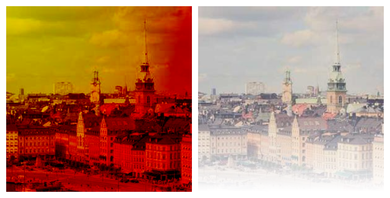
Properties#
class-attribute
instance-attribute
#
The blend mode to use when applying the shader to the
content.
class-attribute
instance-attribute
#
border_radius: BorderRadiusValue | None = None
The radius of the mask.