Row
Displays its children in a horizontal array.
To cause a child control to expand and fill the available horizontal space, set
its [expand][flet.controls.core.row.Row.expand] property.
Example:

Basic row of controls
Inherits: LayoutControl, ScrollableControl, AdaptiveControl
Properties
-
alignment(MainAxisAlignment) –Defines how the child
controlsshould be placed horizontally. -
controls(list[Control]) –A list of Controls to display.
-
intrinsic_height(bool) –Whether this row should be as tall as the tallest child control in
-
run_alignment(MainAxisAlignment) –How the runs should be placed in the cross-axis when
wrapisTrue. -
run_spacing(Number) –The spacing between runs when
wrapisTrue. -
spacing(Number) –The spacing between the child
controls. -
tight(bool) –Whether this row should occupy all available horizontal space (
True), -
vertical_alignment(CrossAxisAlignment) –Defines how the child
controlsshould be placed vertically. -
wrap(bool) –Whether this row should put child
controlsinto additional rows (runs) if
Examples#
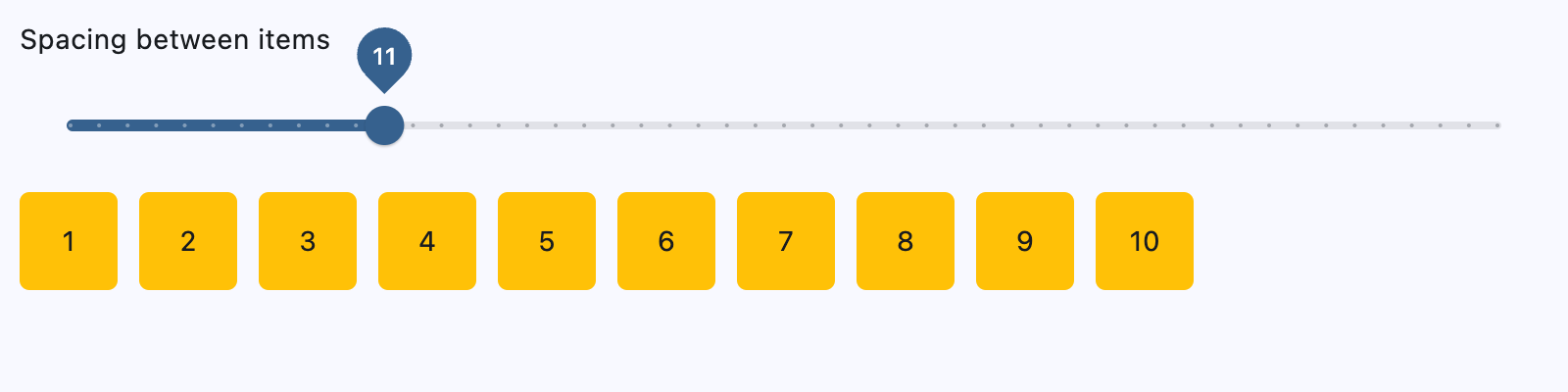
Spacing children#
import flet as ft


def main(page: ft.Page):
    def generate_items(count: int):
        return [
            ft.Container(
                content=ft.Text(value=str(i)),
                alignment=ft.Alignment.CENTER,
                width=50,
                height=50,
                bgcolor=ft.Colors.AMBER,
                border_radius=ft.BorderRadius.all(5),
            )
            for i in range(1, count + 1)
        ]

    def handle_slider_change(e: ft.Event[ft.Slider]):
        row.spacing = int(e.control.value)
        row.update()

    page.add(
        ft.Column(
            controls=[
                ft.Text("Spacing between items"),
                ft.Slider(
                    key="slider",
                    min=0,
                    max=50,
                    divisions=50,
                    value=0,
                    label="{value}",
                    on_change=handle_slider_change,
                ),
            ]
        ),
        row := ft.Row(
            spacing=0, controls=generate_items(10), scroll=ft.ScrollMode.AUTO
        ),
    )


if __name__ == "__main__":
    ft.run(main)
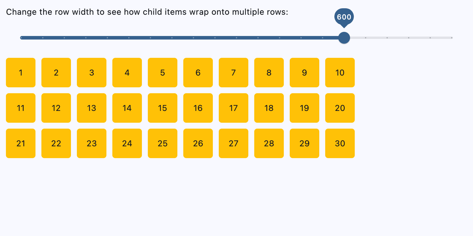
Wrapping children#
import flet as ft


def main(page: ft.Page):
    def generate_items(count: int):
        return [
            ft.Container(
                content=ft.Text(value=str(i)),
                alignment=ft.Alignment.CENTER,
                width=50,
                height=50,
                bgcolor=ft.Colors.AMBER,
                border_radius=ft.BorderRadius.all(5),
            )
            for i in range(1, count + 1)
        ]

    def handle_slider_change(e: ft.Event[ft.Slider]):
        row.width = float(e.control.value)
        row.update()

    page.add(
        ft.Column(
            controls=[
                ft.Text(
                    "Change the row width to see how child items wrap onto multiple rows:"
                ),
                ft.Slider(
                    min=0,
                    max=page.window.width,
                    divisions=20,
                    value=page.window.width,
                    label="{value}",
                    on_change=handle_slider_change,
                ),
            ]
        ),
        row := ft.Row(
            wrap=True,
            spacing=10,
            run_spacing=10,
            controls=generate_items(30),
            width=page.window.width,
        ),
    )


if __name__ == "__main__":
    ft.run(main)
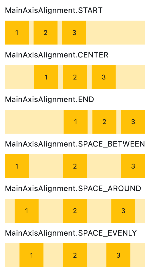
Setting horizontal alignment#
import flet as ft


class RowWithAlignment(ft.Column):
    def __init__(self, alignment: ft.MainAxisAlignment):
        super().__init__()
        self.controls = [
            ft.Text(str(alignment), size=16),
            ft.Container(
                content=ft.Row(self.generate_items(3), alignment=alignment),
                bgcolor=ft.Colors.AMBER_100,
            ),
        ]

    @staticmethod
    def generate_items(count: int):
        return [
            ft.Container(
                content=ft.Text(value=str(i)),
                alignment=ft.Alignment.CENTER,
                width=50,
                height=50,
                bgcolor=ft.Colors.AMBER_500,
            )
            for i in range(1, count + 1)
        ]


def main(page: ft.Page):
    page.scroll = ft.ScrollMode.AUTO

    page.add(
        ft.Column(
            scroll=ft.ScrollMode.AUTO,
            controls=[
                RowWithAlignment(ft.MainAxisAlignment.START),
                RowWithAlignment(ft.MainAxisAlignment.CENTER),
                RowWithAlignment(ft.MainAxisAlignment.END),
                RowWithAlignment(ft.MainAxisAlignment.SPACE_BETWEEN),
                RowWithAlignment(ft.MainAxisAlignment.SPACE_AROUND),
                RowWithAlignment(ft.MainAxisAlignment.SPACE_EVENLY),
            ],
        )
    )


if __name__ == "__main__":
    ft.run(main)
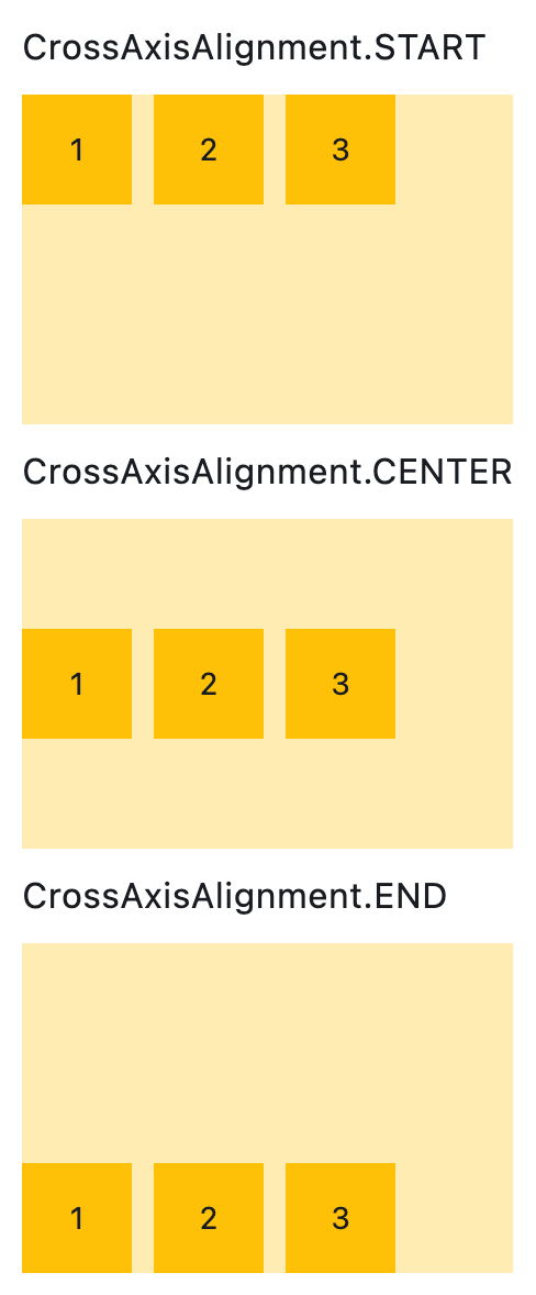
Setting vertical alignment#
import flet as ft


class RowWithVerticalAlignment(ft.Column):
    def __init__(self, alignment: ft.CrossAxisAlignment):
        super().__init__()
        self.controls = [
            ft.Text(str(alignment), size=16),
            ft.Container(
                content=ft.Row(self.generate_items(3), vertical_alignment=alignment),
                bgcolor=ft.Colors.AMBER_100,
                height=150,
            ),
        ]

    @staticmethod
    def generate_items(count: int):
        return [
            ft.Container(
                content=ft.Text(value=str(i)),
                alignment=ft.Alignment.CENTER,
                width=50,
                height=50,
                bgcolor=ft.Colors.AMBER_500,
            )
            for i in range(1, count + 1)
        ]


def main(page: ft.Page):
    page.add(
        RowWithVerticalAlignment(ft.CrossAxisAlignment.START),
        RowWithVerticalAlignment(ft.CrossAxisAlignment.CENTER),
        RowWithVerticalAlignment(ft.CrossAxisAlignment.END),
    )


if __name__ == "__main__":
    ft.run(main)
Properties#
class-attribute
instance-attribute
#
alignment: MainAxisAlignment = START
Defines how the child controls should be placed horizontally.
class-attribute
instance-attribute
#
A list of Controls to display.
class-attribute
instance-attribute
#
intrinsic_height: bool = False
Whether this row should be as tall as the tallest child control in
controls.
class-attribute
instance-attribute
#
run_alignment: MainAxisAlignment = START
How the runs should be placed in the cross-axis when wrap is True.
class-attribute
instance-attribute
#
run_spacing: Number = 10
The spacing between runs when wrap is True.
class-attribute
instance-attribute
#
spacing: Number = 10
The spacing between the child controls.
Note
Has effect only when alignment is set to
MainAxisAlignment.START, MainAxisAlignment.END,
or MainAxisAlignment.CENTER.
class-attribute
instance-attribute
#
vertical_alignment: CrossAxisAlignment = CENTER
Defines how the child controls should be placed vertically.
Note
When wrap is True, this property doesn't support
CrossAxisAlignment.STRETCH or
CrossAxisAlignment.BASELINE. If either is used,
CrossAxisAlignment.CENTER will be applied instead.