ResponsiveRow
Responsive row
Inherits: LayoutControl, AdaptiveControl
Properties
-
alignment(MainAxisAlignment) –Defines how the child
controlsshould be placed horizontally. -
breakpoints(dict[ResponsiveRowBreakpoint | str, Number]) –Defines the minimum widths (in px) for each breakpoint key used by responsive properties such as
col,spacing, andrun_spacing. -
columns(ResponsiveNumber) –The number of virtual columns to layout children.
-
controls(list[Control]) –A list of Controls to display.
-
run_spacing(ResponsiveNumber) –The spacing between runs.
-
spacing(ResponsiveNumber) –The spacing between controls in a row in virtual pixels.
-
vertical_alignment(CrossAxisAlignment) –Defines how the child
controlsshould be placed vertically.
Examples#
ResponsiveRow#
import flet as ft
def main(page: ft.Page):
def handle_page_resize(e: ft.PageResizeEvent):
pw.value = f"{page.width} px"
pw.update()
page.update()
page.on_resize = handle_page_resize
pw = ft.Text(text_align=ft.TextAlign.END, style=ft.TextTheme.display_small)
# page.overlay.append(pw)
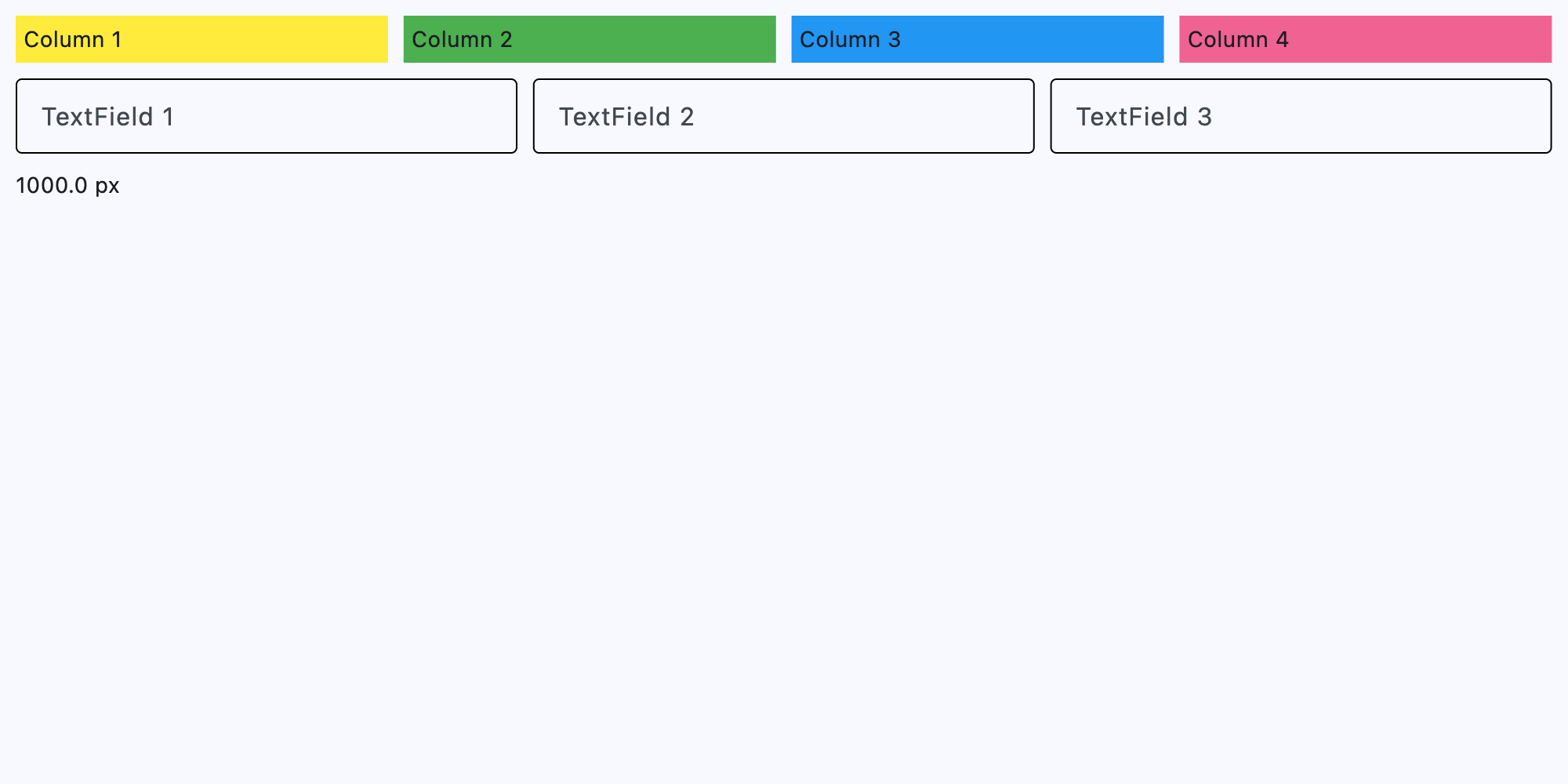
page.add(
ft.ResponsiveRow(
controls=[
ft.Container(
content=ft.Text("Column 1"),
padding=5,
bgcolor=ft.Colors.YELLOW,
col={
ft.ResponsiveRowBreakpoint.XS: 12,
ft.ResponsiveRowBreakpoint.MD: 6,
ft.ResponsiveRowBreakpoint.LG: 3,
},
),
ft.Container(
content=ft.Text("Column 2"),
padding=5,
bgcolor=ft.Colors.GREEN,
col={
ft.ResponsiveRowBreakpoint.XS: 12,
ft.ResponsiveRowBreakpoint.MD: 6,
ft.ResponsiveRowBreakpoint.LG: 3,
},
),
ft.Container(
content=ft.Text("Column 3"),
padding=5,
bgcolor=ft.Colors.BLUE,
col={
ft.ResponsiveRowBreakpoint.XS: 12,
ft.ResponsiveRowBreakpoint.MD: 6,
ft.ResponsiveRowBreakpoint.LG: 3,
},
),
ft.Container(
content=ft.Text("Column 4"),
padding=5,
bgcolor=ft.Colors.PINK_300,
col={
ft.ResponsiveRowBreakpoint.XS: 12,
ft.ResponsiveRowBreakpoint.MD: 6,
ft.ResponsiveRowBreakpoint.LG: 3,
},
),
],
),
ft.ResponsiveRow(
run_spacing={ft.ResponsiveRowBreakpoint.XS: 10},
controls=[
ft.TextField(
label="TextField 1",
col={ft.ResponsiveRowBreakpoint.MD: 4},
),
ft.TextField(
label="TextField 2",
col={ft.ResponsiveRowBreakpoint.MD: 4},
),
ft.TextField(
label="TextField 3",
col={ft.ResponsiveRowBreakpoint.MD: 4},
),
],
),
pw,
)
if __name__ == "__main__":
ft.run(main)
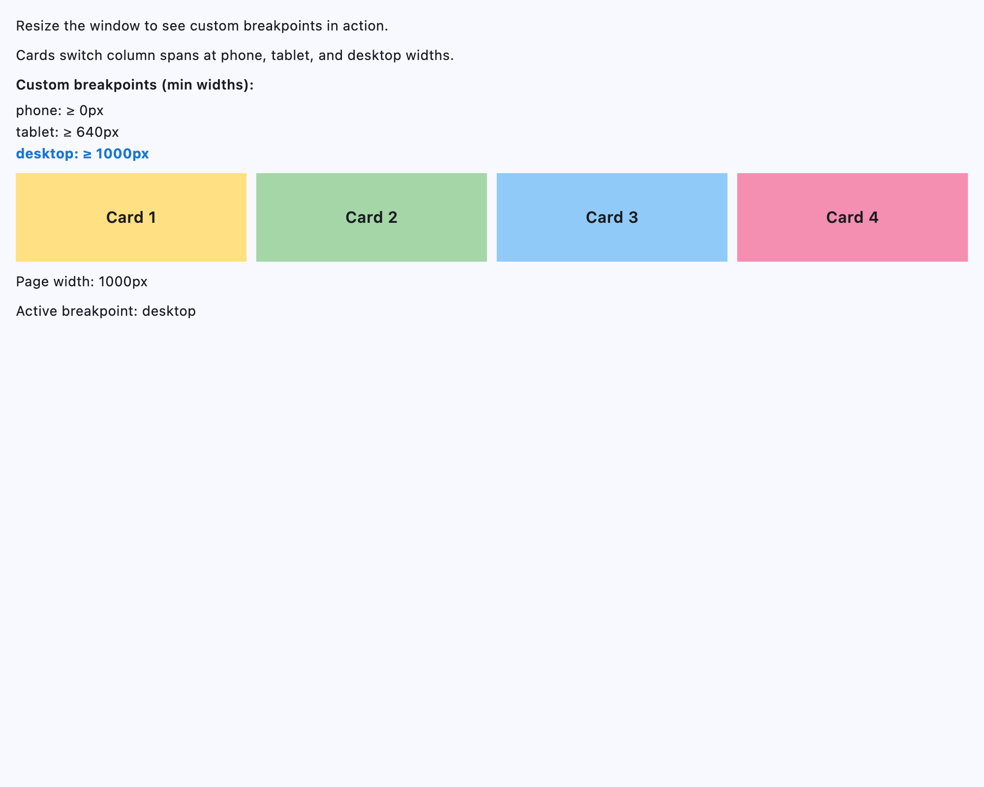
Custom breakpoints#
import flet as ft


def main(page: ft.Page):
    page.title = "ResponsiveRow with custom breakpoints"
    page.padding = 16

    breakpoints = {
        "phone": 0,
        "tablet": 540,
        "desktop": 800,
    }

    sorted_breakpoints = sorted(breakpoints.items(), key=lambda item: item[1])

    breakpoint_labels = {
        name: ft.Text(f"{name}: \u2265 {value}px", weight=ft.FontWeight.W_500)
        for name, value in sorted_breakpoints
    }

    width_label = ft.Text()
    breakpoint_label = ft.Text()

    def update_status(_=None):
        width = (
            (page.window.width if page.window and page.window.width else None)
            or page.width
            or 0
        )
        width_label.value = f"Page width: {width:.0f}px"
        active_breakpoint = max(
            (bp for bp, min_width in breakpoints.items() if width >= min_width),
            key=lambda bp: breakpoints[bp],
            default="phone",
        )
        breakpoint_label.value = f"Active breakpoint: {active_breakpoint}"
        for name, label in breakpoint_labels.items():
            is_active = name == active_breakpoint
            label.color = ft.Colors.BLUE_700 if is_active else None
            label.weight = ft.FontWeight.W_700 if is_active else ft.FontWeight.W_400
            label.update()
        width_label.update()
        breakpoint_label.update()

    page.on_resize = update_status

    page.add(
        ft.Text("Resize the window to see custom breakpoints in action."),
        ft.Text("Cards switch column spans at phone, tablet, and desktop widths."),
        ft.Column(
            [
                ft.Text(
                    "Custom breakpoints (min widths):",
                    weight=ft.FontWeight.W_600,
                ),
                ft.Column(list(breakpoint_labels.values()), spacing=2),
            ],
            spacing=6,
        ),
        ft.ResponsiveRow(
            breakpoints=breakpoints,
            columns={"phone": 4, "tablet": 8, "desktop": 12},
            spacing=10,
            run_spacing=10,
            controls=[
                ft.Container(
                    content=ft.Text("Card 1", size=16, weight=ft.FontWeight.W_600),
                    alignment=ft.Alignment.CENTER,
                    bgcolor=ft.Colors.AMBER_200,
                    height=60,
                    col={"phone": 4, "tablet": 4, "desktop": 3},
                ),
                ft.Container(
                    content=ft.Text("Card 2", size=16, weight=ft.FontWeight.W_600),
                    alignment=ft.Alignment.CENTER,
                    bgcolor=ft.Colors.GREEN_200,
                    height=60,
                    col={"phone": 4, "tablet": 4, "desktop": 3},
                ),
                ft.Container(
                    content=ft.Text("Card 3", size=16, weight=ft.FontWeight.W_600),
                    alignment=ft.Alignment.CENTER,
                    bgcolor=ft.Colors.BLUE_200,
                    height=60,
                    col={"phone": 4, "tablet": 4, "desktop": 3},
                ),
                ft.Container(
                    content=ft.Text("Card 4", size=16, weight=ft.FontWeight.W_600),
                    alignment=ft.Alignment.CENTER,
                    bgcolor=ft.Colors.PINK_200,
                    height=60,
                    col={"phone": 4, "tablet": 4, "desktop": 3},
                ),
            ],
        ),
        width_label,
        breakpoint_label,
    )
    update_status()


if __name__ == "__main__":
    ft.run(main)
Properties#
class-attribute
instance-attribute
#
alignment: MainAxisAlignment = START
Defines how the child controls should be placed horizontally.
class-attribute
instance-attribute
#
breakpoints: dict[ResponsiveRowBreakpoint | str, Number] = (
    field(
        default_factory=lambda: {
            XS: 0,
            SM: 576,
            MD: 768,
            LG: 992,
            XL: 1200,
            XXL: 1400,
        }
    )
)
Defines the minimum widths (in px) for each breakpoint key used by responsive properties such as col, spacing, and run_spacing.
Keys can be ResponsiveRowBreakpoint values or custom strings.
Breakpoint names in responsive values must match the names used here.
The default mirrors Bootstrap breakpoints.
class-attribute
instance-attribute
#
columns: ResponsiveNumber = 12
The number of virtual columns to layout children.
class-attribute
instance-attribute
#
A list of Controls to display.
class-attribute
instance-attribute
#
run_spacing: ResponsiveNumber = 10
The spacing between runs.
class-attribute
instance-attribute
#
spacing: ResponsiveNumber = 10
The spacing between controls in a row in virtual pixels.
Note
Has effect only when alignment is set to
MainAxisAlignment.START, MainAxisAlignment.END,
or MainAxisAlignment.CENTER.
class-attribute
instance-attribute
#
vertical_alignment: CrossAxisAlignment = START
Defines how the child controls should be placed vertically.