ReorderableListView
A scrollable list of controls that can be reordered.
Tip
By default, each child control (from controls) is draggable using an
automatically created drag handle (see show_default_drag_handles).
To customize the draggable area, use the ReorderableDragHandle to
define your own drag handle or region.
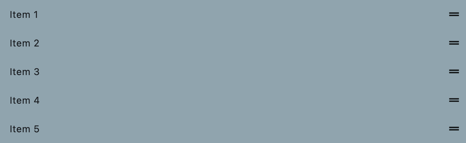
Reorderable list view
Inherits: ListView
Properties
-
anchor(Number) –The relative position of the zero scroll offset.
-
auto_scroller_velocity_scalar(Number | None) –The velocity scalar per pixel over scroll.
-
build_controls_on_demand(bool) –Whether the
controlsshould be built lazily/on-demand, -
cache_extent(Number | None) –The viewport has an area before and after the visible area to cache items that are
-
clip_behavior(ClipBehavior) –The content will be clipped (or not) according to this option.
-
controls(list[Control]) –The controls to be reordered.
-
first_item_prototype(bool) –Whether the dimensions of the first item should be used as a "prototype"
-
footer(Control | None) –A non-reorderable footer item to show after the
controls. -
header(Control | None) –A non-reorderable header item to show before the
controls. -
horizontal(bool) –Whether the
controlsshould be laid out horizontally. -
item_extent(Number | None) –Defines the extent that the
controlsshould have in the scroll direction. -
mouse_cursor(MouseCursor | None) –The cursor for a mouse pointer when it enters or is hovering over the drag handle.
-
padding(PaddingValue | None) –The amount of space by which to inset the
controls. -
reverse(bool) –Whether the scroll view scrolls in the reading direction.
-
show_default_drag_handles(bool) –Whether to show default drag handles for each
controlsitem.
Events
-
on_reorder(EventHandler[OnReorderEvent] | None) –Called when a
controlsitem has been dragged to a new location/position -
on_reorder_end(EventHandler[OnReorderEvent] | None) –Called when the dragged
controlsitem is dropped. -
on_reorder_start(EventHandler[OnReorderEvent] | None) –Called when a
controlsitem drag has started.
Examples#
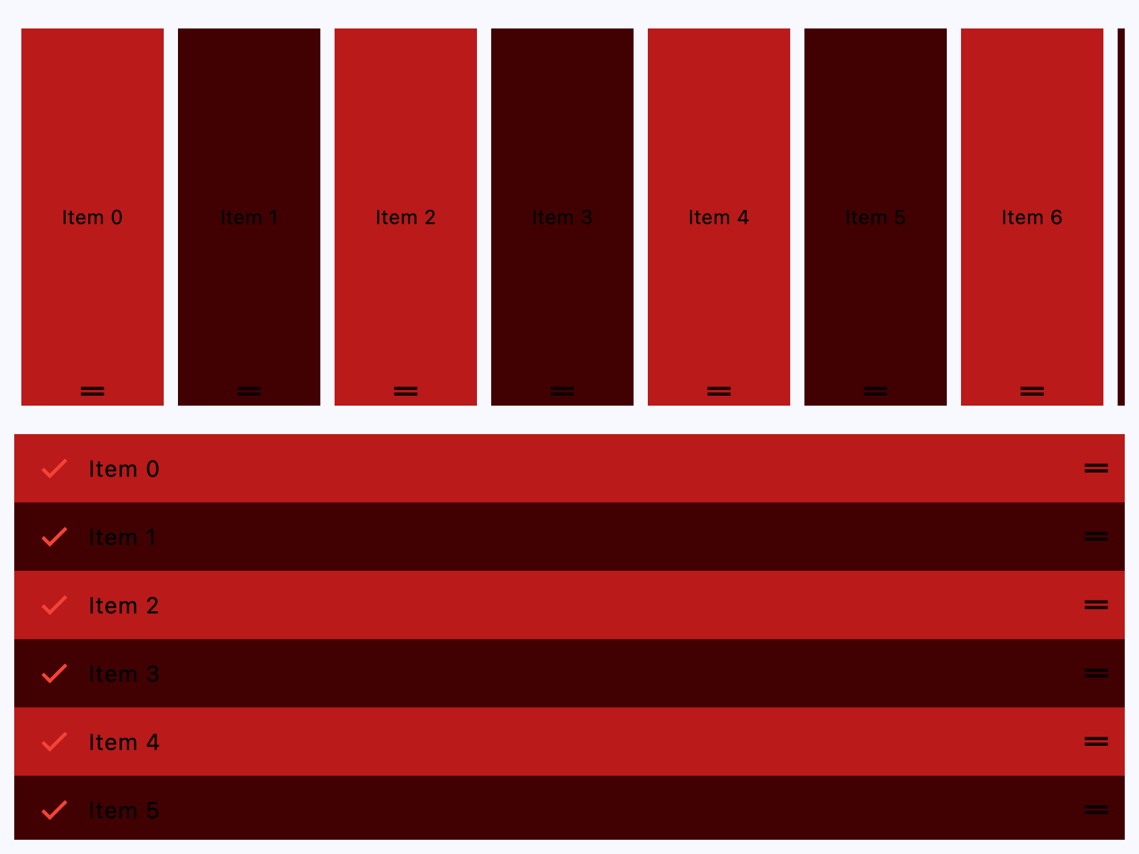
Horizontal and Vertical#
import flet as ft


def main(page: ft.Page):
    # the primary color is the color of the reorder handle
    page.theme = page.dark_theme = ft.Theme(
        color_scheme=ft.ColorScheme(primary=ft.Colors.BLUE)
    )

    def handle_reorder(e: ft.OnReorderEvent):
        e.control.controls.insert(e.new_index, e.control.controls.pop(e.old_index))

    def get_color(i):
        return ft.Colors.ERROR if i % 2 == 0 else ft.Colors.ON_ERROR_CONTAINER

    page.add(
        # horizontal
        ft.ReorderableListView(
            expand=True,
            horizontal=True,
            on_reorder=handle_reorder,
            controls=[
                ft.Container(
                    content=ft.Text(f"Item {i}", color=ft.Colors.BLACK),
                    bgcolor=get_color(i),
                    margin=ft.Margin.symmetric(horizontal=5, vertical=10),
                    width=100,
                    alignment=ft.Alignment.CENTER,
                )
                for i in range(10)
            ],
        ),
        # vertical
        ft.ReorderableListView(
            expand=True,
            on_reorder=handle_reorder,
            controls=[
                ft.ListTile(
                    title=ft.Text(f"Item {i}", color=ft.Colors.BLACK),
                    leading=ft.Icon(ft.Icons.CHECK, color=ft.Colors.RED),
                    bgcolor=get_color(i),
                )
                for i in range(10)
            ],
        ),
    )


if __name__ == "__main__":
    ft.run(main)
Custom drag handle#
See this.
Properties#
class-attribute
instance-attribute
#
anchor: Number = 0.0
The relative position of the zero scroll offset.
class-attribute
instance-attribute
#
auto_scroller_velocity_scalar: Number | None = None
The velocity scalar per pixel over scroll.
It represents how the velocity scale with the over scroll distance. The auto-scroll velocity = (distance of overscroll) * velocity scalar.
class-attribute
instance-attribute
#
build_controls_on_demand: bool = True
Whether the controls should be built lazily/on-demand,
i.e. only when they are about to become visible.
This is particularly useful when dealing with a large number of controls.
class-attribute
instance-attribute
#
cache_extent: Number | None = None
The viewport has an area before and after the visible area to cache items that are about to become visible when the user scrolls.
Items that fall in this cache area are laid out even though they are not (yet)
visible on screen. The cache_extent describes how many pixels the cache area
extends before the leading edge and after the trailing edge of the viewport.
The total extent, which the viewport will try to cover with children, is
cache_extent before the leading edge + extent of the main axis + cache_extent
after the trailing edge.
The cache area is also used to implement implicit accessibility scrolling on iOS: When the accessibility focus moves from an item in the visible viewport to an invisible item in the cache area, the framework will bring that item into view with an (implicit) scroll action.
class-attribute
instance-attribute
#
clip_behavior: ClipBehavior = HARD_EDGE
The content will be clipped (or not) according to this option.
class-attribute
instance-attribute
#
The controls to be reordered.
class-attribute
instance-attribute
#
first_item_prototype: bool = False
Whether the dimensions of the first item should be used as a "prototype" for all other items.
If True, their height or width will be the same as the first item.
class-attribute
instance-attribute
#
footer: Control | None = None
A non-reorderable footer item to show after the controls.
class-attribute
instance-attribute
#
header: Control | None = None
A non-reorderable header item to show before the controls.
class-attribute
instance-attribute
#
horizontal: bool = False
Whether the controls should be laid out horizontally.
class-attribute
instance-attribute
#
item_extent: Number | None = None
Defines the extent that the controls should have in the scroll direction.
Specifying an item_extent is more efficient than letting the controls
determine their own extent because the scrolling machinery can make use of the
foreknowledge of the controls extent to save work, for example when the scroll
position changes drastically.
class-attribute
instance-attribute
#
mouse_cursor: MouseCursor | None = None
The cursor for a mouse pointer when it enters or is hovering over the drag handle.
class-attribute
instance-attribute
#
padding: PaddingValue | None = None
The amount of space by which to inset the controls.
class-attribute
instance-attribute
#
reverse: bool = False
Whether the scroll view scrolls in the reading direction.
For example, if the reading direction is left-to-right and horizontal
is True, then the scroll view scrolls from left to right when reverse is False
and from right to left when reverse is True.
Similarly, if horizontal is False, then the scroll view scrolls from top
to bottom when reverse is False and from bottom to top when reverse is True.
class-attribute
instance-attribute
#
show_default_drag_handles: bool = True
Whether to show default drag handles for each controls item.
If True: on desktop platforms, a drag handle is stacked over the
center of each item's trailing edge; on mobile platforms, a long
press anywhere on the item starts a drag.
The default desktop drag handle is just an Icons.DRAG_HANDLE
wrapped by a ReorderableDragHandle. On mobile platforms, the entire
item is wrapped with a [ReorderableDelayedDragStartListener].
To customize the appearance or layout of drag handles, wrap each
controls item, or a control within each of them, with a
ReorderableDragHandle, [ReorderableDelayedDragStartListener],
or your own subclass of ReorderableDragHandle. For full control
over the drag handles, you might want to set show_default_drag_handles to False.
Example
ft.ReorderableListView(
    show_default_drag_handles=False,
    controls=[
        ft.ListTile(
            title=ft.Text(f"Draggable Item {i}", color=ft.Colors.BLACK),
            leading=ft.ReorderableDragHandle(
                content=ft.Icon(ft.Icons.DRAG_INDICATOR, color=ft.Colors.RED),
                mouse_cursor=ft.MouseCursor.GRAB,
            ),
        )
        for i in range(10)
    ],
)
Events#
class-attribute
instance-attribute
#
on_reorder: EventHandler[OnReorderEvent] | None = None
Called when a controls item has been dragged to a new location/position
and the order of the items gets updated.
class-attribute
instance-attribute
#
on_reorder_end: EventHandler[OnReorderEvent] | None = None
Called when the dragged controls item is dropped.
class-attribute
instance-attribute
#
on_reorder_start: EventHandler[OnReorderEvent] | None = None
Called when a controls item drag has started.