ProgressRing

Fixed progress ring
Inherits: LayoutControl
Properties
-
bgcolor(ColorValue | None) –Color of the circular track being filled
-
color(ColorValue | None) –The progress indicator's color.
-
padding(PaddingValue | None) –The padding around the indicator track.
-
semantics_label(str | None) –Used to identify the purpose of this progress bar for screen reading software.
-
semantics_value(Number | None) –Used for determinate progress indicators to indicate how much progress has been
-
size_constraints(BoxConstraints | None) –Defines the minimum and maximum size of the progress indicator.
-
stroke_align(Number | None) –The relative position of the stroke.
-
stroke_cap(StrokeCap | None) –The progress indicator's line ending.
-
stroke_width(Number | None) –The width of the line used to draw the circle.
-
track_gap(Number | None) –The gap between the active indicator and the background track.
-
value(Number | None) –The value of this progress indicator.
-
year_2023(bool | None) –If this is set to
False, theProgressRingwill use the latest Material Design 3
Examples#
Determinate and indeterminate progress rings#
import asyncio
import flet as ft
async def main(page: ft.Page):
page.add(
ft.Text(
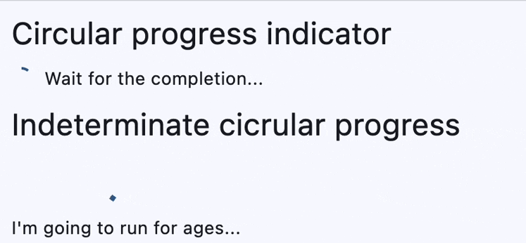
value="Circular progress indicator",
theme_style=ft.TextThemeStyle.HEADLINE_SMALL,
),
ft.Row(
controls=[
determinate_ring := ft.ProgressRing(
width=16, height=16, stroke_width=2
),
determinate_message := ft.Text("Wait for the completion..."),
]
),
ft.Text(
value="Indeterminate cicrular progress",
theme_style=ft.TextThemeStyle.HEADLINE_SMALL,
),
ft.Column(
horizontal_alignment=ft.CrossAxisAlignment.CENTER,
controls=[ft.ProgressRing(), ft.Text("I'm going to run for ages...")],
),
)
for i in range(0, 101):
determinate_ring.value = i * 0.01
await asyncio.sleep(0.1)
if i == 100:
determinate_message.value = "Finished!"
page.update()
if __name__ == "__main__":
ft.run(main)
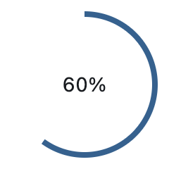
Gauge with progress#
import flet as ft


def main(page: ft.Page):
    page.add(
        ft.Stack(
            width=100,
            height=100,
            controls=[
                ft.Container(content=ft.Text("60%"), alignment=ft.Alignment.CENTER),
                ft.ProgressRing(value=0.6, width=100, height=100),
            ],
        )
    )


if __name__ == "__main__":
    ft.run(main)
Properties#
class-attribute
instance-attribute
#
bgcolor: ColorValue | None = None
Color of the circular track being filled by the circular indicator.
class-attribute
instance-attribute
#
color: ColorValue | None = None
The progress indicator's color.
class-attribute
instance-attribute
#
padding: PaddingValue | None = None
The padding around the indicator track.
If None,
ProgressIndicatorTheme.circular_track_padding
is used.
If that's is also None and year_2023 is False,
defaults to Padding.all(4.0).
Otherwise, defaults to Padding.all(0.0).
class-attribute
instance-attribute
#
semantics_label: str | None = None
Used to identify the purpose of this progress bar for screen reading software.
class-attribute
instance-attribute
#
semantics_value: Number | None = None
Used for determinate progress indicators to indicate how much progress has been made.
class-attribute
instance-attribute
#
size_constraints: BoxConstraints | None = None
Defines the minimum and maximum size of the progress indicator.
If None,
ProgressIndicatorTheme.size_constraints
is used.
If that's is also None, defaults to a minimum width and height of 36.
class-attribute
instance-attribute
#
stroke_align: Number | None = None
The relative position of the stroke.
Value typically ranges be -1.0 (inside stroke) and 1.0 (outside stroke).
A value of 0 (center stroke) will center the border on the edge of the control.
If ProgressRing.year_2023 is True, then the
default value is 0. Otherwise, the default value is -1.
class-attribute
instance-attribute
#
stroke_cap: StrokeCap | None = None
The progress indicator's line ending.
class-attribute
instance-attribute
#
stroke_width: Number | None = None
The width of the line used to draw the circle.
class-attribute
instance-attribute
#
track_gap: Number | None = None
The gap between the active indicator and the background track.
If year_2023 is True or Theme.use_material3 is
False, then no track gap will be drawn.
Set track_gap to 0 to hide this track gap.
If None,
ProgressIndicatorTheme.track_gap is used.
If that's is also None, defaults to 4.0.
class-attribute
instance-attribute
#
value: Number | None = None
The value of this progress indicator.
A value of 0.0 means no progress and 1.0 means that progress is complete.
The value will be clamped to be in the range 0.0 - 1.0. If None, this
progress indicator is indeterminate, which means the indicator displays a
predetermined animation that does not indicate how much actual progress is being
made.
class-attribute
instance-attribute
#
year_2023: bool | None = None
If this is set to False, the ProgressRing will use the latest Material Design 3
appearance, which was introduced in December 2023.
When True, the ProgressRing will use the 2023 Material Design 3 appearance.
If not set, then the
ProgressIndicatorTheme.year_2023 will be
used, which is False by default.
If Theme.use_material3 is False, then this property
is ignored.