MenuItemButton
Menu item buttons outside of menubar
Inherits: LayoutControl
Properties
-
autofocus(bool) –Whether this button should automatically request focus.
-
clip_behavior(ClipBehavior) –Whether to clip the content of this control or not.
-
close_on_click(bool) –Defines if the menu will be closed when the
MenuItemButtonis clicked. -
content(StrOrControl | None) –The child control or text to be displayed in the center of this button.
-
focus_on_hover(bool) –Determine if hovering can request focus.
-
leading(Control | None) –An optional control to display before the
content. -
overflow_axis(Axis) –The direction in which the menu item expands.
-
semantic_label(str | None) –A string that describes the button's action to assistive technologies.
-
style(ButtonStyle | None) –Customizes this button's appearance.
-
trailing(Control | None) –An optional control to display after the
content.
Events
-
on_blur(ControlEventHandler[MenuItemButton] | None) –Called when this button loses focus.
-
on_click(ControlEventHandler[MenuItemButton] | None) –Called when the button is clicked.If not defined the button will be disabled.
-
on_focus(ControlEventHandler[MenuItemButton] | None) –Called when the button receives focus.
-
on_hover(ControlEventHandler[MenuItemButton] | None) –Called when the button is hovered.
Examples#
Basic Example#
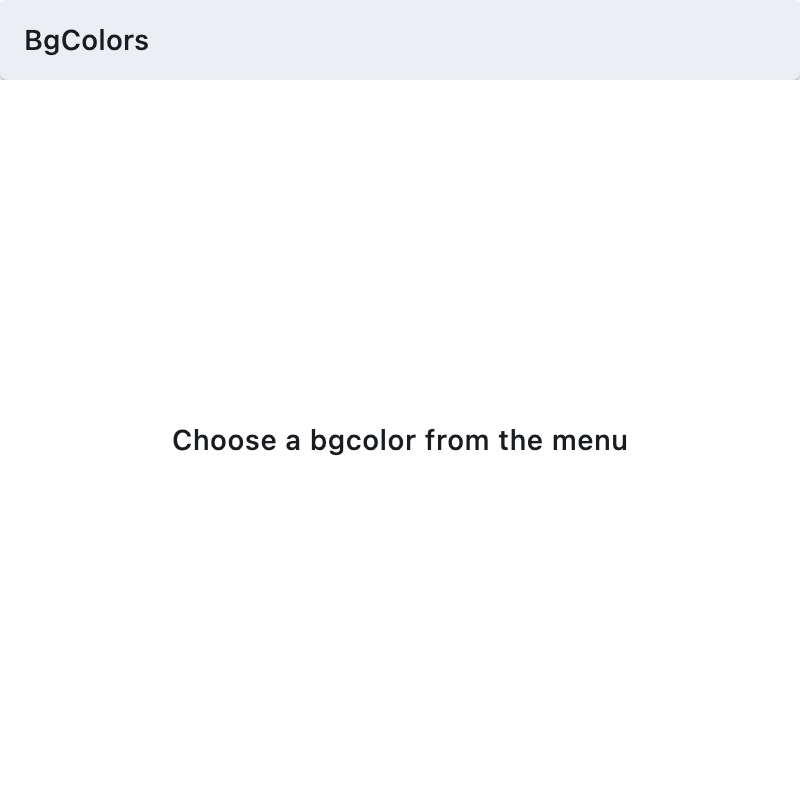
import flet as ft
def main(page: ft.Page):
page.padding = 0
page.spacing = 0
page.theme_mode = ft.ThemeMode.LIGHT
def handle_color_click(e: ft.Event[ft.MenuItemButton]):
color = e.control.content.value
background_container.content.value = f"{color} background color"
background_container.bgcolor = color.lower()
page.update()
def handle_on_hover(e: ft.Event[ft.MenuItemButton]):
print(e)
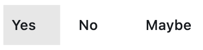
menubar = ft.MenuBar(
expand=True,
controls=[
ft.SubmenuButton(
content=ft.Text("BgColors"),
controls=[
ft.MenuItemButton(
content=ft.Text("Blue"),
leading=ft.Icon(ft.Icons.COLORIZE),
style=ft.ButtonStyle(
bgcolor={ft.ControlState.HOVERED: ft.Colors.BLUE}
),
on_click=handle_color_click,
on_hover=handle_on_hover,
),
ft.MenuItemButton(
content=ft.Text("Green"),
leading=ft.Icon(ft.Icons.COLORIZE),
style=ft.ButtonStyle(
bgcolor={ft.ControlState.HOVERED: ft.Colors.GREEN}
),
on_click=handle_color_click,
on_hover=handle_on_hover,
),
ft.MenuItemButton(
content=ft.Text("Red"),
leading=ft.Icon(ft.Icons.COLORIZE),
style=ft.ButtonStyle(
bgcolor={ft.ControlState.HOVERED: ft.Colors.RED}
),
on_click=handle_color_click,
on_hover=handle_on_hover,
),
],
),
],
)
page.add(
ft.Row(controls=[menubar]),
background_container := ft.Container(
expand=True,
bgcolor=ft.Colors.WHITE,
alignment=ft.Alignment.CENTER,
content=ft.Text(
value="Choose a bgcolor from the menu",
style=ft.TextStyle(weight=ft.FontWeight.W_500),
),
),
)
if __name__ == "__main__":
ft.run(main)
Properties#
class-attribute
instance-attribute
#
autofocus: bool = False
Whether this button should automatically request focus.
Defaults to False.
class-attribute
instance-attribute
#
clip_behavior: ClipBehavior = NONE
Whether to clip the content of this control or not.
class-attribute
instance-attribute
#
close_on_click: bool = True
Defines if the menu will be closed when the MenuItemButton is clicked.
class-attribute
instance-attribute
#
content: StrOrControl | None = None
The child control or text to be displayed in the center of this button.
Typically this is the button's label, using a Text control.
class-attribute
instance-attribute
#
focus_on_hover: bool = True
Determine if hovering can request focus.
class-attribute
instance-attribute
#
leading: Control | None = None
An optional control to display before the content.
Typically an Icon control.
class-attribute
instance-attribute
#
overflow_axis: Axis = HORIZONTAL
The direction in which the menu item expands.
If the menu item button is a descendent of MenuBar, then this property is ignored.
class-attribute
instance-attribute
#
semantic_label: str | None = None
A string that describes the button's action to assistive technologies.
class-attribute
instance-attribute
#
style: ButtonStyle | None = None
Customizes this button's appearance.
class-attribute
instance-attribute
#
trailing: Control | None = None
An optional control to display after the content.
Typically an Icon control.
Events#
class-attribute
instance-attribute
#
on_blur: ControlEventHandler[MenuItemButton] | None = None
Called when this button loses focus.
class-attribute
instance-attribute
#
on_click: ControlEventHandler[MenuItemButton] | None = None
Called when the button is clicked.If not defined the button will be disabled.
class-attribute
instance-attribute
#
on_focus: ControlEventHandler[MenuItemButton] | None = None
Called when the button receives focus.
class-attribute
instance-attribute
#
on_hover: ControlEventHandler[MenuItemButton] | None = None
Called when the button is hovered.