MenuBar
A menu bar that manages cascading child menus.
It could be placed anywhere but typically resides above the main body of the application and defines a menu system for invoking callbacks in response to user selection of a menu item.
Basic menu bar
Inherits: Control
Properties
-
clip_behavior(ClipBehavior) –Whether to clip the content of this control or not.
-
controls(list[Control]) –A list of top-level menu controls to display in this menu bar.
-
style(MenuStyle | None) –The menu bar style.
Examples#
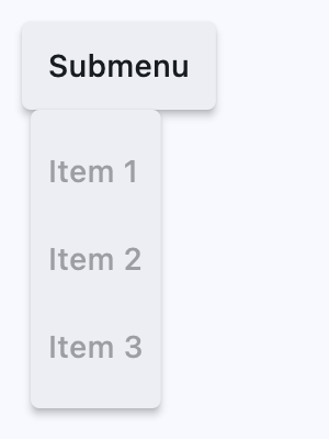
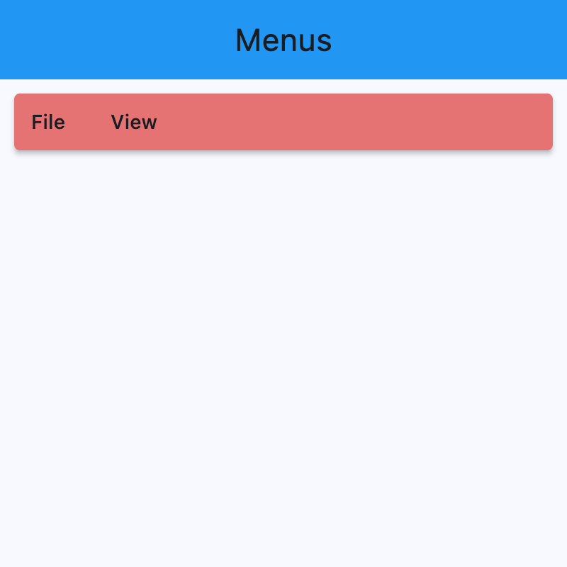
MenuBar with Nested Submenus#
import flet as ft


def main(page: ft.Page):
    appbar_text_ref = ft.Ref[ft.Text]()

    def handle_menu_item_click(e: ft.Event[ft.MenuItemButton]):
        text = e.control.content.value
        page.show_dialog(ft.SnackBar(ft.Text(f"{text} was clicked!")))
        appbar_text_ref.current.value = text
        page.update()

    def handle_submenu_open(e: ft.Event[ft.SubmenuButton]):
        print(f"{e.control.content.value}.on_open")

    def handle_submenu_close(e: ft.Event[ft.SubmenuButton]):
        print(f"{e.control.content.value}.on_close")

    def handle_submenu_hover(e: ft.Event[ft.SubmenuButton]):
        print(f"{e.control.content.value}.on_hover")

    page.appbar = ft.AppBar(
        title=ft.Text("Menus", ref=appbar_text_ref),
        center_title=True,
        bgcolor=ft.Colors.BLUE,
    )

    page.add(
        ft.Row(
            controls=[
                ft.MenuBar(
                    expand=True,
                    style=ft.MenuStyle(
                        alignment=ft.Alignment.TOP_LEFT,
                        bgcolor=ft.Colors.RED_300,
                        mouse_cursor={
                            ft.ControlState.HOVERED: ft.MouseCursor.WAIT,
                            ft.ControlState.DEFAULT: ft.MouseCursor.ZOOM_OUT,
                        },
                    ),
                    controls=[
                        ft.SubmenuButton(
                            content=ft.Text("File"),
                            on_open=handle_submenu_open,
                            on_close=handle_submenu_close,
                            on_hover=handle_submenu_hover,
                            controls=[
                                ft.MenuItemButton(
                                    content=ft.Text("About"),
                                    leading=ft.Icon(ft.Icons.INFO),
                                    on_click=handle_menu_item_click,
                                    style=ft.ButtonStyle(
                                        bgcolor={
                                            ft.ControlState.HOVERED: ft.Colors.GREEN_100
                                        }
                                    ),
                                ),
                                ft.MenuItemButton(
                                    content=ft.Text("Save"),
                                    leading=ft.Icon(ft.Icons.SAVE),
                                    on_click=handle_menu_item_click,
                                    style=ft.ButtonStyle(
                                        bgcolor={
                                            ft.ControlState.HOVERED: ft.Colors.GREEN_100
                                        }
                                    ),
                                ),
                                ft.MenuItemButton(
                                    content=ft.Text("Quit"),
                                    leading=ft.Icon(ft.Icons.CLOSE),
                                    on_click=handle_menu_item_click,
                                    style=ft.ButtonStyle(
                                        bgcolor={
                                            ft.ControlState.HOVERED: ft.Colors.GREEN_100
                                        }
                                    ),
                                ),
                            ],
                        ),
                        ft.SubmenuButton(
                            content=ft.Text("View"),
                            on_open=handle_submenu_open,
                            on_close=handle_submenu_close,
                            on_hover=handle_submenu_hover,
                            controls=[
                                ft.SubmenuButton(
                                    content=ft.Text("Zoom"),
                                    controls=[
                                        ft.MenuItemButton(
                                            content=ft.Text("Magnify"),
                                            leading=ft.Icon(ft.Icons.ZOOM_IN),
                                            close_on_click=False,
                                            on_click=handle_menu_item_click,
                                            style=ft.ButtonStyle(
                                                bgcolor={
                                                    ft.ControlState.HOVERED: ft.Colors.PURPLE_200
                                                }
                                            ),
                                        ),
                                        ft.MenuItemButton(
                                            content=ft.Text("Minify"),
                                            leading=ft.Icon(ft.Icons.ZOOM_OUT),
                                            close_on_click=False,
                                            on_click=handle_menu_item_click,
                                            style=ft.ButtonStyle(
                                                bgcolor={
                                                    ft.ControlState.HOVERED: ft.Colors.PURPLE_200
                                                }
                                            ),
                                        ),
                                    ],
                                )
                            ],
                        ),
                    ],
                )
            ]
        )
    )


if __name__ == "__main__":
    ft.run(main)
Properties#
class-attribute
instance-attribute
#
clip_behavior: ClipBehavior = NONE
Whether to clip the content of this control or not.
class-attribute
instance-attribute
#
A list of top-level menu controls to display in this menu bar.
Raises:
-
ValueError–If none of the controls are visible.