Markdown

Basic Markdown
Inherits: LayoutControl
Properties
-
auto_follow_links(bool) –Automatically open URLs in the document.
-
auto_follow_links_target(UrlTarget | None) –Where to open URL in the web mode.
-
code_style_sheet(MarkdownStyleSheet | None) –The styles to use when displaying the code blocks.
-
code_theme(MarkdownCodeTheme | MarkdownCustomCodeTheme | None) –A syntax highlighting theme for code blocks.
-
extension_set(MarkdownExtensionSet) –The extensions to use when rendering the markdown content.
-
fit_content(bool) –Whether to allow the widget to fit the child content.
-
image_error_content(Control | None) –The control to display when an image fails to load.
-
latex_scale_factor(float | None) –The scale factor for LaTeX formulas rendering.
-
latex_style(TextStyle | None) –The text style to apply to LaTeX formulas.
-
md_style_sheet(MarkdownStyleSheet | None) –The styles to use when displaying the markdown.
-
selectable(bool) –Whether rendered text is selectable or not.
-
shrink_wrap(bool) –Whether the extent of the scroll view in the scroll direction should be determined by the contents being viewed.
-
soft_line_break(bool) –The soft line break is used to identify the spaces at the end of a line of text and the leading spaces in the immediately following the line of text.
-
value(str) –Markdown content to render.
Events
-
on_selection_change(EventHandler[TextSelectionChangeEvent[Markdown]] | None) –Called when the text selection changes.
-
on_tap_link(ControlEventHandler[Markdown] | None) –Called when a link within Markdown document is clicked/tapped.
-
on_tap_text(ControlEventHandler[Markdown] | None) –Called when some text is clicked/tapped.
Examples#
Basic Example#
import flet as ft
sample = """
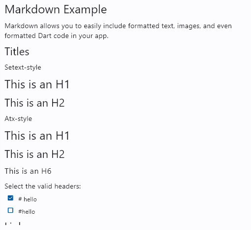
# Markdown Example
Markdown allows you to easily include formatted text, images, and even formatted Dart
code in your app.
## Titles
Setext-style
This is an H1
=============
This is an H2
-------------
Atx-style
# This is an H1
## This is an H2
###### This is an H6
Select the valid headers:
- [x] `# hello`
- [ ] `#hello`
## Links
[inline-style](https://www.google.com)
## Images


## Tables
|Syntax |Result |
|---------------------------------------|-------------------------------------|
|`*italic 1*` |*italic 1* |
|`_italic 2_` | _italic 2_ |
|`**bold 1**` |**bold 1** |
|`__bold 2__` |__bold 2__ |
|`This is a ~~strikethrough~~` |This is a ~~strikethrough~~ |
|`***italic bold 1***` |***italic bold 1*** |
|`___italic bold 2___` |___italic bold 2___ |
|`***~~italic bold strikethrough 1~~***`|***~~italic bold strikethrough 1~~***|
|`~~***italic bold strikethrough 2***~~`|~~***italic bold strikethrough 2***~~|
## Styling
Style text as _italic_, __bold__, ~~strikethrough~~, or `inline code`.
- Use bulleted lists
- To better clarify
- Your points
## Code blocks
Formatted Dart code looks really pretty too:
~~~dart
void main() {
runApp(MaterialApp(
home: Scaffold(
body: ft.Markdown(data: markdownData),
),
));
}
~~~
"""
def main(page: ft.Page):
page.scroll = ft.ScrollMode.AUTO
async def handle_link_tap(e: ft.Event[ft.Markdown]):
await page.launch_url(e.data)
page.add(
ft.Markdown(
value=sample,
selectable=True,
extension_set=ft.MarkdownExtensionSet.GITHUB_WEB,
on_tap_link=handle_link_tap,
)
)
ft.run(main)
Code syntax highlight#
import flet as ft
sample = """
# Flet
<img src="https://raw.githubusercontent.com/flet-dev/flet/flet-widget/media/logo/flet-logo.svg" width="50%"/>
Flet is a framework for adding server-driven UI (SDUI) experiences to existing Flutter
apps or building standalone web, mobile and desktop apps with Flutter UI.
Add an interactive `FletApp` widget to your Flutter app whose content is controlled by a remote Python script.
It is an ideal solution for building non-core or frequently changing functionality such as product catalog, feedback form, in-app survey or support chat. Flet enables your team to ship new features faster by reducing the number of App Store validation cycles. Just re-deploy a web app hosting a Python script and your users will get an instant update!
On the server side Flet provides an easy to learn programming model that enables Python developers without prior Flutter (or even front-end) experience to participate in development of your larger Flutter app or build their own apps with Flutter UI from scratch.
## Getting started with Flet
### Install `flet` Python module
Flet requires Python 3.7 or above. To start with Flet, you need to install flet module first:
~~~bash
pip install flet
~~~
### Create Python program
Create a new Python program using Flet which will be driving the content of `FletApp` widget.
Let's do a simple `counter.py` app similar to a Flutter new project template:
~~~python
import flet
from flet import IconButton, Page, Row, TextField, icons
def main(page: Page):
page.title = "Flet counter example"
page.vertical_alignment = "center"
txt_number = TextField(value="0", text_align="right", width=100)
def minus_click(e):
txt_number.value = int(txt_number.value) - 1
page.update()
def plus_click(e):
txt_number.value = int(txt_number.value) + 1
page.update()
page.add(
Row(
[
IconButton(icons.REMOVE, on_click=minus_click),
txt_number,
IconButton(icons.ADD, on_click=plus_click),
],
alignment="center",
)
)
flet.app(main, port=8550)
~~~
Run the app:
~~~bash
python counter.py
~~~
You should see the app running in a native OS window.
There is a web server (Fletd) running in the background on a fixed port `8550`. Fletd web server is a "bridge" between Python and Flutter.
`FletApp` widget in your Flutter application will be communicating with Fletd web server via WebSockets to receive UI updates and send user-generated UI events.
For production use Python app along with Fletd could be [deployed to a public web host](https://docs.flet.dev/publish/web/dynamic-website/) and be accessible via HTTPS with domain name.
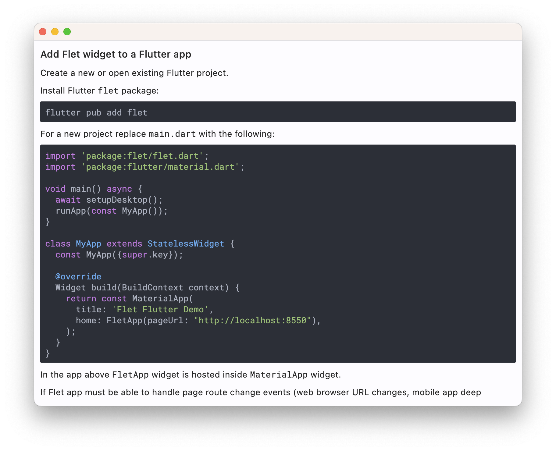
### Add Flet widget to a Flutter app
Create a new or open existing Flutter project.
Install Flutter `flet` package:
~~~bash
flutter pub add flet
~~~
For a new project replace `main.dart` with the following:
~~~dart
import 'package:flet/flet.dart';
import 'package:flutter/material.dart';
void main() async {
await setupDesktop();
runApp(const MyApp());
}
class MyApp extends StatelessWidget {
const MyApp({super.key});
@override
Widget build(BuildContext context) {
return const MaterialApp(
title: 'Flet Flutter Demo',
home: FletApp(pageUrl: "http://localhost:8550"),
);
}
}
~~~
In the app above `FletApp` widget is hosted inside `MaterialApp` widget.
If Flet app must be able to handle page route change events (web browser URL changes, mobile app deep linking) it must be the top most widget as it contains its own `MaterialApp` widget handling route changes:
~~~dart
import 'package:flet/flet.dart';
import 'package:flutter/material.dart';
void main() async {
await setupDesktop();
runApp(const FletApp(pageUrl: "http://localhost:8550"));
}
~~~
Run the program and see Flet app running inside a Flutter app.
When adding `FletApp` widget to the existing desktop Flutter app make sure `setupDesktop()` is called before `runApp()` to initialize Flet's built-in window manager.
## Flet learning resources
* [Getting started for Python](https://docs.flet.dev/getting-started/installation/)
* [Controls reference](https://docs.flet.dev/controls)
* [Tutorials](https://docs.flet.dev/tutorials)
* [Examples](https://github.com/flet-dev/examples/tree/main/python)
## Flet community
* [Discussions](https://github.com/flet-dev/flet/discussions)
* [Discord](https://discord.gg/dzWXP8SHG8)
* [Twitter](https://twitter.com/fletdev)
* [Email](mailto:[email protected])
## FAQ
Coming soon.
## Adding custom Flutter widgets
Coming soon.
""" # noqa: E501
def main(page: ft.Page):
page.scroll = ft.ScrollMode.AUTO
page.fonts = {
"Roboto Mono": "RobotoMono-VariableFont_wght.ttf",
}
async def navigate_md_link(e: ft.Event[ft.Markdown]):
await page.launch_url(e.data)
page.add(
ft.Markdown(
value=sample,
selectable=True,
extension_set=ft.MarkdownExtensionSet.GITHUB_WEB,
code_theme=ft.MarkdownCodeTheme.ATOM_ONE_DARK,
code_style_sheet=ft.MarkdownStyleSheet(
code_text_style=ft.TextStyle(font_family="Roboto Mono")
),
on_tap_link=navigate_md_link,
)
)
ft.run(main)
Custom text theme#
import flet as ft


def main(page: ft.Page):
    page.theme_mode = ft.ThemeMode.DARK

    def change_theme_mode(e: ft.Event[ft.Switch]):
        if page.theme_mode == ft.ThemeMode.DARK:
            page.theme_mode = ft.ThemeMode.LIGHT
            switch.thumb_icon = ft.Icons.LIGHT_MODE
        else:
            switch.thumb_icon = ft.Icons.DARK_MODE
            page.theme_mode = ft.ThemeMode.DARK
        page.update()

    switch = ft.Switch(thumb_icon=ft.Icons.DARK_MODE, on_change=change_theme_mode)

    page.add(
        ft.Row(
            alignment=ft.MainAxisAlignment.SPACE_BETWEEN,
            controls=[
                ft.Container(
                    content=ft.Markdown("I can read this!"),
                    bgcolor="#550000",
                    padding=20,
                    theme=ft.Theme(
                        text_theme=ft.TextTheme(
                            body_medium=ft.TextStyle(color=ft.Colors.WHITE),
                            body_large=ft.TextStyle(color=ft.Colors.WHITE),
                            body_small=ft.TextStyle(color=ft.Colors.WHITE),
                        )
                    ),
                ),
                ft.Container(
                    content=switch,
                    padding=ft.Padding.only(bottom=50),
                    alignment=ft.Alignment.TOP_RIGHT,
                ),
            ],
        )
    )


ft.run(main)
Properties#
class-attribute
instance-attribute
#
auto_follow_links: bool = False
Automatically open URLs in the document.
If registered, on_tap_link event is fired after that.
class-attribute
instance-attribute
#
auto_follow_links_target: UrlTarget | None = None
Where to open URL in the web mode.
class-attribute
instance-attribute
#
code_style_sheet: MarkdownStyleSheet | None = None
The styles to use when displaying the code blocks.
class-attribute
instance-attribute
#
code_theme: (
    MarkdownCodeTheme | MarkdownCustomCodeTheme | None
) = None
A syntax highlighting theme for code blocks.
Defaults to MarkdownCodeTheme.GITHUB.
class-attribute
instance-attribute
#
extension_set: MarkdownExtensionSet = NONE
The extensions to use when rendering the markdown content.
class-attribute
instance-attribute
#
fit_content: bool = True
Whether to allow the widget to fit the child content.
class-attribute
instance-attribute
#
image_error_content: Control | None = None
The control to display when an image fails to load.
class-attribute
instance-attribute
#
latex_scale_factor: float | None = None
The scale factor for LaTeX formulas rendering. Controls the size of rendered mathematical expressions.
class-attribute
instance-attribute
#
latex_style: TextStyle | None = None
The text style to apply to LaTeX formulas. Allows customization of font, color, and other text properties for mathematical expressions.
class-attribute
instance-attribute
#
md_style_sheet: MarkdownStyleSheet | None = None
The styles to use when displaying the markdown.
class-attribute
instance-attribute
#
selectable: bool = False
Whether rendered text is selectable or not.
class-attribute
instance-attribute
#
shrink_wrap: bool = True
Whether the extent of the scroll view in the scroll direction should be determined by the contents being viewed.
class-attribute
instance-attribute
#
soft_line_break: bool = False
The soft line break is used to identify the spaces at the end of a line of text and the leading spaces in the immediately following the line of text.
Events#
class-attribute
instance-attribute
#
on_selection_change: (
    EventHandler[TextSelectionChangeEvent[Markdown]] | None
) = None
Called when the text selection changes.
class-attribute
instance-attribute
#
on_tap_link: ControlEventHandler[Markdown] | None = None
Called when a link within Markdown document is clicked/tapped.
The data property of the event handler argument
contains the clickedURL.
class-attribute
instance-attribute
#
on_tap_text: ControlEventHandler[Markdown] | None = None
Called when some text is clicked/tapped.