IconButton
Basic IconButton
Inherits: LayoutControl, AdaptiveControl
Properties
-
alignment(Alignment | None) –Defines how the icon is positioned within this button.
-
autofocus(bool) –Whether this control will be provided initial focus. If there is more than one control on a page with autofocus set, then the first one added to the page will get focus.
-
bgcolor(ColorValue | None) –The background color of this button.
-
disabled_color(ColorValue | None) –The color to use for the icon inside the button when disabled.
-
enable_feedback(bool | None) –Whether detected gestures should provide acoustic and/or haptic feedback.
-
focus_color(ColorValue | None) –The color of this button when in focus.
-
highlight_color(ColorValue | None) –The color of this button when it is pressed.
-
hover_color(ColorValue | None) –The color of this button when hovered.
-
icon(IconDataOrControl | None) –An icon to be shown in this button.
-
icon_color(ColorValue | None) –The foreground color of the
icon. -
icon_size(Number | None) –The
icon's size in virtual pixels. -
mouse_cursor(MouseCursor | None) –The cursor to be displayed when a mouse pointer enters or is hovering over this control.
-
padding(PaddingValue | None) –Defines the padding around this button. The entire padded icon will react to input gestures.
-
selected(bool | None) –The optional selection state of this button.
-
selected_icon(IconDataOrControl | None) –The icon to be shown in this button for the 'selected' state.
-
selected_icon_color(ColorValue | None) –The icon color for the 'selected' state of this button.
-
size_constraints(BoxConstraints | None) –Size constraints for this button.
-
splash_color(ColorValue | None) –The primary color of this button when it is in the pressed state.
-
splash_radius(Number | None) –The splash radius.
-
style(ButtonStyle | None) –Customizes this button's appearance.
-
url(str | Url | None) –The URL to open when this button is clicked.
-
visual_density(VisualDensity | None) –Defines how compact this button's layout will be.
Events
-
on_blur(ControlEventHandler[IconButton] | None) –Called when this button has lost focus.
-
on_click(ControlEventHandler[IconButton] | None) –Called when a user clicks this button.
-
on_focus(ControlEventHandler[IconButton] | None) –Called when this button has received focus.
-
on_hover(ControlEventHandler[IconButton] | None) –Called when the button is hovered.
-
on_long_press(ControlEventHandler[IconButton] | None) –Called when the button is long-pressed.
Methods
-
focus–Moves focus to this button.
Examples#
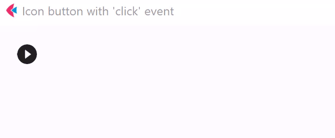
Handling clicks#
import flet as ft


def main(page: ft.Page):
    page.title = "IconButton Example"

    def button_clicked(e: ft.Event[ft.IconButton]):
        button.data += 1
        message.value = f"Button clicked {button.data} time(s)"
        page.update()

    page.add(
        button := ft.IconButton(
            icon=ft.Icons.PLAY_CIRCLE_FILL_OUTLINED,
            data=0,
            on_click=button_clicked,
        ),
        message := ft.Text(),
    )


ft.run(main)
Selected icon#
import flet as ft


def main(page: ft.Page):
    page.title = "IconButton Example"
    page.padding = 10
    page.horizontal_alignment = ft.CrossAxisAlignment.CENTER
    page.vertical_alignment = ft.MainAxisAlignment.CENTER

    def handle_click(e: ft.Event[ft.IconButton]):
        e.control.selected = not e.control.selected
        e.control.update()

    page.add(
        ft.IconButton(
            icon=ft.Icons.BATTERY_1_BAR,
            selected_icon=ft.Icons.BATTERY_FULL,
            scale=5,
            on_click=handle_click,
            selected=False,
            style=ft.ButtonStyle(
                color={
                    ft.ControlState.SELECTED: ft.Colors.GREEN,
                    ft.ControlState.DEFAULT: ft.Colors.RED,
                }
            ),
        )
    )


ft.run(main)
Properties#
class-attribute
instance-attribute
#
alignment: Alignment | None = None
Defines how the icon is positioned within this button.
Defaults to Alignment.CENTER.
class-attribute
instance-attribute
#
autofocus: bool = False
Whether this control will be provided initial focus. If there is more than one control on a page with autofocus set, then the first one added to the page will get focus.
class-attribute
instance-attribute
#
bgcolor: ColorValue | None = field(
    default=None, metadata={"skip": True}
)
The background color of this button.
class-attribute
instance-attribute
#
disabled_color: ColorValue | None = None
The color to use for the icon inside the button when disabled.
class-attribute
instance-attribute
#
enable_feedback: bool | None = None
Whether detected gestures should provide acoustic and/or haptic feedback.
On Android, for example, setting this to True produce a click sound and a
long-press will produce a short vibration.
class-attribute
instance-attribute
#
focus_color: ColorValue | None = None
The color of this button when in focus.
class-attribute
instance-attribute
#
highlight_color: ColorValue | None = None
The color of this button when it is pressed. The highlight fades in quickly as this button is pressed/held down.
class-attribute
instance-attribute
#
hover_color: ColorValue | None = None
The color of this button when hovered.
class-attribute
instance-attribute
#
icon: IconDataOrControl | None = None
An icon to be shown in this button.
class-attribute
instance-attribute
#
icon_color: ColorValue | None = None
The foreground color of the icon.
class-attribute
instance-attribute
#
icon_size: Number | None = None
The icon's size in virtual pixels.
Defaults to 24.
class-attribute
instance-attribute
#
mouse_cursor: MouseCursor | None = field(
    default=None, metadata={"skip": True}
)
The cursor to be displayed when a mouse pointer enters or is hovering over this control.
class-attribute
instance-attribute
#
padding: PaddingValue | None = None
Defines the padding around this button. The entire padded icon will react to input gestures.
Defaults to Padding.all(8).
class-attribute
instance-attribute
#
selected: bool | None = None
The optional selection state of this button.
If this property is not set, the button will behave as a normal push button,
otherwise, the button will toggle between showing icon
(when False), and selected_icon (when True).
class-attribute
instance-attribute
#
selected_icon: IconDataOrControl | None = None
The icon to be shown in this button for the 'selected' state.
class-attribute
instance-attribute
#
selected_icon_color: ColorValue | None = None
The icon color for the 'selected' state of this button.
class-attribute
instance-attribute
#
size_constraints: BoxConstraints | None = None
Size constraints for this button.
class-attribute
instance-attribute
#
splash_color: ColorValue | None = None
The primary color of this button when it is in the pressed state.
class-attribute
instance-attribute
#
splash_radius: Number | None = None
The splash radius.
Note
This value is honoured only when in Material 2
(Theme.use_material3 is False).
Raises:
-
ValueError–If
splash_radiusis not greater than0.
class-attribute
instance-attribute
#
style: ButtonStyle | None = None
Customizes this button's appearance.
Note
- Only honoured in Material 3 design (
Theme.use_material3isTrue). - If
Theme.use_material3isTrue, any parameters defined in style will be overridden by the corresponding parameters in this button. For example, if icon buttonvisual_densityis set toVisualDensity.STANDARDand style'svisual_densityis set toVisualDensity.COMPACT,VisualDensity.STANDARDwill be used.
class-attribute
instance-attribute
#
The URL to open when this button is clicked.
Additionally, if on_click event callback is provided,
it is fired after that.
class-attribute
instance-attribute
#
visual_density: VisualDensity | None = field(
    default=None, metadata={"skip": True}
)
Defines how compact this button's layout will be.
Events#
class-attribute
instance-attribute
#
on_blur: ControlEventHandler[IconButton] | None = None
Called when this button has lost focus.
class-attribute
instance-attribute
#
on_click: ControlEventHandler[IconButton] | None = None
Called when a user clicks this button.
class-attribute
instance-attribute
#
on_focus: ControlEventHandler[IconButton] | None = None
Called when this button has received focus.
class-attribute
instance-attribute
#
on_hover: ControlEventHandler[IconButton] | None = None
Called when the button is hovered.
class-attribute
instance-attribute
#
on_long_press: ControlEventHandler[IconButton] | None = None
Called when the button is long-pressed.