GestureDetector
A control that detects gestures.
Attempts to recognize gestures that correspond to its non-None callbacks.
If this control has a content, it defers to that child control for
its sizing behavior, else it grows to fit the parent instead.
Inherits: LayoutControl, AdaptiveControl
Properties
-
allowed_devices(list[PointerDeviceType] | None) –TBD
-
content(Control | None) –A child Control contained by the gesture detector.
-
drag_interval(int) –Throttling in milliseconds for horizontal drag, vertical drag and pan update events.
-
exclude_from_semantics(bool) –TBD
-
hover_interval(int) –Throttling in milliseconds for
on_hoverevent. -
mouse_cursor(MouseCursor | None) –The mouse cursor for mouse pointers that are hovering over the control.
-
multi_tap_touches(int) –The minimum number of pointers to trigger
on_multi_tapevent. -
trackpad_scroll_causes_scale(bool) –TBD
Events
-
on_double_tap(ControlEventHandler[GestureDetector] | None) –The user has tapped the screen with a primary button at the same location twice
-
on_double_tap_cancel(ControlEventHandler[GestureDetector] | None) –The pointer sequence that was expected to cause a double tap will not do so.
-
on_double_tap_down(EventHandler[TapEvent[GestureDetector]] | None) –Called when a pointer that might cause a double tap has contacted the screen at
-
on_enter(EventHandler[HoverEvent[GestureDetector]] | None) –Called when a mouse pointer has entered this control.
-
on_exit(EventHandler[HoverEvent[GestureDetector]] | None) –Called when a mouse pointer has exited this control.
-
on_force_press_end(EventHandler[ForcePressEvent[GestureDetector]] | None) –Called when the pointer that triggered a force press is no longer
-
on_force_press_peak(EventHandler[ForcePressEvent[GestureDetector]] | None) –Called when a pointer has pressed with a force exceeding the peak pressure.
-
on_force_press_start(EventHandler[ForcePressEvent[GestureDetector]] | None) –Called when a pointer has pressed with a force exceeding the start pressure.
-
on_force_press_update(EventHandler[ForcePressEvent[GestureDetector]] | None) –Called for each update after a force press has started.
-
on_horizontal_drag_cancel(ControlEventHandler[GestureDetector] | None) –The pointer that previously triggered
on_horizontal_drag_down -
on_horizontal_drag_down(EventHandler[DragDownEvent[GestureDetector]] | None) –Called when a pointer has contacted the screen and might begin to
-
on_horizontal_drag_end(EventHandler[DragEndEvent[GestureDetector]] | None) –Called when a pointer moving horizontally is no longer in contact and was
-
on_horizontal_drag_start(EventHandler[DragStartEvent[GestureDetector]] | None) –Called when a pointer has contacted the screen with a primary button and has
-
on_horizontal_drag_update(EventHandler[DragUpdateEvent[GestureDetector]] | None) –Called when a pointer that is in contact with the screen and moving horizontally
-
on_hover(EventHandler[HoverEvent[GestureDetector]] | None) –Called when a mouse pointer has entered this control.
-
on_long_press(ControlEventHandler[GestureDetector] | None) –Called when a long press gesture with a primary button has been recognized.
-
on_long_press_cancel(ControlEventHandler[GestureDetector] | None) –The pointer that previously triggered
on_long_press_down -
on_long_press_down(EventHandler[LongPressDownEvent[GestureDetector]] | None) –Called when a pointer that might cause a long press with a primary button
-
on_long_press_end(EventHandler[LongPressEndEvent[GestureDetector]] | None) –Called when a pointer that has triggered a long-press with a primary button has
-
on_long_press_move_update(EventHandler[LongPressMoveUpdateEvent[GestureDetector]] | None) –Called when, after a long press has been accepted, the pointer moves.
-
on_long_press_start(EventHandler[LongPressStartEvent[GestureDetector]] | None) –Triggered when a pointer has remained in contact with the screen at the same
-
on_long_press_up(ControlEventHandler[GestureDetector] | None) –Called when a pointer that has triggered a long press with a primary button
-
on_multi_long_press(EventHandler[LongPressEndEvent[GestureDetector]] | None) –Called when a long press gesture with multiple pointers has been recognized.
-
on_multi_tap(EventHandler[TapEvent[GestureDetector]] | None) –Called when multiple pointers contacted the screen.
-
on_pan_cancel(ControlEventHandler[GestureDetector] | None) –The pointer that previously triggered
on_pan_downwill not end up -
on_pan_down(EventHandler[DragDownEvent[GestureDetector]] | None) –Called when a pointer has contacted the screen and might begin to move.
-
on_pan_end(EventHandler[DragEndEvent[GestureDetector]] | None) –Called when a pointer is no longer in contact and was moving at a specific velocity.
-
on_pan_start(EventHandler[DragStartEvent[GestureDetector]] | None) –Called when a pointer has contacted the screen and has begun to move.
-
on_pan_update(EventHandler[DragUpdateEvent[GestureDetector]] | None) –Called when a pointer that is in contact with the screen and moving has moved again.
-
on_right_pan_end(EventHandler[PointerEvent[GestureDetector]] | None) –A pointer with secondary button pressed is no longer in contact
-
on_right_pan_start(EventHandler[PointerEvent[GestureDetector]] | None) –Pointer has contacted the screen while secondary button pressed
-
on_right_pan_update(EventHandler[PointerEvent[GestureDetector]] | None) –A pointer that is in contact with the screen, secondary button pressed
-
on_scale_end(EventHandler[ScaleEndEvent[GestureDetector]] | None) –TBD
-
on_scale_start(EventHandler[ScaleStartEvent[GestureDetector]] | None) –Called when the pointers in contact with the screen have established a focal
-
on_scale_update(EventHandler[ScaleUpdateEvent[GestureDetector]] | None) –TBD
-
on_scroll(EventHandler[ScrollEvent[GestureDetector]] | None) –TBD
-
on_secondary_long_press(ControlEventHandler[GestureDetector] | None) –Called when a long press gesture with a secondary button has been recognized.
-
on_secondary_long_press_cancel(ControlEventHandler[GestureDetector] | None) –The pointer that previously triggered
on_secondary_long_press_down -
on_secondary_long_press_down(EventHandler[LongPressDownEvent[GestureDetector]] | None) –Called when a pointer that might cause a long press with a secondary button
-
on_secondary_long_press_end(EventHandler[LongPressEndEvent[GestureDetector]] | None) –Called when a pointer that has triggered a long-press with a secondary button has
-
on_secondary_long_press_move_update(EventHandler[LongPressMoveUpdateEvent[GestureDetector]] | None) –Called when, after a secondary long press has been accepted, the pointer moves.
-
on_secondary_long_press_start(EventHandler[LongPressStartEvent[GestureDetector]] | None) –Triggered when a pointer has remained in contact with the screen at the same
-
on_secondary_long_press_up(ControlEventHandler[GestureDetector] | None) –Called when a pointer that has triggered a long press with a secondary button
-
on_secondary_tap(ControlEventHandler[GestureDetector] | None) –A tap with a secondary button has occurred.
-
on_secondary_tap_cancel(ControlEventHandler[GestureDetector] | None) –The pointer that previously triggered
on_secondary_tap_down -
on_secondary_tap_down(EventHandler[TapEvent[GestureDetector]] | None) –Called when a pointer that might cause a tap with a secondary button has contacted
-
on_secondary_tap_up(EventHandler[TapEvent[GestureDetector]] | None) –Called when a pointer that will trigger a tap with a secondary button has stopped
-
on_tap(EventHandler[TapEvent[GestureDetector]] | None) –Called when a tap with a primary button has occurred.
-
on_tap_cancel(ControlEventHandler[GestureDetector] | None) –The pointer that previously triggered
on_tap_downwill not -
on_tap_down(EventHandler[TapEvent[GestureDetector]] | None) –Called when a pointer that might cause a tap with a primary button has contacted
-
on_tap_move(EventHandler[TapMoveEvent[GestureDetector]] | None) –Called when a pointer that triggered a tap has moved.
-
on_tap_up(EventHandler[TapEvent[GestureDetector]] | None) –Called when a pointer that will trigger a tap with a primary button has stopped
-
on_tertiary_long_press(ControlEventHandler[GestureDetector] | None) –Called when a long press gesture with a tertiary button has been recognized.
-
on_tertiary_long_press_cancel(ControlEventHandler[GestureDetector] | None) –The pointer that previously triggered
on_tertiary_long_press_down -
on_tertiary_long_press_down(EventHandler[LongPressDownEvent[GestureDetector]] | None) –Called when a pointer that might cause a long press with a tertiary button
-
on_tertiary_long_press_end(EventHandler[LongPressEndEvent[GestureDetector]] | None) –Called when a pointer that has triggered a long-press with a tertiary button has
-
on_tertiary_long_press_move_update(EventHandler[LongPressMoveUpdateEvent[GestureDetector]] | None) –Called when, after a tertiary long press has been accepted, the pointer moves.
-
on_tertiary_long_press_start(EventHandler[LongPressStartEvent[GestureDetector]] | None) –Triggered when a pointer has remained in contact with the screen at the same
-
on_tertiary_long_press_up(ControlEventHandler[GestureDetector] | None) –Called when a pointer that has triggered a long press with a tertiary button
-
on_tertiary_tap_cancel(ControlEventHandler[GestureDetector] | None) –The pointer that previously triggered
on_tertiary_tap_down -
on_tertiary_tap_down(EventHandler[TapEvent[GestureDetector]] | None) –Called when a pointer that might cause a tap with a tertiary button has contacted
-
on_tertiary_tap_up(EventHandler[TapEvent[GestureDetector]] | None) –Called when a pointer that will trigger a tap with a tertiary button has stopped
-
on_vertical_drag_cancel(ControlEventHandler[GestureDetector] | None) –The pointer that previously triggered
on_vertical_drag_down -
on_vertical_drag_down(EventHandler[DragDownEvent[GestureDetector]] | None) –Called when a pointer has contacted the screen and might begin to
-
on_vertical_drag_end(EventHandler[DragEndEvent[GestureDetector]] | None) –Called when a pointer moving vertically is no longer in contact and was
-
on_vertical_drag_start(EventHandler[DragStartEvent[GestureDetector]] | None) –Called when a pointer has contacted the screen and has begun to move vertically.
-
on_vertical_drag_update(EventHandler[DragUpdateEvent[GestureDetector]] | None) –A pointer moving vertically has moved in the vertical direction.
Examples#
Handling events#
import flet as ft


def main(page: ft.Page):
    page.add(
        ft.GestureDetector(
            content=ft.Container(bgcolor=ft.Colors.GREEN, width=200, height=200),
            hover_interval=50,
            on_tap=lambda e: print(e),
            on_tap_down=lambda e: print(e),
            on_tap_up=lambda e: print(e),
            on_secondary_tap=lambda e: print(e),
            on_secondary_tap_down=lambda e: print(e),
            on_secondary_tap_up=lambda e: print(e),
            on_long_press_start=lambda e: print(e),
            on_long_press_end=lambda e: print(e),
            on_secondary_long_press_start=lambda e: print(e),
            on_secondary_long_press_end=lambda e: print(e),
            on_double_tap=lambda e: print(e),
            on_double_tap_down=lambda e: print(e),
            on_pan_start=lambda e: print(e),
            on_pan_update=lambda e: print(e),
            on_pan_end=lambda e: print(e),
            on_hover=lambda e: print(e),
            on_enter=lambda e: print(e),
            on_exit=lambda e: print(e),
        )
    )


ft.run(main)
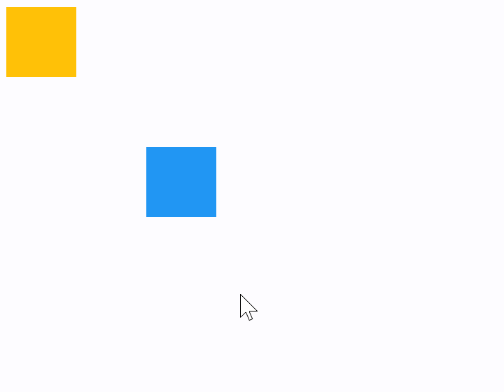
Draggable containers#
The following example demonstrates how a control can be freely dragged inside a Stack.
The sample also shows that GestureDetector can have a child control (blue container) as well as be nested inside another control (yellow container) giving the same results.
import flet as ft


def main(page: ft.Page):
    def handle_pan_update1(e: ft.DragUpdateEvent[ft.GestureDetector]):
        container = e.control.parent
        container.top = max(0.0, container.top + e.local_delta.y)
        container.left = max(0.0, container.left + e.local_delta.x)
        container.update()

    def handle_pan_update2(e: ft.DragUpdateEvent[ft.GestureDetector]):
        e.control.top = max(0.0, e.control.top + e.local_delta.y)
        e.control.left = max(0.0, e.control.left + e.local_delta.x)
        e.control.update()

    page.add(
        ft.Stack(
            width=1000,
            height=500,
            controls=[
                ft.Container(
                    bgcolor=ft.Colors.AMBER,
                    width=50,
                    height=50,
                    left=0,
                    top=0,
                    content=ft.GestureDetector(
                        mouse_cursor=ft.MouseCursor.MOVE,
                        drag_interval=50,
                        on_pan_update=handle_pan_update1,
                    ),
                ),
                ft.GestureDetector(
                    mouse_cursor=ft.MouseCursor.MOVE,
                    drag_interval=10,
                    on_vertical_drag_update=handle_pan_update2,
                    left=100,
                    top=100,
                    content=ft.Container(bgcolor=ft.Colors.BLUE, width=50, height=50),
                ),
            ],
        )
    )


ft.run(main)
Window drag area#
import flet as ft


def main(page: ft.Page):
    def on_pan_update(e: ft.DragUpdateEvent[ft.GestureDetector]):
        page.window.left += e.global_delta.x
        page.window.top += e.global_delta.y
        page.update()

    page.add(
        ft.Stack(
            width=1000,
            height=500,
            controls=[
                ft.GestureDetector(
                    mouse_cursor=ft.MouseCursor.MOVE,
                    on_pan_update=on_pan_update,
                    left=200,
                    top=200,
                    content=ft.Container(bgcolor=ft.Colors.PINK, width=50, height=50),
                ),
            ],
        )
    )


ft.run(main)
Mouse Cursors#
import random

import flet as ft


def main(page: ft.Page):
    def on_pan_update(event: ft.DragUpdateEvent[ft.GestureDetector]):
        container.top = max(0.0, container.top + event.delta_y)
        container.left = max(0.0, container.left + event.delta_x)
        container.update()

    gesture_detector = ft.GestureDetector(
        mouse_cursor=ft.MouseCursor.BASIC,
        drag_interval=50,
        on_pan_update=on_pan_update,
    )
    container = ft.Container(
        content=gesture_detector,
        bgcolor=ft.Colors.AMBER,
        width=150,
        height=150,
        left=0,
        top=0,
    )

    def handle_button_click(e: ft.Event[ft.Button]):
        gesture_detector.mouse_cursor = random.choice(list(ft.MouseCursor))
        text.value = f"Mouse Cursor:  {gesture_detector.mouse_cursor}"
        page.update()

    page.add(
        ft.Stack(controls=[container], width=1000, height=500),
        ft.Button("Change mouse Cursor", on_click=handle_button_click),
        text := ft.Text(f"Mouse Cursor:  {gesture_detector.mouse_cursor}"),
    )


ft.run(main)
Properties#
class-attribute
instance-attribute
#
allowed_devices: list[PointerDeviceType] | None = None
TBD
class-attribute
instance-attribute
#
content: Control | None = None
A child Control contained by the gesture detector.
class-attribute
instance-attribute
#
drag_interval: int = 0
Throttling in milliseconds for horizontal drag, vertical drag and pan update events.
When a user moves a pointer a lot of events are being generated to do precise
tracking. drag_interval allows sending drag update events to a Flet program every
X milliseconds, thus preserving the bandwidth (web and mobile apps).
Default is 0 - no throttling, all events are sent to a Flet program, very smooth
tracking.
class-attribute
instance-attribute
#
exclude_from_semantics: bool = False
TBD
class-attribute
instance-attribute
#
hover_interval: int = 0
Throttling in milliseconds for on_hover event.
class-attribute
instance-attribute
#
mouse_cursor: MouseCursor | None = None
The mouse cursor for mouse pointers that are hovering over the control.
class-attribute
instance-attribute
#
multi_tap_touches: int = 0
The minimum number of pointers to trigger on_multi_tap event.
class-attribute
instance-attribute
#
trackpad_scroll_causes_scale: bool = False
TBD
Events#
class-attribute
instance-attribute
#
on_double_tap: (
    ControlEventHandler[GestureDetector] | None
) = None
The user has tapped the screen with a primary button at the same location twice in quick succession.
class-attribute
instance-attribute
#
on_double_tap_cancel: (
    ControlEventHandler[GestureDetector] | None
) = None
The pointer sequence that was expected to cause a double tap will not do so.
class-attribute
instance-attribute
#
on_double_tap_down: (
    EventHandler[TapEvent[GestureDetector]] | None
) = None
Called when a pointer that might cause a double tap has contacted the screen at a particular location.
Triggered immediately after the down event of the second tap.
class-attribute
instance-attribute
#
on_enter: (
    EventHandler[HoverEvent[GestureDetector]] | None
) = None
Called when a mouse pointer has entered this control.
class-attribute
instance-attribute
#
on_exit: (
    EventHandler[HoverEvent[GestureDetector]] | None
) = None
Called when a mouse pointer has exited this control.
class-attribute
instance-attribute
#
on_force_press_end: (
    EventHandler[ForcePressEvent[GestureDetector]] | None
) = None
Called when the pointer that triggered a force press is no longer in contact with the screen.
class-attribute
instance-attribute
#
on_force_press_peak: (
    EventHandler[ForcePressEvent[GestureDetector]] | None
) = None
Called when a pointer has pressed with a force exceeding the peak pressure.
class-attribute
instance-attribute
#
on_force_press_start: (
    EventHandler[ForcePressEvent[GestureDetector]] | None
) = None
Called when a pointer has pressed with a force exceeding the start pressure.
class-attribute
instance-attribute
#
on_force_press_update: (
    EventHandler[ForcePressEvent[GestureDetector]] | None
) = None
Called for each update after a force press has started.
class-attribute
instance-attribute
#
on_horizontal_drag_cancel: (
    ControlEventHandler[GestureDetector] | None
) = None
The pointer that previously triggered on_horizontal_drag_down
will not end up causing a horizontal drag.
class-attribute
instance-attribute
#
on_horizontal_drag_down: (
    EventHandler[DragDownEvent[GestureDetector]] | None
) = None
Called when a pointer has contacted the screen and might begin to move horizontally.
class-attribute
instance-attribute
#
on_horizontal_drag_end: (
    EventHandler[DragEndEvent[GestureDetector]] | None
) = None
Called when a pointer moving horizontally is no longer in contact and was moving at a specific velocity.
class-attribute
instance-attribute
#
on_horizontal_drag_start: (
    EventHandler[DragStartEvent[GestureDetector]] | None
) = None
Called when a pointer has contacted the screen with a primary button and has begun to move horizontally.
class-attribute
instance-attribute
#
on_horizontal_drag_update: (
    EventHandler[DragUpdateEvent[GestureDetector]] | None
) = None
Called when a pointer that is in contact with the screen and moving horizontally has moved in the horizontal direction.
class-attribute
instance-attribute
#
on_hover: (
    EventHandler[HoverEvent[GestureDetector]] | None
) = None
Called when a mouse pointer has entered this control.
class-attribute
instance-attribute
#
on_long_press: (
    ControlEventHandler[GestureDetector] | None
) = None
Called when a long press gesture with a primary button has been recognized.
class-attribute
instance-attribute
#
on_long_press_cancel: (
    ControlEventHandler[GestureDetector] | None
) = None
The pointer that previously triggered on_long_press_down
will not end up causing a long-press.
class-attribute
instance-attribute
#
on_long_press_down: (
    EventHandler[LongPressDownEvent[GestureDetector]] | None
) = None
Called when a pointer that might cause a long press with a primary button has contacted the screen.
class-attribute
instance-attribute
#
on_long_press_end: (
    EventHandler[LongPressEndEvent[GestureDetector]] | None
) = None
Called when a pointer that has triggered a long-press with a primary button has stopped contacting the screen.
class-attribute
instance-attribute
#
on_long_press_move_update: (
    EventHandler[LongPressMoveUpdateEvent[GestureDetector]]
    | None
) = None
Called when, after a long press has been accepted, the pointer moves.
class-attribute
instance-attribute
#
on_long_press_start: (
    EventHandler[LongPressStartEvent[GestureDetector]]
    | None
) = None
Triggered when a pointer has remained in contact with the screen at the same location for a long period of time.
class-attribute
instance-attribute
#
on_long_press_up: (
    ControlEventHandler[GestureDetector] | None
) = None
Called when a pointer that has triggered a long press with a primary button is no longer in contact with the screen.
class-attribute
instance-attribute
#
on_multi_long_press: (
    EventHandler[LongPressEndEvent[GestureDetector]] | None
) = None
Called when a long press gesture with multiple pointers has been recognized.
class-attribute
instance-attribute
#
on_multi_tap: (
    EventHandler[TapEvent[GestureDetector]] | None
) = None
Called when multiple pointers contacted the screen.
class-attribute
instance-attribute
#
on_pan_cancel: (
    ControlEventHandler[GestureDetector] | None
) = None
The pointer that previously triggered on_pan_down will not end up
causing a pan gesture.
class-attribute
instance-attribute
#
on_pan_down: (
    EventHandler[DragDownEvent[GestureDetector]] | None
) = None
Called when a pointer has contacted the screen and might begin to move.
class-attribute
instance-attribute
#
on_pan_end: (
    EventHandler[DragEndEvent[GestureDetector]] | None
) = None
Called when a pointer is no longer in contact and was moving at a specific velocity.
class-attribute
instance-attribute
#
on_pan_start: (
    EventHandler[DragStartEvent[GestureDetector]] | None
) = None
Called when a pointer has contacted the screen and has begun to move.
class-attribute
instance-attribute
#
on_pan_update: (
    EventHandler[DragUpdateEvent[GestureDetector]] | None
) = None
Called when a pointer that is in contact with the screen and moving has moved again.
class-attribute
instance-attribute
#
on_right_pan_end: (
    EventHandler[PointerEvent[GestureDetector]] | None
) = None
A pointer with secondary button pressed is no longer in contact and was moving at a specific velocity.
class-attribute
instance-attribute
#
on_right_pan_start: (
    EventHandler[PointerEvent[GestureDetector]] | None
) = None
Pointer has contacted the screen while secondary button pressed and has begun to move.
class-attribute
instance-attribute
#
on_right_pan_update: (
    EventHandler[PointerEvent[GestureDetector]] | None
) = None
A pointer that is in contact with the screen, secondary button pressed and moving has moved again.
class-attribute
instance-attribute
#
on_scale_end: (
    EventHandler[ScaleEndEvent[GestureDetector]] | None
) = None
TBD
class-attribute
instance-attribute
#
on_scale_start: (
    EventHandler[ScaleStartEvent[GestureDetector]] | None
) = None
Called when the pointers in contact with the screen have established a focal
point and initial scale of 1.0.
class-attribute
instance-attribute
#
on_scale_update: (
    EventHandler[ScaleUpdateEvent[GestureDetector]] | None
) = None
TBD
class-attribute
instance-attribute
#
on_scroll: (
    EventHandler[ScrollEvent[GestureDetector]] | None
) = None
TBD
class-attribute
instance-attribute
#
on_secondary_long_press: (
    ControlEventHandler[GestureDetector] | None
) = None
Called when a long press gesture with a secondary button has been recognized.
class-attribute
instance-attribute
#
on_secondary_long_press_cancel: (
    ControlEventHandler[GestureDetector] | None
) = None
The pointer that previously triggered on_secondary_long_press_down
not end up causing a long-press.
class-attribute
instance-attribute
#
on_secondary_long_press_down: (
    EventHandler[LongPressDownEvent[GestureDetector]] | None
) = None
Called when a pointer that might cause a long press with a secondary button has contacted the screen.
class-attribute
instance-attribute
#
on_secondary_long_press_end: (
    EventHandler[LongPressEndEvent[GestureDetector]] | None
) = None
Called when a pointer that has triggered a long-press with a secondary button has stopped contacting the screen.
class-attribute
instance-attribute
#
on_secondary_long_press_move_update: (
    EventHandler[LongPressMoveUpdateEvent[GestureDetector]]
    | None
) = None
Called when, after a secondary long press has been accepted, the pointer moves.
class-attribute
instance-attribute
#
on_secondary_long_press_start: (
    EventHandler[LongPressStartEvent[GestureDetector]]
    | None
) = None
Triggered when a pointer has remained in contact with the screen at the same location for a long period of time.
class-attribute
instance-attribute
#
on_secondary_long_press_up: (
    ControlEventHandler[GestureDetector] | None
) = None
Called when a pointer that has triggered a long press with a secondary button is no longer in contact with the screen.
class-attribute
instance-attribute
#
on_secondary_tap: (
    ControlEventHandler[GestureDetector] | None
) = None
A tap with a secondary button has occurred.
class-attribute
instance-attribute
#
on_secondary_tap_cancel: (
    ControlEventHandler[GestureDetector] | None
) = None
The pointer that previously triggered on_secondary_tap_down
will not end up causing a tap.
class-attribute
instance-attribute
#
on_secondary_tap_down: (
    EventHandler[TapEvent[GestureDetector]] | None
) = None
Called when a pointer that might cause a tap with a secondary button has contacted the screen at a particular location.
class-attribute
instance-attribute
#
on_secondary_tap_up: (
    EventHandler[TapEvent[GestureDetector]] | None
) = None
Called when a pointer that will trigger a tap with a secondary button has stopped contacting the screen at a particular location.
class-attribute
instance-attribute
#
on_tap: EventHandler[TapEvent[GestureDetector]] | None = (
    None
)
Called when a tap with a primary button has occurred.
class-attribute
instance-attribute
#
on_tap_cancel: (
    ControlEventHandler[GestureDetector] | None
) = None
The pointer that previously triggered on_tap_down will not
end up causing a tap.
class-attribute
instance-attribute
#
on_tap_down: (
    EventHandler[TapEvent[GestureDetector]] | None
) = None
Called when a pointer that might cause a tap with a primary button has contacted the screen at a particular location.
class-attribute
instance-attribute
#
on_tap_move: (
    EventHandler[TapMoveEvent[GestureDetector]] | None
) = None
Called when a pointer that triggered a tap has moved.
class-attribute
instance-attribute
#
on_tap_up: (
    EventHandler[TapEvent[GestureDetector]] | None
) = None
Called when a pointer that will trigger a tap with a primary button has stopped contacting the screen at a particular location.
class-attribute
instance-attribute
#
on_tertiary_long_press: (
    ControlEventHandler[GestureDetector] | None
) = None
Called when a long press gesture with a tertiary button has been recognized.
class-attribute
instance-attribute
#
on_tertiary_long_press_cancel: (
    ControlEventHandler[GestureDetector] | None
) = None
The pointer that previously triggered on_tertiary_long_press_down
will not end up causing a long-press.
class-attribute
instance-attribute
#
on_tertiary_long_press_down: (
    EventHandler[LongPressDownEvent[GestureDetector]] | None
) = None
Called when a pointer that might cause a long press with a tertiary button has contacted the screen.
class-attribute
instance-attribute
#
on_tertiary_long_press_end: (
    EventHandler[LongPressEndEvent[GestureDetector]] | None
) = None
Called when a pointer that has triggered a long-press with a tertiary button has stopped contacting the screen.
class-attribute
instance-attribute
#
on_tertiary_long_press_move_update: (
    EventHandler[LongPressMoveUpdateEvent[GestureDetector]]
    | None
) = None
Called when, after a tertiary long press has been accepted, the pointer moves.
class-attribute
instance-attribute
#
on_tertiary_long_press_start: (
    EventHandler[LongPressStartEvent[GestureDetector]]
    | None
) = None
Triggered when a pointer has remained in contact with the screen at the same location for a long period of time.
class-attribute
instance-attribute
#
on_tertiary_long_press_up: (
    ControlEventHandler[GestureDetector] | None
) = None
Called when a pointer that has triggered a long press with a tertiary button is no longer in contact with the screen.
class-attribute
instance-attribute
#
on_tertiary_tap_cancel: (
    ControlEventHandler[GestureDetector] | None
) = None
The pointer that previously triggered on_tertiary_tap_down
will not end up causing a tap.
class-attribute
instance-attribute
#
on_tertiary_tap_down: (
    EventHandler[TapEvent[GestureDetector]] | None
) = None
Called when a pointer that might cause a tap with a tertiary button has contacted the screen at a particular location.
class-attribute
instance-attribute
#
on_tertiary_tap_up: (
    EventHandler[TapEvent[GestureDetector]] | None
) = None
Called when a pointer that will trigger a tap with a tertiary button has stopped contacting the screen at a particular location.
class-attribute
instance-attribute
#
on_vertical_drag_cancel: (
    ControlEventHandler[GestureDetector] | None
) = None
The pointer that previously triggered on_vertical_drag_down
will not end up causing a vertical drag.
class-attribute
instance-attribute
#
on_vertical_drag_down: (
    EventHandler[DragDownEvent[GestureDetector]] | None
) = None
Called when a pointer has contacted the screen and might begin to move vertically.
class-attribute
instance-attribute
#
on_vertical_drag_end: (
    EventHandler[DragEndEvent[GestureDetector]] | None
) = None
Called when a pointer moving vertically is no longer in contact and was moving at a specific velocity.
class-attribute
instance-attribute
#
on_vertical_drag_start: (
    EventHandler[DragStartEvent[GestureDetector]] | None
) = None
Called when a pointer has contacted the screen and has begun to move vertically.
class-attribute
instance-attribute
#
on_vertical_drag_update: (
    EventHandler[DragUpdateEvent[GestureDetector]] | None
) = None
A pointer moving vertically has moved in the vertical direction.