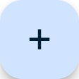
FloatingActionButton
A floating action button is a circular icon button that hovers over content to promote a primary action in the application. Floating action button is usually set to page.floating_action_button, but can also be added as a regular control at any place on a page.
Basic FloatingActionButton
Inherits: LayoutControl
Properties
-
autofocus(bool) –True if the control will be selected as the initial focus. If there is more than one control on a page with autofocus set, then the first one added to the page will get focus.
-
bgcolor(ColorValue | None) –Button background color.
-
clip_behavior(ClipBehavior) –Defines how the
contentis clipped. -
content(StrOrControl | None) –The content of this button.
-
disabled_elevation(Number | None) –The elevation of this button when disabled.
-
elevation(Number | None) –The elevation of this button.
-
enable_feedback(bool | None) –Whether detected gestures should provide acoustic and/or haptic feedback. On Android, for example, setting this to
Truewill produce a click sound and a long-press will produce a short vibration. -
focus_color(ColorValue | None) –The color to use for filling this button when it has input focus.
-
focus_elevation(Number | None) –The elevation of this button when it has input focus.
-
foreground_color(ColorValue | None) –The default foreground color for icons and text within this button.
-
highlight_elevation(Number | None) –The elevation of this button when it is highlighted.
-
hover_color(ColorValue | None) –The color to use for filling this button when hovered.
-
hover_elevation(Number | None) –The elevation of this button it is enabled and being hovered over.
-
icon(IconDataOrControl | None) –Icon shown in this button.
-
mini(bool) –Controls the size of this button.
-
mouse_cursor(MouseCursor | None) –The cursor to be displayed when a mouse pointer enters or is hovering over this control.
-
shape(OutlinedBorder | None) –The shape of the FAB's border.
-
splash_color(ColorValue | None) –The color to use for the ink splash.
-
url(str | Url | None) –The URL to open when this button is clicked.
Events
-
on_click(ControlEventHandler[FloatingActionButton] | None) –Called when a user clicks this button.
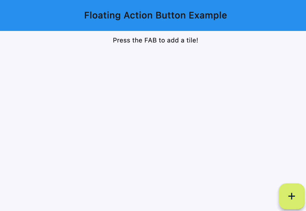
Examples#
Handling clicks#
import flet as ft


def main(page: ft.Page):
    page.title = "Floating Action Button"
    page.theme_mode = ft.ThemeMode.LIGHT
    page.horizontal_alignment = ft.CrossAxisAlignment.CENTER
    page.padding = 0
    page.scroll = ft.ScrollMode.HIDDEN

    # keeps track of the number of tiles already added
    count = 1

    def handle_fab_click(e: ft.Event[ft.FloatingActionButton]):
        nonlocal count  # to modify the count variable found in the outer scope
        page.add(
            ft.ListTile(
                title=ft.Text(f"Tile {count}"),
                bgcolor=ft.Colors.TEAL_300,
                leading=ft.Icon(
                    ft.Icons.CIRCLE_OUTLINED, color=ft.Colors.DEEP_ORANGE_300
                ),
                on_click=lambda x: print(x.control.title.value + " was clicked!"),
            )
        )
        page.show_dialog(ft.SnackBar(ft.Text("Tile was added successfully!")))
        count += 1

    page.floating_action_button = ft.FloatingActionButton(
        icon=ft.Icons.ADD,
        on_click=handle_fab_click,
        bgcolor=ft.Colors.LIME_300,
    )

    page.add(
        ft.Container(
            bgcolor=ft.Colors.BLUE,
            padding=ft.Padding.all(20),
            content=ft.Row(
                alignment=ft.MainAxisAlignment.CENTER,
                controls=[
                    ft.Text(
                        value="Floating Action Button Example",
                        style=ft.TextStyle(size=20, weight=ft.FontWeight.W_500),
                    )
                ],
            ),
        ),
        ft.Text("Press the FAB to add a tile!"),
    )


ft.run(main)
Properties#
class-attribute
instance-attribute
#
autofocus: bool = False
True if the control will be selected as the initial focus. If there is more than one control on a page with autofocus set, then the first one added to the page will get focus.
class-attribute
instance-attribute
#
bgcolor: ColorValue | None = None
Button background color.
class-attribute
instance-attribute
#
clip_behavior: ClipBehavior = NONE
Defines how the content is clipped.
class-attribute
instance-attribute
#
content: StrOrControl | None = None
The content of this button.
Raises:
-
ValueError–If neither
iconnor a validcontent(string or visible Control) is provided.
class-attribute
instance-attribute
#
disabled_elevation: Number | None = None
The elevation of this button when disabled.
Defaults to the same value as elevation.
Raises:
-
ValueError–If it is less than
0.
class-attribute
instance-attribute
#
enable_feedback: bool | None = None
Whether detected gestures should provide acoustic and/or haptic feedback. On Android, for example, setting this to True will produce a click sound and a long-press will produce a short vibration.
class-attribute
instance-attribute
#
focus_color: ColorValue | None = None
The color to use for filling this button when it has input focus.
class-attribute
instance-attribute
#
focus_elevation: Number | None = None
The elevation of this button when it has input focus.
Defaults to 8.
Raises:
-
ValueError–If it is less than
0.
class-attribute
instance-attribute
#
foreground_color: ColorValue | None = None
The default foreground color for icons and text within this button.
class-attribute
instance-attribute
#
highlight_elevation: Number | None = None
The elevation of this button when it is highlighted.
Defaults to 12.
Raises:
-
ValueError–If it is less than
0.
class-attribute
instance-attribute
#
hover_color: ColorValue | None = None
The color to use for filling this button when hovered.
class-attribute
instance-attribute
#
hover_elevation: Number | None = None
The elevation of this button it is enabled and being hovered over.
Defaults to 8.
Raises:
-
ValueError–If it is less than
0.
class-attribute
instance-attribute
#
icon: IconDataOrControl | None = None
Icon shown in this button.
class-attribute
instance-attribute
#
mini: bool = False
Controls the size of this button.
By default, floating action buttons are non-mini and have a height and width of
56.0 logical pixels. Mini floating action buttons have a height and width of
40.0 logical pixels with a layout width and height of 48.0 logical pixels.
class-attribute
instance-attribute
#
mouse_cursor: MouseCursor | None = None
The cursor to be displayed when a mouse pointer enters or is hovering over this control.
class-attribute
instance-attribute
#
shape: OutlinedBorder | None = None
The shape of the FAB's border.
class-attribute
instance-attribute
#
splash_color: ColorValue | None = None
The color to use for the ink splash.
class-attribute
instance-attribute
#
The URL to open when this button is clicked.
Additionally, if on_click event callback
is provided, it is fired after that.
Events#
class-attribute
instance-attribute
#
on_click: (
    ControlEventHandler[FloatingActionButton] | None
) = None
Called when a user clicks this button.