ExpansionPanel
A material expansion panel. It can either be expanded or collapsed. Its body is only visible when it is expanded.
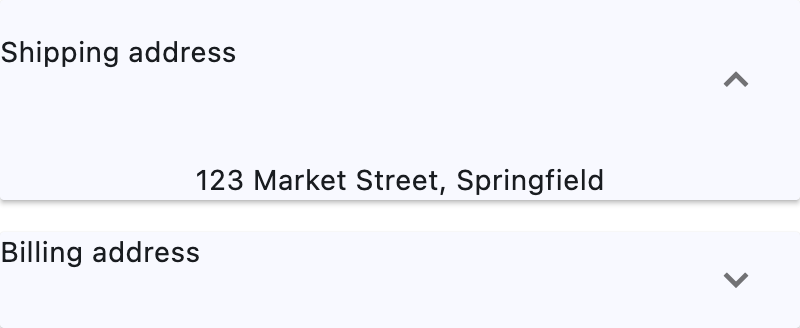
Basic ExpansionPanel
Inherits: LayoutControl, AdaptiveControl
Properties
-
bgcolor(ColorValue | None) –The background color of the panel.
-
can_tap_header(bool) –If
True, tapping on the panel'sheaderwill expand or collapse it. -
content(Control | None) –The control to be found in the body of the
ExpansionPanel. It is displayed below -
expanded(bool) –Whether expanded(
True) or collapsed(False). -
header(Control | None) –The control to be found in the header of the
ExpansionPanel. Ifcan_tap_header -
highlight_color(ColorValue | None) –TBD
-
splash_color(ColorValue | None) –TBD
Properties#
class-attribute
instance-attribute
#
bgcolor: ColorValue | None = None
The background color of the panel.
class-attribute
instance-attribute
#
can_tap_header: bool = False
If True, tapping on the panel's header will expand or collapse it.
class-attribute
instance-attribute
#
content: Control | None = None
The control to be found in the body of the ExpansionPanel. It is displayed below
the header when the panel is expanded.
If this property is None, the ExpansionPanel will have a placeholder Text as
content.
class-attribute
instance-attribute
#
expanded: bool = False
Whether expanded(True) or collapsed(False).
class-attribute
instance-attribute
#
header: Control | None = None
The control to be found in the header of the ExpansionPanel. If can_tap_header
is True, tapping on the header will expand or collapse the panel.
If this property is None, the ExpansionPanel will have a placeholder Text as
header.