Draggable
A control that can be dragged from to a DragTarget.
When a draggable control recognizes the start of a drag gesture, it displays the
content_feedback control that tracks the user's finger across the screen.
If the user lifts their finger while on top of a DragTarget, this target is
given the opportunity to complete drag-and-drop flow.
Inherits: Control
Properties
-
affinity(Axis | None) –Specifies the axis along which this control competes with other gestures to initiate a drag.
-
axis(Axis | None) –Restricts the draggable's movement to a specific axis.
-
content(Control) –The control to display when the draggable is not being dragged.
-
content_feedback(Control | None) –The control to show under the pointer when a drag is under way.
-
content_when_dragging(Control | None) –The control to display instead of
contentwhen this draggable is being dragged. -
group(str) –The group this draggable belongs to.
-
max_simultaneous_drags(int | None) –Specifies how many simultaneous drag operations are allowed for this draggable.
Events
-
on_drag_complete(ControlEventHandler[Draggable] | None) –Called when this draggable is dropped and accepted by a
DragTarget. -
on_drag_start(ControlEventHandler[Draggable] | None) –Called when this draggable starts being dragged.
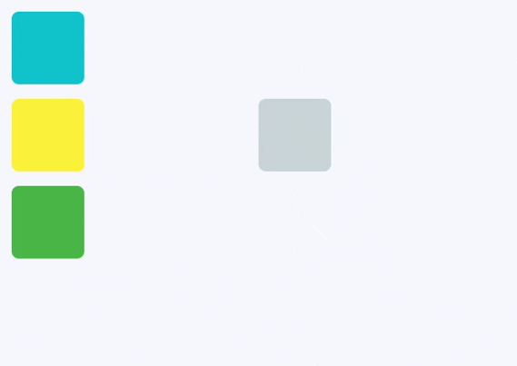
Examples#
Drag and drop Containers#
Imperative#
import flet as ft


def main(page: ft.Page):
    def handle_drag_will_accept(e: ft.DragWillAcceptEvent):
        e.control.content.border = ft.Border.all(
            2, ft.Colors.BLACK_45 if e.accept else ft.Colors.RED
        )
        e.control.update()

    def handle_drag_accept(e: ft.DragTargetEvent):
        src = page.get_control(e.src_id)
        e.control.content.bgcolor = src.content.bgcolor
        e.control.content.border = None
        e.control.update()

    def handle_drag_leave(e: ft.DragTargetLeaveEvent):
        e.control.content.border = None
        e.control.update()

    page.add(
        ft.Row(
            controls=[
                ft.Column(
                    controls=[
                        ft.Draggable(
                            group="color",
                            content=ft.Container(
                                width=50,
                                height=50,
                                bgcolor=ft.Colors.CYAN,
                                border_radius=5,
                            ),
                            content_feedback=ft.Container(
                                width=20,
                                height=20,
                                bgcolor=ft.Colors.CYAN,
                                border_radius=3,
                            ),
                        ),
                        ft.Draggable(
                            group="color",
                            content=ft.Container(
                                width=50,
                                height=50,
                                bgcolor=ft.Colors.YELLOW,
                                border_radius=5,
                            ),
                        ),
                        ft.Draggable(
                            group="color",
                            content=ft.Container(
                                width=50,
                                height=50,
                                bgcolor=ft.Colors.GREEN,
                                border_radius=5,
                            ),
                        ),
                    ]
                ),
                ft.Container(width=100),
                ft.DragTarget(
                    group="color",
                    on_will_accept=handle_drag_will_accept,
                    on_accept=handle_drag_accept,
                    on_leave=handle_drag_leave,
                    content=ft.Container(
                        width=50,
                        height=50,
                        bgcolor=ft.Colors.BLUE_GREY_100,
                        border_radius=5,
                    ),
                ),
            ]
        )
    )


ft.run(main)
Declarative#
from dataclasses import dataclass

import flet as ft


@dataclass
@ft.observable
class TargetState:
    bgcolor: ft.Colors = ft.Colors.BLUE_GREY_100
    is_drag_over: bool = False


@ft.component
def App():
    target, _ = ft.use_state(lambda: TargetState())

    def on_will_accept(e: ft.DragWillAcceptEvent):
        target.is_drag_over = True

    def on_accept(e: ft.DragTargetEvent):
        target.bgcolor = e.src.data
        target.is_drag_over = False

    def on_leave(e: ft.DragTargetLeaveEvent):
        target.is_drag_over = False

    return ft.Row(
        controls=[
            ft.Column(
                controls=[
                    ft.Draggable(
                        group="color",
                        data=ft.Colors.CYAN,
                        content=ft.Container(
                            width=50,
                            height=50,
                            bgcolor=ft.Colors.CYAN,
                            border_radius=5,
                        ),
                        content_feedback=ft.Container(
                            width=20,
                            height=20,
                            bgcolor=ft.Colors.CYAN,
                            border_radius=3,
                        ),
                    ),
                    ft.Draggable(
                        group="color",
                        data=ft.Colors.YELLOW,
                        content=ft.Container(
                            width=50,
                            height=50,
                            bgcolor=ft.Colors.YELLOW,
                            border_radius=5,
                        ),
                    ),
                    ft.Draggable(
                        group="color",
                        data=ft.Colors.GREEN,
                        content=ft.Container(
                            width=50,
                            height=50,
                            bgcolor=ft.Colors.GREEN,
                            border_radius=5,
                        ),
                    ),
                ]
            ),
            ft.Container(width=100),
            ft.DragTarget(
                group="color",
                on_will_accept=on_will_accept,
                on_accept=on_accept,
                on_leave=on_leave,
                content=ft.Container(
                    width=50,
                    height=50,
                    bgcolor=target.bgcolor,
                    border=ft.Border.all(2, ft.Colors.BLACK_45)
                    if target.is_drag_over
                    else None,
                    border_radius=5,
                ),
            ),
        ]
    )


ft.run(lambda page: page.render(App))
Properties#
class-attribute
instance-attribute
#
affinity: Axis | None = None
Specifies the axis along which this control competes with other gestures to initiate a drag.
- If
None, the drag starts as soon as a tap down gesture is recognized, regardless of direction. - If set to
Axis.HORIZONTALorAxis.VERTICAL, the control will only initiate a drag when the gesture matches the specified axis, allowing it to compete with other gestures in that direction.
class-attribute
instance-attribute
#
axis: Axis | None = None
Restricts the draggable's movement to a specific axis.
Axis.HORIZONTAL: Only allows horizontal dragging.Axis.VERTICAL: Only allows vertical dragging.None: Allows dragging in any direction.
instance-attribute
#
content: Control
The control to display when the draggable is not being dragged.
If the draggable is being dragged, the
content_when_dragging is displayed instead.
Raises:
-
ValueError–If
contentis not visible.
class-attribute
instance-attribute
#
content_feedback: Control | None = None
The control to show under the pointer when a drag is under way.
class-attribute
instance-attribute
#
content_when_dragging: Control | None = None
The control to display instead of content when this draggable is being dragged.
If set, this control visually replaces content during an active drag operation,
allowing you to show a different appearance or an "empty" placeholder.
If None, the original content remains visible while dragging.
class-attribute
instance-attribute
#
group: str = 'default'
The group this draggable belongs to.
Note
For a DragTarget to accept an incoming drop from a Draggable,
they must both be in the same group.
class-attribute
instance-attribute
#
max_simultaneous_drags: int | None = None
Specifies how many simultaneous drag operations are allowed for this draggable.
0- disables dragging entirely.1- allows only one drag at a time. For a better user experience, you may want to provide an "empty" widget forcontent_when_draggingto visually indicate the item is being moved.- Set to any positive integer to allow that many concurrent drags.
- If
None, there is no limit on the number of simultaneous drags.
Raises:
-
ValueError–If
max_simultaneous_dragsis set to a negative value.
Events#
class-attribute
instance-attribute
#
on_drag_complete: ControlEventHandler[Draggable] | None = (
    None
)
Called when this draggable is dropped and accepted by a DragTarget.
class-attribute
instance-attribute
#
on_drag_start: ControlEventHandler[Draggable] | None = None
Called when this draggable starts being dragged.