Divider
Basic Divider
Inherits: Control
Properties
-
color(ColorValue | None) –The color to use when painting the line.
-
height(Number | None) –The divider's height extent. The divider itself is always drawn as a horizontal
-
leading_indent(Number | None) –The amount of empty space to the leading edge of the divider.
-
radius(BorderRadiusValue | None) –The border radius of the divider.
-
thickness(Number | None) –The thickness of the line drawn within the divider.
-
trailing_indent(Number | None) –The amount of empty space to the trailing edge of the divider.
Examples#
Basic Example#
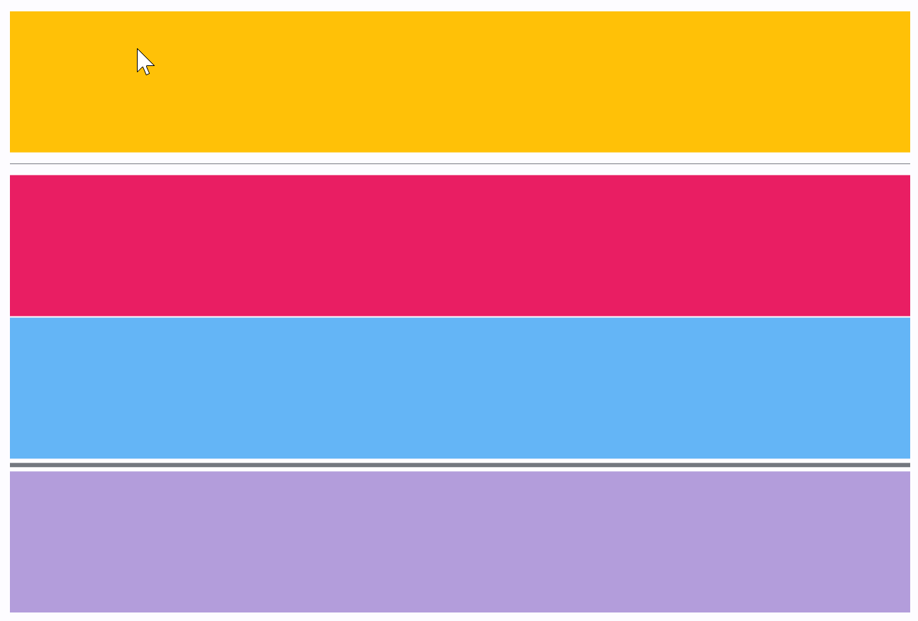
import flet as ft


def main(page: ft.Page):
    page.add(
        ft.Column(
            spacing=0,
            expand=True,
            controls=[
                ft.Container(
                    expand=True,
                    bgcolor=ft.Colors.AMBER,
                    alignment=ft.Alignment.CENTER,
                ),
                ft.Divider(),
                ft.Container(
                    expand=True,
                    bgcolor=ft.Colors.PINK,
                    alignment=ft.Alignment.CENTER,
                ),
                ft.Divider(height=1, color=ft.Colors.WHITE),
                ft.Container(
                    expand=True,
                    bgcolor=ft.Colors.BLUE_300,
                    alignment=ft.Alignment.CENTER,
                ),
                ft.Divider(height=9, thickness=3),
                ft.Container(
                    expand=True,
                    bgcolor=ft.Colors.DEEP_PURPLE_200,
                    alignment=ft.Alignment.CENTER,
                ),
            ],
        ),
    )


ft.run(main)
Properties#
class-attribute
instance-attribute
#
color: ColorValue | None = None
The color to use when painting the line.
If None, DividerTheme.color is used.
class-attribute
instance-attribute
#
height: Number | None = None
The divider's height extent. The divider itself is always drawn as a horizontal line that is centered within the height specified by this value.
If None, DividerTheme.space is used.
If that's is also None, defaults to 16.0.
Raises:
-
ValueError–If
heightis negative.
class-attribute
instance-attribute
#
leading_indent: Number | None = None
The amount of empty space to the leading edge of the divider.
If None, DividerTheme.leading_indent is used.
If that's is also None, defaults to 0.0.
Raises:
-
ValueError–If
leading_indentis negative.
class-attribute
instance-attribute
#
radius: BorderRadiusValue | None = None
The border radius of the divider.
class-attribute
instance-attribute
#
thickness: Number | None = None
The thickness of the line drawn within the divider.
A divider with a thickness of 0.0 is always drawn as a line with a
height of exactly one device pixel.
If None, DividerTheme.thickness is used.
If that is also None, defaults to 0.0.
Raises:
-
ValueError–If
thicknessis negative.
class-attribute
instance-attribute
#
trailing_indent: Number | None = None
The amount of empty space to the trailing edge of the divider.
If None, DividerTheme.trailing_indent is used.
If that is also None, defaults to 0.0.
Raises:
-
ValueError–If
trailing_indentis negative.