Dismissible
A control that can be dismissed by dragging in the indicated dismiss_direction.
When dragged or flung in the specified dismiss_direction,
its content smoothly slides out of view.
After completing the sliding animation, if a resize_duration is provided,
this control further animates its height (or width, depending on what is
perpendicular to the dismiss_direction), gradually reducing it to zero
over the specified resize_duration.
Inherits: LayoutControl, AdaptiveControl
Properties
-
background(Control | None) –A control that is stacked behind the
content. -
content(Control) –The control that is being dismissed.
-
cross_axis_end_offset(Number) –Specifies the end offset along the main axis once the
contenthas been dismissed. -
dismiss_direction(DismissDirection) –The direction in which the control can be dismissed.
-
dismiss_thresholds(dict[DismissDirection, Number | None]) –The offset threshold the item has to be dragged in order to be considered as dismissed. This is specified as a dictionary where the key is of type
DismissDirectionand the value is the threshold (a fractional/decimal value between0.0and1.0, inclusive). -
movement_duration(DurationValue) –The duration for
contentto dismiss or to come back to original position if not dismissed. -
resize_duration(DurationValue) –The amount of time the control will spend contracting before
on_dismissis called. -
secondary_background(Control | None) –A control that is stacked behind the
contentand is exposed when it has been dragged up or to the left.
Events
-
on_confirm_dismiss(EventHandler[DismissibleDismissEvent] | None) –Gives the app an opportunity to confirm or veto a pending dismissal.
-
on_dismiss(EventHandler[DismissibleDismissEvent] | None) –Called when this control has been dismissed, after finishing resizing.
-
on_resize(ControlEventHandler[Dismissible] | None) –Called when this dismissible changes size, for example, when contracting before being dismissed.
-
on_update(EventHandler[DismissibleUpdateEvent] | None) –Called when this control has been dragged.
Methods
-
confirm_dismiss–Resolve a pending dismissal decision triggered by
on_confirm_dismiss.
Examples#
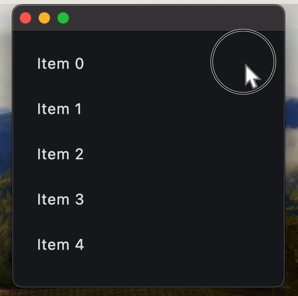
Dismissible ListTiles#
import flet as ft


def main(page: ft.Page):
    async def handle_dialog_action_click(e: ft.Event[ft.TextButton]):
        page.pop_dialog()
        await dlg.data.confirm_dismiss(e.control.data)

    dlg = ft.AlertDialog(
        modal=True,
        title=ft.Text("Please confirm"),
        content=ft.Text("Do you really want to delete this item?"),
        actions=[
            ft.TextButton("Yes", data=True, on_click=handle_dialog_action_click),
            ft.TextButton("No", data=False, on_click=handle_dialog_action_click),
        ],
        actions_alignment=ft.MainAxisAlignment.CENTER,
    )

    async def handle_confirm_dismiss(e: ft.DismissibleDismissEvent):
        if e.direction == ft.DismissDirection.END_TO_START:  # right-to-left slide
            # save current dismissible to dialog's data, for confirmation in
            # handle_dialog_action_click
            dlg.data = e.control
            page.show_dialog(dlg)
        else:  # left-to-right slide
            await e.control.confirm_dismiss(True)

    def handle_dismiss(e):
        e.control.parent.controls.remove(e.control)
        page.update()

    def handle_update(e: ft.DismissibleUpdateEvent):
        print(e)

    page.add(
        ft.ListView(
            expand=True,
            controls=[
                ft.Dismissible(
                    content=ft.ListTile(title=ft.Text(f"Item {i}")),
                    dismiss_direction=ft.DismissDirection.HORIZONTAL,
                    background=ft.Container(bgcolor=ft.Colors.GREEN),
                    secondary_background=ft.Container(bgcolor=ft.Colors.RED),
                    on_dismiss=handle_dismiss,
                    on_update=handle_update,
                    on_confirm_dismiss=handle_confirm_dismiss,
                    dismiss_thresholds={
                        ft.DismissDirection.END_TO_START: 0.2,
                        ft.DismissDirection.START_TO_END: 0.2,
                    },
                )
                for i in range(10)
            ],
        )
    )


ft.run(main)
Remove Dismissible on_dismiss inside component#
Important
Always specify a key for Dismissible when using inside Flet component.
The issue you may encounter here is specific to the Dismissible control used inside Flet component (declarative UI).
When a user swipes (dismisses) an item, that widget is marked as “dismissed” on the Flutter side and effectively removed from the UI. However, when Flet recalculates the UI diff on the Python side, it may attempt to reuse widgets in the list based on their order rather than their identity.
If no key is provided, Flet’s diffing algorithm can’t tell that a particular Dismissible corresponds to a specific item — so it assumes the items have merely shifted.
That leads to update commands like:
“Update text in items 0…N-1, then delete the last item (N).”
On Flutter’s side, though, the already-dismissed Dismissible widget in the middle of the list can’t be updated — it’s gone — causing runtime errors.
Always assign a stable, unique key to each Dismissible, typically based on the item’s identifier or index.
Example:
import flet as ft


@ft.component
def App():
    items, set_items = ft.use_state(list(range(5)))

    return ft.ListView(
        controls=[
            ft.Dismissible(
                key=i,
                content=ft.ListTile(title=ft.Text(f"Item {i}")),
                dismiss_direction=ft.DismissDirection.HORIZONTAL,
                background=ft.Container(bgcolor=ft.Colors.GREEN),
                secondary_background=ft.Container(bgcolor=ft.Colors.RED),
                on_dismiss=lambda e, index=i: set_items(
                    [item for item in items if item != index]
                ),
                dismiss_thresholds={
                    ft.DismissDirection.HORIZONTAL: 0.1,
                    ft.DismissDirection.START_TO_END: 0.1,
                },
            )
            for i in items
        ],
    )


ft.run(lambda page: page.render(App))
Properties#
class-attribute
instance-attribute
#
background: Control | None = None
A control that is stacked behind the content.
If secondary_background is also
specified, then this control only appears when the content has been dragged
down or to the right.
instance-attribute
#
content: Control
The control that is being dismissed.
Must be visible.
Raises:
-
ValueError–If the
contentis not visible.
class-attribute
instance-attribute
#
cross_axis_end_offset: Number = 0.0
Specifies the end offset along the main axis once the content has been dismissed.
If set to a non-zero value, then this dismissible moves in cross direction depending on whether it is positive or negative.
class-attribute
instance-attribute
#
dismiss_direction: DismissDirection = HORIZONTAL
The direction in which the control can be dismissed.
class-attribute
instance-attribute
#
dismiss_thresholds: dict[
    DismissDirection, Number | None
] = field(default_factory=dict)
The offset threshold the item has to be dragged in order to be considered as dismissed. This is specified as a dictionary where the key is of type DismissDirection and the value is the threshold (a fractional/decimal value between 0.0 and 1.0, inclusive).
class-attribute
instance-attribute
#
movement_duration: DurationValue = field(
    default_factory=lambda: Duration(milliseconds=200)
)
The duration for content to dismiss or to come back to original position if not dismissed.
class-attribute
instance-attribute
#
resize_duration: DurationValue = field(
    default_factory=lambda: Duration(milliseconds=300)
)
The amount of time the control will spend contracting before on_dismiss is called.
class-attribute
instance-attribute
#
secondary_background: Control | None = None
A control that is stacked behind the content and is exposed when it has been dragged up or to the left.
Raises:
-
ValueError–If it is provided and visible but the
backgroundis not provided and visible.
Events#
class-attribute
instance-attribute
#
on_confirm_dismiss: (
    EventHandler[DismissibleDismissEvent] | None
) = None
Gives the app an opportunity to confirm or veto a pending dismissal. This dismissible cannot be dragged again until this pending dismissal is resolved.
To resolve the pending dismissal, call the
confirm_dismiss() method
passing it a boolean representing the decision. If True, then the control will be
dismissed, otherwise it will be moved back to its original location.
class-attribute
instance-attribute
#
on_dismiss: EventHandler[DismissibleDismissEvent] | None = (
    None
)
Called when this control has been dismissed, after finishing resizing.
class-attribute
instance-attribute
#
on_resize: ControlEventHandler[Dismissible] | None = None
Called when this dismissible changes size, for example, when contracting before being dismissed.
class-attribute
instance-attribute
#
on_update: EventHandler[DismissibleUpdateEvent] | None = (
    None
)
Called when this control has been dragged.
Methods#
async
#
confirm_dismiss(dismiss: bool)
Resolve a pending dismissal decision triggered by on_confirm_dismiss.
Call this method from your confirmation flow after handling
on_confirm_dismiss.
Parameters:
-
dismiss(bool) –Trueto continue dismissing the control,Falseto cancel and return it to the original position.