DataTable#
Basic DataTable
Inherits: LayoutControl
Properties
-
bgcolor(ColorValue | None) –The background color for this table.
-
border(Border | None) –The border around the table.
-
border_radius(BorderRadiusValue | None) –Border corners.
-
checkbox_horizontal_margin(Number | None) –Horizontal margin around the checkbox, if it is displayed.
-
clip_behavior(ClipBehavior) –Defines how the contents of this table are clipped.
-
column_spacing(Number | None) –The horizontal margin between the contents of each data column.
-
columns(list[DataColumn]) –A list of
DataColumncontrols describing table columns. -
data_row_color(ControlStateValue[ColorValue] | None) –The background color for the data rows.
-
data_row_max_height(Number | None) –The maximum height of each row (excluding the row that contains column headings).
-
data_row_min_height(Number | None) –The minimum height of each row (excluding the row that contains column headings).
-
data_text_style(TextStyle | None) –The text style of the data
rows. -
divider_thickness(Number) –The width of the divider that appears between
rows. -
gradient(Gradient | None) –The background gradient of this table.
-
heading_row_color(ControlStateValue[ColorValue] | None) –The background color for the heading row.
-
heading_row_height(Number | None) –The height of the heading row.
-
heading_text_style(TextStyle | None) –The text style for the heading row.
-
horizontal_lines(BorderSide | None) –Set the color and width of horizontal lines between rows.
-
horizontal_margin(Number | None) –The horizontal margin between the edges of this table and the content in the first and last cells of each row.
-
rows(list[DataRow]) –A list of
DataRowcontrols defining table rows. -
show_bottom_border(bool) –Whether a border at the bottom of the table is displayed.
-
show_checkbox_column(bool) –Whether the control should display checkboxes for selectable rows.
-
sort_ascending(bool) –Whether the column mentioned in
sort_column_index, if any, is sorted in ascending order. -
sort_column_index(int | None) –The current primary sort key's column.
-
vertical_lines(BorderSide | None) –Set the color and width of vertical lines between columns.
Events
-
on_select_all(ControlEventHandler[DataTable] | None) –Invoked when the user selects or unselects every row, using the checkbox in the heading row.
Examples#
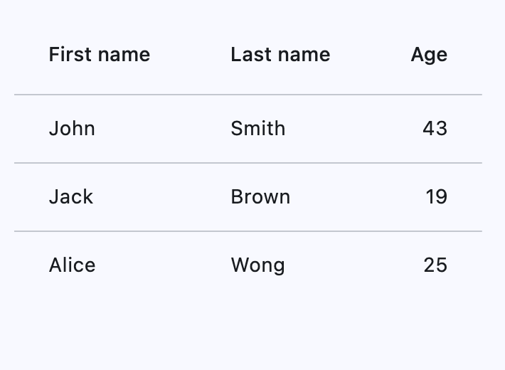
Basic Example#
import flet as ft


def main(page: ft.Page):
    page.add(
        ft.DataTable(
            expand=True,
            columns=[
                ft.DataColumn(label=ft.Text("First name")),
                ft.DataColumn(label=ft.Text("Last name")),
                ft.DataColumn(label=ft.Text("Age"), numeric=True),
            ],
            rows=[
                ft.DataRow(
                    cells=[
                        ft.DataCell(ft.Text("John")),
                        ft.DataCell(ft.Text("Smith")),
                        ft.DataCell(ft.Text("43")),
                    ],
                ),
                ft.DataRow(
                    cells=[
                        ft.DataCell(ft.Text("Jack")),
                        ft.DataCell(ft.Text("Brown")),
                        ft.DataCell(ft.Text("19")),
                    ],
                ),
                ft.DataRow(
                    cells=[
                        ft.DataCell(ft.Text("Alice")),
                        ft.DataCell(ft.Text("Wong")),
                        ft.DataCell(ft.Text("25")),
                    ],
                ),
            ],
        ),
    )


if __name__ == "__main__":
    ft.run(main)
Horizontal margin and column spacing#
Use horizontal_margin to control the left and right
edge spacing of the first and last columns.
Use column_spacing to control spacing between columns.
import flet as ft


def _cell(label: str, color: str = ft.Colors.SURFACE_CONTAINER_HIGHEST) -> ft.DataCell:
    return ft.DataCell(
        ft.Container(
            content=ft.Text(label, size=12, weight=ft.FontWeight.W_600),
            width=90,
            height=32,
            alignment=ft.Alignment.CENTER,
            bgcolor=color,
            border=ft.Border.all(1, ft.Colors.BLACK_26),
        )
    )


def main(page: ft.Page):
    page.scroll = ft.ScrollMode.AUTO
    page.horizontal_alignment = ft.CrossAxisAlignment.CENTER
    page.theme_mode = ft.ThemeMode.DARK

    def update_spacing(e: ft.Event[ft.Slider] = None):
        table.horizontal_margin = horizontal_margin_slider.value
        table.column_spacing = column_spacing_slider.value
        page.update()

    def set_preset(horizontal_margin: float, column_spacing: float):
        horizontal_margin_slider.value = horizontal_margin
        column_spacing_slider.value = column_spacing
        update_spacing()

    page.appbar = ft.AppBar(title="DataTable spacing")
    page.add(
        ft.Container(
            width=520,
            padding=12,
            border=ft.Border.all(1, ft.Colors.OUTLINE_VARIANT),
            border_radius=8,
            content=ft.Column(
                horizontal_alignment=ft.CrossAxisAlignment.CENTER,
                controls=[
                    ft.Text("horizontal_margin (outer edges)"),
                    horizontal_margin_slider := ft.Slider(
                        min=0,
                        max=40,
                        divisions=40,
                        value=16,
                        label="{value}",
                        on_change=update_spacing,
                    ),
                    ft.Text("column_spacing (between columns)"),
                    column_spacing_slider := ft.Slider(
                        min=0,
                        max=40,
                        divisions=40,
                        value=16,
                        label="{value}",
                        on_change=update_spacing,
                    ),
                    ft.Row(
                        wrap=True,
                        controls=[
                            ft.FilledButton(
                                "Reset",
                                on_click=lambda _: set_preset(16, 16),
                            ),
                            ft.OutlinedButton(
                                "Compact preset",
                                on_click=lambda _: set_preset(0, 0),
                            ),
                            ft.OutlinedButton(
                                "Spacious preset",
                                on_click=lambda _: set_preset(24, 32),
                            ),
                        ],
                    ),
                ],
            ),
        ),
        table := ft.DataTable(
            border=ft.Border.all(1, ft.Colors.ON_SURFACE_VARIANT),
            horizontal_margin=horizontal_margin_slider.value,
            column_spacing=column_spacing_slider.value,
            horizontal_lines=ft.BorderSide(1, ft.Colors.ON_SURFACE_VARIANT),
            vertical_lines=ft.BorderSide(1, ft.Colors.ON_SURFACE_VARIANT),
            heading_row_height=40,
            data_row_min_height=40,
            data_row_max_height=40,
            columns=[
                ft.DataColumn(label="Col A"),
                ft.DataColumn(label="Col B"),
                ft.DataColumn(label="Col C"),
            ],
            rows=[
                ft.DataRow(
                    cells=[_cell("A1"), _cell("B1"), _cell("C1")],
                ),
                ft.DataRow(
                    cells=[_cell("A2"), _cell("B2"), _cell("C2")],
                ),
            ],
        ),
    )


if __name__ == "__main__":
    ft.run(main)
Adaptive row heights#
Setting data_row_max_height to float('inf')
(infinity) will cause the DataTable to let each individual row adapt its height to its
respective content, instead of all rows having the same height.
import flet as ft


def main(page: ft.Page):
    page.add(
        ft.DataTable(
            width=560,
            data_row_min_height=48,
            data_row_max_height=float("inf"),  # infinity to allow adaptive row heights
            columns=[
                ft.DataColumn(label="Description"),
                ft.DataColumn(label="Notes"),
            ],
            rows=[
                ft.DataRow(
                    cells=[
                        ft.DataCell("TWO lines visible without overflow"),
                        ft.DataCell("Line 1\nLine 2"),
                    ],
                ),
                ft.DataRow(
                    cells=[
                        ft.DataCell("FOUR lines visible without overflow"),
                        ft.DataCell("Line 1\nLine 2\nLine 3\nLine 4"),
                    ],
                ),
                ft.DataRow(
                    cells=[
                        ft.DataCell("FIVE lines visible without overflow"),
                        ft.DataCell("Line 1\nLine 2\nLine 3\nLine 4\nLine 5"),
                    ],
                ),
            ],
        ),
    )


if __name__ == "__main__":
    ft.run(main)
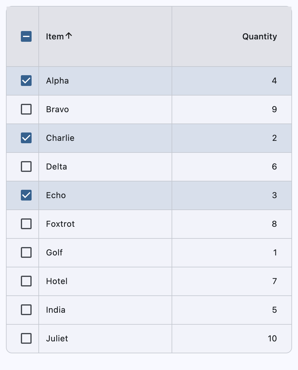
Sortable columns and selectable rows#
This example demonstrates row selection (including select-all), sortable string and numeric columns, and stable selection across sorts and refreshes.
import flet as ft


def main(page: ft.Page):
    # Source data for the table (your domain objects). Each record has a stable `id`
    # so we can track selection even when the table is sorted or rebuilt.
    inventory_items = [
        {"id": 1, "name": "Alpha", "qty": 4},
        {"id": 2, "name": "Bravo", "qty": 9},
        {"id": 3, "name": "Charlie", "qty": 2},
        {"id": 4, "name": "Delta", "qty": 6},
        {"id": 5, "name": "Echo", "qty": 3},
        {"id": 6, "name": "Foxtrot", "qty": 8},
        {"id": 7, "name": "Golf", "qty": 1},
        {"id": 8, "name": "Hotel", "qty": 7},
        {"id": 9, "name": "India", "qty": 5},
        {"id": 10, "name": "Juliet", "qty": 10},
    ]

    # Working list used for sorting/reordering. We keep it separate so the original
    # input remains untouched (useful if you later reload or re-filter data).
    displayed_items = list(inventory_items)

    # Store selected item ids (not row indices) so selection survives sorting.
    selected_item_ids: set[int] = {1, 3, 5}

    # Map column index -> callable used for sorting that column.
    # Note: DataColumnSortEvent provides a `column_index` and an `ascending` flag.
    sort_key_for_column = {
        0: lambda item: str(item["name"]).lower(),  # "Item" column
        1: lambda item: int(item["qty"]),  # "Quantity" column
    }

    def build_rows(items: list[dict[str, int | str]]) -> list[ft.DataRow]:
        """Convert a list of item dicts into DataRow objects."""
        return [
            ft.DataRow(
                selected=item["id"] in selected_item_ids,
                on_select_change=handle_row_selection_change,
                data=item["id"],  # used by event handlers to identify this item
                cells=[
                    ft.DataCell(ft.Text(item["name"])),
                    ft.DataCell(ft.Text(str(item["qty"]))),
                ],
            )
            for item in items
        ]

    def refresh_table_rows():
        """
        Rebuild and redraw the table rows.

        Rebuilding rows is the simplest way to keep selection checkboxes and row
        visuals consistent after a bulk change (sort, select-all, clear selection).
        """
        table.rows = build_rows(displayed_items)
        table.update()

    def handle_row_selection_change(e: ft.Event[ft.DataRow]):
        """Called when a single row's checkbox is toggled."""
        row = e.control
        item_id = row.data
        is_selected = e.data  # new selected state

        if is_selected:
            selected_item_ids.add(item_id)
        else:
            selected_item_ids.discard(item_id)

        # Reflect the new state immediately on the toggled row.
        e.control.selected = is_selected
        e.control.update()

    def handle_select_all(e: ft.Event[ft.DataTable]):
        """
        Called when the header "select all" checkbox is toggled.

        `e.data` is True when selecting all, False when clearing.
        """
        select_all = e.data

        if select_all:
            selected_item_ids.update(int(item["id"]) for item in displayed_items)
        else:
            selected_item_ids.clear()

        refresh_table_rows()

    def handle_column_sort(e: ft.DataColumnSortEvent):
        """
        Called when a column header is clicked to sort.

        We sort `displayed_items` in-place and then refresh the rows. Selection is
        preserved because it is tracked by item id in `selected_item_ids`.
        """
        displayed_items.sort(
            key=sort_key_for_column[e.column_index],
            reverse=not e.ascending,
        )

        # Let the Table know which column is currently sorted and in what order.
        table.sort_column_index = e.column_index
        table.sort_ascending = e.ascending

        refresh_table_rows()

    page.add(
        table := ft.DataTable(
            width=700,
            bgcolor=ft.Colors.SURFACE_CONTAINER_LOW,
            border=ft.Border.all(1, ft.Colors.OUTLINE_VARIANT),
            border_radius=10,
            vertical_lines=ft.border.BorderSide(1, ft.Colors.OUTLINE_VARIANT),
            horizontal_lines=ft.border.BorderSide(1, ft.Colors.OUTLINE_VARIANT),
            sort_column_index=0,
            sort_ascending=True,
            heading_row_color=ft.Colors.SURFACE_CONTAINER_HIGHEST,
            heading_row_height=100,
            data_row_color={
                ft.ControlState.HOVERED: ft.Colors.with_opacity(
                    0.08, ft.Colors.PRIMARY
                ),
                ft.ControlState.SELECTED: ft.Colors.with_opacity(
                    0.14, ft.Colors.PRIMARY
                ),
            },
            show_checkbox_column=True,
            on_select_all=handle_select_all,
            divider_thickness=1,
            column_spacing=200,
            columns=[
                ft.DataColumn(
                    label=ft.Text("Item"),
                    on_sort=handle_column_sort,
                ),
                ft.DataColumn(
                    label=ft.Text("Quantity"),
                    tooltip="Numeric quantity",
                    numeric=True,
                    on_sort=handle_column_sort,
                ),
            ],
            rows=build_rows(displayed_items),
        ),
    )


if __name__ == "__main__":
    ft.run(main)
Handling events#
import flet as ft


def main(page: ft.Page):
    def handle_row_selection_change(e: ft.Event[ft.DataRow]):
        if e.control.data:
            if e.control.data == 1:
                row1.selected = not row1.selected
            elif e.control.data == 2:
                row2.selected = not row2.selected
            elif e.control.data == 3:
                row3.selected = not row3.selected
        page.update()

    def handle_column_sort(e: ft.DataColumnSortEvent):
        if e.control.data:
            if e.control.data == 1:
                print(f"{e.column_index}, {e.ascending}")
                # table.sort_column_index = 1
                table.sort_ascending = e.ascending
            elif e.control.data == 2:
                print(f"{e.column_index}, {e.ascending}")
                # table.sort_column_index = 2
                table.sort_ascending = e.ascending
        page.update()

    page.add(
        table := ft.DataTable(
            width=700,
            bgcolor=ft.Colors.TEAL_ACCENT_200,
            border=ft.Border.all(2, ft.Colors.RED_ACCENT_200),
            border_radius=10,
            vertical_lines=ft.border.BorderSide(3, ft.Colors.BLUE_600),
            horizontal_lines=ft.border.BorderSide(1, ft.Colors.GREEN_600),
            sort_column_index=0,
            sort_ascending=True,
            heading_row_color=ft.Colors.BLACK_12,
            heading_row_height=100,
            data_row_color={ft.ControlState.HOVERED: "0x30FF0000"},
            show_checkbox_column=True,
            divider_thickness=0,
            column_spacing=200,
            columns=[
                ft.DataColumn(
                    label=ft.Text("Column 1"),
                    tooltip="This is the first column",
                    data=1,
                    on_sort=handle_column_sort,
                ),
                ft.DataColumn(
                    label=ft.Text("Column 2"),
                    tooltip="This is a second column",
                    numeric=True,
                    data=2,
                    on_sort=handle_column_sort,
                ),
            ],
            rows=[
                row1 := ft.DataRow(
                    cells=[ft.DataCell(ft.Text("A")), ft.DataCell(ft.Text("1"))],
                    selected=True,
                    on_select_change=handle_row_selection_change,
                    data=1,
                ),
                row2 := ft.DataRow(
                    cells=[ft.DataCell(ft.Text("B")), ft.DataCell(ft.Text("2"))],
                    selected=False,
                    on_select_change=handle_row_selection_change,
                    data=2,
                ),
                row3 := ft.DataRow(
                    cells=[ft.DataCell(ft.Text("C")), ft.DataCell(ft.Text("3"))],
                    selected=False,
                    on_select_change=handle_row_selection_change,
                    data=3,
                ),
            ],
        )
    )


ft.run(main)
Properties#
class-attribute
instance-attribute
#
bgcolor: ColorValue | None = None
The background color for this table.
class-attribute
instance-attribute
#
border: Border | None = None
The border around the table.
class-attribute
instance-attribute
#
border_radius: BorderRadiusValue | None = None
Border corners.
class-attribute
instance-attribute
#
checkbox_horizontal_margin: Number | None = None
Horizontal margin around the checkbox, if it is displayed.
class-attribute
instance-attribute
#
clip_behavior: ClipBehavior = NONE
Defines how the contents of this table are clipped.
class-attribute
instance-attribute
#
column_spacing: Number | None = None
The horizontal margin between the contents of each data column.
instance-attribute
#
columns: list[DataColumn]
A list of DataColumn controls describing table columns.
Raises:
-
ValueError–If there are no visible
columns.
class-attribute
instance-attribute
#
data_row_color: ControlStateValue[ColorValue] | None = None
The background color for the data rows.
The effective background color can be made to depend on the
ControlState state, i.e. if the row is selected, pressed, hovered,
focused, disabled or enabled. The color is painted as an overlay to the row.
To make sure that the row's InkWell is visible (when pressed, hovered and focused),
it is recommended to use a translucent background color.
class-attribute
instance-attribute
#
data_row_max_height: Number | None = None
The maximum height of each row (excluding the row that contains column headings).
Set to float("inf") for the height of each row to adjust automatically with its
content.
Defaults to 48.0.
Note
Must be greater than or equal to data_row_min_height.
Raises:
-
ValueError–If
data_row_max_heightis less thandata_row_min_height.
class-attribute
instance-attribute
#
data_row_min_height: Number | None = None
The minimum height of each row (excluding the row that contains column headings).
Defaults to 48.0.
Note
Must be less than or equal to data_row_max_height.
Raises:
-
ValueError–If
data_row_min_heightis greater thandata_row_max_height.
class-attribute
instance-attribute
#
data_text_style: TextStyle | None = None
The text style of the data rows.
class-attribute
instance-attribute
#
divider_thickness: Number = 1.0
The width of the divider that appears between rows.
Note
Must be greater than or equal to zero.
Raises:
-
ValueError–If
divider_thicknessis negative.
class-attribute
instance-attribute
#
gradient: Gradient | None = None
The background gradient of this table.
class-attribute
instance-attribute
#
heading_row_color: ControlStateValue[ColorValue] | None = (
    None
)
The background color for the heading row.
The effective background color can be made to depend on the
ControlState state, i.e. if the row is pressed, hovered,
focused when sorted. The color is painted as an overlay to the row. To make sure
that the row's InkWell is visible (when pressed, hovered and focused), it is
recommended to use a translucent color.
class-attribute
instance-attribute
#
heading_row_height: Number | None = None
The height of the heading row.
class-attribute
instance-attribute
#
heading_text_style: TextStyle | None = None
The text style for the heading row.
class-attribute
instance-attribute
#
horizontal_lines: BorderSide | None = None
Set the color and width of horizontal lines between rows.
class-attribute
instance-attribute
#
horizontal_margin: Number | None = None
The horizontal margin between the edges of this table and the content in the first and last cells of each row.
When a checkbox is displayed, it is also the margin between the checkbox the content in the first data column.
class-attribute
instance-attribute
#
show_bottom_border: bool = False
Whether a border at the bottom of the table is displayed.
By default, a border is not shown at the bottom to allow for a border around the table defined by decoration.
class-attribute
instance-attribute
#
show_checkbox_column: bool = False
Whether the control should display checkboxes for selectable rows.
If True, a checkbox will be placed at the beginning of each row that is
selectable. However, if DataRow.on_select_change
is not set for any row, checkboxes will not be placed, even if this value is True.
If False, all rows will not display a checkbox.
class-attribute
instance-attribute
#
sort_ascending: bool = False
Whether the column mentioned in sort_column_index, if any, is sorted in ascending order.
If True, the order is ascending (meaning the rows with the smallest values for
the current sort column are first in the table).
If False, the order is descending (meaning the rows with the smallest values for
the current sort column are last in the table).
class-attribute
instance-attribute
#
sort_column_index: int | None = None
The current primary sort key's column.
If specified, indicates that the indicated column is the column by which the data
is sorted. The number must correspond to the index of the relevant column in
columns.
Setting this will cause the relevant column to have a sort indicator displayed.
When this is None, it implies that the table's sort order does not correspond to
any of the columns.
Raises:
-
ValueError–If
sort_column_indexis out of range relative to the visiblecolumns.
class-attribute
instance-attribute
#
vertical_lines: BorderSide | None = None
Set the color and width of vertical lines between columns.
Events#
class-attribute
instance-attribute
#
on_select_all: ControlEventHandler[DataTable] | None = None
Invoked when the user selects or unselects every row, using the checkbox in the heading row.
If this is None, then the DataRow.on_select_change
callback of every row of this table is invoked appropriately instead.
Tip
To control whether a particular row is selectable or not, see
DataRow.on_select_change. This callback is only relevant if
any row is selectable.