CupertinoPicker
Inherits: LayoutControl
Properties
-
bgcolor(ColorValue | None) –The background color of this timer picker.
-
controls(list[Control]) –A list of controls representing items in this picker.
-
default_selection_overlay_bgcolor(ColorValue) –The default background color of the
selection_overlay. -
diameter_ratio(Number) –Relative ratio between this picker's height and the simulated cylinder's diameter.
-
item_extent(Number) –The uniform height of all
controls. -
looping(bool) –If
True, children on a wheel can be scrolled in a loop. -
magnification(Number) –The zoomed-in or magnification rate of the magnifier.
-
off_axis_fraction(Number) –How much the wheel is horizontally off-center, as a fraction of its width.
-
selected_index(int) –The index (starting from
0) of the selected item in thecontrolslist. -
selection_overlay(Control | None) –A control overlaid on the picker to highlight the selected entry, centered and
-
squeeze(Number) –The angular compactness of the children on the wheel.
-
use_magnifier(bool) –Whether to use the magnifier for the center item of this picker's wheel.
Events
-
on_change(ControlEventHandler[CupertinoPicker] | None) –Called when the selection changes.
Examples#
Fruit selection#
import flet as ft
FRUITS = [
"Apple",
"Mango",
"Banana",
"Orange",
"Pineapple",
"Strawberry",
]
def main(page: ft.Page):
page.horizontal_alignment = ft.CrossAxisAlignment.CENTER
selected_fruit_ref = ft.Ref[ft.Text]()
def handle_selection_change(e: ft.Event[ft.CupertinoPicker]):
selected_fruit_ref.current.value = FRUITS[int(e.data)]
page.update()
cupertino_picker = ft.CupertinoPicker(
selected_index=3,
magnification=1.22,
squeeze=1.2,
use_magnifier=True,
on_change=handle_selection_change,
controls=[ft.Text(value=f) for f in FRUITS],
)
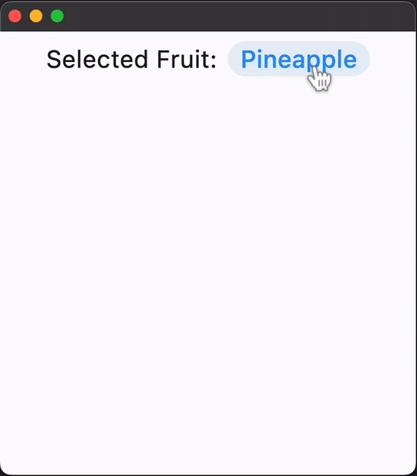
page.add(
ft.Row(
tight=True,
controls=[
ft.Text("Selected Fruit:", size=23),
ft.TextButton(
content=ft.Text(value=FRUITS[3], ref=selected_fruit_ref, size=23),
style=ft.ButtonStyle(color=ft.Colors.BLUE),
on_click=lambda e: page.show_dialog(
ft.CupertinoBottomSheet(
content=cupertino_picker,
height=216,
padding=ft.Padding.only(top=6),
)
),
),
],
),
)
ft.run(main)
Properties#
class-attribute
instance-attribute
#
bgcolor: ColorValue | None = None
The background color of this timer picker.
class-attribute
instance-attribute
#
A list of controls representing items in this picker.
class-attribute
instance-attribute
#
default_selection_overlay_bgcolor: ColorValue = (
    TERTIARY_SYSTEM_FILL
)
The default background color of the selection_overlay.
class-attribute
instance-attribute
#
diameter_ratio: Number = 1.07
Relative ratio between this picker's height and the simulated cylinder's diameter.
Smaller values create more pronounced curvatures in the scrollable wheel.
class-attribute
instance-attribute
#
item_extent: Number = 32.0
The uniform height of all controls.
Raises:
-
ValueError–If
item_extentis not strictly greater than0.0.
class-attribute
instance-attribute
#
looping: bool = False
If True, children on a wheel can be scrolled in a loop.
class-attribute
instance-attribute
#
magnification: Number = 1.0
The zoomed-in or magnification rate of the magnifier.
If the value is greater than 1.0, the item in the center will be zoomed in by that
rate, and it will also be rendered as flat, not cylindrical like the rest of the
list. The item will be zoomed-out if magnification is less than 1.0.
Note
Has effect only if use_magnifier is True.
Raises:
-
ValueError–If
magnificationis not strictly greater than0.0.
class-attribute
instance-attribute
#
off_axis_fraction: Number = 0.0
How much the wheel is horizontally off-center, as a fraction of its width.
class-attribute
instance-attribute
#
selected_index: int = 0
The index (starting from 0) of the selected item in the controls list.
class-attribute
instance-attribute
#
selection_overlay: Control | None = None
A control overlaid on the picker to highlight the selected entry, centered and matching the height of the center row.
Defaults to a rounded rectangle in iOS 14 style with
default_selection_overlay_bgcolor as background color.
class-attribute
instance-attribute
#
squeeze: Number = 1.45
The angular compactness of the children on the wheel.
Raises:
-
ValueError–If
squeezeis not strictly greater than0.0.
class-attribute
instance-attribute
#
use_magnifier: bool = False
Whether to use the magnifier for the center item of this picker's wheel.
Events#
class-attribute
instance-attribute
#
on_change: ControlEventHandler[CupertinoPicker] | None = (
    None
)
Called when the selection changes.