CupertinoListTile
An iOS-style list tile.
The CupertinoListTile is a Cupertino equivalent of the Material ListTile.
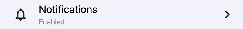
Basic CupertinoListTile
Inherits: LayoutControl
Properties
-
additional_info(StrOrControl | None) –A
Controlto display on the right of the list tile, beforetrailing. -
bgcolor(ColorValue | None) –The background color of this list tile.
-
bgcolor_activated(ColorValue | None) –The background color of this list tile after it was tapped.
-
leading(IconDataOrControl | None) –A control to display before the
title. -
leading_size(Number | None) –Used to constrain the width and height of
leadingcontrol. -
leading_to_title(Number | None) –The horizontal space between
leadingand[title`][flet.controls.cupertino.cupertino_list_tile.CupertinoListTile.title]. -
notched(bool) –Whether this list tile should be created in an "Inset Grouped" form, known from either iOS Notes or Reminders app.
-
padding(PaddingValue | None) –The tile's internal padding. Insets a CupertinoListTile's contents: its
leading,title,subtitle,additional_infoandtrailingcontrols. -
subtitle(StrOrControl | None) –Additional content displayed below the
title. -
title(StrOrControl) –The primary content of this list tile.
-
toggle_inputs(bool) – -
trailing(IconDataOrControl | None) –A control to display after the
title. -
url(str | Url | None) –The URL to open when this button is clicked.
Events
-
on_click(ControlEventHandler[CupertinoListTile] | None) –Called when a user clicks/taps the list tile.
Examples#
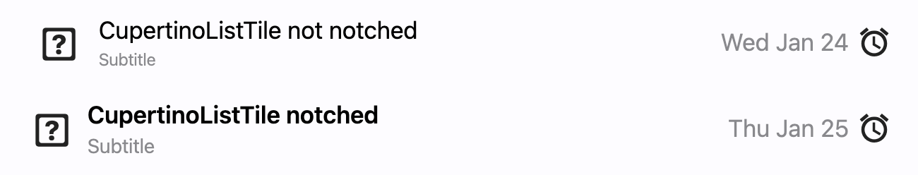
Notched and non-notched list tiles#
import flet as ft


def main(page: ft.Page):
    def handle_tile_click(e: ft.Event[ft.CupertinoListTile]):
        print("Tile clicked")

    page.add(
        ft.CupertinoListTile(
            additional_info=ft.Text("Wed Jan 24"),
            bgcolor_activated=ft.Colors.AMBER_ACCENT,
            leading=ft.Icon(ft.CupertinoIcons.GAME_CONTROLLER),
            title=ft.Text("CupertinoListTile: notched = False"),
            subtitle=ft.Text("Subtitle"),
            trailing=ft.Icon(ft.CupertinoIcons.ALARM),
            on_click=handle_tile_click,
        ),
        ft.CupertinoListTile(
            notched=True,
            additional_info=ft.Text("Thu Jan 25"),
            leading=ft.Icon(ft.CupertinoIcons.GAME_CONTROLLER),
            title=ft.Text("CupertinoListTile: notched = True"),
            subtitle=ft.Text("Subtitle"),
            trailing=ft.Icon(ft.CupertinoIcons.ALARM),
            on_click=handle_tile_click,
        ),
    )


ft.run(main)
Properties#
class-attribute
instance-attribute
#
additional_info: StrOrControl | None = None
A Control to display on the right of the list tile, before trailing.
Similar to subtitle, an additional_info
is used to display additional information.
Typically a Text control.
class-attribute
instance-attribute
#
bgcolor: ColorValue | None = None
The background color of this list tile.
class-attribute
instance-attribute
#
bgcolor_activated: ColorValue | None = None
The background color of this list tile after it was tapped.
class-attribute
instance-attribute
#
leading: IconDataOrControl | None = None
A control to display before the title.
class-attribute
instance-attribute
#
notched: bool = False
Whether this list tile should be created in an "Inset Grouped" form, known from either iOS Notes or Reminders app.
class-attribute
instance-attribute
#
padding: PaddingValue | None = None
The tile's internal padding. Insets a CupertinoListTile's contents: its leading, title, subtitle, additional_info and trailing controls.
class-attribute
instance-attribute
#
subtitle: StrOrControl | None = None
instance-attribute
#
title: StrOrControl
The primary content of this list tile.
Typically a Text control.
Raises:
-
ValueError–If
titleis neither a string nor a visible Control.
class-attribute
instance-attribute
#
trailing: IconDataOrControl | None = None
class-attribute
instance-attribute
#
The URL to open when this button is clicked.
Additionally, if on_click event callback is
provided, it is fired after that.
Events#
class-attribute
instance-attribute
#
on_click: ControlEventHandler[CupertinoListTile] | None = (
    None
)
Called when a user clicks/taps the list tile.