CupertinoDatePicker
Inherits: LayoutControl
Properties
-
bgcolor(ColorValue | None) –The background color of this date picker.
-
date_order(CupertinoDatePickerDateOrder | None) –The order in which the columns inside this picker are displayed.
-
date_picker_mode(CupertinoDatePickerMode) –The mode of the date picker.
-
first_date(DateTimeValue | None) –The earliest allowable date that the user can select.
-
item_extent(Number) –The uniform height of all children.
-
last_date(DateTimeValue | None) –The latest allowable date that the user can select.
-
locale(Locale | None) –The locale for this date picker. It is intended for rare cases where this
-
maximum_year(int | None) –Maximum year to which the picker can be scrolled when in
-
minimum_year(int) –Minimum year to which the picker can be scrolled when in
-
minute_interval(int) –The granularity of the minutes spinner, if it is shown in the current
-
show_day_of_week(bool) –Whether to show day of week alongside day.
-
use_24h_format(bool) –Whether to use the 24-hour time format.
-
value(DateTimeValue) –The initial date and/or time of the picker.
Events
-
on_change(ControlEventHandler[CupertinoDatePicker] | None) –Called when the selected date and/or time changes.
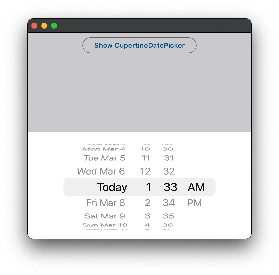
Examples#
Basic Example#
from datetime import datetime

import flet as ft


def main(page: ft.Page):
    page.horizontal_alignment = ft.CrossAxisAlignment.CENTER

    def handle_date_change(e: ft.Event[ft.CupertinoDatePicker]):
        message.value = f"Chosen Date: {e.control.value.strftime('%Y-%m-%d %H:%M %p')}"
        page.update()

    cupertino_date_picker = ft.CupertinoDatePicker(
        value=datetime.now(),
        date_picker_mode=ft.CupertinoDatePickerMode.DATE_AND_TIME,
        on_change=handle_date_change,
    )

    page.add(
        ft.CupertinoFilledButton(
            content="Open CupertinoDatePicker",
            on_click=lambda e: page.show_dialog(
                ft.CupertinoBottomSheet(
                    content=cupertino_date_picker,
                    height=216,
                    padding=ft.Padding.only(top=6),
                )
            ),
        ),
        message := ft.Text("Chosen Time: "),
    )


ft.run(main)
Properties#
class-attribute
instance-attribute
#
bgcolor: ColorValue | None = None
The background color of this date picker.
class-attribute
instance-attribute
#
date_order: CupertinoDatePickerDateOrder | None = None
The order in which the columns inside this picker are displayed.
Note
The final order in which the columns are displayed is also influenced by
the date_picker_mode. For example, if date_picker_mode is
CupertinoDatePickerMode.MONTH_YEAR
both CupertinoDatePickerDateOrder.DAY_MONTH_YEAR and
CupertinoDatePickerDateOrder.MONTH_DAY_YEAR will result
in the month|year order.
class-attribute
instance-attribute
#
date_picker_mode: CupertinoDatePickerMode = DATE_AND_TIME
The mode of the date picker.
class-attribute
instance-attribute
#
first_date: DateTimeValue | None = None
The earliest allowable date that the user can select.
- If set to
None(the default), there is no lower date limit. - When not
None, one can still scroll the picker to dates earlier thanfirst_date, with the exception that theon_changewill not be called. Once let go, the picker will scroll back tofirst_date.
Note
In CupertinoDatePickerMode.TIME mode, a time becomes unselectable
if the datetime produced by combining that particular time and the date part of
value is earlier than last_date. So typically, first_date needs
to be set to a datetime that is on the same date as value.
class-attribute
instance-attribute
#
item_extent: Number = 32.0
The uniform height of all children.
Raises:
-
ValueError–If
item_extentis not strictly greater than0.
class-attribute
instance-attribute
#
last_date: DateTimeValue | None = None
The latest allowable date that the user can select.
- If set to
None(the default), there is no upper date limit. - When not
None, one can still scroll the picker to dates later thanlast_date, with the exception that theon_changewill not be called. Once let go, the picker will scroll back tolast_date.
Note
In CupertinoDatePickerMode.TIME mode, a time becomes unselectable
if the datetime produced by combining that particular time and the date part
of value is later than last_date. So typically, last_date needs
to be set to a datetime that is on the same date as value.
class-attribute
instance-attribute
#
locale: Locale | None = None
The locale for this date picker. It is intended for rare cases where this control should be localized differently from the rest of the page.
Notes
- The locale must be supported by Flutter's global localization delegates; otherwise the override is ignored and the control uses the page or system locale.
- If
None(the default), the page or system locale is used.
class-attribute
instance-attribute
#
maximum_year: int | None = None
Maximum year to which the picker can be scrolled when in
CupertinoDatePickerMode.DATE mode.
Defaults to None - no limit.
Raises:
-
ValueError–If
valueyear is greater thanmaximum_year.
class-attribute
instance-attribute
#
minimum_year: int = 1
Minimum year to which the picker can be scrolled when in
CupertinoDatePickerMode.DATE mode.
Raises:
-
ValueError–If
valueyear is less thanminimum_year.
class-attribute
instance-attribute
#
minute_interval: int = 1
The granularity of the minutes spinner, if it is shown in the current
date_picker_mode.
Note
Must be an integer factor of 60.
Raises:
-
ValueError–If
minute_intervalis not a positive integer factor of60.
class-attribute
instance-attribute
#
show_day_of_week: bool = False
Whether to show day of week alongside day.
Raises:
-
ValueError–If
show_day_of_weekis set whendate_picker_modeis notCupertinoDatePickerMode.DATE.
class-attribute
instance-attribute
#
use_24h_format: bool = False
Whether to use the 24-hour time format.
If False, the 12-hour time format is used.
class-attribute
instance-attribute
#
value: DateTimeValue = field(default_factory=lambda: now())
The initial date and/or time of the picker.
It must conform to the intervals set in first_date, last_date,
minimum_year, and maximum_year,
else a ValueError will be raised.
Defaults to the present date and time.
Raises:
-
ValueError–If
valueis beforefirst_dateor afterlast_date. -
ValueError–If
valueyear is less thanminimum_yearor greater thanmaximum_year. -
ValueError–If
valueminute is not divisible byminute_interval.
Events#
class-attribute
instance-attribute
#
on_change: (
    ControlEventHandler[CupertinoDatePicker] | None
) = None
Called when the selected date and/or time changes.
Will not be called if the new selected value is not valid,
or is not in the range of first_date and last_date.