CupertinoContextMenu
Examples#
Basic Example#
import flet as ft
def main(page: ft.Page):
page.horizontal_alignment = ft.CrossAxisAlignment.CENTER
page.vertical_alignment = ft.MainAxisAlignment.CENTER
page.add(
ft.CupertinoContextMenu(
enable_haptic_feedback=True,
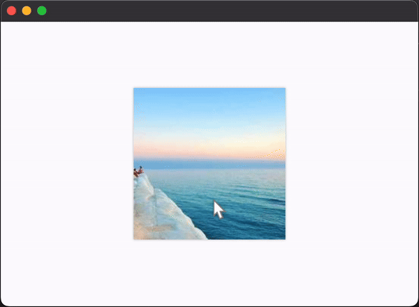
content=ft.Image("https://picsum.photos/200/200"),
actions=[
ft.CupertinoContextMenuAction(
content="Action 1",
default=True,
trailing_icon=ft.Icons.CHECK,
on_click=lambda e: print("Action 1"),
),
ft.CupertinoContextMenuAction(
content="Action 2",
trailing_icon=ft.Icons.MORE,
on_click=lambda e: print("Action 2"),
),
ft.CupertinoContextMenuAction(
content="Action 3",
destructive=True,
trailing_icon=ft.Icons.CANCEL,
on_click=lambda e: print("Action 3"),
),
],
)
)
ft.run(main)
CupertinoContextMenu
#
Bases: AdaptiveControl
A full-screen modal route that opens up when the content
is long-pressed.
actions
#
A list of action buttons to be shown in the menu.
Typically CupertinoContextMenuAction
s.
Note
This list must have at least one visible action.
adaptive
#
adaptive: bool | None = None
Enables platform-specific rendering or inheritance of adaptiveness from parent controls.
col
#
col: ResponsiveNumber = 12
If a parent of this control is a ResponsiveRow
,
this property is used to determine
how many virtual columns of a screen this control will span.
Can be a number or a dictionary configured to have a different value for specific
breakpoints, for example col={"sm": 6}
.
This control spans the 12 virtual columns by default.
Dimensions
Breakpoint | Dimension |
---|---|
xs | <576px |
sm | ≥576px |
md | ≥768px |
lg | ≥992px |
xl | ≥1200px |
xxl | ≥1400px |
content
#
content: Control
The child control to be shown.
When the CupertinoContextMenu
is long-pressed, the menu will open and this control
will be moved to the new route and be expanded. This allows the child to resize to
fit in its place in the new route, if it doesn't size itself.
disabled
#
disabled: bool = False
Every control has disabled
property which is False
by default - control and all
its children are enabled.
Note
The value of this property will be propagated down to all children controls recursively.
enable_haptic_feedback
#
enable_haptic_feedback: bool = True
Whether a click on the actions
should produce haptic feedback.
expand
#
expand_loose
#
expand_loose: bool = False
Allows the control to expand along the main axis if space is available, but does not require it to fill all available space.
More information here.
opacity
#
opacity: Number = 1.0
Defines the transparency of the control.
Value ranges from 0.0
(completely transparent) to 1.0
(completely opaque
without any transparency).
page
#
The page (of type Page
or PageView
) to which this control belongs to.
parent
#
parent: BaseControl | None
The direct ancestor(parent) of this control.
It defaults to None
and will only have a value when this control is mounted (added to the page tree).
The Page
control (which is the root of the tree) is an exception - it always has parent=None
.
tooltip
#
tooltip: TooltipValue | None = None
The tooltip ot show when this control is hovered over.
visible
#
visible: bool = True
Every control has visible
property which is True
by default - control is
rendered on the page. Setting visible
to False
completely prevents control (and
all its children if any) from rendering on a page canvas. Hidden controls cannot be
focused or selected with a keyboard or mouse and they do not emit any events.