CupertinoAlertDialog
An iOS-style alert dialog.
An alert dialog informs the user about situations that require acknowledgement. An alert dialog has an optional title and an optional list of actions. The title is displayed above the content and the actions are displayed below the content.
Inherits: DialogControl
Properties
-
actions(list[Control]) –A set of actions that are displayed at the bottom of the dialog.
-
barrier_color(ColorValue | None) –The color of the modal barrier below this dialog.
-
content(Control | None) –The content of this dialog, displayed in a light font at the center of this dialog.
-
inset_animation(Animation) –The animation style to be used when the system keyboard intrudes into the space that the dialog is placed in.
-
modal(bool) –Whether this dialog cannot be dismissed by clicking the area outside of it.
-
title(StrOrControl | None) –The title of this dialog, displayed in a large font at the top of this dialog.
Examples#
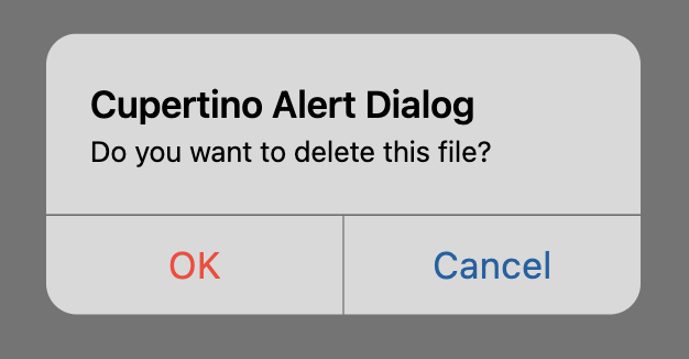
File deletion confirmation#
import flet as ft


def main(page: ft.Page):
    page.horizontal_alignment = ft.CrossAxisAlignment.CENTER

    def handle_dialog_dismissal(e: ft.Event[ft.DialogControl]):
        page.add(ft.Text("Dialog dismissed"))

    def handle_action_click(e: ft.Event[ft.CupertinoDialogAction]):
        page.add(ft.Text(f"Action clicked: {e.control.content}"))
        page.pop_dialog()

    cupertino_alert_dialog = ft.CupertinoAlertDialog(
        title=ft.Text("Cupertino Alert Dialog"),
        content=ft.Text("Do you want to delete this file?"),
        on_dismiss=handle_dialog_dismissal,
        actions=[
            ft.CupertinoDialogAction(
                content="Yes",
                destructive=True,
                on_click=handle_action_click,
            ),
            ft.CupertinoDialogAction(
                content="No", default=True, on_click=handle_action_click
            ),
        ],
    )

    page.add(
        ft.CupertinoFilledButton(
            content="Open CupertinoAlertDialog",
            on_click=lambda e: page.show_dialog(cupertino_alert_dialog),
        )
    )


ft.run(main)
Cupertino, material and adaptive alert dialogs#
from typing import Union

import flet as ft


def main(page: ft.Page):
    page.horizontal_alignment = ft.CrossAxisAlignment.CENTER
    page.scroll = ft.ScrollMode.AUTO

    def handle_action_click(
        e: ft.Event[Union[ft.TextButton, ft.CupertinoDialogAction]],
    ):
        page.add(ft.Text(f"Action clicked: {e.control.content}"))
        page.pop_dialog()

    cupertino_actions = [
        ft.CupertinoDialogAction(
            content="Yes",
            destructive=True,
            on_click=handle_action_click,
        ),
        ft.CupertinoDialogAction(
            content="No",
            default=False,
            on_click=handle_action_click,
        ),
    ]

    material_actions = [
        ft.TextButton(content="Yes", on_click=handle_action_click),
        ft.TextButton(content="No", on_click=handle_action_click),
    ]

    page.add(
        ft.FilledButton(
            content="Open Material Dialog",
            on_click=lambda e: page.show_dialog(
                ft.AlertDialog(
                    title=ft.Text("Material Alert Dialog"),
                    content=ft.Text("Do you want to delete this file?"),
                    actions=material_actions,
                )
            ),
        ),
        ft.CupertinoFilledButton(
            content="Open Cupertino Dialog",
            on_click=lambda e: page.show_dialog(
                ft.CupertinoAlertDialog(
                    title=ft.Text("Cupertino Alert Dialog"),
                    content=ft.Text("Do you want to delete this file?"),
                    actions=cupertino_actions,
                )
            ),
        ),
        ft.FilledButton(
            content="Open Adaptive Dialog",
            adaptive=True,
            bgcolor=ft.Colors.BLUE_ACCENT,
            on_click=lambda e: page.show_dialog(
                ft.AlertDialog(
                    adaptive=True,
                    title=ft.Text("Adaptive Alert Dialog"),
                    content=ft.Text("Do you want to delete this file?"),
                    actions=(
                        cupertino_actions
                        if page.platform.is_apple()
                        else material_actions
                    ),
                )
            ),
        ),
    )


ft.run(main)
Properties#
class-attribute
instance-attribute
#
A set of actions that are displayed at the bottom of the dialog.
Typically this is a list of CupertinoDialogAction controls.
class-attribute
instance-attribute
#
barrier_color: ColorValue | None = None
The color of the modal barrier below this dialog.
If None, then DialogTheme.barrier_color is used.
If that is also None, the default is Colors.BLACK_54.
class-attribute
instance-attribute
#
inset_animation: Animation = field(
    default_factory=lambda: Animation(
        curve=DECELERATE,
        duration=Duration(milliseconds=100),
    )
)
The animation style to be used when the system keyboard intrudes into the space that the dialog is placed in.
class-attribute
instance-attribute
#
modal: bool = False
Whether this dialog cannot be dismissed by clicking the area outside of it.
class-attribute
instance-attribute
#
title: StrOrControl | None = None
The title of this dialog, displayed in a large font at the top of this dialog.
Typically a Text control.