CupertinoActionSheet#
An iOS-style action sheet.
Action sheets are generally used to give the user a choice between two or more choices for the current context.
sheet = ft.CupertinoActionSheet(
    title=ft.Text("Choose an option"),
    message=ft.Text("Select what you would like to do"),
    actions=[
        ft.CupertinoActionSheetAction(content=ft.Text("Save")),
        ft.CupertinoActionSheetAction(
            content=ft.Text("Delete"), destructive=True
        ),
    ],
    cancel=ft.CupertinoActionSheetAction(content=ft.Text("Cancel")),
)
page.show_dialog(ft.CupertinoBottomSheet(sheet))
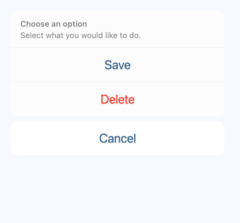
Basic CupertinoActionSheet
Inherits: LayoutControl
Properties
-
actions(list[Control] | None) –A list of action buttons to be shown in the sheet.
-
cancel(Control | None) –An optional control to be shown below the actions but grouped separately from them.
-
message(StrOrControl | None) –A control containing a descriptive message that provides more details about the reason for the alert.
-
title(StrOrControl | None) –A control containing the title of the action sheet.
Examples#
Basic Example#
import flet as ft


def main(page: ft.Page):
    page.horizontal_alignment = ft.CrossAxisAlignment.CENTER

    def handle_click(e):
        page.add(ft.Text(f"Action clicked: {e.control.content.value}"))
        page.pop_dialog()

    action_sheet = ft.CupertinoActionSheet(
        title=ft.Row(
            controls=[ft.Text("Title"), ft.Icon(ft.Icons.BEDTIME)],
            alignment=ft.MainAxisAlignment.CENTER,
        ),
        message=ft.Row(
            controls=[ft.Text("Description"), ft.Icon(ft.Icons.AUTO_AWESOME)],
            alignment=ft.MainAxisAlignment.CENTER,
        ),
        cancel=ft.CupertinoActionSheetAction(
            content=ft.Text("Cancel"),
            on_click=handle_click,
        ),
        actions=[
            ft.CupertinoActionSheetAction(
                content=ft.Text("Default Action"),
                default=True,
                on_click=handle_click,
            ),
            ft.CupertinoActionSheetAction(
                content=ft.Text("Normal Action"),
                on_click=handle_click,
            ),
            ft.CupertinoActionSheetAction(
                content=ft.Text("Destructive Action"),
                destructive=True,
                on_click=handle_click,
            ),
        ],
    )

    bottom_sheet = ft.CupertinoBottomSheet(action_sheet)

    page.add(
        ft.CupertinoFilledButton(
            content="Open CupertinoBottomSheet",
            on_click=lambda e: page.show_dialog(bottom_sheet),
        )
    )


ft.run(main)
Properties#
class-attribute
instance-attribute
#
A list of action buttons to be shown in the sheet.
These actions are typically CupertinoActionSheetActions.
Raises:
class-attribute
instance-attribute
#
cancel: Control | None = None
An optional control to be shown below the actions but grouped separately from them.
Typically a CupertinoActionSheetAction button.
class-attribute
instance-attribute
#
message: StrOrControl | None = None
A control containing a descriptive message that provides more details about the reason for the alert.
Typically a Text control.
class-attribute
instance-attribute
#
title: StrOrControl | None = None
A control containing the title of the action sheet.
Typically a Text control.