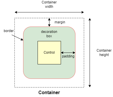
Container
Allows to decorate a control with background color and border and position it with padding, margin and alignment.
Inherits: LayoutControl, AdaptiveControl
Properties
-
alignment(Alignment | None) –Defines the alignment of the
contentinside the container. -
animate(AnimationValue | None) –Enables container "implicit" animation that gradually changes its values over a period of time.
-
bgcolor(ColorValue | None) –Defines the background color of this container.
-
blend_mode(BlendMode | None) –The blend mode applied to the
colororgradientbackground of the container. -
blur(BlurValue | None) –Defines how Gaussian blur effect should be applied under this container.
-
border(Border | None) –A border to draw above the background color.
-
border_radius(BorderRadiusValue | None) –The border radius of this container.
-
clip_behavior(ClipBehavior | None) –Defines how the
contentof this container is clipped. -
color_filter(ColorFilter | None) –Applies a color filter to this container.
-
content(Control | None) –The content of this container.
-
dark_theme(Theme | None) –Allows setting a nested theme to be used when in dark theme mode for all controls inside the container and down its tree.
-
foreground_decoration(BoxDecoration | None) –The foreground decoration of this container.
-
gradient(Gradient | None) –Defines the gradient background of this container.
-
ignore_interactions(bool) –Whether to ignore all interactions with this container and its descendants.
-
image(DecorationImage | None) –An image to paint above the
bgcolororgradient. Ifshape=BoxShape.CIRCLEthen this image is clipped to the circle's boundary; ifborder_radiusis notNonethen the image is clipped to the given radii. -
ink(bool) –Trueto produce ink ripples effect when user clicks this container. -
ink_color(ColorValue | None) –The splash color of the ink response.
-
padding(PaddingValue | None) –Empty space to inscribe inside a container decoration (background, border). The child control is placed inside this padding.
-
shadow(BoxShadowValue | None) –The shadow(s) below this container.
-
shape(BoxShape) –Sets the shape of this container.
-
theme(Theme | None) –Allows setting a nested theme for all controls inside this container and down its tree.
-
theme_mode(ThemeMode | None) –"Resets" parent theme and creates a new, unique scheme for all controls inside the container. Otherwise the styles defined in container's
themeproperty override corresponding styles from the parent, inherited theme. -
url(str | Url | None) –The URL to open when this container is clicked.
Events
-
on_click(ControlEventHandler[Container] | None) –Called when a user clicks the container.
-
on_hover(ControlEventHandler[Container] | None) –Called when a mouse pointer enters or exists the container area.
-
on_long_press(ControlEventHandler[Container] | None) –Called when this container is long-pressed.
-
on_tap_down(EventHandler[TapEvent[Container]] | None) –Called when a user clicks the container with or without a long press.
Examples#
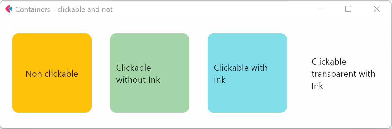
Clickable container#
import flet as ft


def main(page: ft.Page):
    page.title = "Container Example"
    page.theme_mode = ft.ThemeMode.LIGHT
    page.vertical_alignment = ft.MainAxisAlignment.CENTER
    page.horizontal_alignment = ft.CrossAxisAlignment.CENTER

    page.add(
        ft.Row(
            alignment=ft.MainAxisAlignment.CENTER,
            controls=[
                ft.Container(
                    content=ft.Text("Non clickable"),
                    margin=10,
                    padding=10,
                    alignment=ft.Alignment.CENTER,
                    bgcolor=ft.Colors.AMBER,
                    width=150,
                    height=150,
                    border_radius=10,
                ),
                ft.Container(
                    content=ft.Text("Clickable without Ink"),
                    margin=10,
                    padding=10,
                    alignment=ft.Alignment.CENTER,
                    bgcolor=ft.Colors.GREEN_200,
                    width=150,
                    height=150,
                    border_radius=10,
                    on_click=lambda e: print("Clickable without Ink clicked!"),
                ),
                ft.Container(
                    content=ft.Text("Clickable with Ink"),
                    margin=10,
                    padding=10,
                    alignment=ft.Alignment.CENTER,
                    bgcolor=ft.Colors.CYAN_200,
                    width=150,
                    height=150,
                    border_radius=10,
                    ink=True,
                    on_click=lambda e: print("Clickable with Ink clicked!"),
                ),
                ft.Container(
                    content=ft.Text("Clickable transparent with Ink"),
                    margin=10,
                    padding=10,
                    alignment=ft.Alignment.CENTER,
                    width=150,
                    height=150,
                    border_radius=10,
                    ink=True,
                    on_click=lambda e: print("Clickable transparent with Ink clicked!"),
                ),
            ],
        ),
    )


ft.run(main)
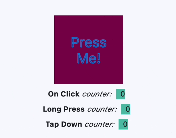
Handling clicks#
import flet as ft


def main(page: ft.Page):
    page.theme_mode = ft.ThemeMode.LIGHT
    page.vertical_alignment = ft.MainAxisAlignment.CENTER
    page.horizontal_alignment = ft.CrossAxisAlignment.CENTER
    lp_counter = 0
    cl_counter = 0
    td_counter = 0

    def on_click(e):
        nonlocal cl_counter
        cl_counter += 1
        t1.spans[-1] = ft.TextSpan(
            text=f"  {cl_counter}  ",
            style=ft.TextStyle(size=16, bgcolor=ft.Colors.TEAL_300),
        )
        page.update()

    def on_long_press(e):
        nonlocal lp_counter
        lp_counter += 1
        t3.spans[-1] = ft.TextSpan(
            text=f"  {lp_counter}  ",
            style=ft.TextStyle(size=16, bgcolor=ft.Colors.TEAL_300),
        )
        page.update()

    def on_tap_down(e):
        nonlocal td_counter
        td_counter += 1
        t2.spans[-1] = ft.TextSpan(
            text=f"  {td_counter}  ",
            style=ft.TextStyle(size=16, bgcolor=ft.Colors.TEAL_300),
        )
        page.update()

    c = ft.Container(
        bgcolor=ft.Colors.PINK_900,
        alignment=ft.Alignment.CENTER,
        padding=ft.Padding.all(10),
        height=150,
        width=150,
        on_click=on_click,
        on_long_press=on_long_press,
        on_tap_down=on_tap_down,
        content=ft.Text(
            "Press Me!",
            text_align=ft.TextAlign.CENTER,
            style=ft.TextStyle(
                size=30,
                # weight=ft.FontWeight.BOLD,
                foreground=ft.Paint(
                    color=ft.Colors.BLUE_700,
                    stroke_cap=ft.StrokeCap.BUTT,
                    stroke_width=2,
                    stroke_join=ft.StrokeJoin.BEVEL,
                    style=ft.PaintingStyle.STROKE,
                ),
            ),
            theme_style=ft.TextThemeStyle.DISPLAY_MEDIUM,
        ),
    )
    t1 = ft.Text(
        spans=[
            ft.TextSpan(
                text="On Click", style=ft.TextStyle(size=16, weight=ft.FontWeight.BOLD)
            ),
            ft.TextSpan(text=" counter:  ", style=ft.TextStyle(size=16, italic=True)),
            ft.TextSpan(
                text=f"  {cl_counter}  ",
                style=ft.TextStyle(size=16, bgcolor=ft.Colors.TEAL_300),
            ),
        ]
    )
    t2 = ft.Text(
        spans=[
            ft.TextSpan(
                text="Tap Down", style=ft.TextStyle(size=16, weight=ft.FontWeight.BOLD)
            ),
            ft.TextSpan(text=" counter:  ", style=ft.TextStyle(size=16, italic=True)),
            ft.TextSpan(
                text=f"  {td_counter}  ",
                style=ft.TextStyle(size=16, bgcolor=ft.Colors.TEAL_300),
            ),
        ]
    )
    t3 = ft.Text(
        spans=[
            ft.TextSpan(
                text="Long Press",
                style=ft.TextStyle(size=16, weight=ft.FontWeight.BOLD),
            ),
            ft.TextSpan(text=" counter:  ", style=ft.TextStyle(size=16, italic=True)),
            ft.TextSpan(
                text=f"  {lp_counter}  ",
                style=ft.TextStyle(size=16, bgcolor=ft.Colors.TEAL_300),
            ),
        ]
    )

    page.add(c, t1, t3, t2)


ft.run(main)
Handling hovers#
import flet as ft


def main(page: ft.Page):
    def handle_hover(e: ft.Event[ft.Container]):
        e.control.bgcolor = ft.Colors.BLUE if e.data else ft.Colors.RED
        e.control.update()

    page.add(
        ft.Container(
            width=200,
            height=200,
            bgcolor=ft.Colors.RED,
            ink=False,
            on_hover=handle_hover,
        )
    )


ft.run(main)
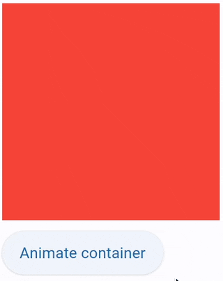
Animate 1#
import flet as ft


def main(page: ft.Page):
    def animate_container(e: ft.Event[ft.Button]):
        container.width = 100 if container.width == 150 else 150
        container.height = 50 if container.height == 150 else 150
        container.bgcolor = (
            ft.Colors.BLUE if container.bgcolor == ft.Colors.RED else ft.Colors.RED
        )
        container.update()

    page.add(
        container := ft.Container(
            width=150,
            height=150,
            bgcolor=ft.Colors.RED,
            animate=ft.Animation(duration=1000, curve=ft.AnimationCurve.BOUNCE_OUT),
        ),
        ft.Button("Animate container", on_click=animate_container),
    )


ft.run(main)
Animate 2#
import flet as ft


def main(page: ft.Page):
    gradient1 = ft.LinearGradient(
        begin=ft.Alignment.TOP_CENTER,
        end=ft.Alignment.BOTTOM_CENTER,
        colors=[ft.Colors.GREEN, ft.Colors.BLUE],
        stops=[0.5, 1.0],
    )
    gradient2 = ft.RadialGradient(
        center=ft.Alignment.TOP_LEFT,
        radius=1.0,
        colors=[ft.Colors.YELLOW, ft.Colors.DEEP_ORANGE_900],
        tile_mode=ft.GradientTileMode.CLAMP,
    )

    message = ft.Text("Animate me!")

    def animate_container(e: ft.Event[ft.Button]):
        message.value = (
            "Animate me back!" if message.value == "Animate me!" else "Animate me!"
        )
        container.width = 150 if container.width == 250 else 250
        container.height = 150 if container.height == 250 else 250
        container.gradient = gradient2 if container.gradient == gradient1 else gradient1
        if container.alignment == ft.Alignment.TOP_LEFT:
            container.alignment = ft.Alignment.BOTTOM_RIGHT
        else:
            container.alignment = ft.Alignment.TOP_LEFT
        container.border_radius = 30 if container.border_radius == 10 else 10
        container.border = (
            ft.Border.all(width=2, color=ft.Colors.BLACK)
            if container.border == ft.Border.all(width=2, color=ft.Colors.BLUE)
            else ft.Border.all(width=2, color=ft.Colors.BLUE)
        )
        container.update()

    page.add(
        container := ft.Container(
            content=message,
            width=250,
            height=250,
            gradient=gradient2,
            alignment=ft.Alignment.TOP_LEFT,
            animate=ft.Animation(duration=1000, curve=ft.AnimationCurve.BOUNCE_OUT),
            border=ft.Border.all(width=2, color=ft.Colors.BLUE),
            border_radius=10,
            padding=10,
        ),
        ft.Button("Animate container", on_click=animate_container),
    )


ft.run(main)
Animate 3#
import flet as ft


def main(page: ft.Page):
    def animate(e: ft.Event[ft.Button]):
        container.width = 100 if container.width == 150 else 150
        container.height = 50 if container.height == 150 else 150
        container.bgcolor = (
            ft.Colors.BLUE if container.bgcolor == ft.Colors.RED else ft.Colors.RED
        )
        container.update()

    page.add(
        container := ft.Container(
            width=150,
            height=150,
            bgcolor=ft.Colors.RED,
            animate=ft.Animation(1000, ft.AnimationCurve.BOUNCE_OUT),
        ),
        ft.Button("Animate container", on_click=animate),
    )


ft.run(main)
Animate 4#
import flet as ft


def main(page: ft.Page):
    def show_menu(e: ft.Event[ft.Button]):
        container.offset = ft.Offset(0, 0)
        container.update()

    def hide_menu(e: ft.Event[ft.IconButton]):
        container.offset = ft.Offset(-2, 0)
        container.update()

    page.overlay.append(
        container := ft.Container(
            left=10,
            top=10,
            width=200,
            height=300,
            bgcolor=ft.Colors.SURFACE_CONTAINER_HIGHEST,
            border_radius=5,
            offset=ft.Offset(-2, 0),
            animate_offset=ft.Animation(300, ft.AnimationCurve.EASE_IN),
            content=ft.Column(
                controls=[
                    ft.Row(
                        alignment=ft.MainAxisAlignment.END,
                        controls=[
                            ft.IconButton(icon=ft.Icons.CLOSE, on_click=hide_menu)
                        ],
                    ),
                    ft.ListTile(
                        title=ft.Text("Menu A"),
                        on_click=lambda _: print("Menu A clicked"),
                    ),
                    ft.ListTile(
                        title=ft.Text("Menu B"),
                        on_click=lambda _: print("Menu B clicked"),
                    ),
                ]
            ),
        )
    )

    page.add(ft.Button("Show menu", on_click=show_menu))


ft.run(main)
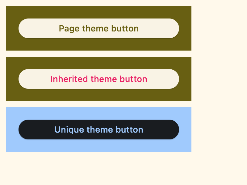
Nested themes 1#
import flet as ft


def main(page: ft.Page):
    # Yellow page theme with SYSTEM (default) mode
    page.theme = ft.Theme(
        color_scheme_seed=ft.Colors.YELLOW,
    )

    page.add(
        # Page theme
        ft.Container(
            content=ft.Button("Page theme button"),
            bgcolor=ft.Colors.SURFACE_TINT,
            padding=20,
            width=300,
        ),
        # Inherited theme with primary color overridden
        ft.Container(
            theme=ft.Theme(color_scheme=ft.ColorScheme(primary=ft.Colors.PINK)),
            content=ft.Button("Inherited theme button"),
            bgcolor=ft.Colors.SURFACE_TINT,
            padding=20,
            width=300,
        ),
        # Unique always DARK theme
        ft.Container(
            theme=ft.Theme(color_scheme_seed=ft.Colors.INDIGO),
            theme_mode=ft.ThemeMode.DARK,
            content=ft.Button("Unique theme button"),
            bgcolor=ft.Colors.SURFACE_TINT,
            padding=20,
            width=300,
        ),
    )


if __name__ == "__main__":
    ft.run(main)
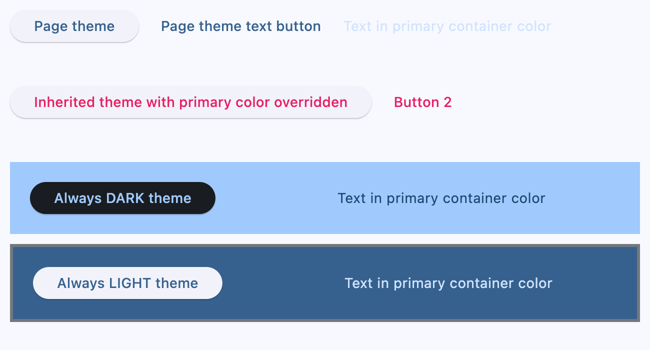
Nested themes 2#
import flet as ft


def main(page: ft.Page):
    # page.theme = ft.Theme(
    #     color_scheme_seed=ft.Colors.YELLOW,
    #     color_scheme=ft.ColorScheme(
    #         primary=ft.Colors.GREEN, primary_container=ft.Colors.GREEN_200
    #     ),
    # )

    page.add(
        ft.Row(
            controls=[
                ft.Button("Page theme"),
                ft.TextButton("Page theme text button"),
                ft.Text(
                    "Text in primary container color",
                    color=ft.Colors.PRIMARY_CONTAINER,
                ),
            ]
        ),
        ft.Container(
            height=100,
            theme=ft.Theme(color_scheme=ft.ColorScheme(primary=ft.Colors.PINK)),
            content=ft.Row(
                controls=[
                    ft.Button("Inherited theme with primary color overridden"),
                    ft.TextButton("Button 2"),
                ]
            ),
        ),
        ft.Container(
            padding=20,
            bgcolor=ft.Colors.SURFACE_TINT,
            theme_mode=ft.ThemeMode.DARK,
            theme=ft.Theme(
                color_scheme_seed=ft.Colors.GREEN,
                color_scheme=ft.ColorScheme(primary_container=ft.Colors.BLUE),
            ),
            content=ft.Row(
                controls=[
                    ft.Button("Always DARK theme"),
                    ft.TextButton("Text button"),
                    ft.Text(
                        "Text in primary container color",
                        color=ft.Colors.PRIMARY_CONTAINER,
                    ),
                ]
            ),
        ),
        ft.Container(
            padding=20,
            bgcolor=ft.Colors.SURFACE_TINT,
            border=ft.Border.all(3, ft.Colors.OUTLINE),
            theme_mode=ft.ThemeMode.LIGHT,
            theme=ft.Theme(),
            content=ft.Row(
                controls=[
                    ft.Button("Always LIGHT theme"),
                    ft.TextButton("Text button"),
                    ft.Text(
                        "Text in primary container color",
                        color=ft.Colors.PRIMARY_CONTAINER,
                    ),
                ]
            ),
        ),
    )


if __name__ == "__main__":
    ft.run(main)
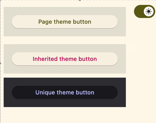
Nested themes 3#
import flet as ft


def main(page: ft.Page):
    page.theme_mode = ft.ThemeMode.DARK

    def handle_switch_change(e: ft.Event[ft.Switch]):
        if page.theme_mode == ft.ThemeMode.DARK:
            page.theme_mode = ft.ThemeMode.LIGHT
            switch.thumb_icon = ft.Icons.LIGHT_MODE
        else:
            switch.thumb_icon = ft.Icons.DARK_MODE
            page.theme_mode = ft.ThemeMode.DARK
        page.update()

    # Yellow page theme with SYSTEM (default) mode
    page.theme = ft.Theme(color_scheme_seed=ft.Colors.YELLOW)

    switch = ft.Switch(thumb_icon=ft.Icons.DARK_MODE, on_change=handle_switch_change)

    page.add(
        # Page theme
        ft.Row(
            alignment=ft.MainAxisAlignment.SPACE_BETWEEN,
            controls=[
                ft.Container(
                    content=ft.Button("Page theme button"),
                    bgcolor=ft.Colors.SURFACE_TINT,
                    padding=20,
                    width=300,
                ),
                ft.Container(
                    content=switch,
                    padding=ft.Padding.only(bottom=50),
                    alignment=ft.Alignment.TOP_RIGHT,
                ),
            ],
        ),
        # Inherited theme with primary color overridden
        ft.Container(
            theme=ft.Theme(color_scheme=ft.ColorScheme(primary=ft.Colors.PINK)),
            content=ft.Button("Inherited theme button"),
            bgcolor=ft.Colors.SURFACE_TINT,
            padding=20,
            width=300,
        ),
        # Unique always DARK theme
        ft.Container(
            theme=ft.Theme(color_scheme_seed=ft.Colors.INDIGO),
            theme_mode=ft.ThemeMode.DARK,
            content=ft.Button("Unique theme button"),
            bgcolor=ft.Colors.SURFACE_TINT,
            padding=20,
            width=300,
        ),
    )


ft.run(main)
Size aware#
import flet as ft


def main(page: ft.Page):
    def handle_size_change(e: ft.LayoutSizeChangeEvent[ft.Container]):
        e.control.content.value = f"{int(e.width)} x {int(e.height)}"

    page.add(
        ft.Container(
            expand=True,
            alignment=ft.Alignment.CENTER,
            bgcolor=ft.Colors.BLUE_ACCENT,
            content=ft.Text(color=ft.Colors.WHITE, weight=ft.FontWeight.BOLD),
            size_change_interval=100,
            on_size_change=handle_size_change,
        )
    )


if __name__ == "__main__":
    ft.run(main)
Properties#
class-attribute
instance-attribute
#
alignment: Alignment | None = None
Defines the alignment of the content inside the container.
class-attribute
instance-attribute
#
animate: AnimationValue | None = None
Enables container "implicit" animation that gradually changes its values over a period of time.
class-attribute
instance-attribute
#
bgcolor: ColorValue | None = None
Defines the background color of this container.
class-attribute
instance-attribute
#
blend_mode: BlendMode | None = None
The blend mode applied to the color or gradient background of the container.
Defaults to BlendMode.MODULATE.
class-attribute
instance-attribute
#
blur: BlurValue | None = None
Defines how Gaussian blur effect should be applied under this container.
Example
ft.Stack(
    controls=[
        ft.Container(
            content=ft.Text("Hello"),
            image_src="https://picsum.photos/100/100",
            width=100,
            height=100,
        ),
        ft.Container(
            width=50,
            height=50,
            blur=10,
            bgcolor="#44CCCC00",
        ),
        ft.Container(
            width=50,
            height=50,
            left=10,
            top=60,
            blur=(0, 10),
        ),
        ft.Container(
            top=10,
            left=60,
            blur=ft.Blur(10, 0, ft.BlurTileMode.MIRROR),
            width=50,
            height=50,
            bgcolor="#44CCCCCC",
            border=ft.border.all(2, ft.Colors.BLACK),
        ),
    ]
)
class-attribute
instance-attribute
#
border: Border | None = None
A border to draw above the background color.
class-attribute
instance-attribute
#
border_radius: BorderRadiusValue | None = None
The border radius of this container.
class-attribute
instance-attribute
#
clip_behavior: ClipBehavior | None = None
Defines how the content of this container is clipped.
Defaults to ClipBehavior.ANTI_ALIAS if border_radius is not None;
otherwise ClipBehavior.NONE.
class-attribute
instance-attribute
#
color_filter: ColorFilter | None = None
Applies a color filter to this container.
class-attribute
instance-attribute
#
content: Control | None = None
The content of this container.
class-attribute
instance-attribute
#
dark_theme: Theme | None = None
Allows setting a nested theme to be used when in dark theme mode for all controls inside the container and down its tree.
class-attribute
instance-attribute
#
foreground_decoration: BoxDecoration | None = None
The foreground decoration of this container.
class-attribute
instance-attribute
#
gradient: Gradient | None = None
Defines the gradient background of this container.
class-attribute
instance-attribute
#
ignore_interactions: bool = False
Whether to ignore all interactions with this container and its descendants.
class-attribute
instance-attribute
#
image: DecorationImage | None = None
An image to paint above the bgcolor or gradient. If shape=BoxShape.CIRCLE then this image is clipped to the circle's boundary; if border_radius is not None then the image is clipped to the given radii.
class-attribute
instance-attribute
#
ink: bool = False
True to produce ink ripples effect when user clicks this container.
class-attribute
instance-attribute
#
ink_color: ColorValue | None = None
The splash color of the ink response.
class-attribute
instance-attribute
#
padding: PaddingValue | None = None
Empty space to inscribe inside a container decoration (background, border). The child control is placed inside this padding.
class-attribute
instance-attribute
#
shadow: BoxShadowValue | None = None
The shadow(s) below this container.
class-attribute
instance-attribute
#
Sets the shape of this container.
class-attribute
instance-attribute
#
theme: Theme | None = None
Allows setting a nested theme for all controls inside this container and down its tree.
class-attribute
instance-attribute
#
theme_mode: ThemeMode | None = None
"Resets" parent theme and creates a new, unique scheme for all controls inside the container. Otherwise the styles defined in container's theme property override corresponding styles from the parent, inherited theme.
Defaults to ThemeMode.SYSTEM.
class-attribute
instance-attribute
#
The URL to open when this container is clicked.
Additionally, if an on_click callback is provided,
it is fired after that.
Events#
class-attribute
instance-attribute
#
on_click: ControlEventHandler[Container] | None = None
Called when a user clicks the container.
It will not be called if this container is long pressed.
class-attribute
instance-attribute
#
on_hover: ControlEventHandler[Container] | None = None
Called when a mouse pointer enters or exists the container area.
The data property of the event handler argument is a boolean:
True when the cursor enters and False when it exits this container.
class-attribute
instance-attribute
#
on_long_press: ControlEventHandler[Container] | None = None
Called when this container is long-pressed.
class-attribute
instance-attribute
#
on_tap_down: EventHandler[TapEvent[Container]] | None = None
Called when a user clicks the container with or without a long press.