Column

Basic Column with Text controls
Inherits: LayoutControl, ScrollableControl, AdaptiveControl
Properties
-
alignment(MainAxisAlignment) –How the child Controls should be placed vertically.
-
controls(list[Control]) –A list of controls to display.
-
horizontal_alignment(CrossAxisAlignment) –Defines how the
controlsshould be placed horizontally. -
intrinsic_width(bool) –If
True, the Column will be as wide as the widest child control. -
run_alignment(MainAxisAlignment) –How the runs should be placed in the cross-axis when
wrap -
run_spacing(Number) –The spacing between runs when
wrapisTrue. -
spacing(Number) –Spacing between the
controls. -
tight(bool) –Determines how vertical space is allocated.
-
wrap(bool) –Whether the
controlsshould wrap into additional columns (runs) when they don't fit in a single vertical column.
Examples#
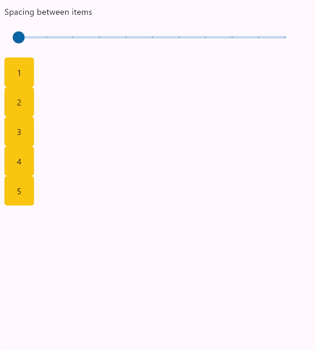
Column spacing#
import flet as ft


def main(page: ft.Page):
    def generate_items(count: int):
        """Generates a list of custom Containers with length `count`."""
        return [
            ft.Container(
                content=ft.Text(value=str(i)),
                alignment=ft.Alignment.CENTER,
                width=50,
                height=50,
                bgcolor=ft.Colors.AMBER,
                border_radius=ft.BorderRadius.all(5),
            )
            for i in range(1, count + 1)
        ]

    def handle_slider_change(e: ft.Event[ft.Slider]):
        """Updates the spacing between items based on slider value."""
        column.spacing = int(e.control.value)
        column.update()

    page.add(
        ft.Column(
            controls=[
                ft.Text("Spacing between items"),
                ft.Slider(
                    min=0,
                    max=100,
                    divisions=10,
                    value=0,
                    label="{value}",
                    width=500,
                    on_change=handle_slider_change,
                ),
            ]
        ),
        column := ft.Column(spacing=0, controls=generate_items(5)),
    )


ft.run(main)
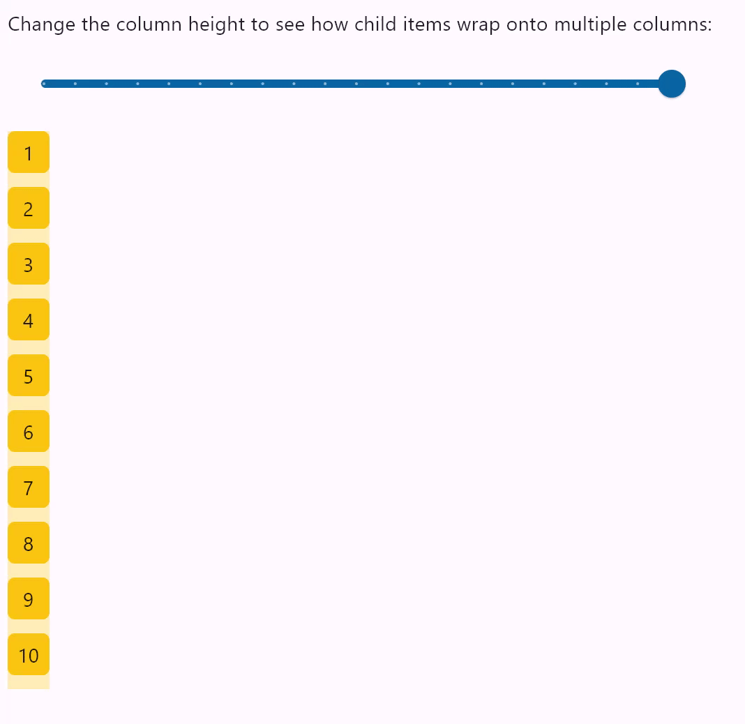
Column wrapping#
import flet as ft

HEIGHT = 400


def main(page: ft.Page):
    def items(count: int):
        return [
            ft.Container(
                content=ft.Text(value=str(i)),
                alignment=ft.Alignment.CENTER,
                width=30,
                height=30,
                bgcolor=ft.Colors.AMBER,
                border_radius=ft.BorderRadius.all(5),
            )
            for i in range(1, count + 1)
        ]

    def handle_slider_change(e: ft.Event[ft.Slider]):
        col.height = float(e.control.value)
        col.update()

    page.add(
        ft.Column(
            controls=[
                ft.Text(
                    "Change the column height to see how child items wrap onto multiple columns:"
                ),
                ft.Slider(
                    min=0,
                    max=HEIGHT,
                    divisions=20,
                    value=HEIGHT,
                    label="{value}",
                    width=500,
                    on_change=handle_slider_change,
                ),
            ]
        ),
        ft.Container(
            bgcolor=ft.Colors.TRANSPARENT,
            content=(
                col := ft.Column(
                    wrap=True,
                    spacing=10,
                    run_spacing=10,
                    controls=items(10),
                    height=HEIGHT,
                )
            ),
        ),
    )


ft.run(main)
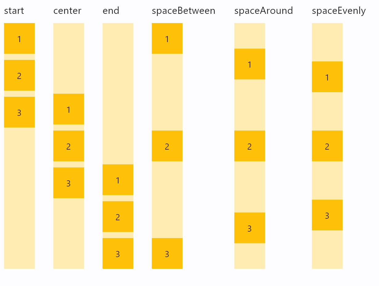
Column vertical alignments#
import flet as ft


class ColumnFromVerticalAlignment(ft.Column):
    def __init__(self, alignment: ft.MainAxisAlignment):
        super().__init__()
        self.controls = [
            ft.Text(str(alignment), size=10),
            ft.Container(
                content=ft.Column(self.generate_items(3), alignment=alignment),
                bgcolor=ft.Colors.AMBER_100,
                height=400,
            ),
        ]

    @staticmethod
    def generate_items(count: int):
        """Generates a list of custom Containers with length `count`."""
        return [
            ft.Container(
                content=ft.Text(value=str(i)),
                alignment=ft.Alignment.CENTER,
                width=50,
                height=50,
                bgcolor=ft.Colors.AMBER_500,
            )
            for i in range(1, count + 1)
        ]


def main(page: ft.Page):
    page.add(
        ft.Row(
            spacing=30,
            alignment=ft.MainAxisAlignment.START,
            scroll=ft.ScrollMode.AUTO,
            controls=[
                ColumnFromVerticalAlignment(ft.MainAxisAlignment.START),
                ColumnFromVerticalAlignment(ft.MainAxisAlignment.CENTER),
                ColumnFromVerticalAlignment(ft.MainAxisAlignment.END),
                ColumnFromVerticalAlignment(ft.MainAxisAlignment.SPACE_BETWEEN),
                ColumnFromVerticalAlignment(ft.MainAxisAlignment.SPACE_AROUND),
                ColumnFromVerticalAlignment(ft.MainAxisAlignment.SPACE_EVENLY),
            ],
        )
    )


ft.run(main)
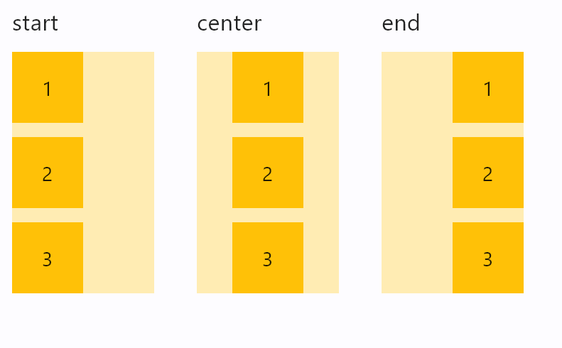
Column horizontal alignments#
import flet as ft


class ColumnFromHorizontalAlignment(ft.Column):
    def __init__(self, alignment: ft.CrossAxisAlignment):
        super().__init__()
        self.controls = [
            ft.Text(str(alignment), size=16),
            ft.Container(
                bgcolor=ft.Colors.AMBER_100,
                width=100,
                content=ft.Column(
                    controls=self.generate_items(3),
                    alignment=ft.MainAxisAlignment.START,
                    horizontal_alignment=alignment,
                ),
            ),
        ]

    @staticmethod
    def generate_items(count: int):
        """Generates a list of custom Containers with length `count`."""
        return [
            ft.Container(
                content=ft.Text(value=str(i)),
                alignment=ft.Alignment.CENTER,
                width=50,
                height=50,
                bgcolor=ft.Colors.AMBER_500,
            )
            for i in range(1, count + 1)
        ]


def main(page: ft.Page):
    page.add(
        ft.Row(
            spacing=30,
            alignment=ft.MainAxisAlignment.START,
            controls=[
                ColumnFromHorizontalAlignment(ft.CrossAxisAlignment.START),
                ColumnFromHorizontalAlignment(ft.CrossAxisAlignment.CENTER),
                ColumnFromHorizontalAlignment(ft.CrossAxisAlignment.END),
            ],
        )
    )


ft.run(main)
Infinite scrolling#
This example demonstrates adding of list items on-the-fly, as user scroll to the bottom, creating the illusion of infinite list:
import threading

import flet as ft


class State:
    i = 0


s = State()
sem = threading.Semaphore()


def main(page: ft.Page):
    def on_scroll(e: ft.OnScrollEvent):
        if e.pixels >= e.max_scroll_extent - 100 and sem.acquire(blocking=False):
            try:
                for _i in range(0, 10):
                    cl.controls.append(ft.Text(f"Text line {s.i}", key=str(s.i)))
                    s.i += 1
                cl.update()
            finally:
                sem.release()

    cl = ft.Column(
        spacing=10,
        height=200,
        width=200,
        scroll=ft.ScrollMode.ALWAYS,
        scroll_interval=0,
        on_scroll=on_scroll,
    )
    for _i in range(0, 50):
        cl.controls.append(ft.Text(f"Text line {s.i}", key=str(s.i)))
        s.i += 1

    page.add(ft.Container(cl, border=ft.Border.all(1)))


ft.run(main)
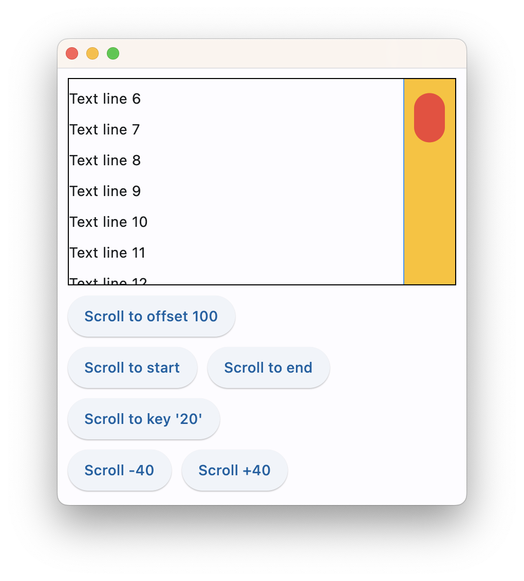
Scrolling programmatically#
This example shows how to use scroll_to() to programmatically scroll a column:
import flet as ft


def main(page: ft.Page):
    column = ft.Column(
        spacing=10,
        height=200,
        width=float("inf"),
        scroll=ft.ScrollMode.ALWAYS,
        controls=[
            ft.Text(f"Text line {i}", key=ft.ScrollKey(i)) for i in range(0, 100)
        ],
    )

    async def scroll_to_offset(e):
        await column.scroll_to(offset=500, duration=1000)

    async def scroll_to_start(e):
        await column.scroll_to(offset=0, duration=1000)

    async def scroll_to_end(e):
        await column.scroll_to(
            offset=-1, duration=2000, curve=ft.AnimationCurve.EASE_IN_OUT
        )

    async def scroll_to_key(e):
        await column.scroll_to(scroll_key="20", duration=1000)

    async def scroll_to_delta(e):
        await column.scroll_to(delta=100, duration=200)

    async def scroll_to_minus_delta(e):
        await column.scroll_to(delta=-100, duration=200)

    page.add(
        ft.Container(content=column, border=ft.Border.all(1)),
        ft.Button("Scroll to offset 500", on_click=scroll_to_offset),
        ft.Row(
            controls=[
                ft.Button("Scroll -100", on_click=scroll_to_minus_delta),
                ft.Button("Scroll +100", on_click=scroll_to_delta),
            ]
        ),
        ft.Button("Scroll to key '20'", on_click=scroll_to_key),
        ft.Row(
            controls=[
                ft.Button("Scroll to start", on_click=scroll_to_start),
                ft.Button("Scroll to end", on_click=scroll_to_end),
            ]
        ),
    )


ft.run(main)
Properties#
class-attribute
instance-attribute
#
alignment: MainAxisAlignment = START
How the child Controls should be placed vertically.
class-attribute
instance-attribute
#
A list of controls to display.
class-attribute
instance-attribute
#
horizontal_alignment: CrossAxisAlignment = START
Defines how the controls should be placed horizontally.
class-attribute
instance-attribute
#
intrinsic_width: bool = False
If True, the Column will be as wide as the widest child control.
class-attribute
instance-attribute
#
run_alignment: MainAxisAlignment = START
How the runs should be placed in the cross-axis when wrap
is True.
class-attribute
instance-attribute
#
run_spacing: Number = 10
The spacing between runs when wrap is True.
class-attribute
instance-attribute
#
spacing: Number = 10
Spacing between the controls.
It is applied only when alignment is
MainAxisAlignment.START, MainAxisAlignment.END or MainAxisAlignment.CENTER.