Checkbox
Basic checkboxes
Inherits: LayoutControl, AdaptiveControl
Properties
-
active_color(ColorValue | None) –The color to use when this checkbox is checked.
-
autofocus(bool) –True if the control will be selected as the initial focus. If there is more than one control on a page with autofocus set, then the first one added to the page will get focus.
-
border_side(ControlStateValue[BorderSide] | None) –The color and width of this checkbox's border in all or specific
ControlStates. -
check_color(ColorValue | None) –The color to use for the check icon when this checkbox is checked.
-
error(bool) –Whether this checkbox wants to show an error state.
-
fill_color(ControlStateValue[ColorValue] | None) –The color that fills this checkbox in all or specific
ControlStates. -
focus_color(ColorValue | None) –The color for the checkbox's Material when it has the input focus.
-
hover_color(ColorValue | None) –The color to use when this checkbox is hovered.
-
label(StrOrControl | None) –The clickable label to display on the right of a checkbox.
-
label_position(LabelPosition) –Defines on which side of the checkbox the
labelshould be shown. -
label_style(TextStyle | None) –The
label's text style. -
mouse_cursor(MouseCursor | None) –The cursor to be displayed when a mouse pointer enters or is hovering over this checkbox.
-
overlay_color(ControlStateValue[ColorValue] | None) –The color of this checkbox's overlay in various
ControlStatestates. -
semantics_label(str | None) –The semantic label for the checkbox that is not shown in the UI, but will be announced by screen readers in accessibility modes (e.g TalkBack/VoiceOver).
-
shape(OutlinedBorder | None) –The shape of the checkbox.
-
splash_radius(Number | None) –The radius of the circular Material ink response (ripple) in logical pixels.
-
tristate(bool) –If
Truethe checkbox'svaluecan beTrue,False, orNone. -
value(bool | None) –The value of this checkbox.
-
visual_density(VisualDensity | None) –Defines how compact the checkbox's layout will be.
Events
-
on_blur(ControlEventHandler[Checkbox] | None) –Called when this checkbox has lost focus.
-
on_change(ControlEventHandler[Checkbox] | None) –Called when the state of this checkbox is changed.
-
on_focus(ControlEventHandler[Checkbox] | None) –Called when this checkbox has received focus.
Examples#
Basic Example#
import flet as ft


def main(page: ft.Page):
    def handle_button_click(e: ft.Event[ft.Button]):
        message.value = (
            f"Checkboxes values are:  {c1.value}, {c2.value}, {c3.value}, "
            f"{c4.value}, {c5.value}."
        )
        page.update()

    page.add(
        c1 := ft.Checkbox(label="Unchecked by default checkbox", value=False),
        c2 := ft.Checkbox(
            label="Undefined by default tristate checkbox", tristate=True
        ),
        c3 := ft.Checkbox(label="Checked by default checkbox", value=True),
        c4 := ft.Checkbox(label="Disabled checkbox", disabled=True),
        c5 := ft.Checkbox(
            label="Checkbox with LEFT label_position",
            label_position=ft.LabelPosition.LEFT,
        ),
        ft.Button(content="Submit", on_click=handle_button_click),
        message := ft.Text(),
    )


if __name__ == "__main__":
    ft.run(main)
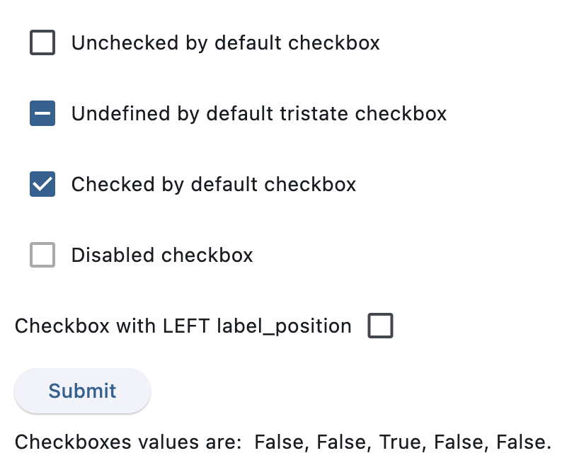
After clicking Submit
Handling events#
import flet as ft


def main(page: ft.Page):
    def handle_checkbox_change(e: ft.Event[ft.Checkbox]):
        page.add(ft.Text(f"Checkbox value changed to {e.control.value}"))
        page.update()

    page.add(
        ft.Checkbox(
            label="Checkbox with 'change' event",
            on_change=handle_checkbox_change,
        )
    )


if __name__ == "__main__":
    ft.run(main)
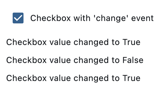
After three clicks
Styled checkboxes#
import flet as ft
def main(page: ft.Page):
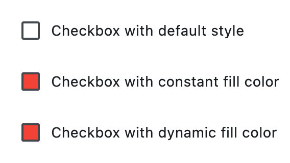
page.add(
ft.Checkbox(label="Checkbox with default style"),
ft.Checkbox(
label="Checkbox with constant fill color",
fill_color=ft.Colors.RED,
check_color=ft.Colors.YELLOW,
),
ft.Checkbox(
label="Checkbox with dynamic fill color",
fill_color={
ft.ControlState.HOVERED: ft.Colors.BLUE,
ft.ControlState.SELECTED: ft.Colors.GREEN,
ft.ControlState.DEFAULT: ft.Colors.RED,
},
# border_side={ft.ControlState.HOVERED: ft.BorderSide(width=1.0)},
),
)
if __name__ == "__main__":
ft.run(main)
Properties#
class-attribute
instance-attribute
#
active_color: ColorValue | None = None
The color to use when this checkbox is checked.
class-attribute
instance-attribute
#
autofocus: bool = False
True if the control will be selected as the initial focus. If there is more than one control on a page with autofocus set, then the first one added to the page will get focus.
class-attribute
instance-attribute
#
border_side: ControlStateValue[BorderSide] | None = None
The color and width of this checkbox's border in all or specific ControlStates.
Defaults to CheckboxTheme.border_side, or if that is None,
falls back to BorderSide with a width of 2.0.
Note
Supported states: ControlState.SELECTED,
ControlState.HOVERED, ControlState.DISABLED,
ControlState.FOCUSED, ControlState.PRESSED,
ControlState.ERROR, and ControlState.DEFAULT.
class-attribute
instance-attribute
#
check_color: ColorValue | None = None
The color to use for the check icon when this checkbox is checked.
class-attribute
instance-attribute
#
error: bool = False
Whether this checkbox wants to show an error state.
If True this checkbox will
have a different default container color and check color.
class-attribute
instance-attribute
#
fill_color: ControlStateValue[ColorValue] | None = None
The color that fills this checkbox in all or specific ControlStates.
Note
Supported states: ControlState.SELECTED,
ControlState.HOVERED, ControlState.DISABLED,
ControlState.FOCUSED, and ControlState.DEFAULT.
class-attribute
instance-attribute
#
focus_color: ColorValue | None = None
The color for the checkbox's Material when it has the input focus.
If overlay_color returns a non-None color in the
ControlState.FOCUSED state, it will be used instead.
Defaults to CheckboxTheme.overlay_color in the
ControlState.FOCUSED state, or if that is None,
falls back to Theme.focus_color.
class-attribute
instance-attribute
#
hover_color: ColorValue | None = None
The color to use when this checkbox is hovered.
class-attribute
instance-attribute
#
label: StrOrControl | None = None
The clickable label to display on the right of a checkbox.
class-attribute
instance-attribute
#
label_position: LabelPosition = RIGHT
Defines on which side of the checkbox the label should be shown.
class-attribute
instance-attribute
#
label_style: TextStyle | None = None
The label's text style.
class-attribute
instance-attribute
#
mouse_cursor: MouseCursor | None = None
The cursor to be displayed when a mouse pointer enters or is hovering over this checkbox.
Defaults to CheckboxTheme.mouse_cursor,
or if that is None, falls back to MouseCursor.CLICK.
class-attribute
instance-attribute
#
overlay_color: ControlStateValue[ColorValue] | None = None
The color of this checkbox's overlay in various ControlState states.
Note
Supported states: ControlState.PRESSED,
ControlState.SELECTED, ControlState.HOVERED,
ControlState.FOCUSED, and ControlState.DEFAULT.
class-attribute
instance-attribute
#
semantics_label: str | None = None
The semantic label for the checkbox that is not shown in the UI, but will be announced by screen readers in accessibility modes (e.g TalkBack/VoiceOver).
class-attribute
instance-attribute
#
shape: OutlinedBorder | None = None
The shape of the checkbox.
Defaults to CheckboxTheme.shape, or if that is None,
falls back to RoundedRectangleBorder(radius=2).
class-attribute
instance-attribute
#
splash_radius: Number | None = None
The radius of the circular Material ink response (ripple) in logical pixels.
Defaults to CheckboxTheme.splash_radius,
or if that is None, falls back to 20.0.
class-attribute
instance-attribute
#
tristate: bool = False
If True the checkbox's value can be True, False, or None.
class-attribute
instance-attribute
#
value: bool | None = False
The value of this checkbox.
- If
True, this checkbox is checked. - If
False, this checkbox is unchecked. - If
NoneandtristateisTrue, this checkbox is indeterminate (displayed as a dash).
class-attribute
instance-attribute
#
visual_density: VisualDensity | None = None
Defines how compact the checkbox's layout will be.
Events#
class-attribute
instance-attribute
#
on_blur: ControlEventHandler[Checkbox] | None = None
Called when this checkbox has lost focus.
class-attribute
instance-attribute
#
on_change: ControlEventHandler[Checkbox] | None = None
Called when the state of this checkbox is changed.
class-attribute
instance-attribute
#
on_focus: ControlEventHandler[Checkbox] | None = None
Called when this checkbox has received focus.