Canvas#
Canvas is a control for drawing arbitrary graphics using a set of primitives or "shapes" such as line, arc, path and text.
Example:

Basic Canvas
Inherits: LayoutControl
Properties
-
content(Control | None) –The content of this canvas.
-
resize_interval(Number) –Sampling interval in milliseconds for
on_resizeevent. -
shapes(list[Shape]) –A list of shapes to draw on this canvas.
Events
-
on_resize(EventHandler[CanvasResizeEvent] | None) –Called when the size of this canvas has changed.
Methods
-
capture–Captures the current visual state of the canvas.
-
clear_capture–Clears the previously captured canvas image.
-
get_capture–Retrieves the most recent canvas capture as PNG bytes.
Examples#
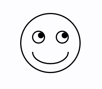
Smiling face#
import math

import flet as ft
import flet.canvas as cv


def main(page: ft.Page):
    stroke_paint = ft.Paint(stroke_width=2, style=ft.PaintingStyle.STROKE)
    fill_paint = ft.Paint(style=ft.PaintingStyle.FILL)

    page.add(
        cv.Canvas(
            width=float("inf"),
            expand=True,
            shapes=[
                cv.Circle(x=100, y=100, radius=50, paint=stroke_paint),
                cv.Circle(x=80, y=90, radius=10, paint=stroke_paint),
                cv.Circle(x=84, y=87, radius=5, paint=fill_paint),
                cv.Circle(x=120, y=90, radius=10, paint=stroke_paint),
                cv.Circle(x=124, y=87, radius=5, paint=fill_paint),
                cv.Arc(
                    x=70,
                    y=95,
                    width=60,
                    height=40,
                    start_angle=0,
                    sweep_angle=math.pi,
                    paint=stroke_paint,
                ),
            ],
        )
    )


ft.run(main)
Flet logo#
import flet as ft
import flet.canvas as cv


def main(page: ft.Page):
    page.theme_mode = ft.ThemeMode.LIGHT

    page.add(
        cv.Canvas(
            width=float("inf"),
            expand=True,
            shapes=[
                cv.Path(
                    elements=[
                        cv.Path.MoveTo(x=25, y=125),
                        cv.Path.QuadraticTo(cp1x=50, cp1y=25, x=135, y=35, w=0.35),
                        cv.Path.QuadraticTo(cp1x=75, cp1y=115, x=135, y=215, w=0.6),
                        cv.Path.QuadraticTo(cp1x=50, cp1y=225, x=25, y=125, w=0.35),
                    ],
                    paint=ft.Paint(
                        stroke_width=2,
                        style=ft.PaintingStyle.FILL,
                        color=ft.Colors.PINK_400,
                    ),
                ),
                cv.Path(
                    elements=[
                        cv.Path.MoveTo(x=85, y=125),
                        cv.Path.QuadraticTo(cp1x=120, cp1y=85, x=165, y=75, w=0.5),
                        cv.Path.QuadraticTo(cp1x=120, cp1y=115, x=165, y=175, w=0.3),
                        cv.Path.QuadraticTo(cp1x=120, cp1y=165, x=85, y=125, w=0.5),
                    ],
                    paint=ft.Paint(
                        stroke_width=2,
                        style=ft.PaintingStyle.FILL,
                        color=ft.Colors.with_opacity(0.5, ft.Colors.BLUE_400),
                    ),
                ),
            ],
        )
    )


ft.run(main)
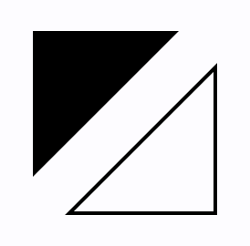
Triangles#
import flet as ft
import flet.canvas as cv


def main(page: ft.Page):
    page.add(
        cv.Canvas(
            width=float("inf"),
            expand=True,
            shapes=[
                cv.Path(
                    paint=ft.Paint(style=ft.PaintingStyle.FILL),
                    elements=[
                        cv.Path.MoveTo(x=25, y=25),
                        cv.Path.LineTo(x=105, y=25),
                        cv.Path.LineTo(x=25, y=105),
                    ],
                ),
                cv.Path(
                    paint=ft.Paint(stroke_width=2, style=ft.PaintingStyle.STROKE),
                    elements=[
                        cv.Path.MoveTo(x=125, y=125),
                        cv.Path.LineTo(x=125, y=45),
                        cv.Path.LineTo(x=45, y=125),
                        cv.Path.Close(),
                    ],
                ),
            ],
        )
    )


ft.run(main)
Bezier curves#
import flet as ft
import flet.canvas as cv


def main(page: ft.Page):
    cp = cv.Canvas(
        width=float("inf"),
        expand=True,
        shapes=[
            cv.Path(
                paint=ft.Paint(stroke_width=2, style=ft.PaintingStyle.STROKE),
                elements=[
                    cv.Path.MoveTo(x=75, y=25),
                    cv.Path.QuadraticTo(cp1x=25, cp1y=25, x=25, y=62.5),
                    cv.Path.QuadraticTo(cp1x=25, cp1y=100, x=50, y=100),
                    cv.Path.QuadraticTo(cp1x=50, cp1y=120, x=30, y=125),
                    cv.Path.QuadraticTo(cp1x=60, cp1y=120, x=65, y=100),
                    cv.Path.QuadraticTo(cp1x=125, cp1y=100, x=125, y=62.5),
                    cv.Path.QuadraticTo(cp1x=125, cp1y=25, x=75, y=25),
                ],
            ),
            cv.Path(
                elements=[
                    cv.Path.SubPath(
                        x=100,
                        y=100,
                        elements=[
                            cv.Path.MoveTo(x=75, y=40),
                            cv.Path.CubicTo(
                                cp1x=75, cp1y=37, cp2x=70, cp2y=25, x=50, y=25
                            ),
                            cv.Path.CubicTo(
                                cp1x=20, cp1y=25, cp2x=20, cp2y=62.5, x=20, y=62.5
                            ),
                            cv.Path.CubicTo(
                                cp1x=20, cp1y=80, cp2x=40, cp2y=102, x=75, y=120
                            ),
                            cv.Path.CubicTo(
                                cp1x=110, cp1y=102, cp2x=130, cp2y=80, x=130, y=62.5
                            ),
                            cv.Path.CubicTo(
                                cp1x=130, cp1y=62.5, cp2x=130, cp2y=25, x=100, y=25
                            ),
                            cv.Path.CubicTo(
                                cp1x=85, cp1y=25, cp2x=75, cp2y=37, x=75, y=40
                            ),
                        ],
                    )
                ],
                paint=ft.Paint(
                    style=ft.PaintingStyle.FILL,
                    gradient=ft.PaintRadialGradient(
                        center=ft.Offset(150, 150),
                        radius=50,
                        colors=[ft.Colors.PINK_100, ft.Colors.PINK],
                    ),
                ),
            ),
        ],
    )

    page.add(cp)


ft.run(main)

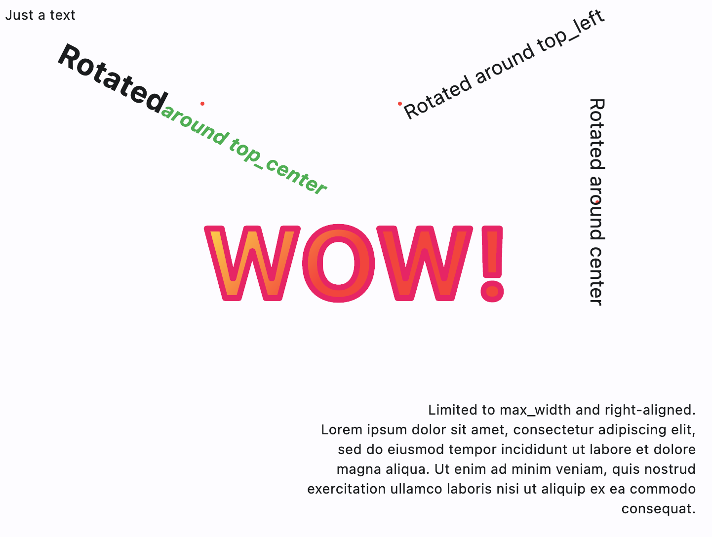
Text#
import math

import flet as ft
import flet.canvas as cv


def main(page: ft.Page):
    page.add(
        cv.Canvas(
            width=float("inf"),
            expand=True,
            shapes=[
                cv.Text(x=0, y=0, value="Just a text"),
                cv.Circle(x=200, y=100, radius=2, paint=ft.Paint(color=ft.Colors.RED)),
                cv.Text(
                    x=200,
                    y=100,
                    style=ft.TextStyle(weight=ft.FontWeight.BOLD, size=30),
                    alignment=ft.Alignment.TOP_CENTER,
                    rotate=math.pi * 0.15,
                    value="Rotated",
                    spans=[
                        ft.TextSpan(
                            text="around top_center",
                            style=ft.TextStyle(
                                italic=True, color=ft.Colors.GREEN, size=20
                            ),
                        )
                    ],
                ),
                cv.Circle(x=400, y=100, radius=2, paint=ft.Paint(color=ft.Colors.RED)),
                cv.Text(
                    x=400,
                    y=100,
                    value="Rotated around top_left",
                    style=ft.TextStyle(size=20),
                    alignment=ft.Alignment.TOP_LEFT,
                    rotate=math.pi * -0.15,
                ),
                cv.Circle(x=600, y=200, radius=2, paint=ft.Paint(color=ft.Colors.RED)),
                cv.Text(
                    x=600,
                    y=200,
                    value="Rotated around center",
                    style=ft.TextStyle(size=20),
                    alignment=ft.Alignment.CENTER,
                    rotate=math.pi / 2,
                ),
                cv.Text(
                    x=300,
                    y=400,
                    value="Limited to max_width and right-aligned.\nLorem ipsum dolor sit amet, consectetur adipiscing elit, sed do eiusmod tempor incididunt ut labore et dolore magna aliqua. Ut enim ad minim veniam, quis nostrud exercitation ullamco laboris nisi ut aliquip ex ea commodo consequat.",
                    text_align=ft.TextAlign.RIGHT,
                    max_width=400,
                ),
                cv.Text(
                    x=200,
                    y=200,
                    value="WOW!",
                    style=ft.TextStyle(
                        weight=ft.FontWeight.BOLD,
                        size=100,
                        foreground=ft.Paint(
                            color=ft.Colors.PINK,
                            stroke_width=6,
                            style=ft.PaintingStyle.STROKE,
                            stroke_join=ft.StrokeJoin.ROUND,
                            stroke_cap=ft.StrokeCap.ROUND,
                        ),
                    ),
                ),
                cv.Text(
                    x=200,
                    y=200,
                    value="WOW!",
                    style=ft.TextStyle(
                        weight=ft.FontWeight.BOLD,
                        size=100,
                        foreground=ft.Paint(
                            gradient=ft.PaintLinearGradient(
                                begin=(200, 200),
                                end=(300, 300),
                                colors=[ft.Colors.YELLOW, ft.Colors.RED],
                            ),
                            stroke_join=ft.StrokeJoin.ROUND,
                            stroke_cap=ft.StrokeCap.ROUND,
                        ),
                    ),
                ),
            ],
        )
    )


ft.run(main)
Free-hand drawing with image capture#
from dataclasses import dataclass

import flet as ft
import flet.canvas as cv

MAX_SHAPES_PER_CAPTURE = 30


@dataclass
class State:
    x: float = 0
    y: float = 0
    shapes_count: int = 1


state = State()


def main(page: ft.Page):
    page.title = "Canvas Example"

    file_picker = ft.FilePicker()

    def handle_pan_start(e: ft.DragStartEvent):
        state.x = e.local_position.x
        state.y = e.local_position.y

    async def handle_pan_update(e: ft.DragUpdateEvent):
        ft.context.disable_auto_update()
        canvas.shapes.append(
            cv.Line(
                x1=state.x,
                y1=state.y,
                x2=e.local_position.x,
                y2=e.local_position.y,
                paint=ft.Paint(stroke_width=3),
            )
        )
        canvas.update()
        state.shapes_count += 1

        if state.shapes_count == MAX_SHAPES_PER_CAPTURE:
            await canvas.capture()
            canvas.shapes.clear()
            canvas.update()
            state.shapes_count = 0

        state.x = e.local_position.x
        state.y = e.local_position.y

    canvas = cv.Canvas(
        expand=False,
        shapes=[
            cv.Fill(ft.Paint(color=ft.Colors.WHITE)),
        ],
        content=ft.GestureDetector(
            on_pan_start=handle_pan_start,
            on_pan_update=handle_pan_update,
            drag_interval=10,
        ),
    )

    async def save_image():
        await canvas.capture()
        capture = await canvas.get_capture()
        if capture:
            file_path = await file_picker.save_file(
                file_name="flet_picture.png", src_bytes=capture
            )
            if file_path and page.platform in [
                ft.PagePlatform.MACOS,
                ft.PagePlatform.WINDOWS,
                ft.PagePlatform.LINUX,
            ]:
                with open(file_path, "wb") as f:
                    f.write(capture)

    page.add(
        ft.Button("Save image", on_click=save_image),
        ft.Container(
            content=canvas,
            border_radius=5,
            border=ft.Border.all(2),
            bgcolor=ft.Colors.WHITE,
            width=float("inf"),
            expand=True,
        ),
    )


ft.run(main)
Gradients#
import math

import flet as ft
import flet.canvas as cv


def main(page: ft.Page):
    page.add(
        cv.Canvas(
            width=float("inf"),
            expand=True,
            shapes=[
                cv.Rect(
                    x=10,
                    y=10,
                    width=100,
                    height=100,
                    border_radius=5,
                    paint=ft.Paint(
                        style=ft.PaintingStyle.FILL,
                        gradient=ft.PaintLinearGradient(
                            begin=(0, 10),
                            end=(100, 50),
                            colors=[ft.Colors.BLUE, ft.Colors.YELLOW],
                        ),
                    ),
                ),
                cv.Circle(
                    x=60,
                    y=170,
                    radius=50,
                    paint=ft.Paint(
                        style=ft.PaintingStyle.FILL,
                        gradient=ft.PaintRadialGradient(
                            radius=50,
                            center=(60, 170),
                            colors=[ft.Colors.YELLOW, ft.Colors.BLUE],
                        ),
                    ),
                ),
                cv.Path(
                    elements=[
                        cv.Path.Arc(
                            x=10,
                            y=230,
                            width=100,
                            height=100,
                            start_angle=3 * math.pi / 4,
                            sweep_angle=3 * math.pi / 2,
                        ),
                    ],
                    paint=ft.Paint(
                        stroke_width=15,
                        stroke_join=ft.StrokeJoin.ROUND,
                        style=ft.PaintingStyle.STROKE,
                        gradient=ft.PaintSweepGradient(
                            start_angle=0,
                            end_angle=math.pi * 2,
                            rotation=3 * math.pi / 4,
                            center=(60, 280),
                            colors=[ft.Colors.YELLOW, ft.Colors.PURPLE],
                            color_stops=[0.0, 1.0],
                        ),
                    ),
                ),
            ],
        )
    )


ft.run(main)
Properties#
class-attribute
instance-attribute
#
content: Control | None = None
The content of this canvas.
class-attribute
instance-attribute
#
resize_interval: Number = 10
Sampling interval in milliseconds for on_resize event.
Setting to 0 calls on_resize immediately
on every change.
class-attribute
instance-attribute
#
A list of shapes to draw on this canvas.
Events#
class-attribute
instance-attribute
#
on_resize: EventHandler[CanvasResizeEvent] | None = None
Called when the size of this canvas has changed.
Methods#
async
#
capture(pixel_ratio: Number | None = None)
Captures the current visual state of the canvas.
The captured image is stored internally and will be rendered as a background beneath all subsequently drawn shapes.
Parameters:
-
pixel_ratio(Number | None, default:None) –The pixel density multiplier to use when rendering the capture.
1.0means 1 device pixel per logical pixel (no scaling). Values greater than1.0produce higher-resolution captures. IfNone, the device's default pixel ratio is used.
async
#
Clears the previously captured canvas image.
After clearing, no background will be rendered from a prior capture.