AutofillGroup
Inherits: Control
Properties
-
content(Control) –The content of this group.
-
dispose_action(AutofillGroupDisposeAction) –The action to be run when this group is the topmost and it's being disposed, in order to clean up the current autofill context.
Examples#
Basic example#
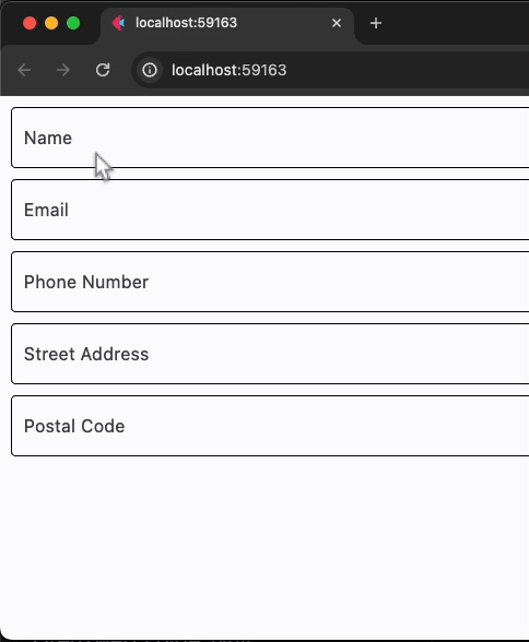
import flet as ft


def main(page: ft.Page):
    page.add(
        ft.AutofillGroup(
            content=ft.Column(
                controls=[
                    ft.TextField(
                        label="Name",
                        autofill_hints=ft.AutofillHint.NAME,
                    ),
                    ft.TextField(
                        label="Email",
                        autofill_hints=[ft.AutofillHint.EMAIL],
                    ),
                    ft.TextField(
                        label="Phone Number",
                        autofill_hints=[ft.AutofillHint.TELEPHONE_NUMBER],
                    ),
                    ft.TextField(
                        label="Street Address",
                        autofill_hints=ft.AutofillHint.FULL_STREET_ADDRESS,
                    ),
                    ft.TextField(
                        label="Postal Code",
                        autofill_hints=ft.AutofillHint.POSTAL_CODE,
                    ),
                ]
            )
        )
    )


ft.run(main)